Preview image. Unlock full-res
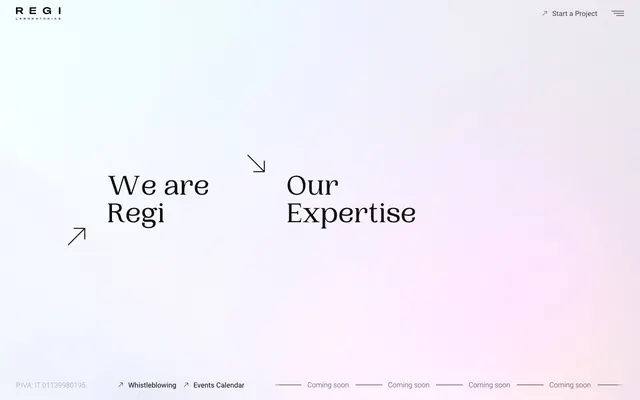
Ethereal canvas with typographic whisper
Color palette
Understated background gradient for atmospheric elements, primarily decorative
Swiper UI elements (not explicitly seen on provided screenshot, but in tokens)
Primary page background, general surface
Subtle background for card surfaces and secondary panels, providing a gentle visual separation from the main canvas
Primary text color for headings, strong emphasis, and icon fills. Also used for outlined button borders
Text color for links, important body text, and subtle icon strokes
Secondary text, footer links, and subtle borders
Typography
- Weights
- 400, 700
- Sizes
- 16px, 64px
- Line height
- 0.97, 1.5
- Fallback
- Playfair Display
Display headings and prominent headlines - the 0.97 line-height for larger sizes creates a tight, sophisticated stack.
- Weights
- 400, 700
- Sizes
- 16px
- Line height
- 1.5
- Fallback
- Inter
Body text, navigation, and functional UI elements, providing a legible and approachable counterpoint to the display font.
Spacing & shape
Components
Text in Muted Grey (#454545) with a bottom border in Ink Black (#000000) for active states. No background fill, creating a lightweight, ghost-like appearance. Padding is minimal (0px vertical, 22.4px horizontal).
Background is Surface Frost (#f5f7f8) with a 50% border radius to create a perfect circle. No box shadow, keeping it flat.
Text color is Muted Grey (#454545) for inactive states, changing to Graphite Text (#0f0f0f) on hover/active, with a discreet bottom border in Ink Black (#000000) for interaction states.
Uses PP Woodland font, Ink Black (#000000) color, with large sizes (e.g., 64px) and a tight line-height of 0.97 to stack text compactly.
Guidelines
- Use PP Woodland for all headings and large display text, ensuring line-height is 0.97 for sizes above 30px.
- Prioritize Ink Black (#000000) for primary text and borders, with Graphite Text (#0f0f0f) for links and Muted Grey (#454545) for secondary text.
- Implement lightweight, ghost-style buttons with Muted Grey (#454545) text and Ink Black (#000000) bottom borders for interactive elements.
- Maintain a clear separation between the Canvas White (#ffffff) background and Surface Frost (#f5f7f8) for card elements.
- Apply a 50% border radius to any background boxes that function as cards or decorative elements.
- Emphasize whitespace, using 'elementGap' of 16px and 'sectionGap' of 76px to create natural breaks and visual breathing room.
- Integrate the 'Sky Haze Gradient' as a subtle, background atmospheric effect rather than a prominent UI component.
- Avoid solid background colors for interactive elements, favoring ghost buttons with borders as the primary action style.
- Do not introduce strong, saturated colors for backgrounds or large sections; maintain the achromatic base palette.
- Refrain from using prominent box-shadows or heavy elevation effects; surfaces should remain flat or with minimal visual depth.
- Do not deviate from the PP Woodland and Roboto font families; avoid system defaults or other decorative fonts.
- Avoid large contiguous blocks of text without sufficient line-height (1.5 for Roboto) or padding.
- Do not use generic square corners for cards or prominent containers; rely on the subtle radius for cards and zero radius for buttons.
- Never use the Swiper Blue (#007aff) directly in UI elements unless it's an underlying framework component.
About this system
ShowHide
The REGI Laboratories design system employs a refined, almost minimalist aesthetic with a dominant white canvas subtly tinted by a soft, ethereal gradient. Typography takes center stage, featuring a classic serif for headlines that conveys heritage and authority, contrasted with a modern sans-serif for body text. Interaction elements are ghost-like and understated, relying on subtle borders and text color changes rather than bold fills, maintaining an open and airy feel. Whitespace is generous, allowing content to breathe and emphasizing the delicate visual balance.
The page maintains a centered, maximal-width layout, with content contained within a comfortable reading measure that is not explicitly fixed but appears consistently aligned. The hero section makes use of the full viewport, featuring large centered headlines against the ephemeral radial gradient background. Section rhythm is open and spacious, with implied vertical sections rather than overt dividers. Content arrangement is primarily centered or implicitly balanced through typography and sparse elements, suggesting a focus on showcasing text-based information. Navigation consists of a minimal top bar with ghost-like links and a hamburger menu icon. The footer is also minimal, containing legal links and 'coming soon' placeholders.
This design system favors an imagery-light approach, with the focus remaining on typography and subtle background gradients. Any graphical elements are primarily functional icons or abstract, decorative arrows, maintaining a clean and uncluttered presentation. Where imagery would typically appear, it is either absent or implied through abstract visual textures, allowing the information and brand voice to lead. Icons appear as minimal outlines, rendered in Ink Black.
Reminiscent of Bvlgari, Hermes, Apple, Dior.
# REGI Laboratories — Style Reference
> Ethereal canvas with typographic whisper

**Theme:** light

**Site:** https://regi.it

The REGI Laboratories design system employs a refined, almost minimalist aesthetic with a dominant white canvas subtly tinted by a soft, ethereal gradient. Typography takes center stage, featuring a classic serif for headlines that conveys heritage and authority, contrasted with a modern sans-serif for body text. Interaction elements are ghost-like and understated, relying on subtle borders and text color changes rather than bold fills, maintaining an open and airy feel. Whitespace is generous, allowing content to breathe and emphasizing the delicate visual balance.

## Tokens — Colors

| Name | Value | Token | Role |
|------|------|------|------|
| Sky Haze Gradient | `#4571ea` | `--color-sky-haze-gradient` | Understated background gradient for atmospheric elements, primarily decorative |
| Swiper Blue | `#007aff` | `--color-swiper-blue` | Swiper UI elements (not explicitly seen on provided screenshot, but in tokens) |
| Canvas White | `#ffffff` | `--color-canvas-white` | Primary page background, general surface |
| Surface Frost | `#f5f7f8` | `--color-surface-frost` | Subtle background for card surfaces and secondary panels, providing a gentle visual separation from the main canvas |
| Ink Black | `#000000` | `--color-ink-black` | Primary text color for headings, strong emphasis, and icon fills. Also used for outlined button borders |
| Graphite Text | `#0f0f0f` | `--color-graphite-text` | Text color for links, important body text, and subtle icon strokes |
| Muted Grey | `#454545` | `--color-muted-grey` | Secondary text, footer links, and subtle borders |

## Tokens — Typography

### PP Woodland
- **Substitute:** Playfair Display
- **Weights:** 400, 700
- **Sizes:** 16px, 64px
- **Line height:** 0.97, 1.5
- **Role:** Display headings and prominent headlines - the 0.97 line-height for larger sizes creates a tight, sophisticated stack.

### Roboto
- **Substitute:** Inter
- **Weights:** 400, 700
- **Sizes:** 16px
- **Line height:** 1.5
- **Role:** Body text, navigation, and functional UI elements, providing a legible and approachable counterpoint to the display font.

## Tokens — Type Scale

| Role | Size | Line height | Letter spacing |
|------|------|------|------|
| body | 16px | 1.5 | — |
| display | 64px | 0.97 | — |

## Tokens — Spacing

- **Section gap:** 76px
- **Card padding:** 22px
- **Element gap:** 16px

## Tokens — Radius

- **Buttons:** 0px
- **Cards:** 50%

## Layout

The page maintains a centered, maximal-width layout, with content contained within a comfortable reading measure that is not explicitly fixed but appears consistently aligned. The hero section makes use of the full viewport, featuring large centered headlines against the ephemeral radial gradient background. Section rhythm is open and spacious, with implied vertical sections rather than overt dividers. Content arrangement is primarily centered or implicitly balanced through typography and sparse elements, suggesting a focus on showcasing text-based information. Navigation consists of a minimal top bar with ghost-like links and a hamburger menu icon. The footer is also minimal, containing legal links and 'coming soon' placeholders.

## Imagery

This design system favors an imagery-light approach, with the focus remaining on typography and subtle background gradients. Any graphical elements are primarily functional icons or abstract, decorative arrows, maintaining a clean and uncluttered presentation. Where imagery would typically appear, it is either absent or implied through abstract visual textures, allowing the information and brand voice to lead. Icons appear as minimal outlines, rendered in Ink Black.

## Components

### Ghost Button
*Primary action, navigation items*

Text in Muted Grey (#454545) with a bottom border in Ink Black (#000000) for active states. No background fill, creating a lightweight, ghost-like appearance. Padding is minimal (0px vertical, 22.4px horizontal).

### Circular Card
*Decorative or illustrative containers*

Background is Surface Frost (#f5f7f8) with a 50% border radius to create a perfect circle. No box shadow, keeping it flat.

### Navigation Link
*Header and footer navigation*

Text color is Muted Grey (#454545) for inactive states, changing to Graphite Text (#0f0f0f) on hover/active, with a discreet bottom border in Ink Black (#000000) for interaction states.

### Main Heading
*Hero section titles, major content blocks*

Uses PP Woodland font, Ink Black (#000000) color, with large sizes (e.g., 64px) and a tight line-height of 0.97 to stack text compactly.

## Guidelines

### Do

- Use PP Woodland for all headings and large display text, ensuring line-height is 0.97 for sizes above 30px.
- Prioritize Ink Black (#000000) for primary text and borders, with Graphite Text (#0f0f0f) for links and Muted Grey (#454545) for secondary text.
- Implement lightweight, ghost-style buttons with Muted Grey (#454545) text and Ink Black (#000000) bottom borders for interactive elements.
- Maintain a clear separation between the Canvas White (#ffffff) background and Surface Frost (#f5f7f8) for card elements.
- Apply a 50% border radius to any background boxes that function as cards or decorative elements.
- Emphasize whitespace, using 'elementGap' of 16px and 'sectionGap' of 76px to create natural breaks and visual breathing room.
- Integrate the 'Sky Haze Gradient' as a subtle, background atmospheric effect rather than a prominent UI component.

### Don't

- Avoid solid background colors for interactive elements, favoring ghost buttons with borders as the primary action style.
- Do not introduce strong, saturated colors for backgrounds or large sections; maintain the achromatic base palette.
- Refrain from using prominent box-shadows or heavy elevation effects; surfaces should remain flat or with minimal visual depth.
- Do not deviate from the PP Woodland and Roboto font families; avoid system defaults or other decorative fonts.
- Avoid large contiguous blocks of text without sufficient line-height (1.5 for Roboto) or padding.
- Do not use generic square corners for cards or prominent containers; rely on the subtle radius for cards and zero radius for buttons.
- Never use the Swiper Blue (#007aff) directly in UI elements unless it's an underlying framework component.

## Agent Prompt Guide

Quick Color Reference:
text: #000000
background: #ffffff
border: #000000
accent: #4571ea
primary action: no distinct CTA color

Example Component Prompts:
Create a hero section: radial-gradient(circle closest-side, rgba(69, 113, 234, 0.5) 0%, rgba(234, 113, 69, 0) 100%) background. Heading 'We are Regi' at 64px PP Woodland Light, #000000, line-height 0.97. Subtle decorative arrows in #000000.
Create a navigation button 'Start a Project': text 'Start a Project' at 16px Roboto Bold, #454545, with a 1px bottom border in #000000, no background fill, 0px border-radius, padding 0px 22.4px.
Create a footer link 'Whistleblowing': text 'Whistleblowing' at 16px Roboto Regular, #454545.
Create a circular informational card: background #f5f7f8, 50% border-radius, no shadow, with internal padding of 22px.
More like this









Keep what you find
A free account saves references to boards and can send you a weekly email of picks based on what you save.
To see every result, go Pro.