Preview image. Unlock full-res
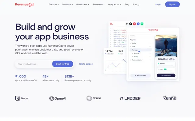
precision architecture on crisp white. Like an x-ray of meticulously organized components within a bright, airy digital lab.
Color palette
Primary text for headings, navigation, and key informational elements. Establishes a professional, technical tone.
Primary accent for CTA buttons, active navigation, links, and interactive icons. Signals action and interactivity.
Subtle background for hover states or very light emphasis on certain text blocks.
Decorative background gradient used for abstract visual elements or hero sections, blending violet, gray, and green for a dynamic, modern feel.
Page background, surface backgrounds, interactive element text.
Subtle background for card sections and segmented content areas. Provides slight visual separation from the main page.
Secondary text color for body paragraphs, labels, and less prominent text that still requires high readability.
Body text for longer descriptions and secondary information, providing a softer contrast than Deep Space Violet.
Placeholder text, subtle borders, and tertiary information. Creates a subdued, supporting visual layer.
Fine borders for subtle element separation, like separators or table dividers. Provides structure without visual weight.
Typography
- Weights
- 100, 300, 400, 500, 700
- Sizes
- 13px, 14px, 16px, 18px, 24px, 28px, 32px, 40px, 48px, 54px, 56px, 64px, 80px
- Line height
- 1, 1.13, 1.25, 1.38, 1.5
- Letter spacing
- -0.0700em at 80px, -0.0400em at 48px, -0.0300em at 40px, -0.0250em at 32px, -0.0200em at 24px
- Fallback
- system-ui
Headings and prominent display text. The tight letter-spacing on larger sizes is a signature trait, conveying precision and authority through controlled forms rather than bold mass.
- Weights
- 300, 400, 500
- Sizes
- 16px, 18px, 20px, 22px
- Line height
- 1, 1.25, 1.38, 1.5
- Letter spacing
- normal
- Fallback
- system-ui
Body text, navigation, and input fields. Its clean, neutral readability supports the precision-focused aesthetic without distracting from the custom heading font.
Spacing & shape
Elevation
Components
Filled button with `Digital Violet` background (#576cdb) and `White Canvas` text (#ffffff), `9999px` border-radius, `28px` horizontal padding, `16px` vertical padding. Prominently signals primary interaction.
Transparent background, `Charcoal Text` color (#171a1c), `0px` border-radius, no horizontal padding, generous `36px` top padding, no bottom padding. Used for 'Talk to sales' type actions, blending with surrounding text.
Transparent background or `Cloud Gray` (#f9f9fb) background, `0px` border-radius, `0px` padding, no boxShadow for most. A minimalist container that prioritizes content.
Transparent background, `Slate Text` color (#3d3d5c) for input text, `Whisper Gray` (#6b7280) border on focus, `0px` border-radius, `24px` horizontal padding, `8px` vertical padding.
White background (`#ffffff`), `16px` border-radius. Features a complex shadow: `rgba(71, 92, 133, 0.25) 0px 4px 20px 0px, rgba(144, 138, 208, 0.1) 0px 30px 60px 0px`. This dual shadow creates a distinct, layered elevation.
Thin line (`1px`) with `Light Violet Stroke` color (#eaedf6). Used for subtle visual breaks, grounding content without heavy borders.
Guidelines
- Use `Digital Violet` (#576cdb) exclusively for primary interactive elements, reserving its impact for key actions.
- Apply `Object Sans` with tight letter-spacing for all headlines to establish a tone of precise authority.
- Maintain `0px` border-radius for all informational cards and structural containers to reinforce a clean and architectural aesthetic.
- Prioritize `White Canvas` (#ffffff) and `Cloud Gray` (#f9f9fb) as dominant background colors to support the bright, spacious feel.
- Utilize `Charcoal Text` (#171a1c) for main body copy and `Deep Space Violet` (#1f1f47) for headlines to ensure clear typographic hierarchy.
- Employ `9999px` border-radius for all buttons that are not hero-sized, distinguishing them as friendly, clickable elements.
- Avoid using `Digital Violet` (#576cdb) for non-interactive decorative elements; preserve its signaling function.
- Do not introduce additional font families or weights beyond `Object Sans` (100-700) and `Helvetica Neue` (300-500) to maintain typographic rigor.
- Refrain from using strong, colorful background images or patterns that would detract from the minimalist, content-focused layout.
- Do not apply heavy, opaque shadows to elements unless specifically using the `Elevated Content Card` style, to preserve the system's light and airy quality.
- Limit the use of `4px` and `6px` spacing tokens to internal component padding or very subtle micro-adjustments; stick to larger multiples of 20px for overall layout.
- Do not deviate from the `0px` border-radius for non-button components; rounded corners break their structured appearance.
About this system
ShowHide
This design system conjures the feeling of a highly organized, trustworthy digital workspace, balancing robust information display with approachable interactions. It achieves this through a high-contrast white background and deep, muted violet text, accented by a single, prominent 'Digital Violet' (#576cdb) that signifies action and focus. Object Sans headlines, particularly at display sizes, use a whisper-soft letter spacing (e.g., -0.0700em at 80px) to convey authority through precision rather than boldness, ensuring technical infrastructure feels accessible. The interplay between sharp 0px radii on informational cards and generous 9999px pill shapes for primary buttons creates a dynamic tension between structure and user-friendliness.
The page adheres to a centered, max-width `1216px` container for most content, maintaining clarity and readability. The hero section, however, uses a full-bleed background often featuring abstract gradients, with key information centered. Sections alternate between pure `White Canvas` (#ffffff) and `Cloud Gray` (#f9f9fb) backgrounds, providing a clear visual rhythm without harsh dividers. Content is frequently arranged in multi-column grids (2-column for text+image and 4-column for featured items/cards), showcasing information efficiently. A notable pattern is the use of horizontally scrolling card carousels for testimonials and feature highlights, lending a dynamic, interactive feel to content blocks. The navigation is a sticky top bar, consistent across the site.
The visual language relies heavily on product pseudo-screenshots and abstract data visualizations. Product screenshots are typically high-fidelity UI snippets, often framed within clean, white cards, highlighting specific features or data points. They sometimes show overlapping elements with soft, almost translucent edges, creating depth. Photography is sparse, appearing mostly in testimonials as profile pictures. Illustrations are minimalist icons, often represented in a single brand color like `Digital Violet` (#576cdb) or `Deep Space Violet` (#1f1f47), acting as clear, explanatory content indicators rather than decorative elements. The overall density is balanced, allowing UI elements and text to dominate, with imagery serving a direct, explanatory role.
Reminiscent of Stripe, Vercel, Linear, Notion.
# Revenuecat — Style Reference
> precision architecture on crisp white. Like an x-ray of meticulously organized components within a bright, airy digital lab.

**Theme:** light

**Site:** https://revenuecat.com

This design system conjures the feeling of a highly organized, trustworthy digital workspace, balancing robust information display with approachable interactions. It achieves this through a high-contrast white background and deep, muted violet text, accented by a single, prominent 'Digital Violet' (#576cdb) that signifies action and focus. Object Sans headlines, particularly at display sizes, use a whisper-soft letter spacing (e.g., -0.0700em at 80px) to convey authority through precision rather than boldness, ensuring technical infrastructure feels accessible. The interplay between sharp 0px radii on informational cards and generous 9999px pill shapes for primary buttons creates a dynamic tension between structure and user-friendliness.

## Tokens — Colors

| Name | Value | Token | Role |
|------|------|------|------|
| Deep Space Violet | `#1f1f47` | `--color-deep-space-violet` | Primary text for headings, navigation, and key informational elements. Establishes a professional, technical tone. |
| Digital Violet | `#576cdb` | `--color-digital-violet` | Primary accent for CTA buttons, active navigation, links, and interactive icons. Signals action and interactivity. |
| Hover Violet | `#abb6ed` | `--color-hover-violet` | Subtle background for hover states or very light emphasis on certain text blocks. |
| Gradient Aura | `#5a73f2` | `--color-gradient-aura` | Decorative background gradient used for abstract visual elements or hero sections, blending violet, gray, and green for a dynamic, modern feel. |
| White Canvas | `#ffffff` | `--color-white-canvas` | Page background, surface backgrounds, interactive element text. |
| Cloud Gray | `#f9f9fb` | `--color-cloud-gray` | Subtle background for card sections and segmented content areas. Provides slight visual separation from the main page. |
| Charcoal Text | `#171a1c` | `--color-charcoal-text` | Secondary text color for body paragraphs, labels, and less prominent text that still requires high readability. |
| Slate Text | `#3d3d5c` | `--color-slate-text` | Body text for longer descriptions and secondary information, providing a softer contrast than Deep Space Violet. |
| Whisper Gray | `#6c7693` | `--color-whisper-gray` | Placeholder text, subtle borders, and tertiary information. Creates a subdued, supporting visual layer. |
| Light Violet Stroke | `#eaedf6` | `--color-light-violet-stroke` | Fine borders for subtle element separation, like separators or table dividers. Provides structure without visual weight. |

## Tokens — Typography

### Object Sans
- **Substitute:** system-ui
- **Weights:** 100, 300, 400, 500, 700
- **Sizes:** 13px, 14px, 16px, 18px, 24px, 28px, 32px, 40px, 48px, 54px, 56px, 64px, 80px
- **Line height:** 1, 1.13, 1.25, 1.38, 1.5
- **Letter spacing:** -0.0700em at 80px, -0.0400em at 48px, -0.0300em at 40px, -0.0250em at 32px, -0.0200em at 24px
- **Role:** Headings and prominent display text. The tight letter-spacing on larger sizes is a signature trait, conveying precision and authority through controlled forms rather than bold mass.

### Helvetica Neue
- **Substitute:** system-ui
- **Weights:** 300, 400, 500
- **Sizes:** 16px, 18px, 20px, 22px
- **Line height:** 1, 1.25, 1.38, 1.5
- **Letter spacing:** normal
- **Role:** Body text, navigation, and input fields. Its clean, neutral readability supports the precision-focused aesthetic without distracting from the custom heading font.

## Tokens — Type Scale

| Role | Size | Line height | Letter spacing |
|------|------|------|------|
| caption | 13px | 1.5 | — |
| body | 16px | 1.5 | — |
| subheading | 18px | 1.5 | — |
| heading-sm | 24px | 1.38 | -0.48px |
| heading | 32px | 1.25 | -0.8px |
| heading-lg | 40px | 1.25 | -1.2px |
| display | 48px | 1.25 | -1.92px |
| display-lg | 80px | 1.13 | -5.6px |

## Tokens — Spacing

- **Max width:** 1216px
- **Section gap:** 120px
- **Card padding:** 24px
- **Element gap:** 20px

## Tokens — Radius

- **General:** 16px
- **Buttons:** 9999px
- **Cards:** 0px
- **Images:** 16px
- **pill-buttons-large:** 40px

## Tokens — Elevation

- **Elevated Content Card:** `rgba(71, 92, 133, 0.25) 0px 4px 20px 0px, rgba(144, 138, 208, 0.1) 0px 30px 60px 0px`

## Layout

The page adheres to a centered, max-width `1216px` container for most content, maintaining clarity and readability. The hero section, however, uses a full-bleed background often featuring abstract gradients, with key information centered. Sections alternate between pure `White Canvas` (#ffffff) and `Cloud Gray` (#f9f9fb) backgrounds, providing a clear visual rhythm without harsh dividers. Content is frequently arranged in multi-column grids (2-column for text+image and 4-column for featured items/cards), showcasing information efficiently. A notable pattern is the use of horizontally scrolling card carousels for testimonials and feature highlights, lending a dynamic, interactive feel to content blocks. The navigation is a sticky top bar, consistent across the site.

## Imagery

The visual language relies heavily on product pseudo-screenshots and abstract data visualizations. Product screenshots are typically high-fidelity UI snippets, often framed within clean, white cards, highlighting specific features or data points. They sometimes show overlapping elements with soft, almost translucent edges, creating depth. Photography is sparse, appearing mostly in testimonials as profile pictures. Illustrations are minimalist icons, often represented in a single brand color like `Digital Violet` (#576cdb) or `Deep Space Violet` (#1f1f47), acting as clear, explanatory content indicators rather than decorative elements. The overall density is balanced, allowing UI elements and text to dominate, with imagery serving a direct, explanatory role.

## Components

### Stat Block — Hero Metrics

### Feature Cards — Data and Tools for Every Team

### Testimonial Card — VSCO Case Study

### Primary Action Button
*Calls to action*

Filled button with `Digital Violet` background (#576cdb) and `White Canvas` text (#ffffff), `9999px` border-radius, `28px` horizontal padding, `16px` vertical padding. Prominently signals primary interaction.

### Text Link Button
*Secondary actions, navigation, and inline links*

Transparent background, `Charcoal Text` color (#171a1c), `0px` border-radius, no horizontal padding, generous `36px` top padding, no bottom padding. Used for 'Talk to sales' type actions, blending with surrounding text.

### Informational Card
*Displaying content blocks, features, testimonials*

Transparent background or `Cloud Gray` (#f9f9fb) background, `0px` border-radius, `0px` padding, no boxShadow for most. A minimalist container that prioritizes content.

### Input Field
*User input fields*

Transparent background, `Slate Text` color (#3d3d5c) for input text, `Whisper Gray` (#6b7280) border on focus, `0px` border-radius, `24px` horizontal padding, `8px` vertical padding.

### Elevated Content Card
*Highlighting key information or interactive elements with depth*

White background (`#ffffff`), `16px` border-radius. Features a complex shadow: `rgba(71, 92, 133, 0.25) 0px 4px 20px 0px, rgba(144, 138, 208, 0.1) 0px 30px 60px 0px`. This dual shadow creates a distinct, layered elevation.

### Horizontal Divider Line
*Visual separation between content sections or elements*

Thin line (`1px`) with `Light Violet Stroke` color (#eaedf6). Used for subtle visual breaks, grounding content without heavy borders.

## Guidelines

### Do

- Use `Digital Violet` (#576cdb) exclusively for primary interactive elements, reserving its impact for key actions.
- Apply `Object Sans` with tight letter-spacing for all headlines to establish a tone of precise authority.
- Maintain `0px` border-radius for all informational cards and structural containers to reinforce a clean and architectural aesthetic.
- Prioritize `White Canvas` (#ffffff) and `Cloud Gray` (#f9f9fb) as dominant background colors to support the bright, spacious feel.
- Utilize `Charcoal Text` (#171a1c) for main body copy and `Deep Space Violet` (#1f1f47) for headlines to ensure clear typographic hierarchy.
- Employ `9999px` border-radius for all buttons that are not hero-sized, distinguishing them as friendly, clickable elements.

### Don't

- Avoid using `Digital Violet` (#576cdb) for non-interactive decorative elements; preserve its signaling function.
- Do not introduce additional font families or weights beyond `Object Sans` (100-700) and `Helvetica Neue` (300-500) to maintain typographic rigor.
- Refrain from using strong, colorful background images or patterns that would detract from the minimalist, content-focused layout.
- Do not apply heavy, opaque shadows to elements unless specifically using the `Elevated Content Card` style, to preserve the system's light and airy quality.
- Limit the use of `4px` and `6px` spacing tokens to internal component padding or very subtle micro-adjustments; stick to larger multiples of 20px for overall layout.
- Do not deviate from the `0px` border-radius for non-button components; rounded corners break their structured appearance.

## Agent Prompt Guide

### Quick Color Reference
- Text (primary): #1f1f47
- Text (secondary): #171a1c
- Background (page): #ffffff
- CTA: #576cdb
- Border (subtle): #eaedf6
- Accent (link/active): #576cdb

### 3-5 Example Component Prompts
1. **Create a Hero Section:** Use a `White Canvas` background. Headline: `Build and grow your app business` using `Object Sans` at `48px` size, `lineHeight 1.25`, `letterSpacing -1.92px`, and `Deep Space Violet` (#1f1f47) color. Body text: `The world's best apps...` using `Helvetica Neue` at `18px` size, `lineHeight 1.5`, `Charcoal Text` (#171a1c). Include a `Primary Action Button` with text `Start for free` and a `Text Link Button` with text `Talk to sales`.
2. **Generate an Informational Card:** Develop a `Cloud Gray` (#f9f9fb) background card with `0px` radius, `0px` padding. Inside, place a `heading-sm` (`24px`, `Object Sans`, `lineHeight 1.38`, `letterSpacing -0.48px`, `Deep Space Violet`) `Engineering`, and a `body` text (`16px`, `Helvetica Neue`, `lineHeight 1.5`, `Slate Text` (#3d3d5c)) `Stop spending time...` Below that, add a `Text Link Button` (`For engineering teams >`).
3. **Design an Elevated Content Card for a Testimonial:** Create an `Elevated Content Card` on a `White Canvas` background. Inside, place `body` text in `Charcoal Text` (`#171a1c`) `"The RevenueCat and Braze integration..."`. Include a person's name as a `subheading` (`18px`, `Helvetica Neue`, `Charcoal Text`), and their title as `body-sm` (`14px`, `Helvetica Neue`, `Whisper Gray` (#6c7693)). On the right, display `5%` prominently with `display` size text (`48px`).
4. **Build an Input Field with Label:** Create an input field with `0px` border-radius, `24px` horizontal padding, and `8px` vertical padding. Placeholder text color `Whisper Gray` (#6c7693). Label it with `body-sm` (`14px`, `Helvetica Neue`, `Slate Text` (#3d3d5c)) 'Your email address...'. When focused, border color should be `Digital Violet` (#576cdb).
More like this










Keep what you find
A free account saves references to boards and can send you a weekly email of picks based on what you save.
To see every result, go Pro.