Preview image. Unlock full-res
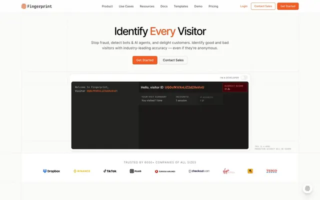
Data Sheet Precision. A clean, well-organized technical document with key elements highlighted in a single, vivid accent.
Color palette
Primary calls to action, active navigation, key highlights in text, brand identifier.
Used for specific data points or emphasis within content, creating a cool data highlight.
Used for specific data points or emphasis within content, particularly for information. Not a primary interaction color.
Code snippets, monospace text, data display fields.
Page backgrounds, large content areas, card surfaces.
Primary text, headings, icons, strong UI elements.
Secondary text, button text on light backgrounds, less prominent UI elements.
Subtle section dividers, borders, very light backgrounds.
Component borders, subtle separators, card outlines.
Tertiary text, descriptive labels, less emphasized information.
Hover states, active backgrounds, ghost button text.
Backgrounds for code snippets or data-rich console-like displays.
Badge backgrounds for positive status indications.
Typography
- Weights
- 400
- Sizes
- 10px, 11px, 12px, 13px, 14px, 16px
- Line height
- 1.4, 1.5, 1.6, 1.7
- Letter spacing
- -0.0620em, -0.0200em, 0.0010em, 0.0090em, 0.0100em, 0.0600em, 0.0800em, 0.1200em, 0.2000em
- Fallback
- system-ui, sans-serif
Primary body text, labels, general UI elements. The default for readable content.
- Weights
- 600
- Sizes
- 16px, 30px, 36px, 48px
- Line height
- 1.15, 1.22, 1.3
- Letter spacing
- -0.062em at 48px, -0.02em at 30px
- Fallback
- system-ui, sans-serif
Headlines and prominent text, uses tighter letter spacing for display sizes for impact. The 600 weight provides firm emphasis without being overly bold.
- Weights
- 400
- Sizes
- 10px, 11px, 12px, 13px, 14px
- Line height
- 1.45, 1.5, 1.57, 1.6
- Letter spacing
- 0.001em
- Fallback
- monospace
Code snippets, data displays, API responses, and all console-like content. Its fixed-width character ensures readability of technical output.
Spacing & shape
Elevation
Components
Solid Accent Orange background (#f35b22), white text (#ffffff), 6px border radius. Padding 8px vertical, 16px horizontal. Features a darker border color (#be400f) for depth.
Transparent background, Graphite text (#454542), 4px border radius. Border is a thin Graphite line. Padding 3px vertical, 10px horizontal. Used for less emphasized actions.
Transparent background, Ink Black text (#141415), no border radius (0px). No padding. Used for minimal, text-based actions or navigation links that appear as buttons.
Canvas White background (#fafaf8), Ink Black text (#141415), 6px border radius. Light border (#d9d9d9). Padding 8px vertical, 16px horizontal.
Canvas White background (#fafaf8), 12px border radius. Inset shadow rgba(228, 229, 225, 0.3) 0px 1px 0px 0px inset, rgba(110, 111, 109, 0.1) 0px -1px 0px 0px inset. No explicit padding mentioned in data, implies content children determine internal spacing.
Transparent background, no specific border radius or shadow. Padding is dynamic based on content. Inter, weight 400, Ink Black text. Often contains an icon.
Code Block Dark background (#2e2e2c), JetBrains Mono for text at various small sizes, Monitor Grey (#abb2bf) for standard text. Contains a mix of code, labels, and values. No specific padding or radius on the data block itself, but usually contained within a larger card structure. The red 'Suspect Score' is RGB(246, 121, 120), indicating a specific high-alert state.
Success Green background (#62b06d), matching text color, 50% border radius for circular shape. Used for 'true' or 'detected' states. No padding explicitly set, implying native content dimensions.
Guidelines
- Prioritize Inter 400 for all body copy and standard UI text at 14px or 16px size for clear readability.
- Use Accent Orange (#f35b22) exclusively for primary calls to action and active states to guide user focus.
- Apply a 6px border radius for all interactive buttons and a 12px radius for contained content cards to provide soft corners.
- Ensure all technical data, code snippets, and console-like displays use JetBrains Mono in Code Block Dark (#2e2e2c) backgrounds for consistent visual cueing.
- Use Border Ash (#e4e5e1) for all component borders and dividers to maintain a subtle, structured appearance.
- Implement the card shadow `rgba(228, 229, 225, 0.3) 0px 1px 0px 0px inset, rgba(110, 111, 109, 0.1) 0px -1px 0px 0px inset` for subtle internal depth on cards.
- Do not introduce new chromatic colors; stick to Accent Orange, Deep Teal, Soft Blue, Monitor Grey, and Success Green for emphasis.
- Avoid using bold or weight 700 for paragraphs; reserve Inter 600 for headlines and critical short statements only.
- Do not deviate from the established spacing scale; maintain 8px element gaps and 48px section gaps for visual rhythm.
- Do not use hard, sharp shadows; only apply the specified inset shadows or light, diffused box shadows for elevation.
- Avoid large imagery that breaks the grid; if images are used, they should complement the data-driven content or be contained within structured layouts.
- Do not use generic blue for interactive elements; Accent Orange is the designated primary interaction color.
About this system
ShowHide
Fingerprint's design system offers a grounded, informative aesthetic that balances clear data presentation with subtle brand touches. The combination of a warm, off-white background and a dark, slightly desaturated typography creates a high-contrast yet comfortable reading experience. The system utilizes a precise, technical monospace font for data display, contrasting with a clean sans-serif for general content, underscoring its focus on accuracy and data integrity. Primary interactions are highlighted with a vibrant, energetic orange, adding a focused burst of color against the otherwise subdued palette.
The page adheres to a max-width 1232px centered layout with generous vertical spacing between sections, using a consistent 48px section gap. The hero section follows a split content pattern, presenting a prominent headline and subtitle next to a visual example (often a screenshot of the product UI in a dark container). Content is frequently arranged in two-column structures, with text on one side and supporting visuals or data displays on the other. Feature sections often utilize a grid for presenting distinct items, typically 3-column articles. The overall density is spacious, providing ample breathing room for explanations and data. The navigation is a sticky top bar with interactive elements on the right.
The site's visual language primarily features product screenshots and abstract graphic elements. Product screenshots are typically high-fidelity UI examples, often depicting data tables or console interfaces, presented within dark, contained blocks to emphasize the 'software in action'. Abstract graphics are minimal, often using a limited color palette (orange, teal, blue) and clean, geometric shapes to convey concepts without distracting. Icons are mostly outlined, monochrome (Ink Black or Monitor Grey), with a few exceptions of filled, brand-colored icons for specific interactive elements or logos. Treatment is generally contained and isolated, with minimal overlapping, putting the focus on clarity and information. Image density is moderate, used to break up text and showcase product functionality rather than decorative atmosphere.
Reminiscent of Segment, Datadog, Auth0, Plaid.
# Fingerprint — Style Reference
> Data Sheet Precision. A clean, well-organized technical document with key elements highlighted in a single, vivid accent.

**Theme:** light

**Site:** https://fingerprint.com

Fingerprint's design system offers a grounded, informative aesthetic that balances clear data presentation with subtle brand touches. The combination of a warm, off-white background and a dark, slightly desaturated typography creates a high-contrast yet comfortable reading experience. The system utilizes a precise, technical monospace font for data display, contrasting with a clean sans-serif for general content, underscoring its focus on accuracy and data integrity. Primary interactions are highlighted with a vibrant, energetic orange, adding a focused burst of color against the otherwise subdued palette.

## Tokens — Colors

| Name | Value | Token | Role |
|------|------|------|------|
| Accent Orange | `#f35b22` | `--color-accent-orange` | Primary calls to action, active navigation, key highlights in text, brand identifier. |
| Deep Teal | `#88d2c3` | `--color-deep-teal` | Used for specific data points or emphasis within content, creating a cool data highlight. |
| Soft Blue | `#8bc5f3` | `--color-soft-blue` | Used for specific data points or emphasis within content, particularly for information. Not a primary interaction color. |
| Monitor Grey | `#abb2bf` | `--color-monitor-grey` | Code snippets, monospace text, data display fields. |
| Canvas White | `#fafaf8` | `--color-canvas-white` | Page backgrounds, large content areas, card surfaces. |
| Ink Black | `#141415` | `--color-ink-black` | Primary text, headings, icons, strong UI elements. |
| Graphite | `#454542` | `--color-graphite` | Secondary text, button text on light backgrounds, less prominent UI elements. |
| Light Gray | `#f0f0ef` | `--color-light-gray` | Subtle section dividers, borders, very light backgrounds. |
| Border Ash | `#e4e5e1` | `--color-border-ash` | Component borders, subtle separators, card outlines. |
| Faded Stone | `#8c8c89` | `--color-faded-stone` | Tertiary text, descriptive labels, less emphasized information. |
| Warm White | `#ffffff` | `--color-warm-white` | Hover states, active backgrounds, ghost button text. |
| Code Block Dark | `#2e2e2c` | `--color-code-block-dark` | Backgrounds for code snippets or data-rich console-like displays. |
| Success Green | `#62b06d` | `--color-success-green` | Badge backgrounds for positive status indications. |

## Tokens — Typography

### Inter
- **Substitute:** system-ui, sans-serif
- **Weights:** 400
- **Sizes:** 10px, 11px, 12px, 13px, 14px, 16px
- **Line height:** 1.4, 1.5, 1.6, 1.7
- **Letter spacing:** -0.0620em, -0.0200em, 0.0010em, 0.0090em, 0.0100em, 0.0600em, 0.0800em, 0.1200em, 0.2000em
- **Role:** Primary body text, labels, general UI elements. The default for readable content.

### Inter
- **Substitute:** system-ui, sans-serif
- **Weights:** 600
- **Sizes:** 16px, 30px, 36px, 48px
- **Line height:** 1.15, 1.22, 1.3
- **Letter spacing:** -0.062em at 48px, -0.02em at 30px
- **Role:** Headlines and prominent text, uses tighter letter spacing for display sizes for impact. The 600 weight provides firm emphasis without being overly bold.

### JetBrains Mono
- **Substitute:** monospace
- **Weights:** 400
- **Sizes:** 10px, 11px, 12px, 13px, 14px
- **Line height:** 1.45, 1.5, 1.57, 1.6
- **Letter spacing:** 0.001em
- **Role:** Code snippets, data displays, API responses, and all console-like content. Its fixed-width character ensures readability of technical output.

## Tokens — Type Scale

| Role | Size | Line height | Letter spacing |
|------|------|------|------|
| caption | 10px | 1.45 | — |
| body | 14px | 1.6 | — |
| body-lg | 16px | 1.6 | — |
| subheading | 30px | 1.22 | -0.6px |
| heading | 36px | 1.15 | — |
| display | 48px | 1.17 | -0.99px |

## Tokens — Spacing

- **Max width:** 1232px
- **Section gap:** 48px
- **Card padding:** 12px
- **Element gap:** 8px

## Tokens — Radius

- **Default:** 4px
- **Buttons:** 6px
- **Cards:** 12px
- **modules:** 12px

## Tokens — Elevation

- **Card/Module (internal):** `rgba(228, 229, 225, 0.3) 0px 1px 0px 0px inset, rgba(110, 111, 109, 0.1) 0px -1px 0px 0px inset`
- **Navigation Button:** `rgba(24, 25, 22, 0.02) 0px 2px 1px 0px, rgba(24, 25, 22, 0.1) 0px -1px 0px 0px inset`
- **Navigation Button (hover/active):** `rgba(255, 255, 255, 0.2) 0px 1px 0px 0px inset, rgba(24, 25, 22, 0.06) 0px 1px 2px 0px, rgba(24, 25, 22, 0.1) 0px -1px 0px 0px inset`
- **Link/Interactive Element:** `rgba(24, 25, 22, 0.06) 0px 1px 2px 0px`

## Layout

The page adheres to a max-width 1232px centered layout with generous vertical spacing between sections, using a consistent 48px section gap. The hero section follows a split content pattern, presenting a prominent headline and subtitle next to a visual example (often a screenshot of the product UI in a dark container). Content is frequently arranged in two-column structures, with text on one side and supporting visuals or data displays on the other. Feature sections often utilize a grid for presenting distinct items, typically 3-column articles. The overall density is spacious, providing ample breathing room for explanations and data. The navigation is a sticky top bar with interactive elements on the right.

## Imagery

The site's visual language primarily features product screenshots and abstract graphic elements. Product screenshots are typically high-fidelity UI examples, often depicting data tables or console interfaces, presented within dark, contained blocks to emphasize the 'software in action'. Abstract graphics are minimal, often using a limited color palette (orange, teal, blue) and clean, geometric shapes to convey concepts without distracting. Icons are mostly outlined, monochrome (Ink Black or Monitor Grey), with a few exceptions of filled, brand-colored icons for specific interactive elements or logos. Treatment is generally contained and isolated, with minimal overlapping, putting the focus on clarity and information. Image density is moderate, used to break up text and showcase product functionality rather than decorative atmosphere.

## Components

### CTA Button Group

### Visitor Data Console

### Stats Block

### Primary Action Button
*Call to action*

Solid Accent Orange background (#f35b22), white text (#ffffff), 6px border radius. Padding 8px vertical, 16px horizontal. Features a darker border color (#be400f) for depth.

### Secondary Ghost Button
*Alternative action*

Transparent background, Graphite text (#454542), 4px border radius. Border is a thin Graphite line. Padding 3px vertical, 10px horizontal. Used for less emphasized actions.

### Outline Ghost Button
*Navigation/Tertiary action*

Transparent background, Ink Black text (#141415), no border radius (0px). No padding. Used for minimal, text-based actions or navigation links that appear as buttons.

### Light Default Button
*Utility/Default action*

Canvas White background (#fafaf8), Ink Black text (#141415), 6px border radius. Light border (#d9d9d9). Padding 8px vertical, 16px horizontal.

### Highlighted Content Card
*Information display*

Canvas White background (#fafaf8), 12px border radius. Inset shadow rgba(228, 229, 225, 0.3) 0px 1px 0px 0px inset, rgba(110, 111, 109, 0.1) 0px -1px 0px 0px inset. No explicit padding mentioned in data, implies content children determine internal spacing.

### Feature List Item
*Listing features/options*

Transparent background, no specific border radius or shadow. Padding is dynamic based on content. Inter, weight 400, Ink Black text. Often contains an icon.

### Data Display Console
*Technical data visualization*

Code Block Dark background (#2e2e2c), JetBrains Mono for text at various small sizes, Monitor Grey (#abb2bf) for standard text. Contains a mix of code, labels, and values. No specific padding or radius on the data block itself, but usually contained within a larger card structure. The red 'Suspect Score' is RGB(246, 121, 120), indicating a specific high-alert state.

### Success Status Badge
*Status indicator*

Success Green background (#62b06d), matching text color, 50% border radius for circular shape. Used for 'true' or 'detected' states. No padding explicitly set, implying native content dimensions.

## Guidelines

### Do

- Prioritize Inter 400 for all body copy and standard UI text at 14px or 16px size for clear readability.
- Use Accent Orange (#f35b22) exclusively for primary calls to action and active states to guide user focus.
- Apply a 6px border radius for all interactive buttons and a 12px radius for contained content cards to provide soft corners.
- Ensure all technical data, code snippets, and console-like displays use JetBrains Mono in Code Block Dark (#2e2e2c) backgrounds for consistent visual cueing.
- Use Border Ash (#e4e5e1) for all component borders and dividers to maintain a subtle, structured appearance.
- Implement the card shadow `rgba(228, 229, 225, 0.3) 0px 1px 0px 0px inset, rgba(110, 111, 109, 0.1) 0px -1px 0px 0px inset` for subtle internal depth on cards.

### Don't

- Do not introduce new chromatic colors; stick to Accent Orange, Deep Teal, Soft Blue, Monitor Grey, and Success Green for emphasis.
- Avoid using bold or weight 700 for paragraphs; reserve Inter 600 for headlines and critical short statements only.
- Do not deviate from the established spacing scale; maintain 8px element gaps and 48px section gaps for visual rhythm.
- Do not use hard, sharp shadows; only apply the specified inset shadows or light, diffused box shadows for elevation.
- Avoid large imagery that breaks the grid; if images are used, they should complement the data-driven content or be contained within structured layouts.
- Do not use generic blue for interactive elements; Accent Orange is the designated primary interaction color.

## Agent Prompt Guide

### Quick Color Reference
- **Text (Primary):** #141415
- **Background (Page):** #fafaf8
- **CTA (Button):** #f35b22
- **Border (Default):** #e4e5e1
- **Accent (Data highlight):** #88d2c3

### 3-5 Example Component Prompts
1. **Create a hero section:** 1232px max-width, Canvas White background. Left: Headline 'Identify Every Visitor' at 48px Inter weight 600, #141415, letter-spacing -0.99px. Subtitle 'Stop fraud, detect bots & AI agents...' at 16px Inter weight 400, #454542. Primary Action Button 'Get Started' (#f35b22) and Secondary Ghost Button 'Contact Sales' (#454542) below. Right: A Data Display Console with Code Block Dark (#2e2e2c) background, inside a Highlighted Content Card with 12px radius.
2. **Generate a feature card:** Highlighted Content Card with 12px radius, Canvas White background, inset shadow. Inside, left aligned, an icon with Ink Black (#141415) stroke, 24px size. Next to it, a subheading 'Account Takeover' at 16px Inter weight 600, Ink Black. Below, body text 'Identify and block login attempts...' at 14px Inter weight 400, Graphite (#454542).
3. **Design a call-to-action block:** Centered content on Canvas White background. Headline 'Ready to get started?' (36px Inter weight 600, Ink Black). Subtext 'Integrate with our powerful API...' (16px Inter weight 400, Graphite). Two buttons: Primary Action Button 'Get Started' and Outline Ghost Button 'Talk to an expert' (Ink Black text, no background).
4. **Create a footer:** Full-width Canvas White background, 48px vertical padding. Left column: Brand logo. Right columns: 3-column grid for navigation links (Monitor Grey text at 14px Inter weight 400), each link Ink Black (#141415) on hover. Bottom row small copyright text (12px Inter weight 400, Faded Stone #8c8c89).
5. **Render a status badge:** A circular Success Status Badge with Success Green (#62b06d) background and text. Inside, a 10px JetBrains Mono weight 400 text 'Active'.
More like this






Keep what you find
A free account saves references to boards and can send you a weekly email of picks based on what you save.
To see every result, go Pro.