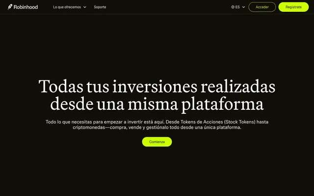
Preview image. Unlock full-res
Electric lime on a dark canvas. The design feels like a financial dashboard powered by neon-green data points against a dark, responsive background.
Color palette
Call-to-action buttons, active states, key interactive elements, brand highlights — a potent, high-energy accent against dark neutrals.
Page backgrounds, card surfaces, primary text on Rocket Lime background, button backgrounds for secondary actions.
Text color on Rocket Lime buttons, accents, footer background.
Primary text, informational text on Deep Space Black.
Subtle border colors, secondary text elements, minor outlines.
Typography
- Weights
- 400
- Sizes
- 13px, 16px, 31px, 72px, 80px
- Line height
- 1, 1.08, 1.2, 1.26
- Letter spacing
- -0.077, -0.019, -0.014, -0.008
- Fallback
- Inter
Versatile sans-serif for body text, navigation, buttons, and some larger display elements. Its varied letter-spacing creates a distinct visual rhythm, tightening at larger sizes for impact and loosening for readability in smaller text.
- Weights
- 400, 700
- Sizes
- 16px, 22px, 31px
- Line height
- 1.09, 1.26, 1.5
- Letter spacing
- -0.016, -0.011, -0.008
- Fallback
- Georgia
Secondary serif font for body and link text, providing a classic counterpoint to the sans-serif. Its heavier weights are used for more prominent text within content blocks, offering a subtle visual hierarchy.
- Weights
- 400
- Sizes
- 72px, 80px
- Line height
- 1, 1.08
- Letter spacing
- -0.014
- Fallback
- Playfair Display
Signature serif font for primary headlines and display text. Its elegant, slightly condensed forms are central to the brand's sophisticated feel, creating a sense of established authority amidst the modern aesthetic.
Spacing & shape
Components
Pill-shaped button with Rocket Lime (#ccff00) background, Void Black (#000000) text, 36px border-radius, and generous horizontal padding (32px left/right), vertical padding 0px. The leading action element.
Minimalist button with transparent background, Deep Space Black (#110e08) text, 36px border-radius, and 32px horizontal padding. Offers an alternative action of lesser prominence.
Ghost White (#ffffff) text using Phonic font, weight 400; no distinct background or padding, emphasizing its textual nature within content.
Ghost White (#ffffff) text using Capsule Sans Text font, weight 400. Appears in the top navigation bar and footer with no background or border, relying on placement and color for distinction.
Based on button radius, likely features 36px border-radius with a Deep Space Black (#110e08) background and Ghost White (#ffffff) text, or a Shadow Graphite (#35322d) border for definition.
Guidelines
- Prioritize Deep Space Black (#110e08) for backgrounds and Ghost White (#ffffff) for primary text to maintain high contrast.
- Use Rocket Lime (#ccff00) exclusively for primary CTA buttons and explicit accent elements, never for large blocks or generic text.
- Apply 36px border-radius to all interactive components like buttons and inputs for a consistent 'pill' shape.
- Utilize Martina Plantijn at 72px or 80px for all page-level headlines to establish a luxurious and authoritative tone.
- Ensure consistent spacing with the 8px base unit, particularly for element-to-element gaps.
- Leverage Capsule Sans Text for all body copy and most UI elements, adjusting letter-spacing as per its defined profiles for optimal visual rhythm.
- Do not introduce new vibrant colors outside of the Rocket Lime (#ccff00) accent.
- Avoid using hard-edged rectangles for interactive elements; all buttons and input fields must be pill-shaped with 36px radius.
- Do not use generic system fonts; stick strictly to Capsule Sans Text, Phonic, and Martina Plantijn.
- Do not dilute the impact of Rocket Lime by using it for non-interactive or purely decorative elements.
- Refrain from heavy drop shadows or excessive elevation; the aesthetic relies on flat, high-contrast layers and typography for hierarchy.
- Avoid using multiple line-heights or letter-spacings for the same font/size combination — adhere to the defined typographic profiles.
About this system
ShowHide
This system evokes a high-contrast, edgy digital experience, like a sleek command interface. Its stark visual identity is built on a limited palette of near-black, pure white, and a single, aggressive electric lime green. Typography plays a crucial role in establishing authority through custom typefaces, with a distinct serif for display headings creating a sense of luxury and importance, while a sans-serif maintains legibility for body text. Rounded pill-shaped buttons stand out against the predominantly angular design, providing clear interactive points.
The page primarily employs a max-width contained layout, though the initial hero section is full-bleed with a deep black background and centered headline. Sections alternate between dark backgrounds (Deep Space Black) and lighter, usually Rocket Lime (#ccff00), for distinct content blocks, creating a strong visual rhythm without explicit dividers. Content is generally arranged in a centered stack for the hero, transitioning into two-column layouts (text beside device mockups) or stacked blocks for feature explanations. The footer is full-bleed deep black, echoing the hero. The navigation is a fixed top bar on a deep black background, centered with interactive elements.
The visual language relies heavily on abstract graphics and product screenshots, with a notable absence of lifestyle photography. Product screenshots feature mobile interfaces in deep black, demonstrating app functionality clearly. Abstract graphics often use the brand's electric lime color to highlight key information or create dynamic backgrounds, particularly for the main hero section. Iconography is clean and minimal, appearing as monochrome outlines or fills, consistent with the overall UI. When imagery is present, it serves an explanatory or informational role rather than a decorative or aspirational one, contained within clear sections or device mockups, and never bleeding into the background.
Reminiscent of Revolut, Monzo, Linear, Cash App, Figma.
# Robinhood — Style Reference
> Electric lime on a dark canvas. The design feels like a financial dashboard powered by neon-green data points against a dark, responsive background.

**Theme:** dark

**Site:** https://robinhood.com

This system evokes a high-contrast, edgy digital experience, like a sleek command interface. Its stark visual identity is built on a limited palette of near-black, pure white, and a single, aggressive electric lime green. Typography plays a crucial role in establishing authority through custom typefaces, with a distinct serif for display headings creating a sense of luxury and importance, while a sans-serif maintains legibility for body text. Rounded pill-shaped buttons stand out against the predominantly angular design, providing clear interactive points.

## Tokens — Colors

| Name | Value | Token | Role |
|------|------|------|------|
| Rocket Lime | `#ccff00` | `--color-rocket-lime` | Call-to-action buttons, active states, key interactive elements, brand highlights — a potent, high-energy accent against dark neutrals. |
| Deep Space Black | `#110e08` | `--color-deep-space-black` | Page backgrounds, card surfaces, primary text on Rocket Lime background, button backgrounds for secondary actions. |
| Void Black | `#000000` | `--color-void-black` | Text color on Rocket Lime buttons, accents, footer background. |
| Ghost White | `#ffffff` | `--color-ghost-white` | Primary text, informational text on Deep Space Black. |
| Shadow Graphite | `#35322d` | `--color-shadow-graphite` | Subtle border colors, secondary text elements, minor outlines. |

## Tokens — Typography

### Capsule Sans Text
- **Substitute:** Inter
- **Weights:** 400
- **Sizes:** 13px, 16px, 31px, 72px, 80px
- **Line height:** 1, 1.08, 1.2, 1.26
- **Letter spacing:** -0.077, -0.019, -0.014, -0.008
- **Role:** Versatile sans-serif for body text, navigation, buttons, and some larger display elements. Its varied letter-spacing creates a distinct visual rhythm, tightening at larger sizes for impact and loosening for readability in smaller text.

### Phonic
- **Substitute:** Georgia
- **Weights:** 400, 700
- **Sizes:** 16px, 22px, 31px
- **Line height:** 1.09, 1.26, 1.5
- **Letter spacing:** -0.016, -0.011, -0.008
- **Role:** Secondary serif font for body and link text, providing a classic counterpoint to the sans-serif. Its heavier weights are used for more prominent text within content blocks, offering a subtle visual hierarchy.

### Martina Plantijn
- **Substitute:** Playfair Display
- **Weights:** 400
- **Sizes:** 72px, 80px
- **Line height:** 1, 1.08
- **Letter spacing:** -0.014
- **Role:** Signature serif font for primary headlines and display text. Its elegant, slightly condensed forms are central to the brand's sophisticated feel, creating a sense of established authority amidst the modern aesthetic.

## Tokens — Type Scale

Augmented Fourth (1.414) from 16px base.

| Role | Size | Line height | Letter spacing |
|------|------|------|------|
| caption | 13px | 1.26 | -0.077em |
| body | 16px | 1.5 | -0.008em |
| subheading | 22px | 1.09 | -0.011em |
| heading | 31px | 1.2 | -0.019em |
| display | 72px | 1.08 | -0.014em |
| display-lg | 80px | 1 | -0.014em |

## Tokens — Spacing

- **Card padding:** 24px
- **Element gap:** 8px

## Tokens — Radius

- **Buttons:** 36px
- **Inputs:** 36px

## Layout

The page primarily employs a max-width contained layout, though the initial hero section is full-bleed with a deep black background and centered headline. Sections alternate between dark backgrounds (Deep Space Black) and lighter, usually Rocket Lime (#ccff00), for distinct content blocks, creating a strong visual rhythm without explicit dividers. Content is generally arranged in a centered stack for the hero, transitioning into two-column layouts (text beside device mockups) or stacked blocks for feature explanations. The footer is full-bleed deep black, echoing the hero. The navigation is a fixed top bar on a deep black background, centered with interactive elements.

## Imagery

The visual language relies heavily on abstract graphics and product screenshots, with a notable absence of lifestyle photography. Product screenshots feature mobile interfaces in deep black, demonstrating app functionality clearly. Abstract graphics often use the brand's electric lime color to highlight key information or create dynamic backgrounds, particularly for the main hero section. Iconography is clean and minimal, appearing as monochrome outlines or fills, consistent with the overall UI. When imagery is present, it serves an explanatory or informational role rather than a decorative or aspirational one, contained within clear sections or device mockups, and never bleeding into the background.

## Components

### CTA Button Group

### Stock Token Feature Card

### Asset Search & Tab Bar

### Primary Call-to-Action Button
*Action*

Pill-shaped button with Rocket Lime (#ccff00) background, Void Black (#000000) text, 36px border-radius, and generous horizontal padding (32px left/right), vertical padding 0px. The leading action element.

### Secondary Ghost Button
*Action*

Minimalist button with transparent background, Deep Space Black (#110e08) text, 36px border-radius, and 32px horizontal padding. Offers an alternative action of lesser prominence.

### Inline Text Link
*Navigation/Action*

Ghost White (#ffffff) text using Phonic font, weight 400; no distinct background or padding, emphasizing its textual nature within content.

### Navigation Link
*Navigation*

Ghost White (#ffffff) text using Capsule Sans Text font, weight 400. Appears in the top navigation bar and footer with no background or border, relying on placement and color for distinction.

### Input Field (example)
*Data Entry*

Based on button radius, likely features 36px border-radius with a Deep Space Black (#110e08) background and Ghost White (#ffffff) text, or a Shadow Graphite (#35322d) border for definition.

## Guidelines

### Do

- Prioritize Deep Space Black (#110e08) for backgrounds and Ghost White (#ffffff) for primary text to maintain high contrast.
- Use Rocket Lime (#ccff00) exclusively for primary CTA buttons and explicit accent elements, never for large blocks or generic text.
- Apply 36px border-radius to all interactive components like buttons and inputs for a consistent 'pill' shape.
- Utilize Martina Plantijn at 72px or 80px for all page-level headlines to establish a luxurious and authoritative tone.
- Ensure consistent spacing with the 8px base unit, particularly for element-to-element gaps.
- Leverage Capsule Sans Text for all body copy and most UI elements, adjusting letter-spacing as per its defined profiles for optimal visual rhythm.

### Don't

- Do not introduce new vibrant colors outside of the Rocket Lime (#ccff00) accent.
- Avoid using hard-edged rectangles for interactive elements; all buttons and input fields must be pill-shaped with 36px radius.
- Do not use generic system fonts; stick strictly to Capsule Sans Text, Phonic, and Martina Plantijn.
- Do not dilute the impact of Rocket Lime by using it for non-interactive or purely decorative elements.
- Refrain from heavy drop shadows or excessive elevation; the aesthetic relies on flat, high-contrast layers and typography for hierarchy.
- Avoid using multiple line-heights or letter-spacings for the same font/size combination — adhere to the defined typographic profiles.

## Agent Prompt Guide

### Quick Color Reference
- Text (primary): #ffffff (Ghost White)
- Background (primary): #110e08 (Deep Space Black)
- CTA Button: #ccff00 (Rocket Lime)
- Text on CTA: #000000 (Void Black)
- Border/Subtle elements: #35322d (Shadow Graphite)

### 3-5 Example Component Prompts
1. Create a hero section with a Deep Space Black (#110e08) background. Headline: 'Todas tus inversiones realizadas desde una misma plataforma' using Martina Plantijn, 80px, weight 400, #ffffff, letter-spacing -0.0140em, centered. Subtext: 'Todo lo que necesitas para empezar a invertir está aquí.' using Capsule Sans Text, 16px, weight 400, #ffffff, letter-spacing -0.0080em, centered. Below the subtext, create a Primary Call-to-Action Button: 'Comienza' with Rocket Lime (#ccff00) background, Void Black (#000000) text (Capsule Sans Text, 16px, 400), 36px border-radius, 32px horizontal padding.

2. Design a feature card on a Rocket Lime (#ccff00) background. Headline: 'Invierte' using Capsule Sans Text, 31px, weight 400, #000000, letter-spacing -0.0190em. Body text: 'Empieza con Tokens de Acciones' using Phonic, 22px, weight 400, #000000, letter-spacing -0.0110em. Include a Secondary Ghost Button: 'Más información' with transparent background, Deep Space Black (#110e08) text (Capsule Sans Text, 16px, 400), 36px border-radius, 32px horizontal padding.

3. Generate a navigation bar. Background #110e08. Left-aligned brand logo (placeholder text 'Robinhood' in #ffffff). Right-aligned links: 'Lo que ofrecemos', 'Soporte', 'Acceder' (text in #ffffff, Capsule Sans Text, 16px, 400 without special padding/borders). Add a 'Regístrate' Primary Call-to-Action Button with Rocket Lime (#ccff00) background, Void Black (#000000) text (Capsule Sans Text, 16px, 400), 36px border-radius, 32px horizontal padding.

4. Create a mobile app screen mockup showing a 'Search' input field: Deep Space Black (#110e08) background, rounded with 36px border-radius, with a placeholder like 'Buscar por nombre o símbolo' in Shadow Graphite (#35322d).
More like this









Keep what you find
A free account saves references to boards and can send you a weekly email of picks based on what you save.
To see every result, go Pro.