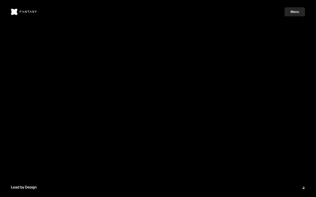
Preview image. Unlock full-res
Black Box Theater — a minimal stage where ideas are spotlighted.
Color palette
Page backgrounds, section dividers, general UI containers — grounds the entire experience in a deep, void-like aesthetic.
Primary text, interactive elements, menu items, borders — contrasts sharply with the black, ensuring maximum readability and a premium feel.
Typography
- Weights
- 400, 500
- Sizes
- 13px, 15px, 17px, 42px, 67px, 117px
- Line height
- 1, 1.1, 1.4
- Letter spacing
- -0.0300em at 117px, -0.0200em at 67px, -0.0130em at 42px, -0.0110em at 17px, -0.0100em at 15px
- Fallback
- Inter
The sole typeface, maintaining a cohesive, sophisticated voice. Weights 400 and 500 are primarily used, creating a subtle hierarchy through size rather than heavy weight. Distinctly tight letter-spacing on larger sizes sharpens headlines and gives them an architectural precision.
Spacing & shape
Components
A ghost button with Polar White text on Absolute Black background. Features a 8.33333px border-radius, no padding, and a white border. Text set in sans-serif, size 17px, weight 400, letter spacing -0.0110em.
Ghost button style with no background, Polar White text and border. Text is sans-serif, size 17px, weight 400, letter spacing -0.0110em. Has no explicit padding, indicating it relies on content for sizing.
Ghost button with no background and Polar White text. Text is sans-serif, size 17px, weight 400, letter spacing -0.0110em. Padding of 0px top/bottom and 26.6667px left/right with 8.33333px border-radius provides a subtle interactive area.
Ghost button with no background and Absolute Black text. Text is sans-serif, size 17px, weight 400, letter spacing -0.0110em. Padding of 0px top/bottom and 26.6667px left/right with 8.33333px border-radius. Currently not visible in provided context, but indicates a potential for inversion.
Text is Polar White, sans-serif, weight 500, size 42px. Line height 1.10. Letter spacing -0.0130em. Displayed on an Absolute Black background with no explicit padding, leveraging implied structural padding.
Text is Polar White, sans-serif, weight 400, size 15px. Line height 1.40. Letter spacing -0.0100em. Uses a more relaxed line height than headlines for readability in blocks of text.
Guidelines
- Prioritize Polar White (#ffffff) text on Absolute Black (#000000) backgrounds for all content sections.
- Use sans-serif font for all typography, strictly adhering to weights 400 and 500.
- Apply specific letter-spacing: -0.0300em for 117px text, -0.0200em for 67px, -0.0130em for 42px, -0.0110em for 17px, and -0.0100em for 15px and 13px.
- Maintain generous vertical spacing between sections, using values within the 80px-138px range.
- Apply a consistent border-radius of 8.33333px to all interactive elements like buttons.
- Avoid introducing any colors other than Polar White (#ffffff) or Absolute Black (#000000) for UI elements.
- Do not use font weights outside of 400 and 500.
- Never add box shadows or strong elevation effects; the design relies on flat contrast.
- Do not vary border-radius from 8.33333px for buttons; consistency is key.
- Avoid using highly saturated images or illustrations; opt for high-contrast, often monochrome, photographic or typographic content.
About this system
ShowHide
This design system evokes a sense of stark luxury, like a gallery space for digital art. The absolute black background intensifies the impact of the crisp white typography, creating a high-contrast, text-dominant presentation. Information is delivered with quiet confidence, relying on precise typographic control and generous negative space to command attention, rather than flashy visuals or complex layouts. The singular focus on black and white, paired with meticulous letter-spacing, projects an image of refined authority and intellectual rigor.
The page adheres to a full-bleed layout with no explicit `pageMaxWidth`, allowing the Absolute Black background to fill the entire viewport. The hero section is full-screen, featuring centered text over the black background, creating an immersive, dramatic introduction. Sections are characterized by consistent, generous vertical spacing (80px-138px `sectionGap`), fostering a spacious, unhurried reading experience. Content arrangement is primarily centered text blocks or simple two-column layouts where text and implicit content elements are balanced. The overall density is low, prioritizing impactful statements and clear typography over information packing. Navigation consists of a minimal top-right 'Menu' button and a logo on the left, maintaining a clean, uncluttered header.
The site's visual language is characterized by an absence of traditional imagery in the main content areas, creating an impactful, text-dominant experience. When visuals appear, as hinted by the brand's logo and what might be product screenshots or abstract graphics in other sections not shown, they exist as stark, high-contrast elements. There's an implied focus on sharp, precise digital artifacts or symbolic representations that integrate seamlessly with the monochrome UI, emphasizing clean lines and sophisticated simplicity, rather than decorative or distracting visual noise. Icons are simple, outlined forms, such as the X and menu icon, reinforcing the minimal aesthetic.
Reminiscent of Apple, B&O (Bang & Olufsen), Acme Co (fictional – typical gallery site), Dribbble (dark mode).
# Fantasy — Style Reference
> Black Box Theater — a minimal stage where ideas are spotlighted.

**Theme:** dark

**Site:** https://fantasy.co

This design system evokes a sense of stark luxury, like a gallery space for digital art. The absolute black background intensifies the impact of the crisp white typography, creating a high-contrast, text-dominant presentation. Information is delivered with quiet confidence, relying on precise typographic control and generous negative space to command attention, rather than flashy visuals or complex layouts. The singular focus on black and white, paired with meticulous letter-spacing, projects an image of refined authority and intellectual rigor.

## Tokens — Colors

| Name | Value | Token | Role |
|------|------|------|------|
| Absolute Black | `#000000` | `--color-absolute-black` | Page backgrounds, section dividers, general UI containers — grounds the entire experience in a deep, void-like aesthetic. |
| Polar White | `#ffffff` | `--color-polar-white` | Primary text, interactive elements, menu items, borders — contrasts sharply with the black, ensuring maximum readability and a premium feel. |

## Tokens — Typography

### sans
- **Substitute:** Inter
- **Weights:** 400, 500
- **Sizes:** 13px, 15px, 17px, 42px, 67px, 117px
- **Line height:** 1, 1.1, 1.4
- **Letter spacing:** -0.0300em at 117px, -0.0200em at 67px, -0.0130em at 42px, -0.0110em at 17px, -0.0100em at 15px
- **Role:** The sole typeface, maintaining a cohesive, sophisticated voice. Weights 400 and 500 are primarily used, creating a subtle hierarchy through size rather than heavy weight. Distinctly tight letter-spacing on larger sizes sharpens headlines and gives them an architectural precision.

## Tokens — Type Scale

| Role | Size | Line height | Letter spacing |
|------|------|------|------|
| caption | 13px | 1.4 | -0.13px |
| body-sm | 15px | 1.4 | -0.15px |
| body | 17px | 1.4 | -0.187px |
| heading | 42px | 1.1 | -0.546px |
| heading-lg | 67px | 1.1 | -1.34px |
| display | 117px | 1 | -3.51px |

## Tokens — Spacing

- **Card padding:** 0px

## Tokens — Radius

- **Buttons:** 8.33333px

## Layout

The page adheres to a full-bleed layout with no explicit `pageMaxWidth`, allowing the Absolute Black background to fill the entire viewport. The hero section is full-screen, featuring centered text over the black background, creating an immersive, dramatic introduction. Sections are characterized by consistent, generous vertical spacing (80px-138px `sectionGap`), fostering a spacious, unhurried reading experience. Content arrangement is primarily centered text blocks or simple two-column layouts where text and implicit content elements are balanced. The overall density is low, prioritizing impactful statements and clear typography over information packing. Navigation consists of a minimal top-right 'Menu' button and a logo on the left, maintaining a clean, uncluttered header.

## Imagery

The site's visual language is characterized by an absence of traditional imagery in the main content areas, creating an impactful, text-dominant experience. When visuals appear, as hinted by the brand's logo and what might be product screenshots or abstract graphics in other sections not shown, they exist as stark, high-contrast elements. There's an implied focus on sharp, precise digital artifacts or symbolic representations that integrate seamlessly with the monochrome UI, emphasizing clean lines and sophisticated simplicity, rather than decorative or distracting visual noise. Icons are simple, outlined forms, such as the X and menu icon, reinforcing the minimal aesthetic.

## Components

### Hero Text Block

### Menu Button + Scroll Indicator

### Stat / Info Cards Row

### Navigation Button - Menu
*Primary navigation trigger*

A ghost button with Polar White text on Absolute Black background. Features a 8.33333px border-radius, no padding, and a white border. Text set in sans-serif, size 17px, weight 400, letter spacing -0.0110em.

### Navigation Link - Implicit
*Top-level navigation*

Ghost button style with no background, Polar White text and border. Text is sans-serif, size 17px, weight 400, letter spacing -0.0110em. Has no explicit padding, indicating it relies on content for sizing.

### Action Button - Explore
*Feature call to action with minimal styling*

Ghost button with no background and Polar White text. Text is sans-serif, size 17px, weight 400, letter spacing -0.0110em. Padding of 0px top/bottom and 26.6667px left/right with 8.33333px border-radius provides a subtle interactive area.

### Action Button - Contact (Black Text)
*Alternative action button for light backgrounds if theme were to shift*

Ghost button with no background and Absolute Black text. Text is sans-serif, size 17px, weight 400, letter spacing -0.0110em. Padding of 0px top/bottom and 26.6667px left/right with 8.33333px border-radius. Currently not visible in provided context, but indicates a potential for inversion.

### Hero Text Block - Dark
*Primary headline presentation*

Text is Polar White, sans-serif, weight 500, size 42px. Line height 1.10. Letter spacing -0.0130em. Displayed on an Absolute Black background with no explicit padding, leveraging implied structural padding.

### Footer Copyright Text
*Legal and informational text*

Text is Polar White, sans-serif, weight 400, size 15px. Line height 1.40. Letter spacing -0.0100em. Uses a more relaxed line height than headlines for readability in blocks of text.

## Guidelines

### Do

- Prioritize Polar White (#ffffff) text on Absolute Black (#000000) backgrounds for all content sections.
- Use sans-serif font for all typography, strictly adhering to weights 400 and 500.
- Apply specific letter-spacing: -0.0300em for 117px text, -0.0200em for 67px, -0.0130em for 42px, -0.0110em for 17px, and -0.0100em for 15px and 13px.
- Maintain generous vertical spacing between sections, using values within the 80px-138px range.
- Apply a consistent border-radius of 8.33333px to all interactive elements like buttons.

### Don't

- Avoid introducing any colors other than Polar White (#ffffff) or Absolute Black (#000000) for UI elements.
- Do not use font weights outside of 400 and 500.
- Never add box shadows or strong elevation effects; the design relies on flat contrast.
- Do not vary border-radius from 8.33333px for buttons; consistency is key.
- Avoid using highly saturated images or illustrations; opt for high-contrast, often monochrome, photographic or typographic content.

## Agent Prompt Guide

### Quick Color Reference
- Text: #ffffff (Polar White)
- Background: #000000 (Absolute Black)
- CTA Background: #000000 (Absolute Black)
- CTA Text: #ffffff (Polar White)
- Border: #ffffff (Polar White)

### 3-5 Example Component Prompts
1. Create a Hero Section: Absolute Black background. Headline 'We are Fantasy.' in Polar White, sans-serif, size 42px, weight 500, line-height 1.10, letter-spacing -0.0130em. Sub-headline 'The creative partner behind the world's biggest digital products.' in Polar White, sans-serif, size 42px, weight 500, line-height 1.10, letter-spacing -0.0130em. Both headlines centered vertically and horizontally within the viewport.
2. Generate a Navigation Button: Label 'Menu' in Polar White, sans-serif, size 17px, weight 400, letter-spacing -0.0110em. Background transparent, border 1px Polar White, border-radius 8.33333px. Padding 0px top/bottom, 26.6667px left/right. Position this to the top right of a header.
3. Create a Footer Link: Text 'Privacy & Terms' in Polar White, sans-serif, size 15px, weight 400, line-height 1.40, letter-spacing -0.0100em. Display on an Absolute Black background. Underline on hover only.
4. Design a Section Headline: 'Launching the next generation of Intelligent Experiences.' in Polar White, sans-serif, size 67px, weight 500, line-height 1.10, letter-spacing -0.0200em. Position with 80px top padding from the previous section.
More like this








Keep what you find
A free account saves references to boards and can send you a weekly email of picks based on what you save.
To see every result, go Pro.