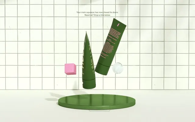
Preview image. Unlock full-res
grid on soft sage
Color palette
Primary action backgrounds, button borders, decorative accents, important text. This muted green establishes the brand's natural and grounded identity
Page backgrounds, input backgrounds, primary text on dark elements
Primary body text, general UI elements
Placeholder text in inputs, secondary text
Typography
- Weights
- 300, 500
- Sizes
- 13px, 15px, 16px
- Line height
- 1.25, 1.33, 1.54
- Letter spacing
- 0.0100em at 15px, 0.0120em at 13px
- Fallback
- system-ui
The primary typeface for all text. The subtle letter-spacing and varied line heights contribute to comfortable reading and a slightly formal, yet approachable, tone.
Spacing & shape
Components
Transparent background with an 8px border radius and a 1px `Dusty Sage` border. Text color is `Dusty Sage`. Padding is 10px all around.
Filled with `Dusty Sage` background and an 8px border radius. Text color is `Canvas White`. Padding is 10px all around.
Transparent background, `Muted Text` color for placeholders, and a 1px border-bottom in `Canvas White`. Padding at the bottom is 15px. Has a 1px radius.
Guidelines
- Use `Canvas White` (#ffffff) for all main page backgrounds and component surfaces unless a `Dusty Sage` filled button.
- Prioritize `Dusty Sage` (#526e3e) for primary calls to action, ensuring it is the main brand accent.
- Apply the Suisse font family for all text elements, utilizing appropriate weights (300, 500) and sizes (13px, 15px, 16px) for hierarchy.
- Maintain a comfortable rhythm between sections using an `80px` section gap.
- Ensure all buttons have an `8px` border radius, creating a consistent soft corner styling.
- Employ `1px` border radius for inputs to maintain a subtle, almost-sharp form that contrasts with the buttons.
- Use `Graphite Text` (#636363) for primary body copy across the site to ensure readability against light backgrounds.
- Do not introduce new saturated colors; adhere strictly to the established `Dusty Sage` for brand accents.
- Avoid heavy shadows or gradients; the design thrives on flat surfaces and subtle distinctions.
- Do not deviate from the specified spacing values of `10px` for button padding and `15px` for input padding.
- Do not use letter spacing greater than 0.0120em or less than 0.0100em; these values are precisely set.
- Do not use black for text; `Graphite Text` (#636363) and `Muted Text` (#6e6e6e) are the darkest sanctioned text colors.
- Avoid complex component borders; stick to the `1px solid` border pattern where needed, especially in inputs.
About this system
ShowHide
Rocc Naturals presents a minimal, product-focused aesthetic, blending soft neutrals with a signature muted green. Textures are subtle, with a visual grid framework providing structure against clean surfaces. The design feels grounded and approachable, relying on direct communication and sparse visual elements rather than elaborate decoration.
The page uses a contained, centered layout, with content primarily arranged in vertical stacks. The hero section features a centered headline over a distinctive grid background, drawing attention to a central product display. Vertical rhythm is established through consistent section gaps, creating deliberate breathing room. There are no obvious alternating light/dark bands, rather a consistent light background. The overall arrangement emphasizes clarity and directness through a simple, organized presentation.
Imagery is minimal and primarily conceptual, featuring 3D rendered product packaging (like tubes) and abstract geometric shapes (cubes, spheres). Product elements are treated realistically with subtle textures and lighting, while abstract shapes are often monochromatic with clean edges. The primary role of imagery is decorative and atmospheric, creating a controlled, almost studio-like environment rather than showcasing in-use contexts or lifestyle. Icons are not visible. The density of imagery is low, with visuals serving as artistic accents around key text content.
Reminiscent of Glossier, Aesop, Byredo, Seedlip.
# Rocc Naturals — Style Reference
> grid on soft sage

**Theme:** light

**Site:** https://roccnaturals.com.au

Rocc Naturals presents a minimal, product-focused aesthetic, blending soft neutrals with a signature muted green. Textures are subtle, with a visual grid framework providing structure against clean surfaces. The design feels grounded and approachable, relying on direct communication and sparse visual elements rather than elaborate decoration.

## Tokens — Colors

| Name | Value | Token | Role |
|------|------|------|------|
| Dusty Sage | `#526e3e` | `--color-dusty-sage` | Primary action backgrounds, button borders, decorative accents, important text. This muted green establishes the brand's natural and grounded identity |
| Canvas White | `#ffffff` | `--color-canvas-white` | Page backgrounds, input backgrounds, primary text on dark elements |
| Graphite Text | `#636363` | `--color-graphite-text` | Primary body text, general UI elements |
| Muted Text | `#6e6e6e` | `--color-muted-text` | Placeholder text in inputs, secondary text |

## Tokens — Typography

### Suisse
- **Substitute:** system-ui
- **Weights:** 300, 500
- **Sizes:** 13px, 15px, 16px
- **Line height:** 1.25, 1.33, 1.54
- **Letter spacing:** 0.0100em at 15px, 0.0120em at 13px
- **Role:** The primary typeface for all text. The subtle letter-spacing and varied line heights contribute to comfortable reading and a slightly formal, yet approachable, tone.

## Tokens — Type Scale

Major Second (1.125) from 16px base.

| Role | Size | Line height | Letter spacing |
|------|------|------|------|
| caption | 13px | 1.33 | — |
| body-sm | 15px | 1.33 | — |
| body | 16px | 1.33 | — |

## Tokens — Spacing

- **Section gap:** 80px
- **Card padding:** 15px
- **Element gap:** 18px

## Tokens — Radius

- **Buttons:** 8px
- **Inputs:** 1px

## Layout

The page uses a contained, centered layout, with content primarily arranged in vertical stacks. The hero section features a centered headline over a distinctive grid background, drawing attention to a central product display. Vertical rhythm is established through consistent section gaps, creating deliberate breathing room. There are no obvious alternating light/dark bands, rather a consistent light background. The overall arrangement emphasizes clarity and directness through a simple, organized presentation.

## Imagery

Imagery is minimal and primarily conceptual, featuring 3D rendered product packaging (like tubes) and abstract geometric shapes (cubes, spheres). Product elements are treated realistically with subtle textures and lighting, while abstract shapes are often monochromatic with clean edges. The primary role of imagery is decorative and atmospheric, creating a controlled, almost studio-like environment rather than showcasing in-use contexts or lifestyle. Icons are not visible. The density of imagery is low, with visuals serving as artistic accents around key text content.

## Components

### Ghost Button
*Secondary action. Low visual priority.*

Transparent background with an 8px border radius and a 1px `Dusty Sage` border. Text color is `Dusty Sage`. Padding is 10px all around.

### Solid Button
*Primary action. High visual priority.*

Filled with `Dusty Sage` background and an 8px border radius. Text color is `Canvas White`. Padding is 10px all around.

### Text Input
*User input fields.*

Transparent background, `Muted Text` color for placeholders, and a 1px border-bottom in `Canvas White`. Padding at the bottom is 15px. Has a 1px radius.

## Guidelines

### Do

- Use `Canvas White` (#ffffff) for all main page backgrounds and component surfaces unless a `Dusty Sage` filled button.
- Prioritize `Dusty Sage` (#526e3e) for primary calls to action, ensuring it is the main brand accent.
- Apply the Suisse font family for all text elements, utilizing appropriate weights (300, 500) and sizes (13px, 15px, 16px) for hierarchy.
- Maintain a comfortable rhythm between sections using an `80px` section gap.
- Ensure all buttons have an `8px` border radius, creating a consistent soft corner styling.
- Employ `1px` border radius for inputs to maintain a subtle, almost-sharp form that contrasts with the buttons.
- Use `Graphite Text` (#636363) for primary body copy across the site to ensure readability against light backgrounds.

### Don't

- Do not introduce new saturated colors; adhere strictly to the established `Dusty Sage` for brand accents.
- Avoid heavy shadows or gradients; the design thrives on flat surfaces and subtle distinctions.
- Do not deviate from the specified spacing values of `10px` for button padding and `15px` for input padding.
- Do not use letter spacing greater than 0.0120em or less than 0.0100em; these values are precisely set.
- Do not use black for text; `Graphite Text` (#636363) and `Muted Text` (#6e6e6e) are the darkest sanctioned text colors.
- Avoid complex component borders; stick to the `1px solid` border pattern where needed, especially in inputs.

## Agent Prompt Guide

Quick Color Reference:
text: #636363
background: #ffffff
border: #526e3e (for buttons), #ffffff (for inputs)
accent: #526e3e
primary action: #526e3e (filled action)

Example Component Prompts:
Create a solid button: `Dusty Sage` background (#526e3e), `Canvas White` text (#ffffff), 8px border radius, 10px padding.
Create a ghost button: Transparent background, `Dusty Sage` border (#526e3e) of 1px, `Dusty Sage` text (#526e3e), 8px border radius, 10px padding.
Create a text input field: Transparent background, `Muted Text` placeholder (#6e6e6e), 1px bottom border in `Canvas White` (#ffffff), 15px padding-bottom, 1px radius.
More like this









Keep what you find
A free account saves references to boards and can send you a weekly email of picks based on what you save.
To see every result, go Pro.