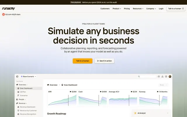
Preview image. Unlock full-res
Warm, analytical canvas.
Color palette
Call-to-action button backgrounds. This vivid amber is the primary interactive accent, drawing attention to critical user actions
Yellow accent for outlined action borders, linked labels, and lightweight interactive emphasis. Do not promote it to the primary CTA color
Orange outline accent for tags, dividers, and focused UI edges. Use as a supporting accent, not as a status color
Violet state accent for badges, validation surfaces, and short status labels.
Background for secondary accent badges, offering another moderate, warmer alternative to the Grape Badge
Primary text, borders, decorative icons, card outlines, subtle accents within components. It provides strong contrast against light backgrounds for readability and definition
Secondary text, muted borders, subtle UI elements where less emphasis than Ink is desired. Adds depth to the neutral palette
Page background, light card surfaces, badge backgrounds. The dominant background color establishing the overall light theme
Elevated card backgrounds, button backgrounds. Used for critical surfaces that need to stand out slightly from the main page background
Hairline borders, subtle dividers, background color for less prominent UI sections. Provides a visual break between content without strong contrast
Used for shadow tints, rather than a solid color to create depth
Typography
- Weights
- 400, 492, 584
- Sizes
- 12px, 14px, 16px, 20px, 24px, 36px, 56px, 65px, 72px
- Line height
- 1, 1.13, 1.25
- Letter spacing
- 0.6, -0.14, -0.16, -0.2, -0.29, -0.61, -1.06, -1.3, -1.58
- Fallback
- Inter
The primary typeface for all text content including headings, body, and UI elements. Its variable font properties allow for precise control of weight for subtle hierarchy and information density.
Spacing & shape
Elevation
Components
Background: Amber Action (#f9a600), Text: Ink (#261b07), Border-radius: 8px, Horizontal padding: 17.5px, Vertical padding: 7px. The contrasting dark text on amber ensures high visibility.
Background: transparent (rgba(0,0,0,0)), Text: Ink (#261b07), Border: Ink (#261b07), Border-radius: 8px, Horizontal padding: 12.25px, Vertical padding: 7px. Offers an alternative action that carries less visual weight than the filled primary button.
Background: transparent (rgba(0,0,0,0)), Text: Ink (#261b07), Border: Ink (#261b07) - only on specific interactive states, Border-radius: 8px, Padding: variable, for example, 32px vertical. Minimal styling for navigation.
Background: Pearl (#ffffff), Border-radius: 12px, Box-shadow: rgba(38,27,7,0.06) 0px 4px 8px 0px. Internal padding: 63px (all sides).
Background: Pearl (#ffffff), Border-radius: 8px, Multi-layered Box-shadow: inset rgba(255,255,255,0.56) 0px 2px 4px 0px, rgba(38,27,7,0.06) 0px 4px 8px 0px, rgba(38,27,7,0.36) 0px 1px 2px 0px. Internal padding: 4px. The inset shadow creates a subtle inner glow.
Background: transparent (rgba(0,0,0,0)), Border-radius: 8px, No shadow. Internal padding: 0px. Defines regions through proximity and content rather than explicit bounding boxes.
Background: Off-White (#f8f7f5), Text: Ink (#261b07), Border-radius: 6px, Padding: 3px vertical, 6px horizontal.
Background: Grape Badge (#d5befa), Text: Ink (#261b07), Border-radius: 6px, Padding: 3.8px vertical, 6px horizontal. Visually distinct due to its color.
Guidelines
- Use Off-White (#f8f7f5) as the primary background for all page sections to maintain a bright, expansive canvas.
- Apply Ink (#261b07) for all primary text and critical UI borders to ensure high contrast and readability.
- Reserve Amber Action (#f9a600) strictly for filled primary calls-to-action, ensuring it is the sole vibrant interactive accent.
- Employ the Interphases Pro Variable font consistently across all text elements, leveraging its weights for hierarchy rather than introducing new typefaces.
- Maintain a compact density, utilizing 4px element gaps for most inline spacing and 56px for clear section breaks.
- Apply 12px border-radius for all major card components and 8px for buttons and interactive controls, balancing softness with precision.
- Utilize the defined box-shadows for cards to add subtle depth, avoiding overuse of strong, opaque shadows.
- Do not introduce new saturated colors for interactive elements; rely on Amber Action (#f9a600) or its outlined variant.
- Avoid using gradients on cards or buttons unless explicitly defined as part of the system; surfaces should remain mostly flat.
- Do not use dark backgrounds for page sections; the system is built around a light theme, with Pearl (#ffffff) and Off-White (#f8f7f5) surfaces.
- Refrain from altering the Interphases Pro Variable font's letter-spacing beyond the defined scale, as tracking is critical for its visual balance.
- Do not add additional border-radius values; stick to 12px for cards, 8px for buttons and interactive elements, and 6px for badges.
- Avoid excessive use of deep shadows or multiple shadow layers outside of the defined card and button styles; maintain a lightweight visual feel.
- Do not use bold or heavy weights for body text; reserve stronger weights for headings and key emphasis to preserve clarity in a compact layout.
About this system
ShowHide
Runway presents a sophisticated, high-contrast light interface built on a minimal palette of warm greys and off-whites, punctuated by a single vibrant amber for key calls to action. The aesthetic blends the precise utility of a spreadsheet with the approachable feel of a modern web application. Surfaces are predominantly flat, with subtle shadows on interactive elements, conveying lightweight utility. Typography is compact and precise, using a variable sans-serif font across a wide range of weights and sizes to establish clear hierarchy.
The page adheres to a maximal width of 1216px, centrally aligned. The hero section features a prominent, centered headline and subtext, with action buttons beneath, set against a subtle, textured background. Section rhythm is primarily consistent vertical spacing with some alternating background (Off-White, Faded Stone, or Pearl) bands defining content blocks. Content arrangement frequently uses a centered stack for narrative sections, and occasionally two-column layouts featuring text on one side and product screenshots or abstract graphics on the other. Card grids are utilized for presenting features or testimonials, typically in a 3-column format. Navigation is a compact top bar, with prominent branding on the left and utility links/buttons on the right, maintaining a sticky presence on scroll.
The site uses a combination of product screenshots, abstract graphics, and a single stylized diagram. Product screenshots are typically tightly cropped, showcasing the UI of the Runway application directly within card-like containers, implying the tool itself is the focus. Abstract graphics or simple diagrams feature minimalist, geometric shapes in muted tones, often with a hint of the brand's Ink or Stone colors, serving as decorative atmosphere rather than conveying specific information. Icons are primarily outlined or subtle fills, aligning with the lightweight UI. Imagery density is moderate, carefully balancing explanatory visuals with text, avoiding large, immersive hero images except for subtle background textures.
Reminiscent of Linear, Ramp, Attio, Coda.
# Runway — Style Reference
> Warm, analytical canvas.

**Theme:** light

**Site:** https://runway.com

Runway presents a sophisticated, high-contrast light interface built on a minimal palette of warm greys and off-whites, punctuated by a single vibrant amber for key calls to action. The aesthetic blends the precise utility of a spreadsheet with the approachable feel of a modern web application. Surfaces are predominantly flat, with subtle shadows on interactive elements, conveying lightweight utility. Typography is compact and precise, using a variable sans-serif font across a wide range of weights and sizes to establish clear hierarchy.

## Tokens — Colors

| Name | Value | Token | Role |
|------|------|------|------|
| Amber Action | `#f9a600` | `--color-amber-action` | Call-to-action button backgrounds. This vivid amber is the primary interactive accent, drawing attention to critical user actions |
| Sunset Orange | `#e89b01` | `--color-sunset-orange` | Yellow accent for outlined action borders, linked labels, and lightweight interactive emphasis. Do not promote it to the primary CTA color |
| Warning Red | `#f0624f` | `--color-warning-red` | Orange outline accent for tags, dividers, and focused UI edges. Use as a supporting accent, not as a status color |
| Grape Badge | `#d5befa` | `--color-grape-badge` | Violet state accent for badges, validation surfaces, and short status labels. |
| Sunshine Badge | `#f8da9d` | `--color-sunshine-badge` | Background for secondary accent badges, offering another moderate, warmer alternative to the Grape Badge |
| Ink | `#261b07` | `--color-ink` | Primary text, borders, decorative icons, card outlines, subtle accents within components. It provides strong contrast against light backgrounds for readability and definition |
| Stone | `#61594a` | `--color-stone` | Secondary text, muted borders, subtle UI elements where less emphasis than Ink is desired. Adds depth to the neutral palette |
| Off-White | `#f8f7f5` | `--color-off-white` | Page background, light card surfaces, badge backgrounds. The dominant background color establishing the overall light theme |
| Pearl | `#ffffff` | `--color-pearl` | Elevated card backgrounds, button backgrounds. Used for critical surfaces that need to stand out slightly from the main page background |
| Faded Stone | `#e3dfd5` | `--color-faded-stone` | Hairline borders, subtle dividers, background color for less prominent UI sections. Provides a visual break between content without strong contrast |
| Shadow Tint | `#aca89f` | `--color-shadow-tint` | Used for shadow tints, rather than a solid color to create depth |

## Tokens — Typography

### Interphases Pro Variable
- **Substitute:** Inter
- **Weights:** 400, 492, 584
- **Sizes:** 12px, 14px, 16px, 20px, 24px, 36px, 56px, 65px, 72px
- **Line height:** 1, 1.13, 1.25
- **Letter spacing:** 0.6, -0.14, -0.16, -0.2, -0.29, -0.61, -1.06, -1.3, -1.58
- **Role:** The primary typeface for all text content including headings, body, and UI elements. Its variable font properties allow for precise control of weight for subtle hierarchy and information density.

## Tokens — Type Scale

| Role | Size | Line height | Letter spacing |
|------|------|------|------|
| caption | 12px | 1.13 | 0.6px |
| body-sm | 14px | 1.25 | -0.14px |
| body | 16px | 1.25 | -0.16px |
| subheading | 20px | 1.25 | -0.2px |
| heading-sm | 24px | 1.25 | -0.29px |
| heading | 36px | 1.25 | -0.61px |
| heading-lg | 56px | 1.13 | -1.06px |
| display | 72px | 1 | -1.58px |

## Tokens — Spacing

- **Max width:** 1216px
- **Section gap:** 56px
- **Card padding:** 32px
- **Element gap:** 4px

## Tokens — Radius

- **Buttons:** 8px
- **Cards:** 12px
- **badges:** 6px
- **formFields:** 4px
- **interactiveElements:** 8px

## Tokens — Elevation

- **Standard Card:** `rgba(38,27,7,0.06) 0px 4px 8px 0px`
- **Elevated Card/Button:** `inset rgba(255,255,255,0.56) 0px 2px 4px 0px, rgba(38,27,7,0.06) 0px 4px 8px 0px, rgba(38,27,7,0.36) 0px 1px 2px 0px`

## Layout

The page adheres to a maximal width of 1216px, centrally aligned. The hero section features a prominent, centered headline and subtext, with action buttons beneath, set against a subtle, textured background. Section rhythm is primarily consistent vertical spacing with some alternating background (Off-White, Faded Stone, or Pearl) bands defining content blocks. Content arrangement frequently uses a centered stack for narrative sections, and occasionally two-column layouts featuring text on one side and product screenshots or abstract graphics on the other. Card grids are utilized for presenting features or testimonials, typically in a 3-column format. Navigation is a compact top bar, with prominent branding on the left and utility links/buttons on the right, maintaining a sticky presence on scroll.

## Imagery

The site uses a combination of product screenshots, abstract graphics, and a single stylized diagram. Product screenshots are typically tightly cropped, showcasing the UI of the Runway application directly within card-like containers, implying the tool itself is the focus. Abstract graphics or simple diagrams feature minimalist, geometric shapes in muted tones, often with a hint of the brand's Ink or Stone colors, serving as decorative atmosphere rather than conveying specific information. Icons are primarily outlined or subtle fills, aligning with the lightweight UI. Imagery density is moderate, carefully balancing explanatory visuals with text, avoiding large, immersive hero images except for subtle background textures.

## Components

### Primary Action Button (Filled)
*Main call-to-action*

Background: Amber Action (#f9a600), Text: Ink (#261b07), Border-radius: 8px, Horizontal padding: 17.5px, Vertical padding: 7px. The contrasting dark text on amber ensures high visibility.

### Secondary Action Button (Outlined)
*Secondary calls-to-action and ghost buttons.*

Background: transparent (rgba(0,0,0,0)), Text: Ink (#261b07), Border: Ink (#261b07), Border-radius: 8px, Horizontal padding: 12.25px, Vertical padding: 7px. Offers an alternative action that carries less visual weight than the filled primary button.

### Navigation Link Button
*Primary navigation items in header/footer.*

Background: transparent (rgba(0,0,0,0)), Text: Ink (#261b07), Border: Ink (#261b07) - only on specific interactive states, Border-radius: 8px, Padding: variable, for example, 32px vertical. Minimal styling for navigation.

### Standard Card
*Information containers, feature blocks.*

Background: Pearl (#ffffff), Border-radius: 12px, Box-shadow: rgba(38,27,7,0.06) 0px 4px 8px 0px. Internal padding: 63px (all sides).

### Elevated Card
*Interactive data panels or forms.*

Background: Pearl (#ffffff), Border-radius: 8px, Multi-layered Box-shadow: inset rgba(255,255,255,0.56) 0px 2px 4px 0px, rgba(38,27,7,0.06) 0px 4px 8px 0px, rgba(38,27,7,0.36) 0px 1px 2px 0px. Internal padding: 4px. The inset shadow creates a subtle inner glow.

### Ghost Card
*Visual grouping of elements without strong borders.*

Background: transparent (rgba(0,0,0,0)), Border-radius: 8px, No shadow. Internal padding: 0px. Defines regions through proximity and content rather than explicit bounding boxes.

### Basic Badge
*Tags, labels, small descriptive elements.*

Background: Off-White (#f8f7f5), Text: Ink (#261b07), Border-radius: 6px, Padding: 3px vertical, 6px horizontal.

### Accent Badge (New)
*Highlighting new features or important statuses.*

Background: Grape Badge (#d5befa), Text: Ink (#261b07), Border-radius: 6px, Padding: 3.8px vertical, 6px horizontal. Visually distinct due to its color.

## Guidelines

### Do

- Use Off-White (#f8f7f5) as the primary background for all page sections to maintain a bright, expansive canvas.
- Apply Ink (#261b07) for all primary text and critical UI borders to ensure high contrast and readability.
- Reserve Amber Action (#f9a600) strictly for filled primary calls-to-action, ensuring it is the sole vibrant interactive accent.
- Employ the Interphases Pro Variable font consistently across all text elements, leveraging its weights for hierarchy rather than introducing new typefaces.
- Maintain a compact density, utilizing 4px element gaps for most inline spacing and 56px for clear section breaks.
- Apply 12px border-radius for all major card components and 8px for buttons and interactive controls, balancing softness with precision.
- Utilize the defined box-shadows for cards to add subtle depth, avoiding overuse of strong, opaque shadows.

### Don't

- Do not introduce new saturated colors for interactive elements; rely on Amber Action (#f9a600) or its outlined variant.
- Avoid using gradients on cards or buttons unless explicitly defined as part of the system; surfaces should remain mostly flat.
- Do not use dark backgrounds for page sections; the system is built around a light theme, with Pearl (#ffffff) and Off-White (#f8f7f5) surfaces.
- Refrain from altering the Interphases Pro Variable font's letter-spacing beyond the defined scale, as tracking is critical for its visual balance.
- Do not add additional border-radius values; stick to 12px for cards, 8px for buttons and interactive elements, and 6px for badges.
- Avoid excessive use of deep shadows or multiple shadow layers outside of the defined card and button styles; maintain a lightweight visual feel.
- Do not use bold or heavy weights for body text; reserve stronger weights for headings and key emphasis to preserve clarity in a compact layout.

## Agent Prompt Guide

Quick Color Reference:
text: #261b07
background: #f8f7f5
border: #261b07
accent: #f9a600
primary action: #f9a600 (filled action)

Example Component Prompts:
1. Create a hero section with a centered headline: 'Simulate any business decision in seconds' (Interphases Pro Variable, 72px, weight 584, #261b07, letter-spacing -1.58px, lineHeight 1.0). Below add a primary action button: 'Talk to a human' (Amber Action #f9a600 background, Ink #261b07 text, 8px radius, 7px vertical padding, 17.5px horizontal padding).
2. Create a feature card: 'Shape data to your business logic' (Interphases Pro Variable, 24px, weight 584, #261b07, letter-spacing -0.29px, lineHeight 1.25) with body text (Interphases Pro Variable, 16px, weight 400, Ink #261b07, letter-spacing -0.16px, lineHeight 1.25). Card background is Pearl #ffffff, 12px radius, with box-shadow rgba(38,27,7,0.06) 0px 4px 8px 0px and 63px internal padding.
3. Create a Primary Action Button: #f9a600 background, #261b07 text, 9999px radius, compact pill padding. Use this filled treatment for the main CTA.
More like this









Keep what you find
A free account saves references to boards and can send you a weekly email of picks based on what you save.
To see every result, go Pro.