Preview image. Unlock full-res
monochrome financial ledger
Color palette
Primary button backgrounds, key interactive elements. The pure black stands out against the near-white canvas
Decorative strokes and subtle highlights, often within SVG elements. A small splash of vivid color
Primary text, darkest surface. Creates stark contrast against lighter backgrounds
Page backgrounds, card surfaces, ghost button text. The primary backdrop for all content
Subtle background for card variants and secondary sections, provides a soft, warm surface distinction
Subtle borders and dividers, navigation backgrounds, a very light gray that acts as an almost invisible separator
Secondary text, muted helper text, and subtle icon details. Provides lower contrast for less prominent information
Subtle borders for ghost buttons and card containers, provides minimal visual separation
Typography
- Weights
- 400, 500, 700
- Sizes
- 10px, 12px, 14px, 16px, 18px, 20px, 24px, 32px, 40px, 60px
- Line height
- 1, 1.1, 1.2, 1.3, 1.5
- Letter spacing
- -0.0300em, 0.0200em, 0.0300em
- Fallback
- Inter
Primary typeface for all UI elements, headings, body text, and links. Its clean, modern lines reinforce the site's precision. Key use cases: weight 700 at 60px for prominent hero headlines, weight 400 at 16px for body content. Features 'ss02' and 'ss03' for consistent brand character.
- Weights
- 400, 500
- Sizes
- 11px, 13px, 20px, 28px, 48px
- Line height
- 1, 1.1
- Letter spacing
- -0.0100em, 0.0300em
- Fallback
- JetBrains Mono
Used sparingly for data displays or code-like elements, lending a technical and precise feel. Its monospaced nature is a deliberate choice for presenting numerical or categorical information. Features 'ss08' for specific character variations.
Spacing & shape
Components
Filled with Action Black (#000000) background, Canvas White (#ffffff) text, and a highly rounded 160px border-radius. Padding is 24px horizontal, with implied vertical padding from line height for text.
Transparent background with Midnight Ink (#111111) text and a subtle Soft Concrete (#d8d3cc) 1px border, 160px border-radius. Padding is 24px horizontal and 11px vertical.
Transparent background with Midnight Ink (#111111) text, no visible border, and a 140px border-radius. Minimal horizontal padding of 18px and vertical padding of 11px for a refined, clickable area.
Background of Off-White Sage (#f3efeb), with a 20px border-radius, and generous 28px padding on all sides. Used for important informational blocks.
Similar to Feature Card, with an Off-White Sage (#f3efeb) background and 32px border-radius, but featuring larger 56px padding on top/bottom and 28-56px variable horizontal padding for more expansive content.
Transparent background, 32px border-radius, with 32px top/bottom padding and 18-28px horizontal padding. Content is separated by implicit spacing, not explicit internal borders.
Midnight Ink (#111111) text, with no underline for a clean appearance. Implied padding when interactive derived from a base unit of 10px.
Guidelines
- Use Midnight Ink (#111111) as the primary text color against Canvas White (#ffffff) or Off-White Sage (#f3efeb) to maintain high contrast.
- Apply a 160px border-radius to all primary and ghost buttons, and 140px to navigation elements for a consistent pill-shaped aesthetic.
- Separate major content sections with 80px vertical spacing to ensure comfortable density and visual breathing room.
- Utilize Geist at weight 700 for headings, sizes 40px and 60px, with -0.0300em letter spacing to create impactful, condensed titles.
- Use Geist Mono sparingly for numerical data or technical terms, leveraging its 'ss08' feature for distinct presentation.
- Implement Soft Concrete (#d8d3cc) for subtle 1px borders on ghost buttons and divider lines to avoid heavy visual separation.
- Employ Off-White Sage (#f3efeb) as a background for secondary content blocks or cards to provide a warm, soft distinction from the main Canvas White background.
- Avoid introducing additional saturated colors; maintain the predominantly monochrome palette with only subtle Highlight Orange accents in decorative elements.
- Do not use box-shadows for elevation; rely on background color changes or subtle borders for surface differentiation.
- Do not use generic circular or square button radii; adhere to the specific 160px and 140px values for interactive elements.
- Avoid dense, unbroken blocks of text; break up content with generous padding, section gaps, and clear typographic hierarchy.
- Do not use default browser link styles; all links should be styled with Midnight Ink (#111111) and no underline by default.
- Do not use thin or light text weights for body copy; ensure readability with Geist at weight 400 or 500 for paragraph text.
- Avoid cluttering the layout; maintain the spacious and comfortable density by respecting elementGap of 24px and cardPadding of 28px.
About this system
ShowHide
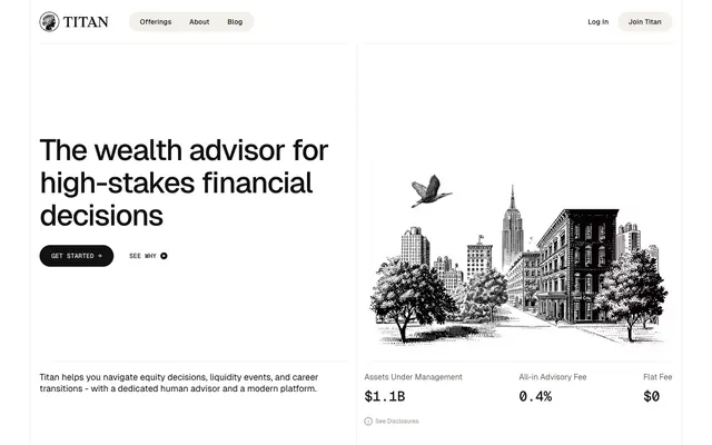
Titan presents a refined, high-contrast, monochrome aesthetic, marrying the sharpness of financial precision with an underlying human warmth. Its visual language prioritizes clear information hierarchy and direct interaction, utilizing stark black and white with subtle, almost imperceptible, warm off-white and gray undertones for depth. Components are lightweight and interaction-focused, often featuring generous padding and distinctive pill-shaped radii to create a sense of approachability within a formal system. The design feels grounded and authoritative, not through heavy elements, but through its disciplined use of space, typography, and a distinct lack of decorative flourishes, allowing content and functionality to lead.
The page follows a contained, centered layout, with content constrained to a `pageMaxWidth` of 1200px. The hero section is a two-column split, with a bold headline and primary CTA on the left, balanced by a large, detailed monochrome illustration on the right. Section rhythm is consistent, primarily using 80px vertical gaps between major content blocks. Content is often presented in a grid-like fashion, such as the three-column card grid for feature highlights. Navigation is a simple, sticky top bar with logo, prominent brand name, a few text links, and filled/ghost buttons for login/signup. The density is comfortable, ensuring plenty of whitespace around elements.
The site uses a combination of high-contrast, black-and-white, highly detailed illustrations and occasional, stark product/lifestyle photography. Illustrations are the primary visual element, depicting urban landscapes (like a cityscape) or abstract financial concepts with fine linework, often with a single bird or abstract element for movement. Photography is minimal, often cropped tightly on individuals (lifestyle) or objects, maintaining the monochrome or desaturated tone. Icons are outlined, thin stroke, and monochromatic, used functionally rather than decoratively. The overall density of imagery is balanced; it serves to add atmosphere and context without overwhelming the clean UI.
Reminiscent of Wealthfront, Linear, Stripe, Kraken.
# Titan — Style Reference
> monochrome financial ledger

**Theme:** light

**Site:** https://www.titan.com

Titan presents a refined, high-contrast, monochrome aesthetic, marrying the sharpness of financial precision with an underlying human warmth. Its visual language prioritizes clear information hierarchy and direct interaction, utilizing stark black and white with subtle, almost imperceptible, warm off-white and gray undertones for depth. Components are lightweight and interaction-focused, often featuring generous padding and distinctive pill-shaped radii to create a sense of approachability within a formal system. The design feels grounded and authoritative, not through heavy elements, but through its disciplined use of space, typography, and a distinct lack of decorative flourishes, allowing content and functionality to lead.

## Tokens — Colors

| Name | Value | Token | Role |
|------|------|------|------|
| Action Black | `#000000` | `--color-action-black` | Primary button backgrounds, key interactive elements. The pure black stands out against the near-white canvas |
| Highlight Orange | `#ff9900` | `--color-highlight-orange` | Decorative strokes and subtle highlights, often within SVG elements. A small splash of vivid color |
| Midnight Ink | `#111111` | `--color-midnight-ink` | Primary text, darkest surface. Creates stark contrast against lighter backgrounds |
| Canvas White | `#ffffff` | `--color-canvas-white` | Page backgrounds, card surfaces, ghost button text. The primary backdrop for all content |
| Off-White Sage | `#f3efeb` | `--color-off-white-sage` | Subtle background for card variants and secondary sections, provides a soft, warm surface distinction |
| Faded Stone | `#e9eaeb` | `--color-faded-stone` | Subtle borders and dividers, navigation backgrounds, a very light gray that acts as an almost invisible separator |
| Gunmetal Gray | `#615e5b` | `--color-gunmetal-gray` | Secondary text, muted helper text, and subtle icon details. Provides lower contrast for less prominent information |
| Soft Concrete | `#d8d3cc` | `--color-soft-concrete` | Subtle borders for ghost buttons and card containers, provides minimal visual separation |

## Tokens — Typography

### Geist
- **Substitute:** Inter
- **Weights:** 400, 500, 700
- **Sizes:** 10px, 12px, 14px, 16px, 18px, 20px, 24px, 32px, 40px, 60px
- **Line height:** 1, 1.1, 1.2, 1.3, 1.5
- **Letter spacing:** -0.0300em, 0.0200em, 0.0300em
- **Role:** Primary typeface for all UI elements, headings, body text, and links. Its clean, modern lines reinforce the site's precision. Key use cases: weight 700 at 60px for prominent hero headlines, weight 400 at 16px for body content. Features 'ss02' and 'ss03' for consistent brand character.

### Geist Mono
- **Substitute:** JetBrains Mono
- **Weights:** 400, 500
- **Sizes:** 11px, 13px, 20px, 28px, 48px
- **Line height:** 1, 1.1
- **Letter spacing:** -0.0100em, 0.0300em
- **Role:** Used sparingly for data displays or code-like elements, lending a technical and precise feel. Its monospaced nature is a deliberate choice for presenting numerical or categorical information. Features 'ss08' for specific character variations.

## Tokens — Type Scale

Major Third (1.25) from 14px base.

| Role | Size | Line height | Letter spacing |
|------|------|------|------|
| caption | 10px | 1.2 | — |
| body-sm | 12px | 1.2 | — |
| body | 14px | 1.2 | — |
| body-lg | 16px | 1.2 | — |
| heading-sm | 20px | 1.2 | — |
| heading | 24px | 1.2 | — |
| heading-lg | 32px | 1.2 | — |
| display-sm | 40px | 1.2 | — |
| display | 60px | 1.2 | — |

## Tokens — Spacing

- **Max width:** 1200px
- **Section gap:** 80px
- **Card padding:** 28px
- **Element gap:** 24px

## Tokens — Radius

- **Buttons:** 160px
- **Cards:** 32px
- **medium:** 20px
- **navigation:** 140px
- **small:** 10px

## Layout

The page follows a contained, centered layout, with content constrained to a `pageMaxWidth` of 1200px. The hero section is a two-column split, with a bold headline and primary CTA on the left, balanced by a large, detailed monochrome illustration on the right. Section rhythm is consistent, primarily using 80px vertical gaps between major content blocks. Content is often presented in a grid-like fashion, such as the three-column card grid for feature highlights. Navigation is a simple, sticky top bar with logo, prominent brand name, a few text links, and filled/ghost buttons for login/signup. The density is comfortable, ensuring plenty of whitespace around elements.

## Imagery

The site uses a combination of high-contrast, black-and-white, highly detailed illustrations and occasional, stark product/lifestyle photography. Illustrations are the primary visual element, depicting urban landscapes (like a cityscape) or abstract financial concepts with fine linework, often with a single bird or abstract element for movement. Photography is minimal, often cropped tightly on individuals (lifestyle) or objects, maintaining the monochrome or desaturated tone. Icons are outlined, thin stroke, and monochromatic, used functionally rather than decoratively. The overall density of imagery is balanced; it serves to add atmosphere and context without overwhelming the clean UI.

## Components

### Primary Filled Button
*Call to action*

Filled with Action Black (#000000) background, Canvas White (#ffffff) text, and a highly rounded 160px border-radius. Padding is 24px horizontal, with implied vertical padding from line height for text.

### Ghost Button
*Secondary action or link*

Transparent background with Midnight Ink (#111111) text and a subtle Soft Concrete (#d8d3cc) 1px border, 160px border-radius. Padding is 24px horizontal and 11px vertical.

### Navigation Link Button
*Tertiary action or inline navigation link*

Transparent background with Midnight Ink (#111111) text, no visible border, and a 140px border-radius. Minimal horizontal padding of 18px and vertical padding of 11px for a refined, clickable area.

### Feature Card
*Informational content container*

Background of Off-White Sage (#f3efeb), with a 20px border-radius, and generous 28px padding on all sides. Used for important informational blocks.

### Expanded Feature Card
*Detailed content container*

Similar to Feature Card, with an Off-White Sage (#f3efeb) background and 32px border-radius, but featuring larger 56px padding on top/bottom and 28-56px variable horizontal padding for more expansive content.

### Stat Display Card
*Quick view data presentation*

Transparent background, 32px border-radius, with 32px top/bottom padding and 18-28px horizontal padding. Content is separated by implicit spacing, not explicit internal borders.

### Inline Text Link
*Navigation or contextual information link*

Midnight Ink (#111111) text, with no underline for a clean appearance. Implied padding when interactive derived from a base unit of 10px.

## Guidelines

### Do

- Use Midnight Ink (#111111) as the primary text color against Canvas White (#ffffff) or Off-White Sage (#f3efeb) to maintain high contrast.
- Apply a 160px border-radius to all primary and ghost buttons, and 140px to navigation elements for a consistent pill-shaped aesthetic.
- Separate major content sections with 80px vertical spacing to ensure comfortable density and visual breathing room.
- Utilize Geist at weight 700 for headings, sizes 40px and 60px, with -0.0300em letter spacing to create impactful, condensed titles.
- Use Geist Mono sparingly for numerical data or technical terms, leveraging its 'ss08' feature for distinct presentation.
- Implement Soft Concrete (#d8d3cc) for subtle 1px borders on ghost buttons and divider lines to avoid heavy visual separation.
- Employ Off-White Sage (#f3efeb) as a background for secondary content blocks or cards to provide a warm, soft distinction from the main Canvas White background.

### Don't

- Avoid introducing additional saturated colors; maintain the predominantly monochrome palette with only subtle Highlight Orange accents in decorative elements.
- Do not use box-shadows for elevation; rely on background color changes or subtle borders for surface differentiation.
- Do not use generic circular or square button radii; adhere to the specific 160px and 140px values for interactive elements.
- Avoid dense, unbroken blocks of text; break up content with generous padding, section gaps, and clear typographic hierarchy.
- Do not use default browser link styles; all links should be styled with Midnight Ink (#111111) and no underline by default.
- Do not use thin or light text weights for body copy; ensure readability with Geist at weight 400 or 500 for paragraph text.
- Avoid cluttering the layout; maintain the spacious and comfortable density by respecting elementGap of 24px and cardPadding of 28px.

## Agent Prompt Guide

Quick Color Reference:
- text: #111111
- background: #ffffff
- border: #e9eaeb
- accent: #ff9900
- primary action: #000000 (filled action)

Example Component Prompts:
- Create a Primary Action Button: #000000 background, #ffffff text, 9999px radius, compact pill padding. Use this filled treatment for the main CTA.
- Generate a Feature Card titled 'Equity Compensation' using Off-White Sage (#f3efeb) background, 20px border-radius, padding 28px. Inside, use Geist weight 500 at 24px for the title and Geist weight 400 at 16px for body text, both in Midnight Ink (#111111).
- Build a Ghost Button 'See More' with Canvas White (#ffffff) background, Midnight Ink (#111111) text, Soft Concrete (#d8d3cc) 1px border, and 160px border-radius, with 24px horizontal padding and 11px vertical padding.
More like this









Keep what you find
A free account saves references to boards and can send you a weekly email of picks based on what you save.
To see every result, go Pro.