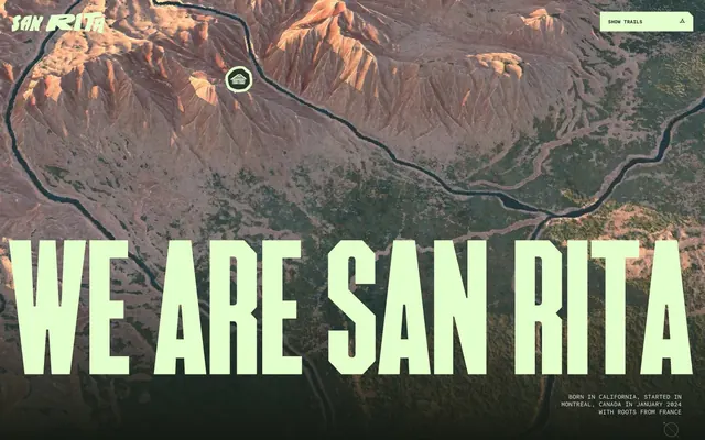
Preview image. Unlock full-res
Field Notes & Radio Signals — a minimalist topographic map combined with stark, technical typography.
Color palette
Main accent for illustrations, some body text, and background elements — provides a muted, organic counterpoint to the vibrant accent.
Primary accent for calls to action, headings on dark backgrounds, and interactive elements — creates high contrast and signals interactivity with a vibrant, almost neon quality.
Primary background for dark sections, footer background — creates a deep, grounding impression.
Secondary background, subtle text contrast on dark surfaces — creates varied surface depth within dark areas.
Lightest neutral, used for body text on dark backgrounds and some icons — provides crisp readability against dark surfaces.
Dominant text color on 'Adventure Chartreuse' backgrounds and for the massive 'F37stout' headlines — provides maximum contrast for key messaging.
Typography
- Weights
- 400
- Sizes
- 40px, 48px, 366px
- Line height
- 0.9
- Letter spacing
- normal
- Fallback
- Bebas Neue
Display headlines and prominent section titles. The extremely low line-height and often massive sizes create a stark, impactful visual block that feels carved or architectural rather than just typeset.
- Weights
- 400, 700
- Sizes
- 10px, 12px, 16px
- Line height
- 1.2
- Letter spacing
- -0.0100em
- Fallback
- Space Mono
Body text, navigation items, metadata, and labels. The monospace, slight negative letter-spacing, and small sizes lend a technical, almost coded or field-report aesthetic, reinforcing the 'exploration' theme.
- Weights
- 400
- Sizes
- 16px
- Line height
- 1.2
- Letter spacing
- normal
- Fallback
- Times New Roman
Used sparingly for specific links or secondary textual elements, adding a classic, documentary-style contrast to the stark monospace text.
Spacing & shape
Components
Button with 'Adventure Chartreuse' background (#e2ffcc), 'Headline Black' text (#000000), rounded corners (radius is part of custom button shape, appearing like a pill in the screenshot). Padding is likely 16px horizontal, 5px vertical based on general spacing and visual analysis. Text is 'mono' font, 10px, weight 400, letter-spacing -0.01em.
Text uses 'Times' font, 16px, weight 400. Color is 'Paper White' (#dde2e4) on dark backgrounds or 'Headline Black' (#000000) on light accent backgrounds.
Uses 'F37stout' font, 366px, weight 400, line-height 0.9. Text color is 'Adventure Chartreuse' (#e2ffcc) against a topographical background image.
Text uses 'mono' font, 16px, weight 400, letter-spacing -0.01em. Color is 'Paper White' (#dde2e4). Padding around text blocks is 24px.
Icon is SVG, 'Paper White' (#dde2e4) fill, 2px stroke, no background. Positioned with 70px left margin based on visual cues.
Guidelines
- Use 'Adventure Chartreuse' (#e2ffcc) for all primary interactive elements and key headings to maintain brand energy.
- Pair 'F37stout' for display text with 'mono' for body text to create the signature technical-meets-monumental typography.
- Employ consistent 12px or 24px spacing for element gaps and margins, extending to 40px for larger structural gaps.
- Maintain a clear visual hierarchy by limiting 'Times' font usage to specific, less prominent links or references.
- Incorporate 'Earth Gray' (#84907f) subtly within illustrations or as a background hue to add an organic, geological feel.
- Avoid using 'Times' font for large headings or core UI elements, as it dilutes the brand's typographic identity.
- Do not introduce new color palettes; stick rigidly to 'Forest Canopy', 'Terrain Shadow', 'Paper White', 'Earth Gray', 'Adventure Chartreuse', and 'Headline Black'.
- Borders or explicit drop shadows are not part of this system; achieve depth through contrasting background colors or layering of content blocks.
- Do not deviate from the specified letter-spacing for 'mono' (-0.01em) as it contributes significantly to its technical character.
- Avoid generic imagery or illustrations; focus on topographic maps, abstract outdoor elements, or tightly cropped, art-directed photography.
About this system
ShowHide
San Rita balances rugged outdoor aesthetics with refined, almost architectural typography. The visual language evokes adventure and groundedness through a dominant muted green (#84907f) and a 'radio-signal' chartreuse accent (#e2ffcc) against a deep forest green background. Oversized, condensed custom typography for headlines grounds the design, while the monospace text adds a technical, almost archival feel, reminiscent of field notes in a wilderness expedition.
The page primarily uses a full-bleed layout, particularly for hero sections and embedded background imagery. Content is contained within invisible horizontal bounds, with generous left/right margins (67px, 70px, 190px). The hero section features a dominant fullscreen background image with oversized, centered typography. Sections alternate between full-bleed imagery and solid color backgrounds, establishing visual rhythm. Content often appears in centered stacks or simple two-column arrangements, always prioritizing generous breathing room defined by large spacing tokens. Navigation consists of a clear top bar with minimal elements.
Visuals are a mix of abstract topographic map imagery as large background elements, and candid, somewhat gritty photography depicting individuals in outdoor settings. The map imagery is full-bleed and dominant, providing context and atmosphere rather than direct information. Photography uses natural light, appears unprocessed, and is presented as overlapping, slightly rotated rectangles, creating a scrapbook-like or 'field journal' aesthetic. Icons are simple, outlined SVGs, typically 'Paper White' against dark backgrounds, acting as minimal navigational cues or location markers. The overall density is heavy in imagery, allowing large visuals to define sections and convey mood.
Reminiscent of Patagonia, Arc'teryx, Native Teams, The North Face.
# San Rita — Style Reference
> Field Notes & Radio Signals — a minimalist topographic map combined with stark, technical typography.

**Theme:** dark

**Site:** https://sanrita.ca/about

San Rita balances rugged outdoor aesthetics with refined, almost architectural typography. The visual language evokes adventure and groundedness through a dominant muted green (#84907f) and a 'radio-signal' chartreuse accent (#e2ffcc) against a deep forest green background. Oversized, condensed custom typography for headlines grounds the design, while the monospace text adds a technical, almost archival feel, reminiscent of field notes in a wilderness expedition.

## Tokens — Colors

| Name | Value | Token | Role |
|------|------|------|------|
| Earth Gray | `#84907f` | `--color-earth-gray` | Main accent for illustrations, some body text, and background elements — provides a muted, organic counterpoint to the vibrant accent. |
| Adventure Chartreuse | `#e2ffcc` | `--color-adventure-chartreuse` | Primary accent for calls to action, headings on dark backgrounds, and interactive elements — creates high contrast and signals interactivity with a vibrant, almost neon quality. |
| Forest Canopy | `#161b13` | `--color-forest-canopy` | Primary background for dark sections, footer background — creates a deep, grounding impression. |
| Terrain Shadow | `#2d3329` | `--color-terrain-shadow` | Secondary background, subtle text contrast on dark surfaces — creates varied surface depth within dark areas. |
| Paper White | `#dde2e4` | `--color-paper-white` | Lightest neutral, used for body text on dark backgrounds and some icons — provides crisp readability against dark surfaces. |
| Headline Black | `#000000` | `--color-headline-black` | Dominant text color on 'Adventure Chartreuse' backgrounds and for the massive 'F37stout' headlines — provides maximum contrast for key messaging. |

## Tokens — Typography

### F37stout
- **Substitute:** Bebas Neue
- **Weights:** 400
- **Sizes:** 40px, 48px, 366px
- **Line height:** 0.9
- **Letter spacing:** normal
- **Role:** Display headlines and prominent section titles. The extremely low line-height and often massive sizes create a stark, impactful visual block that feels carved or architectural rather than just typeset.

### mono
- **Substitute:** Space Mono
- **Weights:** 400, 700
- **Sizes:** 10px, 12px, 16px
- **Line height:** 1.2
- **Letter spacing:** -0.0100em
- **Role:** Body text, navigation items, metadata, and labels. The monospace, slight negative letter-spacing, and small sizes lend a technical, almost coded or field-report aesthetic, reinforcing the 'exploration' theme.

### Times New Roman
- **Substitute:** Times New Roman
- **Weights:** 400
- **Sizes:** 16px
- **Line height:** 1.2
- **Letter spacing:** normal
- **Role:** Used sparingly for specific links or secondary textual elements, adding a classic, documentary-style contrast to the stark monospace text.

## Tokens — Type Scale

| Role | Size | Line height | Letter spacing |
|------|------|------|------|
| caption | 10px | 1.2 | -0.1px |
| body | 16px | 1.2 | -0.16px |
| heading-sm | 40px | 0.9 | — |
| heading | 48px | 0.9 | — |
| display | 366px | 0.9 | — |

## Tokens — Spacing

- **Section gap:** 40px
- **Card padding:** 24px
- **Element gap:** 12px

## Tokens — Radius

- **Default:** 0px

## Layout

The page primarily uses a full-bleed layout, particularly for hero sections and embedded background imagery. Content is contained within invisible horizontal bounds, with generous left/right margins (67px, 70px, 190px). The hero section features a dominant fullscreen background image with oversized, centered typography. Sections alternate between full-bleed imagery and solid color backgrounds, establishing visual rhythm. Content often appears in centered stacks or simple two-column arrangements, always prioritizing generous breathing room defined by large spacing tokens. Navigation consists of a clear top bar with minimal elements.

## Imagery

Visuals are a mix of abstract topographic map imagery as large background elements, and candid, somewhat gritty photography depicting individuals in outdoor settings. The map imagery is full-bleed and dominant, providing context and atmosphere rather than direct information. Photography uses natural light, appears unprocessed, and is presented as overlapping, slightly rotated rectangles, creating a scrapbook-like or 'field journal' aesthetic. Icons are simple, outlined SVGs, typically 'Paper White' against dark backgrounds, acting as minimal navigational cues or location markers. The overall density is heavy in imagery, allowing large visuals to define sections and convey mood.

## Components

### Navigation Button

### Origin Stat Block

### Photo Scrapbook Cards

### Navigation Button
*Primary Call to Action in header*

Button with 'Adventure Chartreuse' background (#e2ffcc), 'Headline Black' text (#000000), rounded corners (radius is part of custom button shape, appearing like a pill in the screenshot). Padding is likely 16px horizontal, 5px vertical based on general spacing and visual analysis. Text is 'mono' font, 10px, weight 400, letter-spacing -0.01em.

### Inline Link
*Interactive text link*

Text uses 'Times' font, 16px, weight 400. Color is 'Paper White' (#dde2e4) on dark backgrounds or 'Headline Black' (#000000) on light accent backgrounds.

### Hero Headline
*Main heading on hero section*

Uses 'F37stout' font, 366px, weight 400, line-height 0.9. Text color is 'Adventure Chartreuse' (#e2ffcc) against a topographical background image.

### Footer Text Block
*Descriptive text in footer*

Text uses 'mono' font, 16px, weight 400, letter-spacing -0.01em. Color is 'Paper White' (#dde2e4). Padding around text blocks is 24px.

### Map Overlay Icon
*Interactive icon on map background*

Icon is SVG, 'Paper White' (#dde2e4) fill, 2px stroke, no background. Positioned with 70px left margin based on visual cues.

## Guidelines

### Do

- Use 'Adventure Chartreuse' (#e2ffcc) for all primary interactive elements and key headings to maintain brand energy.
- Pair 'F37stout' for display text with 'mono' for body text to create the signature technical-meets-monumental typography.
- Employ consistent 12px or 24px spacing for element gaps and margins, extending to 40px for larger structural gaps.
- Maintain a clear visual hierarchy by limiting 'Times' font usage to specific, less prominent links or references.
- Incorporate 'Earth Gray' (#84907f) subtly within illustrations or as a background hue to add an organic, geological feel.

### Don't

- Avoid using 'Times' font for large headings or core UI elements, as it dilutes the brand's typographic identity.
- Do not introduce new color palettes; stick rigidly to 'Forest Canopy', 'Terrain Shadow', 'Paper White', 'Earth Gray', 'Adventure Chartreuse', and 'Headline Black'.
- Borders or explicit drop shadows are not part of this system; achieve depth through contrasting background colors or layering of content blocks.
- Do not deviate from the specified letter-spacing for 'mono' (-0.01em) as it contributes significantly to its technical character.
- Avoid generic imagery or illustrations; focus on topographic maps, abstract outdoor elements, or tightly cropped, art-directed photography.

## Agent Prompt Guide

### Quick Color Reference
- Text on dark: #dde2e4
- Text on light: #000000
- Background dark: #161b13
- Background accent: #e2ffcc
- Accent: #84907f

### 3-5 Example Component Prompts
1. Create a hero section: full-bleed background image, overlay a headline `WE ARE SAN RITA` using F37stout font, 366px, weight 400, line-height 0.9, color #e2ffcc. Position the headline centered.
2. Design a navigation button: `SHOW TRAILS` text using mono font, 10px, weight 400, letter-spacing -0.01em, color #000000. Button background color #e2ffcc, with implied pill shape (no explicit radius, visual). Add 16px horizontal and 5px vertical padding.
3. Generate a footer text block: `Born in California, Started in Montreal...` using mono font, 16px, weight 400, letter-spacing -0.01em, color #dde2e4, on a #161b13 background. Ensure 24px internal padding around the text.
4. Produce a secondary heading: `Julien` using F37stout, 40px, weight 400, line-height 0.9, color #dde2e4.
5. Create a body paragraph: `In the stillness of the California desert...` using mono font, 16px, weight 400, line-height 1.2, letter-spacing -0.01em, color #dde2e4, on a #2d3329 background.
More like this









Keep what you find
A free account saves references to boards and can send you a weekly email of picks based on what you save.
To see every result, go Pro.