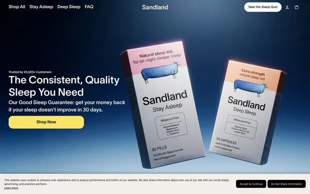
Preview image. Unlock full-res
Calm twilight, soft edges
Color palette
Primary brand color for hero backgrounds, card surfaces, and key icons—establishes a sense of calm and depth
Accent for primary call-to-action buttons, badges, and highlights—injects warmth and guides user attention
Decorative accent primarily seen in subtle box-shadows, providing a hint of energy
Primary text color and significant UI elements like backgrounds and borders for high contrast
Main background for cards, text, and interactive elements, providing a clean, bright foundation
Background for outer page sections, providing a soft, almost imperceptible warmth to the canvas
Subtle borders and dividers, indicating structure without strong visual interruption
Muted text for secondary information, helper text, and subtle icon details
Secondary card background, slightly off-white to create subtle layering
Standard input borders and placeholder text color
Text color for price points and other specific content areas, a softer alternative to pure black
Background for neutral, ghost buttons, providing a subtle interactive cue
Typography
- Weights
- 400, 500, 600
- Sizes
- 10px, 11px, 12px, 13px, 14px, 15px, 16px, 18px, 19px, 20px, 24px, 28px, 40px, 48px, 72px
- Line height
- 1, 1.1, 1.2, 1.3, 1.4, 1.6, 1.67
- Letter spacing
- -0.0300em at display sizes, 0.0450em for small text, neutral otherwise
- Fallback
- Open Sans
Primary typeface for all headings and body text. Its subtle variations in letter spacing across sizes lend a bespoke feel, enhancing readability without drawing attention to the font itself. The regular weight (400) provides a clear, natural voice.
- Weights
- 400
- Sizes
- 14px, 24px
- Line height
- 1.1, 1.4
- Letter spacing
- normal
- Fallback
- Inter
Secondary typeface, used sparingly for specific icons or technical annotations, providing a clean, accessible counterpoint.
- Weights
- 400
- Sizes
- 14px
- Line height
- 1.5
- Letter spacing
- normal
- Fallback
- Roboto
Used for specific auxiliary informational text, adding a subtle touch of distinctiveness.
Spacing & shape
Elevation
Components
Filled button with Amber Glow (#fae467) background, Deepest Night (#000000) text, 20px border radius, and generous 16px 24px padding.
Ghost button with Canvas White (#ffffff) background (90% opacity), Deepest Night (#000000) text, 999px border radius for pill shape, and 1px 6px padding. Used for minimal interactive elements like arrows or small controls.
Button with Light Concrete (#cbd5e0) background, Deepest Night (#000000) text, 999px border radius, and 1px 6px padding. Used for subdued interactive elements.
Container with Canvas White (#ffffff) background (60% opacity), 10px border radius, and a subtle shadow rgba(0, 0, 0, 0.1) 0px 4px 12px 0px. Padding is 30px on all sides.
Container with pure Canvas White (#ffffff) background, 10px border radius, and a more pronounced shadow rgba(0, 0, 0, 0.1) 0px 4px 20px 0px. Padding is 40px on all sides.
Card with Midnight Ink (#1a365d) background, 10px border radius, no shadow. Used for showcasing products with a distinct visual identity.
Transparent background, Slate Border (#726f6d) text and border bottom. Padding is 12px vertical, 0px horizontal. No border radius, relying on the underlying page structure.
Amber Glow (#fae467) background, Deepest Night (#000000) text, 10px border radius, and 5px padding. Used for small, distinctive labels.
Guidelines
- Use Ghost Fog (#f2ede8) as the canvas background for most page sections, occasionally using dark backgrounds like Midnight Ink (#1a365d) for hero or feature areas.
- Apply Deepest Night (#000000) for all primary text elements, ensuring high contrast and legibility.
- Utilize Sandland-550 for all typographic elements, leveraging its weight and letter-spacing variations for hierarchy rather than introducing new font families.
- Wrap interactive elements like buttons and badges in a 20px or 10px border radius, respectively, or 999px for pill-shaped elements.
- Make primary calls to action with a filled Amber Glow (#fae467) button, employing Deepest Night (#000000) for text.
- Maintain a comfortable density with an element gap of 8px and card padding of 30px, ensuring visual breathing room. Section gaps should be 44px.
- Use Subtle Ash (#e6e6e6) for hairline borders and separators to define content zones lightly.
- Avoid using highly saturated colors outside of the Amber Glow (#fae467) accent for primary actions; keep the rest of the palette muted or neutral.
- Do not introduce additional font families beyond Sandland-550, Inter, and GTStandard-M; maintain typographic consistency.
- Refrain from using strong, opaque box shadows; stick to the light, soft shadows defined for cards.
- Do not deviate from the established border radii for components; maintain the consistent level of softness.
- Avoid arbitrary color variations for text or background elements; each color should serve a distinct semantic purpose.
- Do not create layouts that extend beyond the 1200px page max width, ensuring a contained and balanced presentation.
About this system
ShowHide
Sandland Sleep uses a calm, naturalistic visual language designed to evoke tranquility and trust, combining soft, muted backgrounds with clear, legible typography. A dominant dark navy provides a sense of depth and authority, contrasted by a sunny yellow for key calls to action, creating gentle visual punctuation. Surfaces are largely soft-edged cards with subtle elevation, promoting a friendly and approachable feel while maintaining a clean, digital aesthetic. The overall theme is understated and clean, minimizing distractions to focus on clarity and product presentation.
The page maintains a max-width of 1200px, centered for readability and focus. The hero section features a full-width background with a centered, prominent headline and a Call-to-Action button over softly rendered product imagery. Content sections typically follow a consistent vertical rhythm with alternating background colors (Ghost Fog #f2ede8 and Canvas White #ffffff where cards overlay) and are separated by a section gap of 44px. Information is frequently arranged in a grid of 3-column cards, presenting products or features. Section headers are often centered and descriptive. Navigation is a sticky top bar with a left-aligned brand logo and right-aligned actions and links.
Imagery largely consists of tight product photography featuring sleep aid boxes, typically isolated on clean backgrounds or presented diagonally for a dynamic feel. Some illustrations are present, characterized by organic, flat shapes and brand-colored accents (like the blue sheep). Icons are generally outlined or filled with a moderate stroke weight, appearing as line art or simple glyphs, used functionally. The overall density of imagery is balanced, serving both decorative-atmospheric roles (hero section) and explanatory purposes (product display).
Reminiscent of Oura Ring, Calm (app), Hims & Hers, Seed Health.
# Sandland Sleep — Style Reference
> Calm twilight, soft edges

**Theme:** light

**Site:** https://sandlandsleep.com

Sandland Sleep uses a calm, naturalistic visual language designed to evoke tranquility and trust, combining soft, muted backgrounds with clear, legible typography. A dominant dark navy provides a sense of depth and authority, contrasted by a sunny yellow for key calls to action, creating gentle visual punctuation. Surfaces are largely soft-edged cards with subtle elevation, promoting a friendly and approachable feel while maintaining a clean, digital aesthetic. The overall theme is understated and clean, minimizing distractions to focus on clarity and product presentation.

## Tokens — Colors

| Name | Value | Token | Role |
|------|------|------|------|
| Midnight Ink | `#1a365d` | `--color-midnight-ink` | Primary brand color for hero backgrounds, card surfaces, and key icons—establishes a sense of calm and depth |
| Amber Glow | `#fae467` | `--color-amber-glow` | Accent for primary call-to-action buttons, badges, and highlights—injects warmth and guides user attention |
| Scarlet Flash | `#a42325` | `--color-scarlet-flash` | Decorative accent primarily seen in subtle box-shadows, providing a hint of energy |
| Deepest Night | `#000000` | `--color-deepest-night` | Primary text color and significant UI elements like backgrounds and borders for high contrast |
| Canvas White | `#ffffff` | `--color-canvas-white` | Main background for cards, text, and interactive elements, providing a clean, bright foundation |
| Ghost Fog | `#f2ede8` | `--color-ghost-fog` | Background for outer page sections, providing a soft, almost imperceptible warmth to the canvas |
| Subtle Ash | `#e6e6e6` | `--color-subtle-ash` | Subtle borders and dividers, indicating structure without strong visual interruption |
| Stone Gray | `#666666` | `--color-stone-gray` | Muted text for secondary information, helper text, and subtle icon details |
| Pale Pebble | `#faf8f6` | `--color-pale-pebble` | Secondary card background, slightly off-white to create subtle layering |
| Slate Border | `#726f6d` | `--color-slate-border` | Standard input borders and placeholder text color |
| Dark Umbra | `#3d3d3d` | `--color-dark-umbra` | Text color for price points and other specific content areas, a softer alternative to pure black |
| Light Concrete | `#cbd5e0` | `--color-light-concrete` | Background for neutral, ghost buttons, providing a subtle interactive cue |

## Tokens — Typography

### Sandland-550
- **Substitute:** Open Sans
- **Weights:** 400, 500, 600
- **Sizes:** 10px, 11px, 12px, 13px, 14px, 15px, 16px, 18px, 19px, 20px, 24px, 28px, 40px, 48px, 72px
- **Line height:** 1, 1.1, 1.2, 1.3, 1.4, 1.6, 1.67
- **Letter spacing:** -0.0300em at display sizes, 0.0450em for small text, neutral otherwise
- **Role:** Primary typeface for all headings and body text. Its subtle variations in letter spacing across sizes lend a bespoke feel, enhancing readability without drawing attention to the font itself. The regular weight (400) provides a clear, natural voice.

### Inter
- **Substitute:** Inter
- **Weights:** 400
- **Sizes:** 14px, 24px
- **Line height:** 1.1, 1.4
- **Letter spacing:** normal
- **Role:** Secondary typeface, used sparingly for specific icons or technical annotations, providing a clean, accessible counterpoint.

### GTStandard-M
- **Substitute:** Roboto
- **Weights:** 400
- **Sizes:** 14px
- **Line height:** 1.5
- **Letter spacing:** normal
- **Role:** Used for specific auxiliary informational text, adding a subtle touch of distinctiveness.

## Tokens — Type Scale

Augmented Fourth (1.414) from 15px base.

| Role | Size | Line height | Letter spacing |
|------|------|------|------|
| caption | 10px | 1.4 | 0.45px |
| body | 15px | 1.6 | — |
| subheading | 18px | 1.4 | — |
| heading-sm | 24px | 1.2 | — |
| heading | 40px | 1.1 | -0.3px |
| heading-lg | 48px | 1.1 | -0.3px |
| display | 72px | 1 | -0.3px |

## Tokens — Spacing

- **Max width:** 1200px
- **Section gap:** 44px
- **Card padding:** 30px
- **Element gap:** 8px

## Tokens — Radius

- **Buttons:** 20px
- **Cards:** 10px
- **badges:** 10px
- **circular-elements:** 999px
- **input:** 0px

## Tokens — Elevation

- **Default Card:** `rgba(0, 0, 0, 0.1) 0px 4px 12px 0px`
- **Elevated Content Card:** `rgba(0, 0, 0, 0.1) 0px 4px 20px 0px`
- **Input Field Focus:** `rgba(0, 0, 0, 0.13) 0px 1px 0px 0px`

## Layout

The page maintains a max-width of 1200px, centered for readability and focus. The hero section features a full-width background with a centered, prominent headline and a Call-to-Action button over softly rendered product imagery. Content sections typically follow a consistent vertical rhythm with alternating background colors (Ghost Fog #f2ede8 and Canvas White #ffffff where cards overlay) and are separated by a section gap of 44px. Information is frequently arranged in a grid of 3-column cards, presenting products or features. Section headers are often centered and descriptive. Navigation is a sticky top bar with a left-aligned brand logo and right-aligned actions and links.

## Imagery

Imagery largely consists of tight product photography featuring sleep aid boxes, typically isolated on clean backgrounds or presented diagonally for a dynamic feel. Some illustrations are present, characterized by organic, flat shapes and brand-colored accents (like the blue sheep). Icons are generally outlined or filled with a moderate stroke weight, appearing as line art or simple glyphs, used functionally. The overall density of imagery is balanced, serving both decorative-atmospheric roles (hero section) and explanatory purposes (product display).

## Components

### Primary Action Button
*Call to action*

Filled button with Amber Glow (#fae467) background, Deepest Night (#000000) text, 20px border radius, and generous 16px 24px padding.

### Ghost Outline Button
*Secondary action*

Ghost button with Canvas White (#ffffff) background (90% opacity), Deepest Night (#000000) text, 999px border radius for pill shape, and 1px 6px padding. Used for minimal interactive elements like arrows or small controls.

### Neutral Button
*Tertiary action*

Button with Light Concrete (#cbd5e0) background, Deepest Night (#000000) text, 999px border radius, and 1px 6px padding. Used for subdued interactive elements.

### Default Card
*Content container*

Container with Canvas White (#ffffff) background (60% opacity), 10px border radius, and a subtle shadow rgba(0, 0, 0, 0.1) 0px 4px 12px 0px. Padding is 30px on all sides.

### Elevated Content Card
*Prominent content display*

Container with pure Canvas White (#ffffff) background, 10px border radius, and a more pronounced shadow rgba(0, 0, 0, 0.1) 0px 4px 20px 0px. Padding is 40px on all sides.

### Dark Product Card
*Product information display*

Card with Midnight Ink (#1a365d) background, 10px border radius, no shadow. Used for showcasing products with a distinct visual identity.

### Input Field
*User input*

Transparent background, Slate Border (#726f6d) text and border bottom. Padding is 12px vertical, 0px horizontal. No border radius, relying on the underlying page structure.

### Bestseller Badge
*Highlight label*

Amber Glow (#fae467) background, Deepest Night (#000000) text, 10px border radius, and 5px padding. Used for small, distinctive labels.

## Guidelines

### Do

- Use Ghost Fog (#f2ede8) as the canvas background for most page sections, occasionally using dark backgrounds like Midnight Ink (#1a365d) for hero or feature areas.
- Apply Deepest Night (#000000) for all primary text elements, ensuring high contrast and legibility.
- Utilize Sandland-550 for all typographic elements, leveraging its weight and letter-spacing variations for hierarchy rather than introducing new font families.
- Wrap interactive elements like buttons and badges in a 20px or 10px border radius, respectively, or 999px for pill-shaped elements.
- Make primary calls to action with a filled Amber Glow (#fae467) button, employing Deepest Night (#000000) for text.
- Maintain a comfortable density with an element gap of 8px and card padding of 30px, ensuring visual breathing room. Section gaps should be 44px.
- Use Subtle Ash (#e6e6e6) for hairline borders and separators to define content zones lightly.

### Don't

- Avoid using highly saturated colors outside of the Amber Glow (#fae467) accent for primary actions; keep the rest of the palette muted or neutral.
- Do not introduce additional font families beyond Sandland-550, Inter, and GTStandard-M; maintain typographic consistency.
- Refrain from using strong, opaque box shadows; stick to the light, soft shadows defined for cards.
- Do not deviate from the established border radii for components; maintain the consistent level of softness.
- Avoid arbitrary color variations for text or background elements; each color should serve a distinct semantic purpose.
- Do not create layouts that extend beyond the 1200px page max width, ensuring a contained and balanced presentation.

## Agent Prompt Guide

Quick Color Reference:
text: #000000
background: #f2ede8
border: #e6e6e6
accent: #1a365d
primary action: #fae467 (filled action)

Example Component Prompts:
1. Create a Primary Action Button: #fae467 background, #000000 text, 9999px radius, compact pill padding. Use this filled treatment for the main CTA.
2. Design a Product Card for 'Stay Asleep' on a Default Card surface. The card should have a Canvas White (#ffffff) background, 10px radius, rgba(0, 0, 0, 0.1) 0px 4px 12px 0px shadow, and 30px padding. The product title 'Stay Asleep' should use Sandland-550, size 24px, weight 500, color Deepest Night (#000000).
3. Implement a 'Bestseller' Badge using Amber Glow (#fae467) background, Deepest Night (#000000) text, 10px radius, and 5px padding.
More like this









Keep what you find
A free account saves references to boards and can send you a weekly email of picks based on what you save.
To see every result, go Pro.