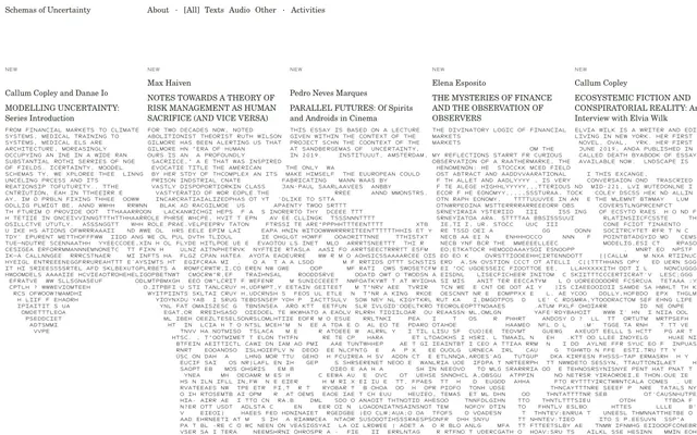
Preview image. Unlock full-res
Deconstructed text, academic sparseness
Color palette
Subtle borders, interactive text elements in navigation, and decorative icons. This color defines the system's only chromatic touch, appearing as a dark, near-black feature
Page backgrounds, unadorned surfaces
Primary text, headings, body copy, and most UI elements
Typography
- Weights
- 400
- Sizes
- 16px
- Line height
- 1.3
- Fallback
- Georgia, serif
Primary body text, article content, and general UI labels. Its classic serif form provides an academic, textual gravity.
- Weights
- 400
- Sizes
- 10px
- Line height
- 1.3
- Fallback
- Space Mono, monospace
Metadata, navigation items, and small informational text. Its monospaced nature contributes to the deconstructed, technical aesthetic, keeping dense information legible at a small size.
Spacing & shape
Components
Uses Next Mono at 10px, weight 400. Text color is Ink Black, with a top border of Charcoal Accent (10px padding-top, 10px padding-bottom) for active or hovered states. No background.
Each article block is essentially text-based, defined by an implied rectangular area, with a top border of Charcoal Accent to visually separate entries, and uses Century Schoolbook for author and title, and Next Mono for metadata like 'NEW'.
Rendered in Century Schoolbook 16px weight 400, Ink Black on Canvas White. Primarily left-aligned, establishing dense informational columns.
'NEW' labels use Next Mono 10px weight 400, Ink Black text on Canvas White background, implicitly contained.
Guidelines
- Prioritize text as the primary visual element, keeping layouts dense and content-focused.
- Use Century Schoolbook 16px / 1.3 lineHeight for all body text, ensuring a consistent academic tone.
- Apply Next Mono 10px / 1.3 lineHeight for all navigation, metadata, and smaller functional text.
- Restrict color usage to Ink Black for text, Canvas White for backgrounds, and Charcoal Accent (#2c3829) for subtle interactive highlights or structural borders.
- Use 10px for internal element spacing and padding within components, maintaining compactness.
- Utilize Charcoal Accent (#2c3829) for all interactive borders (e.g., active navigation items) to provide visual feedback.
- Employ a 138px vertical margin as the primary separator between major sections or content blocks.
- Avoid using any colors beyond Ink Black, Canvas White, and Charcoal Accent; the system is deliberately monochrome.
- Do not introduce significant changes in font size or weight for emphasis; rely on spacing and position for hierarchy.
- Do not use box shadows or rounded corners; the aesthetic is flat, sharp, and text-driven.
- Avoid large imagery or elaborate graphics; the system emphasizes raw textual information over decorative visuals.
- Do not feature large empty spaces or overly generous padding; maintain a compact, information-dense display.
- Refrain from using animated transitions or complex UI effects; interaction should feel direct and immediate.
- Do not deviate from the specified font families; their distinct characteristics are central to the brand identity.
About this system
ShowHide
The 'Schemas of Uncertainty' visual system evokes a stark academic journal or a deconstructed text, prioritizing content density and an austere, monochrome aesthetic. Typography is the primary visual element, laid out to maximize information with minimal spatial adornment. The system relies on a consistent lack of color, using almost exclusively black text on a white background, punctuated by a single, dark gray accent that serves as subtle interactive and structural cues.
The page prominently features a full-width, centered layout with a maximal text column. The hero area consists of a simple brand name and navigation against the white canvas. Content is arranged in alternating multi-column sections, primarily 4-column for article listings, maintaining a consistent vertical rhythm. Each article entry is an isolated block of text, implicitly outlined without explicit borders, and separated by significant vertical spacing (138px section gap). The navigation is a minimalist top bar. The overall density is high in terms of information per block, but the generous vertical spacing between blocks creates a structured, readable flow.
The site's visual language is characterized by an absence of conventional imagery. There are no photographs, illustrations, or product screenshots. The aesthetic is purely textual and typographic, relying on the arrangement of text blocks, headlines, and minimal UI elements to convey information. Icons are simple, outlined (implied stroke weight of 1px from subtle lines), and strictly monochrome. The density of text means visual space is entirely dominated by content, rather than atmospheric or explanatory graphics.
Reminiscent of Are.na, The Browser Company (Arc), New York Review of Books, Marginalia Review of Books.
# Schemasofuncertainty — Style Reference
> Deconstructed text, academic sparseness

**Theme:** light

**Site:** https://schemasofuncertainty.com

The 'Schemas of Uncertainty' visual system evokes a stark academic journal or a deconstructed text, prioritizing content density and an austere, monochrome aesthetic. Typography is the primary visual element, laid out to maximize information with minimal spatial adornment. The system relies on a consistent lack of color, using almost exclusively black text on a white background, punctuated by a single, dark gray accent that serves as subtle interactive and structural cues.

## Tokens — Colors

| Name | Value | Token | Role |
|------|------|------|------|
| Charcoal Accent | `#2c3829` | `--color-charcoal-accent` | Subtle borders, interactive text elements in navigation, and decorative icons. This color defines the system's only chromatic touch, appearing as a dark, near-black feature |
| Canvas White | `#ffffff` | `--color-canvas-white` | Page backgrounds, unadorned surfaces |
| Ink Black | `#000000` | `--color-ink-black` | Primary text, headings, body copy, and most UI elements |

## Tokens — Typography

### Century Schoolbook
- **Substitute:** Georgia, serif
- **Weights:** 400
- **Sizes:** 16px
- **Line height:** 1.3
- **Role:** Primary body text, article content, and general UI labels. Its classic serif form provides an academic, textual gravity.

### Next Mono
- **Substitute:** Space Mono, monospace
- **Weights:** 400
- **Sizes:** 10px
- **Line height:** 1.3
- **Role:** Metadata, navigation items, and small informational text. Its monospaced nature contributes to the deconstructed, technical aesthetic, keeping dense information legible at a small size.

## Tokens — Spacing

- **Section gap:** 138px
- **Card padding:** 10px
- **Element gap:** 10px

## Layout

The page prominently features a full-width, centered layout with a maximal text column. The hero area consists of a simple brand name and navigation against the white canvas. Content is arranged in alternating multi-column sections, primarily 4-column for article listings, maintaining a consistent vertical rhythm. Each article entry is an isolated block of text, implicitly outlined without explicit borders, and separated by significant vertical spacing (138px section gap). The navigation is a minimalist top bar. The overall density is high in terms of information per block, but the generous vertical spacing between blocks creates a structured, readable flow.

## Imagery

The site's visual language is characterized by an absence of conventional imagery. There are no photographs, illustrations, or product screenshots. The aesthetic is purely textual and typographic, relying on the arrangement of text blocks, headlines, and minimal UI elements to convey information. Icons are simple, outlined (implied stroke weight of 1px from subtle lines), and strictly monochrome. The density of text means visual space is entirely dominated by content, rather than atmospheric or explanatory graphics.

## Components

### Navigation Link
*Primary navigation item*

Uses Next Mono at 10px, weight 400. Text color is Ink Black, with a top border of Charcoal Accent (10px padding-top, 10px padding-bottom) for active or hovered states. No background.

### Article Card
*Container for article summaries or entries.*

Each article block is essentially text-based, defined by an implied rectangular area, with a top border of Charcoal Accent to visually separate entries, and uses Century Schoolbook for author and title, and Next Mono for metadata like 'NEW'.

### Body Text Block
*Main content display.*

Rendered in Century Schoolbook 16px weight 400, Ink Black on Canvas White. Primarily left-aligned, establishing dense informational columns.

### Small Text Label
*Category tags, indicators.*

'NEW' labels use Next Mono 10px weight 400, Ink Black text on Canvas White background, implicitly contained.

## Guidelines

### Do

- Prioritize text as the primary visual element, keeping layouts dense and content-focused.
- Use Century Schoolbook 16px / 1.3 lineHeight for all body text, ensuring a consistent academic tone.
- Apply Next Mono 10px / 1.3 lineHeight for all navigation, metadata, and smaller functional text.
- Restrict color usage to Ink Black for text, Canvas White for backgrounds, and Charcoal Accent (#2c3829) for subtle interactive highlights or structural borders.
- Use 10px for internal element spacing and padding within components, maintaining compactness.
- Utilize Charcoal Accent (#2c3829) for all interactive borders (e.g., active navigation items) to provide visual feedback.
- Employ a 138px vertical margin as the primary separator between major sections or content blocks.

### Don't

- Avoid using any colors beyond Ink Black, Canvas White, and Charcoal Accent; the system is deliberately monochrome.
- Do not introduce significant changes in font size or weight for emphasis; rely on spacing and position for hierarchy.
- Do not use box shadows or rounded corners; the aesthetic is flat, sharp, and text-driven.
- Avoid large imagery or elaborate graphics; the system emphasizes raw textual information over decorative visuals.
- Do not feature large empty spaces or overly generous padding; maintain a compact, information-dense display.
- Refrain from using animated transitions or complex UI effects; interaction should feel direct and immediate.
- Do not deviate from the specified font families; their distinct characteristics are central to the brand identity.

## Agent Prompt Guide

Quick Color Reference:
text: #000000
background: #ffffff
border: #2c3829
accent: #2c3829
primary action: no distinct CTA color

3-5 Example Component Prompts:
Create a navigation block: Next Mono 10px weight 400, #000000. Active item has a 1px top border of #2c3829, 10px padding-top, 10px padding-bottom. Inactive items have no border or background.
Create an article listing entry: Uses Century Schoolbook 16px weight 400 for title and author, #000000 color. A 'NEW' tag is positioned above the title, Next Mono 10px weight 400, #000000. Separate entries with a 138px vertical gap and a subtle 1px border of #2c3829 only above the entry.
Design a text-heavy section: Century Schoolbook 16px weight 400, #000000 on #ffffff background. Arrange content in a 4-column grid. Ensure 10px spacing between internal elements and columns.
More like this






Keep what you find
A free account saves references to boards and can send you a weekly email of picks based on what you save.
To see every result, go Pro.