Preview image. Unlock full-res
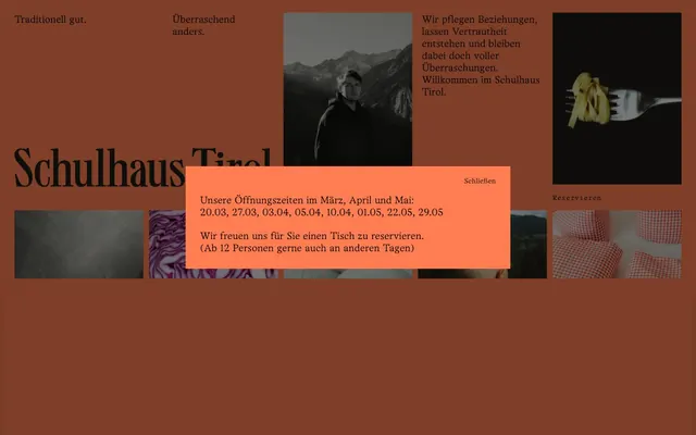
Warm earthy heritage
Color palette
Dominant background for content sections and navigational elements, creating the warm, earthy foundation of the design. Also used for modal backgrounds
Primary text color for headlines, body text, and links, ensuring high contrast against lighter surfaces. Also used for default icon fills and borders
Subtle border color for dividing elements and providing light visual structure within cards and against darker backgrounds
Secondary text and icon color, used for less prominent content and SVG fills
Tertiary border color, used sparingly for very thin dividers
Typography
- Weights
- 400
- Sizes
- 14px, 16px, 20px, 26px
- Line height
- 1.2, 1.25, 1.42, 1.5
- Letter spacing
- 0.0120em for 14px, 0.0160em for 16px, 0.0340em for 20px and 26px.
- Fallback
- Georgia
Primary typeface for headlines, body text, navigation items, and buttons. Its single 400 weight emphasizes a unified, unpretentious voice, relying on size for hierarchy.
- Weights
- 400
- Sizes
- 10px, 12px, 14px
- Line height
- 1.42, 1.7
- Letter spacing
- 0.0340em for 10px, 0.0400em for 12px, 0.0480em for 14px.
- Fallback
- IBM Plex Mono
Monospaced secondary typeface primarily for small labels, input fields, and some body text variations, providing a technical contrast to the primary serif font. Its generous letter-spacing enhances legibility at small sizes.
Spacing & shape
Components
backgroundColor: transparent, color: Carbon Black (#000000), borderRadius: 0px, padding: 0px.
backgroundColor: transparent, color: Carbon Black (#000000), borderColor: Carbon Black (#000000), borderRadius: 0px, padding: 0px 10px.
background-color: Terracotta (#ff7d50), text-color: Carbon Black (#000000), includes a 'Schliessen' ghost button.
1px solid Ash Gray (#e5e7eb) border, no radius.
Guidelines
- Always use Terracotta (#ff7d50) as the background for primary content sections to establish the brand's warm, earthy tone.
- Utilize Carbon Black (#000000) for all primary text and calls to action where high contrast is essential.
- Apply Office Times Sharp at font-weight 400 for all headlines and body text, relying on size to define hierarchy.
- Space elements using multiples of 12px for `elementGap` to maintain a comfortable density.
- Implement 1px solid Ash Gray (#e5e7eb) for subtle borders and element separation.
- Use Office Times Sharp Mono with its characteristic letter-spacing for smaller, functional text elements like captions and input labels.
- Ensure all interactive elements, including buttons and inputs, have a borderRadius of 0px to maintain the clean, sharp aesthetic.
- Avoid using bright or overly saturated colors outside of the Terracotta base, as they will conflict with the muted palette.
- Do not deviate from the specified font weights; the system is designed around the deliberate use of single-weight typefaces.
- Refrain from using shadows or strong elevation for UI elements, as the design emphasizes flat surfaces.
- Do not introduce rounded corners; maintain the sharp, defined edges of existing components.
- Avoid large negative letter-spacing values; the monospaced font is intentionally more open.
- Do not create large, full-bleed images that distract from the typographic focus; images should be contained and integrated with text.
- Do not use generic system fonts; stick to Office Times Sharp and Office Times Sharp Mono for brand consistency.
About this system
ShowHide
Schulhaus Tirol embraces an earthy, rustic elegance with its primary focus on rich, warm tones and robust typography. The design system emphasizes distinct content blocks against a deeply saturated background. Text is generally dark and grounded, providing strong contrast while an accent color creates deliberate visual punctuation. Visuals are contained within defined areas, contributing to a feeling of curated information rather than expansive, flowing layouts.
The page primarily uses a full-bleed layout, with content sections extending edge-to-edge. The hero section features a centered headline over a background that appears to be the dominant Terracotta color, possibly with dark imagery overlaying it. Content generally alternates between large, rectangular blocks of text and image sections. There's an underlying grid implied by horizontally aligned content, but specific column counts are not consistently rigid. Overall, the layout feels spacious and content-focused, with strong vertical rhythm established by generously spaced sections.
The imagery on the site consists of diverse photography, including atmospheric landscapes (mountains), candid portraits, and highly stylized, close-up product shots (food). The treatment is primarily isolated within rectangular frames, often appearing on a dark background within the Terracotta page. There are no apparent borders or rounded corners on the images themselves. Imagery serves both decorative and explanatory roles, setting a mood while also showcasing offerings.
Reminiscent of Aritzia, Aesop, Monocle Magazine.
# Schulhaus Tirol — Style Reference
> Warm earthy heritage

**Theme:** light

**Site:** https://www.schulhaus.tirol

Schulhaus Tirol embraces an earthy, rustic elegance with its primary focus on rich, warm tones and robust typography. The design system emphasizes distinct content blocks against a deeply saturated background. Text is generally dark and grounded, providing strong contrast while an accent color creates deliberate visual punctuation. Visuals are contained within defined areas, contributing to a feeling of curated information rather than expansive, flowing layouts.

## Tokens — Colors

| Name | Value | Token | Role |
|------|------|------|------|
| Terracotta | `#ff7d50` | `--color-terracotta` | Dominant background for content sections and navigational elements, creating the warm, earthy foundation of the design. Also used for modal backgrounds |
| Carbon Black | `#000000` | `--color-carbon-black` | Primary text color for headlines, body text, and links, ensuring high contrast against lighter surfaces. Also used for default icon fills and borders |
| Ash Gray | `#e5e7eb` | `--color-ash-gray` | Subtle border color for dividing elements and providing light visual structure within cards and against darker backgrounds |
| Charcoal Ink | `#1d1d1b` | `--color-charcoal-ink` | Secondary text and icon color, used for less prominent content and SVG fills |
| Pewter | `#555555` | `--color-pewter` | Tertiary border color, used sparingly for very thin dividers |

## Tokens — Typography

### Office Times Sharp
- **Substitute:** Georgia
- **Weights:** 400
- **Sizes:** 14px, 16px, 20px, 26px
- **Line height:** 1.2, 1.25, 1.42, 1.5
- **Letter spacing:** 0.0120em for 14px, 0.0160em for 16px, 0.0340em for 20px and 26px.
- **Role:** Primary typeface for headlines, body text, navigation items, and buttons. Its single 400 weight emphasizes a unified, unpretentious voice, relying on size for hierarchy.

### Office Times Sharp Mono
- **Substitute:** IBM Plex Mono
- **Weights:** 400
- **Sizes:** 10px, 12px, 14px
- **Line height:** 1.42, 1.7
- **Letter spacing:** 0.0340em for 10px, 0.0400em for 12px, 0.0480em for 14px.
- **Role:** Monospaced secondary typeface primarily for small labels, input fields, and some body text variations, providing a technical contrast to the primary serif font. Its generous letter-spacing enhances legibility at small sizes.

## Tokens — Type Scale

| Role | Size | Line height | Letter spacing |
|------|------|------|------|
| caption | 10px | 1.42 | 0.34px |
| body | 14px | 1.2 | 0.168px |
| heading | 20px | 1.42 | 0.68px |
| heading-lg | 26px | 1.5 | 0.884px |

## Tokens — Spacing

- **Section gap:** 64px
- **Card padding:** 30px
- **Element gap:** 12px

## Tokens — Radius

- **none:** 0px

## Layout

The page primarily uses a full-bleed layout, with content sections extending edge-to-edge. The hero section features a centered headline over a background that appears to be the dominant Terracotta color, possibly with dark imagery overlaying it. Content generally alternates between large, rectangular blocks of text and image sections. There's an underlying grid implied by horizontally aligned content, but specific column counts are not consistently rigid. Overall, the layout feels spacious and content-focused, with strong vertical rhythm established by generously spaced sections.

## Imagery

The imagery on the site consists of diverse photography, including atmospheric landscapes (mountains), candid portraits, and highly stylized, close-up product shots (food). The treatment is primarily isolated within rectangular frames, often appearing on a dark background within the Terracotta page. There are no apparent borders or rounded corners on the images themselves. Imagery serves both decorative and explanatory roles, setting a mood while also showcasing offerings.

## Components

### Ghost Button
*Text-only button for navigation or secondary actions, relying on text color for prominence. Appears as a simple text link.*

backgroundColor: transparent, color: Carbon Black (#000000), borderRadius: 0px, padding: 0px.

### Outlined Input Field
*Minimal input field with distinct padding, designed for unobtrusive data entry.*

backgroundColor: transparent, color: Carbon Black (#000000), borderColor: Carbon Black (#000000), borderRadius: 0px, padding: 0px 10px.

### Modal Dialog
*Overlays content with a Terracotta background to highlight important information.*

background-color: Terracotta (#ff7d50), text-color: Carbon Black (#000000), includes a 'Schliessen' ghost button.

### Section Divider
*Hairline horizontal divider used to visually separate content blocks.*

1px solid Ash Gray (#e5e7eb) border, no radius.

## Guidelines

### Do

- Always use Terracotta (#ff7d50) as the background for primary content sections to establish the brand's warm, earthy tone.
- Utilize Carbon Black (#000000) for all primary text and calls to action where high contrast is essential.
- Apply Office Times Sharp at font-weight 400 for all headlines and body text, relying on size to define hierarchy.
- Space elements using multiples of 12px for `elementGap` to maintain a comfortable density.
- Implement 1px solid Ash Gray (#e5e7eb) for subtle borders and element separation.
- Use Office Times Sharp Mono with its characteristic letter-spacing for smaller, functional text elements like captions and input labels.
- Ensure all interactive elements, including buttons and inputs, have a borderRadius of 0px to maintain the clean, sharp aesthetic.

### Don't

- Avoid using bright or overly saturated colors outside of the Terracotta base, as they will conflict with the muted palette.
- Do not deviate from the specified font weights; the system is designed around the deliberate use of single-weight typefaces.
- Refrain from using shadows or strong elevation for UI elements, as the design emphasizes flat surfaces.
- Do not introduce rounded corners; maintain the sharp, defined edges of existing components.
- Avoid large negative letter-spacing values; the monospaced font is intentionally more open.
- Do not create large, full-bleed images that distract from the typographic focus; images should be contained and integrated with text.
- Do not use generic system fonts; stick to Office Times Sharp and Office Times Sharp Mono for brand consistency.

## Agent Prompt Guide

**Quick Color Reference:**
text: #000000
background: #ff7d50
border: #e5e7eb
accent: #ff7d50
primary action: no distinct CTA color

**3-5 Example Component Prompts:**
1. Create a primary navigation link: text 'Speisekarte' in Office Times Sharp regular (400) at 16px, color Carbon Black (#000000), normal line height, letter-spacing 0.0160em.
2. Design a section with a main headline: headline 'Schulhaus Tirol' in Office Times Sharp regular (400) at 26px, color Carbon Black (#000000), line height 1.5, letter-spacing 0.0340em. Followed by body text in Office Times Sharp regular (400) at 14px, color Carbon Black (#000000), line height 1.2, letter-spacing 0.0120em.
3. Build a modal dialog: background Terracotta (#ff7d50), with text 'Unsere Öffnungszeiten...' in Office Times Sharp regular (400) at 20px, color Carbon Black (#000000), line height 1.42, letter-spacing 0.0340em. Include a close button ('Schließen') as a Ghost Button at the top right, using Office Times Sharp Mono regular (400) at 14px, color Carbon Black (#000000), letter-spacing 0.0480em.
4. Show an input field for a form: background transparent, border 1px solid Carbon Black (#000000), no radius, 0px 10px padding, placeholder text in Charcoal Ink (#1d1d1b) using Office Times Sharp Mono regular (400) at 14px, letter-spacing 0.0480em.
More like this









Keep what you find
A free account saves references to boards and can send you a weekly email of picks based on what you save.
To see every result, go Pro.