Preview image. Unlock full-res
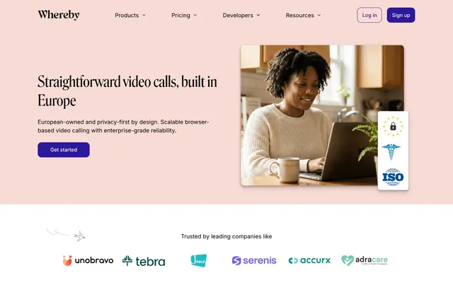
Soft rose + sharp violet — professional warmth.
Color palette
Hero section background, adds a distinctive warm, soft touch to key promotional areas.
Primary call-to-action buttons, interactive elements, prominent headings — the main brand accent color.
Link states, secondary interactive elements, text elements requiring strong emphasis against lighter backgrounds.
Highlighting beneficial features, success indicators, elements related to ecosystem integration.
Primary text, critical UI elements, strong contrasts against light backgrounds.
Page backgrounds, card surfaces, primary content areas.
Subtle section dividers, secondary backgrounds, slight elevation.
Disabled button states, subtle borders.
Typography
- Weights
- 400, 500, 600
- Sizes
- 14px, 16px, 18px
- Line height
- 1.5
- Letter spacing
- -0.028em
- Fallback
- Inter
Body text, navigation items, secondary labels, used at 14px for fine print, 16px for body, 18px for larger body lead ins. Its slight letter-spacing reduction helps fit more content without feeling dense.
- Weights
- 400, 500, 600
- Sizes
- 12px, 16px, 18px
- Line height
- 1, 1.5
- Letter spacing
- normal
- Fallback
- Inter
Used for smaller emphasized text like navigation links and component labels, and specific content points. It provides a touch more presence than 400 weight.
- Weights
- 400, 500, 600
- Sizes
- 14px
- Line height
- 1.5
- Letter spacing
- normal
- Fallback
- Inter
For strong emphasis in body copy or smaller headings, offering clear hierarchy without resorting to bolding entire paragraphs.
- Weights
- 400
- Sizes
- 18px, 24px, 28px
- Line height
- 1.25
- Letter spacing
- normal
- Fallback
- Playfair Display
Subheadings and section titles. This custom serif font adds a touch of classic sophistication, differentiating major content blocks from the modern sans-serif body.
- Weights
- 400
- Sizes
- 40px, 48px, 80px, 120px
- Line height
- 1.15, 1.25
- Letter spacing
- -10.0000em
- Fallback
- Playfair Display
Primary display headlines. The condensed nature paired with a moderate 400 weight prevents it from feeling overpowering, allowing large text to be impactful yet elegant. The extreme negative letterSpacing at larger sizes is a distinctive brand choice requiring careful implementation.
Spacing & shape
Components
Transparent background with a 1px border in 'Whereby Violet' (#2b189b) and 'Whereby Violet' text. 40px border-radius maintains the pill shape. Padding matches primary action buttons.
Default state uses 'Midnight Graphite' (#000000) for text with Inter 400 at 16px. No explicit backgrounds or borders, relying on spacing for separation. Hover/active states might introduce subtle underlining or color changes.
Content block within the hero section, background `Blush Rose` (#f8dbd5). Contains large headings (Whereby Roslindale Display Condensed Regular 80px), body text (Inter 18px), and a primary CTA button. No explicit border, relies on section background for visual grouping.
Card with a `Canvas White` background, 12px border radius, containing an image/video frame, a 'Whereby Roslindale Text Regular' heading (24px), Inter body text (18px), and a 'Whereby Violet' CTA button (pill-shaped, 40px radius). Uses 24px-40px padding.
Uses 'Whisper Gray' (#f4f4f4) as a background to subtly differentiate from the main 'Canvas White' sections. Typically contains a centered stack of elements, like a carousel or a specific product feature showcase, with padding of 64px vertical.
Guidelines
- Use 'Whereby Violet' (#2b189b) exclusively for primary interactive elements, ensuring strong call-to-action visibility.
- Apply a 40px border-radius for all buttons, creating a consistent pill-shaped aesthetic.
- Employ 'Blush Rose' (#f8dbd5) sparingly for hero sections or key promotional areas to maintain its distinctive warm impact.
- Utilize 'Whereby Roslindale Display Condensed Regular' (400 weight) for all key headlines, implementing the negative letter-spacing for large text.
- Maintain a clear visual hierarchy by contrasting 'Whereby Roslindale Text Regular' 400 for subheadings with 'Inter' for body text.
- Ensure generous vertical spacing of 64px between major sections to provide visual breathing room.
- Use 'Integrate Teal' (#006654) only for indicators of success, integration points, or positive attributes.
- Do not use highly saturated colors for backgrounds; reserve them for interactive elements or small accents.
- Avoid mixing 'Blush Rose' (#f8dbd5) with other chromatic background colors; it should stand as a distinct accent.
- Do not use pixel-perfect letter spacing if a font family has specified `em` values, use those for fidelity.
- Do not introduce additional sans-serif fonts; stick to the Inter family for all body and UI text.
- Avoid using border-radius values other than 12px, 20px, or 40px, unless for specific small form elements (4px).
- Do not apply drop shadows to elements; depth is primarily achieved through background color changes (e.g., 'Whisper Gray').
- Do not add additional visual ornamentation or gradients; the design relies on clean surfaces and strong typography.
About this system
ShowHide
Whereby blends a soft, friendly aesthetic with crisp, serious typography to create a sense of approachable professionalism. The subtle use of a pale rose background with deep violet accents softens the otherwise monochrome core, making video conferencing feel less sterile. Strategic pops of teal introduce vitality, particularly in areas signaling integration or positive outcomes, while overall structure relies on clean whites and grays, punctuated by precise typographic heirarchy, maintaining an efficient and trustworthy impression.
The layout primarily follows a max-width centered container model, though the hero section often uses a full-bleed background. The hero features a two-column split, with a large, condensed serif headline and text on the left, balanced by an image on the right, all against a 'Blush Rose' background. Subsequent sections often alternate between 'Canvas White' and 'Whisper Gray' backgrounds, maintaining a strong vertical rhythm with generous padding (64px). Content typically uses either a single-column stacked approach for text blocks or a two-column layout with text and image alternating sides. Feature sections frequently employ an adaptive grid for card-like elements. Navigation is a sticky top bar with brand logo, primary links, and distinct 'Log in' (outlined) and 'Sign up' (filled) buttons.
The site's imagery features professional, mid-shot photography showing individuals engaged in focused work on laptops in bright, airy home or office settings. Images are often contained within softly rounded masks (12px-20px radius). There are also clean, product-focused screenshots of the video conferencing interface itself, framed as if on a desktop or mobile device. Icons are simple, filled, and largely monochrome or in 'Integrate Teal', serving an explanatory and illustrative role rather than purely decorative. Overall, visual density is moderate; imagery serves to illustrate or provide social proof, rather than completely dominate sections. The treatment is naturalistic with a slightly warm filter often present, matching the 'Blush Rose' accent.
Reminiscent of Slack, Figma, Notion.
# Secure — Style Reference
> Soft rose + sharp violet — professional warmth.

**Theme:** light

**Site:** https://whereby.com

Whereby blends a soft, friendly aesthetic with crisp, serious typography to create a sense of approachable professionalism. The subtle use of a pale rose background with deep violet accents softens the otherwise monochrome core, making video conferencing feel less sterile. Strategic pops of teal introduce vitality, particularly in areas signaling integration or positive outcomes, while overall structure relies on clean whites and grays, punctuated by precise typographic heirarchy, maintaining an efficient and trustworthy impression.

## Tokens — Colors

| Name | Value | Token | Role |
|------|------|------|------|
| Blush Rose | `#f8dbd5` | `--color-blush-rose` | Hero section background, adds a distinctive warm, soft touch to key promotional areas. |
| Whereby Violet | `#2b189b` | `--color-whereby-violet` | Primary call-to-action buttons, interactive elements, prominent headings — the main brand accent color. |
| Deep Plum | `#211375` | `--color-deep-plum` | Link states, secondary interactive elements, text elements requiring strong emphasis against lighter backgrounds. |
| Integrate Teal | `#006654` | `--color-integrate-teal` | Highlighting beneficial features, success indicators, elements related to ecosystem integration. |
| Midnight Graphite | `#000000` | `--color-midnight-graphite` | Primary text, critical UI elements, strong contrasts against light backgrounds. |
| Canvas White | `#ffffff` | `--color-canvas-white` | Page backgrounds, card surfaces, primary content areas. |
| Whisper Gray | `#f4f4f4` | `--color-whisper-gray` | Subtle section dividers, secondary backgrounds, slight elevation. |
| Porcelain Gray | `#cccccc` | `--color-porcelain-gray` | Disabled button states, subtle borders. |

## Tokens — Typography

### Inter
- **Substitute:** Inter
- **Weights:** 400, 500, 600
- **Sizes:** 14px, 16px, 18px
- **Line height:** 1.5
- **Letter spacing:** -0.028em
- **Role:** Body text, navigation items, secondary labels, used at 14px for fine print, 16px for body, 18px for larger body lead ins. Its slight letter-spacing reduction helps fit more content without feeling dense.

### Inter
- **Substitute:** Inter
- **Weights:** 400, 500, 600
- **Sizes:** 12px, 16px, 18px
- **Line height:** 1, 1.5
- **Letter spacing:** normal
- **Role:** Used for smaller emphasized text like navigation links and component labels, and specific content points. It provides a touch more presence than 400 weight.

### Inter
- **Substitute:** Inter
- **Weights:** 400, 500, 600
- **Sizes:** 14px
- **Line height:** 1.5
- **Letter spacing:** normal
- **Role:** For strong emphasis in body copy or smaller headings, offering clear hierarchy without resorting to bolding entire paragraphs.

### Whereby Roslindale Text Regular
- **Substitute:** Playfair Display
- **Weights:** 400
- **Sizes:** 18px, 24px, 28px
- **Line height:** 1.25
- **Letter spacing:** normal
- **Role:** Subheadings and section titles. This custom serif font adds a touch of classic sophistication, differentiating major content blocks from the modern sans-serif body.

### Whereby Roslindale Display Condensed Regular
- **Substitute:** Playfair Display
- **Weights:** 400
- **Sizes:** 40px, 48px, 80px, 120px
- **Line height:** 1.15, 1.25
- **Letter spacing:** -10.0000em
- **Role:** Primary display headlines. The condensed nature paired with a moderate 400 weight prevents it from feeling overpowering, allowing large text to be impactful yet elegant. The extreme negative letterSpacing at larger sizes is a distinctive brand choice requiring careful implementation.

## Tokens — Type Scale

| Role | Size | Line height | Letter spacing |
|------|------|------|------|
| caption | 12px | 1 | — |
| body-sm | 14px | 1.5 | -0.448px |
| body | 16px | 1.5 | -0.448px |
| subheading | 18px | 1.25 | — |
| heading-sm | 24px | 1.25 | — |
| heading | 28px | 1.25 | — |
| heading-lg | 40px | 1.15 | -40px |
| display | 48px | 1.15 | -48px |
| display-lg | 80px | 1.15 | -80px |
| display-xl | 120px | 1.25 | -120px |

## Tokens — Spacing

- **Section gap:** 64px
- **Card padding:** 24-40px
- **Element gap:** 8-24px

## Tokens — Radius

- **Default:** 12px
- **Buttons:** 40px
- **Cards:** 12px
- **misc:** 20px

## Layout

The layout primarily follows a max-width centered container model, though the hero section often uses a full-bleed background. The hero features a two-column split, with a large, condensed serif headline and text on the left, balanced by an image on the right, all against a 'Blush Rose' background. Subsequent sections often alternate between 'Canvas White' and 'Whisper Gray' backgrounds, maintaining a strong vertical rhythm with generous padding (64px). Content typically uses either a single-column stacked approach for text blocks or a two-column layout with text and image alternating sides. Feature sections frequently employ an adaptive grid for card-like elements. Navigation is a sticky top bar with brand logo, primary links, and distinct 'Log in' (outlined) and 'Sign up' (filled) buttons.

## Imagery

The site's imagery features professional, mid-shot photography showing individuals engaged in focused work on laptops in bright, airy home or office settings. Images are often contained within softly rounded masks (12px-20px radius). There are also clean, product-focused screenshots of the video conferencing interface itself, framed as if on a desktop or mobile device. Icons are simple, filled, and largely monochrome or in 'Integrate Teal', serving an explanatory and illustrative role rather than purely decorative. Overall, visual density is moderate; imagery serves to illustrate or provide social proof, rather than completely dominate sections. The treatment is naturalistic with a slightly warm filter often present, matching the 'Blush Rose' accent.

## Components

### Button Group — Primary & Secondary CTAs

### Feature Cards — For individuals and For product builders

### Telehealth Highlight Card — Use Case Showcase

### Secondary Call-to-Action Button - Outlined
*Secondary action button (Log in)*

Transparent background with a 1px border in 'Whereby Violet' (#2b189b) and 'Whereby Violet' text. 40px border-radius maintains the pill shape. Padding matches primary action buttons.

### Navigation Link
*Top navigation menu items*

Default state uses 'Midnight Graphite' (#000000) for text with Inter 400 at 16px. No explicit backgrounds or borders, relying on spacing for separation. Hover/active states might introduce subtle underlining or color changes.

### Hero Section Content Block
*Information display*

Content block within the hero section, background `Blush Rose` (#f8dbd5). Contains large headings (Whereby Roslindale Display Condensed Regular 80px), body text (Inter 18px), and a primary CTA button. No explicit border, relies on section background for visual grouping.

### Feature Card
*Detailed feature description*

Card with a `Canvas White` background, 12px border radius, containing an image/video frame, a 'Whereby Roslindale Text Regular' heading (24px), Inter body text (18px), and a 'Whereby Violet' CTA button (pill-shaped, 40px radius). Uses 24px-40px padding.

### Highlight Section Container
*Section for emphasized content*

Uses 'Whisper Gray' (#f4f4f4) as a background to subtly differentiate from the main 'Canvas White' sections. Typically contains a centered stack of elements, like a carousel or a specific product feature showcase, with padding of 64px vertical.

## Guidelines

### Do

- Use 'Whereby Violet' (#2b189b) exclusively for primary interactive elements, ensuring strong call-to-action visibility.
- Apply a 40px border-radius for all buttons, creating a consistent pill-shaped aesthetic.
- Employ 'Blush Rose' (#f8dbd5) sparingly for hero sections or key promotional areas to maintain its distinctive warm impact.
- Utilize 'Whereby Roslindale Display Condensed Regular' (400 weight) for all key headlines, implementing the negative letter-spacing for large text.
- Maintain a clear visual hierarchy by contrasting 'Whereby Roslindale Text Regular' 400 for subheadings with 'Inter' for body text.
- Ensure generous vertical spacing of 64px between major sections to provide visual breathing room.
- Use 'Integrate Teal' (#006654) only for indicators of success, integration points, or positive attributes.

### Don't

- Do not use highly saturated colors for backgrounds; reserve them for interactive elements or small accents.
- Avoid mixing 'Blush Rose' (#f8dbd5) with other chromatic background colors; it should stand as a distinct accent.
- Do not use pixel-perfect letter spacing if a font family has specified `em` values, use those for fidelity.
- Do not introduce additional sans-serif fonts; stick to the Inter family for all body and UI text.
- Avoid using border-radius values other than 12px, 20px, or 40px, unless for specific small form elements (4px).
- Do not apply drop shadows to elements; depth is primarily achieved through background color changes (e.g., 'Whisper Gray').
- Do not add additional visual ornamentation or gradients; the design relies on clean surfaces and strong typography.

## Agent Prompt Guide

### Quick Color Reference
- Text: #000000
- Background: #ffffff
- CTA: #2b189b
- Border: #2b189b (for outlined buttons), #cccccc (for disabled)
- Accent: #006654

### 3-5 Example Component Prompts
1. **Create a Hero Section:** Full-width background: #f8dbd5. Left column: headline 'Whereby Roslindale Display Condensed Regular' 80px, weight 400, #000000, letter-spacing -80px; body text 'Inter' 18px, weight 400, #000000, line-height 1.5. Below body text, a button: 'Whereby Violet' (#2b189b) background, 'Canvas White' (#ffffff) text, 40px border-radius, 16px vertical padding, 40px horizontal padding.
2. **Generate a Feature Card:** Background: #ffffff, 12px border-radius. Headline 'Whereby Roslindale Text Regular' 24px, weight 400, #000000. Body text 'Inter' 16px, weight 400, #000000, line-height 1.5. Internal padding 40px. Include an image slot within the card, with a 12px border-radius.
3. **Design a Navigation Bar Button (Log in):** Text 'Log in', color #2b189b ('Whereby Violet'), 'Inter' 16px, weight 500. Transparent background, 1px border in #2b189b. Border-radius 40px. Padding 10px vertical, 24px horizontal.
More like this









Keep what you find
A free account saves references to boards and can send you a weekly email of picks based on what you save.
To see every result, go Pro.