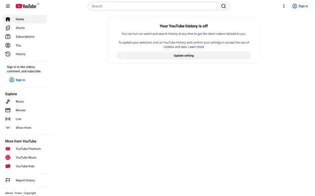
Preview image. Unlock full-res
Crisp White Canvas; an expansive, information-first interface on a stark white background with minimal ornamentation.
Color palette
Interactive elements like links, primary buttons, and active navigation indicators — this is the sole color accent used to highlight engagement points.
YouTube logo and specific brand elements, appearing sparingly.
Primary page and component backgrounds, creating a clean, expansive field for content.
Default text, primary icons, and border accents, providing high contrast against Canvas White.
Secondary text and less critical information, providing a subtle visual hierarchy.
Tertiary text and subtle distinctions in navigation, indicating less emphasis.
Input borders and subtle UI dividers, providing structural definition without visual noise.
Typography
- Weights
- 400, 500, 700, 900
- Sizes
- 10px, 12px, 13px, 14px, 16px
- Line height
- 1.2, 1.38, 1.43, 1.5, 2.57
- Letter spacing
- normal
- Fallback
- system-ui
Primary text font for body copy, links, general UI elements, and buttons. Its unobtrusive nature supports content focus.
- Weights
- 400
- Sizes
- 13px
- Line height
- 1.2
- Letter spacing
- normal
- Fallback
- Helvetica, sans-serif
Fallback font for specific UI elements and legacy components, ensuring broad compatibility.
- Weights
- 600
- Sizes
- 20px
- Line height
- 1.4
- Letter spacing
- normal
- Fallback
- Roboto, sans-serif
Used for section headings, providing a distinct brand voice through its semi-bold weight at a generous size.
Spacing & shape
Components
Text in Ink Black (#0f0f0f) using Roboto font, weight 400, size 14px. On hover, the background changes to a subtle grey. Active states are often marked with a background of rgba(0, 0, 0, 0.05).
Background is Canvas White (#ffffff), text in Ink Black (#0f0f0f). Border is thin, using Border Gray (#c6c6c6). Padding is 1px top/bottom, with subtle inner spacing. Border radius: 0px.
Background transparent (rgba(0,0,0,0)), text in Ink Black (#0f0f0f), Roboto font. No visible border. Padding: 0px.
Background rgba(0,0,0,0.05). Text Ink Black (#0f0f0f). Radius 18px. Uses 16px horizontal padding. Example: 'Sign in' button in the sidebar.
Canvas White (#ffffff) background with a light grey border of #eeeeee. Features rounded corners (radius 10px). Inner padding varies, commonly 16px.
Background is Canvas White (#ffffff). Text color is YouTube Red (#ff0033). Icon is also in YouTube Red. Used for specific YouTube services like 'YouTube Premium'.
Guidelines
- Use Canvas White (#ffffff) as the default background for all page sections and elevated components.
- Apply Ink Black (#0f0f0f) for all main headings, body text, and primary icons to ensure high contrast.
- Employ Accent Blue (#065fd4) exclusively for active states, clickable links, and primary calls to action.
- Maintain a clear visual hierarchy by utilizing Medium Gray (#606060) for secondary information and Light Gray (#909090) for tertiary details.
- Ensure all interactive buttons use a border-radius of 18px for a consistent soft, approachable shape.
- Adhere to Roboto weight 400 for standard body text and weight 600 for YouTube Sans for section headings.
- Use 16px horizontal padding within interactive buttons or elements like the 'Update setting' button.
- Avoid using multiple accent colors; confine brand emphasis strictly to Accent Blue (#065fd4) and YouTube Red (#ff0033) for branding only.
- Do not introduce complex shadows or gradients; prioritize a flat, clean aesthetic over dimensional effects.
- Refrain from using heavily saturated images or illustrations that compete with UI elements; opt for functional imagery.
- Do not deviate from the established type scale and font families; maintain consistency in text presentation.
- Avoid tight spacing; maintain `elementGap` of 8px and larger gaps for sections to ensure content breathability.
- Do not use dark backgrounds for main content areas; reserve them for specific, isolated components if necessary.
- Do not apply rounded corners indiscriminately; reserve radii like 18px for buttons and 10px for cards/dialogues.
About this system
ShowHide
The design prioritizes content delivery with a near-monochromatic palette and a spacious layout. A pure white background ( #ffffff) serves as a digital canvas, allowing black text (#0f0f0f) and a singular vivid blue (#065fd4) for interactive elements to carry all visual weight. Rounded corners (10px, 18px) provide subtle softness against an otherwise austere, functional aesthetic. The lack of decorative elements directs full attention to the video and community content.
The page adheres to a max-width 1185px centered content model. The hero section includes a sticky top navigation bar with a search input. A persistent left-hand sidebar acts as the primary navigation, featuring a hierarchical list of links and categories. Content areas are primarily full-width within the max-width container, with information generally stacked vertically or presented in a single, primary content column. There are no alternating background bands; the layout relies on a uniform Canvas White background to create a spacious, unbounded feeling. The design is information-dense in the main content area, with vertical sections separated by generous padding (sectionGap).
The site primarily uses functional icons and the brand's YouTube Red logo. Icons are line-based and filled, typically in black or gray, maintaining a minimalist, system-driven aesthetic. When imagery is present, it's typically video thumbnails – embedded content rather than decorative graphics. The visual language emphasizes direct content presentation over abstract visuals or elaborate photography, with illustrations being absent. Density is low, with imagery serving explanatory or embedded content roles.
Reminiscent of Google Search, Wikipedia, Spotify Web Player (Light Theme).
# YouTube — Style Reference
> Crisp White Canvas; an expansive, information-first interface on a stark white background with minimal ornamentation.

**Theme:** light

**Site:** https://youtube.com

The design prioritizes content delivery with a near-monochromatic palette and a spacious layout. A pure white background (
#ffffff) serves as a digital canvas, allowing black text (#0f0f0f) and a singular vivid blue (#065fd4) for interactive elements to carry all visual weight. Rounded corners (10px, 18px) provide subtle softness against an otherwise austere, functional aesthetic. The lack of decorative elements directs full attention to the video and community content.

## Tokens — Colors

| Name | Value | Token | Role |
|------|------|------|------|
| Accent Blue | `#065fd4` | `--color-accent-blue` | Interactive elements like links, primary buttons, and active navigation indicators — this is the sole color accent used to highlight engagement points. |
| YouTube Red | `#ff0033` | `--color-youtube-red` | YouTube logo and specific brand elements, appearing sparingly. |
| Canvas White | `#ffffff` | `--color-canvas-white` | Primary page and component backgrounds, creating a clean, expansive field for content. |
| Ink Black | `#0f0f0f` | `--color-ink-black` | Default text, primary icons, and border accents, providing high contrast against Canvas White. |
| Medium Gray | `#606060` | `--color-medium-gray` | Secondary text and less critical information, providing a subtle visual hierarchy. |
| Light Gray | `#909090` | `--color-light-gray` | Tertiary text and subtle distinctions in navigation, indicating less emphasis. |
| Border Gray | `#c6c6c6` | `--color-border-gray` | Input borders and subtle UI dividers, providing structural definition without visual noise. |

## Tokens — Typography

### Roboto
- **Substitute:** system-ui
- **Weights:** 400, 500, 700, 900
- **Sizes:** 10px, 12px, 13px, 14px, 16px
- **Line height:** 1.2, 1.38, 1.43, 1.5, 2.57
- **Letter spacing:** normal
- **Role:** Primary text font for body copy, links, general UI elements, and buttons. Its unobtrusive nature supports content focus.

### Arial
- **Substitute:** Helvetica, sans-serif
- **Weights:** 400
- **Sizes:** 13px
- **Line height:** 1.2
- **Letter spacing:** normal
- **Role:** Fallback font for specific UI elements and legacy components, ensuring broad compatibility.

### YouTube Sans
- **Substitute:** Roboto, sans-serif
- **Weights:** 600
- **Sizes:** 20px
- **Line height:** 1.4
- **Letter spacing:** normal
- **Role:** Used for section headings, providing a distinct brand voice through its semi-bold weight at a generous size.

## Tokens — Type Scale

Augmented Fourth (1.414) from 10px base.

| Role | Size | Line height | Letter spacing |
|------|------|------|------|
| caption | 10px | 1.5 | — |
| body-lg | 14px | 1.2 | — |
| heading | 20px | 1.4 | — |

## Tokens — Spacing

- **Max width:** 1185px
- **Section gap:** 48px
- **Card padding:** 16px
- **Element gap:** 8px

## Tokens — Radius

- **Default:** 10px
- **Buttons:** 18px
- **subtle:** 40px

## Layout

The page adheres to a max-width 1185px centered content model. The hero section includes a sticky top navigation bar with a search input. A persistent left-hand sidebar acts as the primary navigation, featuring a hierarchical list of links and categories. Content areas are primarily full-width within the max-width container, with information generally stacked vertically or presented in a single, primary content column. There are no alternating background bands; the layout relies on a uniform Canvas White background to create a spacious, unbounded feeling. The design is information-dense in the main content area, with vertical sections separated by generous padding (sectionGap).

## Imagery

The site primarily uses functional icons and the brand's YouTube Red logo. Icons are line-based and filled, typically in black or gray, maintaining a minimalist, system-driven aesthetic. When imagery is present, it's typically video thumbnails – embedded content rather than decorative graphics. The visual language emphasizes direct content presentation over abstract visuals or elaborate photography, with illustrations being absent. Density is low, with imagery serving explanatory or embedded content roles.

## Components

### History Off — Dialogue Card

### Sidebar Navigation — Explore Section

### Sign In Prompt — Sidebar Card

### Navigation Link
*Interactive element*

Text in Ink Black (#0f0f0f) using Roboto font, weight 400, size 14px. On hover, the background changes to a subtle grey. Active states are often marked with a background of rgba(0, 0, 0, 0.05).

### Search Input Field
*Data entry*

Background is Canvas White (#ffffff), text in Ink Black (#0f0f0f). Border is thin, using Border Gray (#c6c6c6). Padding is 1px top/bottom, with subtle inner spacing. Border radius: 0px.

### Standard Button (Text)
*Action trigger*

Background transparent (rgba(0,0,0,0)), text in Ink Black (#0f0f0f), Roboto font. No visible border. Padding: 0px.

### Rounded Action Button
*Primary action*

Background rgba(0,0,0,0.05). Text Ink Black (#0f0f0f). Radius 18px. Uses 16px horizontal padding. Example: 'Sign in' button in the sidebar.

### Dialogue Card
*Information display*

Canvas White (#ffffff) background with a light grey border of #eeeeee. Features rounded corners (radius 10px). Inner padding varies, commonly 16px.

### YouTube Red Indicator Button
*Brand-specific action*

Background is Canvas White (#ffffff). Text color is YouTube Red (#ff0033). Icon is also in YouTube Red. Used for specific YouTube services like 'YouTube Premium'.

## Guidelines

### Do

- Use Canvas White (#ffffff) as the default background for all page sections and elevated components.
- Apply Ink Black (#0f0f0f) for all main headings, body text, and primary icons to ensure high contrast.
- Employ Accent Blue (#065fd4) exclusively for active states, clickable links, and primary calls to action.
- Maintain a clear visual hierarchy by utilizing Medium Gray (#606060) for secondary information and Light Gray (#909090) for tertiary details.
- Ensure all interactive buttons use a border-radius of 18px for a consistent soft, approachable shape.
- Adhere to Roboto weight 400 for standard body text and weight 600 for YouTube Sans for section headings.
- Use 16px horizontal padding within interactive buttons or elements like the 'Update setting' button.

### Don't

- Avoid using multiple accent colors; confine brand emphasis strictly to Accent Blue (#065fd4) and YouTube Red (#ff0033) for branding only.
- Do not introduce complex shadows or gradients; prioritize a flat, clean aesthetic over dimensional effects.
- Refrain from using heavily saturated images or illustrations that compete with UI elements; opt for functional imagery.
- Do not deviate from the established type scale and font families; maintain consistency in text presentation.
- Avoid tight spacing; maintain `elementGap` of 8px and larger gaps for sections to ensure content breathability.
- Do not use dark backgrounds for main content areas; reserve them for specific, isolated components if necessary.
- Do not apply rounded corners indiscriminately; reserve radii like 18px for buttons and 10px for cards/dialogues.

## Agent Prompt Guide

**Quick Color Reference:**
- Text: #0f0f0f
- Background: #ffffff
- CTA: #065fd4
- Border: #c6c6c6
- Accent: #ff0033

**Example Component Prompts:**
1. Create a `Dialogue Card` with the heading 'Your YouTube history is off' (YouTube Sans, weight 600, size 20px, #0f0f0f), a body text description (Roboto, weight 400, size 14px, #0f0f0f), and a 'Learn more' link (Roboto, weight 400, size 14px, #065fd4). The card should have a #ffffff background, 10px radius, and a 1px #eeeeee border. Apply 16px padding on all sides.
2. Generate a `Rounded Action Button` with the text 'Update setting' (Roboto, weight 400, size 14px, #0f0f0f). The button should have a background of rgba(0,0,0,0.05), a border-radius of 18px, and 16px horizontal padding. Vertical padding should be 0px as per component variant.
3. Design a `Navigation Link` for 'Home' icon and text. Text color #0f0f0f, Roboto, weight 400, size 14px. On hover, background rgba(0,0,0,0.05). Use 12px vertical padding around the icon and text to align with active states.
More like this






Keep what you find
A free account saves references to boards and can send you a weekly email of picks based on what you save.
To see every result, go Pro.