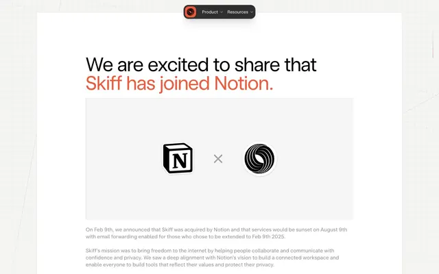
Preview image. Unlock full-res
Crisp digital canvas with energetic orange
Color palette
Headline accents, active states, decorative icons, and brand calls to attention
Primary text, icon fills, strong borders, dark overlay elements; Modal backgrounds, subtle overlay scrims. Note: uses rgba(0,0,0,.1); Slightly lighter modal backgrounds or overlay scrims. Note: uses rgba(0,0,0,.08); Very faint overlay for subtle elevation or hover states. Note: uses rgba(0,0,0,.04)
Secondary text, muted backgrounds for subtle contrast
Decorative borders not intended for high contrast
Helper text, captions, secondary information
Hairline separators, subtle strokes, table borders
Soft icon strokes, subtle dividers, and low-emphasis decorative details. Do not promote it to the primary CTA color
Page background, card surfaces, default UI element fills
Typography
- Weights
- 380, 400
- Sizes
- 14px, 16px
- Line height
- 1.35, 1.5
- Letter spacing
- -0.0100em
- Fallback
- Georgia
General body text and interface elements where readability is paramount. Its classic nature provides a counterpoint to the custom sans-serif.
- Weights
- 380
- Sizes
- 14px, 15px, 17px
- Line height
- 1.3, 1.35, 1.5
- Letter spacing
- -0.0100em, -0.0050em
- Fallback
- Inter
Compact body text and descriptive UI labels. Its custom design provides brand personality at smaller scales.
- Weights
- 380
- Sizes
- 13px
- Line height
- 1.5
- Letter spacing
- normal
- Fallback
- JetBrains Mono
Code snippets, data displays, or specialized information ensuring precise alignment and distinct character forms.
- Weights
- 380
- Sizes
- 64px
- Line height
- 0.95
- Letter spacing
- -0.0100em
- Fallback
- Inter Display
Hero headlines and impactful statements. The light weight and tight letter-spacing create a refined, impactful presence without being heavy.
Spacing & shape
Components
Uses Skiff Sans Text, 16px, weight 380, Pitch Black text. On hover or active, underline with Border Light and change text color to Brand Orange.
Subtle dark overlay container (rgba(0,0,0,.08)) with 12px border radius. Menu items are Pitch Black text on Canvas White backgrounds, 14px Skiff Sans Text.
Mixed typography: initial text Pitch Black, 64px Skiff Sans Display weight 380; emphasized words Brand Orange, 64px Skiff Sans Display weight 380. Line height 0.95.
Times 16px weight 400, Pitch Black text for primary content. Muted Text for secondary or explanatory notes.
Canvas White background with a Border Light 1px solid border. Padding 40px top/bottom and 160px left/right. 4px subtle border radius maintains crispness.
Dark Gray background with Canvas White text, 14px Times. Characterized by a 36px border radius, creating a distinct pill shape.
Guidelines
- Prioritize Canvas White (#ffffff) for page backgrounds and primary content surfaces.
- Use Pitch Black (#000000) for all primary text and critical UI elements to ensure high contrast.
- Apply Brand Orange (#ef5a3c) sparingly as a functional accent for active states, key data points, and brand communication.
- Ensure all interactive elements have a visible Border Light (#dfdfdf) border or a subtle dark overlay (rgba(0,0,0,.08)) for definition.
- Employ Skiff Sans Display at 64px, weight 380, with a negative letter-spacing of -0.0100em for all main page headlines.
- Maintain a comfortable density with an 8px elementGap and 48px sectionGap for clear content separation.
- Use 4px border-radius for subtle component rounding, 12px or 16px for cards, and 36px for distinct pill shapes.
- Avoid using multiple chromatic colors; limit the accent palette strictly to variations of Brand Orange.
- Do not introduce heavy shadows or complex gradients unless explicitly defined in component specifications.
- Do not use typography weights heavier than 400; the system relies on lighter weights for a modern, understated aesthetic.
- Do not deviate from the established spacing scale (multiples of 4px) to retain consistent rhythm and density.
- Do not use highly saturated photography; imagery should be clean, focused, or abstract to complement the UI.
- Do not use any blue as an accent or primary color, as it would conflict with the brand's orange identity.
- Do not use default browser link styling; all links should use Pitch Black text and Brand Orange on hover or active.
About this system
ShowHide
Skiff adopts a crisp, functional aesthetic with a dominant light theme and a single vibrant orange as its brand accent. The design leans into distinct typographic contrasts using a custom sans-serif display font for impactful headlines and system fonts for readability in body text. UI elements are sharp and precise, avoiding heavy shadows or elaborate gradients, focusing instead on clear boundaries and ample negative space. The overall impression is one of modern utility with a hint of warm, energetic personality.
The page structure is primarily content-contained with no explicit `pageMaxWidth` suggesting a flexible, fluid-width approach, although content appears centered. The hero section features a prominent, often accented, headline. Sections are defined by consistent vertical spacing with ample padding, creating a comfortable density. Element layout is typically centered within content blocks or laid out side-by-side. Layout is generally linear and stacked, without complex grid systems or overlapping elements.
This design system primarily relies on icons and simple graphic elements. Where imagery is present for brand logos, it is simple, monochromatic (black on white), and contained within defined spaces. There is no large-scale photography or complex illustrations. Iconography is filled, in Pitch Black. The overall density of imagery is low, with text dominating the content areas.
Reminiscent of Notion, Linear, Superhuman, Figma.
# skiff.com — Style Reference
> Crisp digital canvas with energetic orange

**Theme:** light

**Site:** https://skiff.com

Skiff adopts a crisp, functional aesthetic with a dominant light theme and a single vibrant orange as its brand accent. The design leans into distinct typographic contrasts using a custom sans-serif display font for impactful headlines and system fonts for readability in body text. UI elements are sharp and precise, avoiding heavy shadows or elaborate gradients, focusing instead on clear boundaries and ample negative space. The overall impression is one of modern utility with a hint of warm, energetic personality.

## Tokens — Colors

| Name | Value | Token | Role |
|------|------|------|------|
| Brand Orange | `#ef5a3c` | `--color-brand-orange` | Headline accents, active states, decorative icons, and brand calls to attention |
| Pitch Black | `#000000` | `--color-pitch-black` | Primary text, icon fills, strong borders, dark overlay elements; Modal backgrounds, subtle overlay scrims. Note: uses rgba(0,0,0,.1); Slightly lighter modal backgrounds or overlay scrims. Note: uses rgba(0,0,0,.08); Very faint overlay for subtle elevation or hover states. Note: uses rgba(0,0,0,.04) |
| Deep Gray | `#303030` | `--color-deep-gray` | Secondary text, muted backgrounds for subtle contrast |
| Medium Gray | `#505050` | `--color-medium-gray` | Decorative borders not intended for high contrast |
| Muted Text | `#8f8f8f` | `--color-muted-text` | Helper text, captions, secondary information |
| Divider Gray | `#d6d6d6` | `--color-divider-gray` | Hairline separators, subtle strokes, table borders |
| Border Light | `#dfdfdf` | `--color-border-light` | Soft icon strokes, subtle dividers, and low-emphasis decorative details. Do not promote it to the primary CTA color |
| Canvas White | `#ffffff` | `--color-canvas-white` | Page background, card surfaces, default UI element fills |

## Tokens — Typography

### Times
- **Substitute:** Georgia
- **Weights:** 380, 400
- **Sizes:** 14px, 16px
- **Line height:** 1.35, 1.5
- **Letter spacing:** -0.0100em
- **Role:** General body text and interface elements where readability is paramount. Its classic nature provides a counterpoint to the custom sans-serif.

### Skiff Sans Text
- **Substitute:** Inter
- **Weights:** 380
- **Sizes:** 14px, 15px, 17px
- **Line height:** 1.3, 1.35, 1.5
- **Letter spacing:** -0.0100em, -0.0050em
- **Role:** Compact body text and descriptive UI labels. Its custom design provides brand personality at smaller scales.

### Skiff Mono
- **Substitute:** JetBrains Mono
- **Weights:** 380
- **Sizes:** 13px
- **Line height:** 1.5
- **Letter spacing:** normal
- **Role:** Code snippets, data displays, or specialized information ensuring precise alignment and distinct character forms.

### Skiff Sans Display
- **Substitute:** Inter Display
- **Weights:** 380
- **Sizes:** 64px
- **Line height:** 0.95
- **Letter spacing:** -0.0100em
- **Role:** Hero headlines and impactful statements. The light weight and tight letter-spacing create a refined, impactful presence without being heavy.

## Tokens — Type Scale

| Role | Size | Line height | Letter spacing |
|------|------|------|------|
| body-sm | 14px | 1.35 | -0.14px |
| body | 16px | 1.5 | -0.16px |
| display | 64px | 0.95 | -0.64px |

## Tokens — Spacing

- **Section gap:** 48px
- **Card padding:** 28px
- **Element gap:** 8px

## Tokens — Radius

- **lg:** 16px
- **md:** 12px
- **pill:** 36px
- **sm:** 4px

## Layout

The page structure is primarily content-contained with no explicit `pageMaxWidth` suggesting a flexible, fluid-width approach, although content appears centered. The hero section features a prominent, often accented, headline. Sections are defined by consistent vertical spacing with ample padding, creating a comfortable density. Element layout is typically centered within content blocks or laid out side-by-side. Layout is generally linear and stacked, without complex grid systems or overlapping elements.

## Imagery

This design system primarily relies on icons and simple graphic elements. Where imagery is present for brand logos, it is simple, monochromatic (black on white), and contained within defined spaces. There is no large-scale photography or complex illustrations. Iconography is filled, in Pitch Black. The overall density of imagery is low, with text dominating the content areas.

## Components

### Navigation Menu Item
*Interactive menu item for top navigation or secondary links.*

Uses Skiff Sans Text, 16px, weight 380, Pitch Black text. On hover or active, underline with Border Light and change text color to Brand Orange.

### Top Navigation Dropdown
*Contextual menu for product or resource groups.*

Subtle dark overlay container (rgba(0,0,0,.08)) with 12px border radius. Menu items are Pitch Black text on Canvas White backgrounds, 14px Skiff Sans Text.

### Accent Headline
*Primary headings with brand emphasis.*

Mixed typography: initial text Pitch Black, 64px Skiff Sans Display weight 380; emphasized words Brand Orange, 64px Skiff Sans Display weight 380. Line height 0.95.

### Body Text Block
*Standard paragraph content and descriptive rich text.*

Times 16px weight 400, Pitch Black text for primary content. Muted Text for secondary or explanatory notes.

### Informational Section Card
*Container for showcasing key information or logos.*

Canvas White background with a Border Light 1px solid border. Padding 40px top/bottom and 160px left/right. 4px subtle border radius maintains crispness.

### Pill Tag
*Small, semantic labels or interactive filters.*

Dark Gray background with Canvas White text, 14px Times. Characterized by a 36px border radius, creating a distinct pill shape.

## Guidelines

### Do

- Prioritize Canvas White (#ffffff) for page backgrounds and primary content surfaces.
- Use Pitch Black (#000000) for all primary text and critical UI elements to ensure high contrast.
- Apply Brand Orange (#ef5a3c) sparingly as a functional accent for active states, key data points, and brand communication.
- Ensure all interactive elements have a visible Border Light (#dfdfdf) border or a subtle dark overlay (rgba(0,0,0,.08)) for definition.
- Employ Skiff Sans Display at 64px, weight 380, with a negative letter-spacing of -0.0100em for all main page headlines.
- Maintain a comfortable density with an 8px elementGap and 48px sectionGap for clear content separation.
- Use 4px border-radius for subtle component rounding, 12px or 16px for cards, and 36px for distinct pill shapes.

### Don't

- Avoid using multiple chromatic colors; limit the accent palette strictly to variations of Brand Orange.
- Do not introduce heavy shadows or complex gradients unless explicitly defined in component specifications.
- Do not use typography weights heavier than 400; the system relies on lighter weights for a modern, understated aesthetic.
- Do not deviate from the established spacing scale (multiples of 4px) to retain consistent rhythm and density.
- Do not use highly saturated photography; imagery should be clean, focused, or abstract to complement the UI.
- Do not use any blue as an accent or primary color, as it would conflict with the brand's orange identity.
- Do not use default browser link styling; all links should use Pitch Black text and Brand Orange on hover or active.

## Agent Prompt Guide

Quick Color Reference:
- text: #000000
- background: #ffffff
- border: #dfdfdf
- accent: #ef5a3c
- primary action: no distinct CTA color

Example Component Prompts:
- Create a section headline: 'We are excited to share that Skiff has joined Notion.' where 'Skiff has joined Notion.' is Brand Orange (#ef5a3c) and the rest is Pitch Black (#000000). Use Skiff Sans Display at 64px weight 380, line-height 0.95, letter-spacing -0.0100em.
- Create a standard body paragraph: 'On Feb 9th, we announced that Skiff was acquired by Notion and services would be sunset...'. Use Times at 16px weight 400, Pitch Black (#000000) text.
- Create a top navigation dropdown menu: Background with rgba(0,0,0,.08) and 12px border radius. Include two items: 'Product' and 'Resources', both using Skiff Sans Text 14px weight 380, Pitch Black (#000000) text. Separate items with a Divider Gray (#d6d6d6) hairline border. Each item should have 12px horizontal padding.
- Create an informational card: Canvas White (#ffffff) background, 1px Border Light (#dfdfdf) border, 4px border radius. Internally, have 40px vertical padding and 160px horizontal padding.
More like this









Keep what you find
A free account saves references to boards and can send you a weekly email of picks based on what you save.
To see every result, go Pro.