Preview image. Unlock full-res
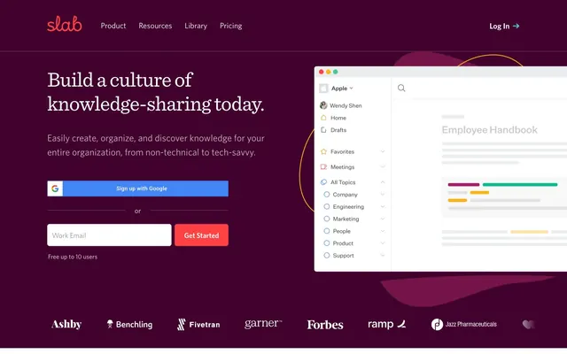
Warm knowledge hub behind a berry curtain. The UI feels like an organized library where key information is highlighted by vibrant accents.
Color palette
Primary call-to-action buttons, indicating immediate action.
Secondary call-to-action buttons (e.g., Google sign-up), providing an alternative interactive color.
Decorative accents in illustrations, adding a fresh, complementary touch.
Decorative accents in illustrations.
Decorative accents in illustrations.
Decorative accents in illustrations.
Page backgrounds, card surfaces, primary text on dark backgrounds.
Primary body text, input borders, drawing attention through high contrast.
Secondary text, icons, borders, providing robust readability without harshness.
Tertiary text, subtle borders, inactive elements, providing visual breathing room.
Subtle dividers and borders, adding structural definition.
Subtle background shifts for content blocks.
Typography
- Weights
- 400, 500, 600, 700
- Sizes
- 12px, 16px, 18px, 20px, 24px
- Line height
- 1.15, 1.2, 1.33, 1.5, 1.6, 1.67, 1.75
- Letter spacing
- 0.2, 0.27, 0.3, 0.33, 0.4
- Fallback
- Inter
Used for body text, interface elements, and secondary headings. Its consistent slightly tracked letter-spacing at all sizes provides a refined, open feel across the UI.
- Weights
- 300, 400
- Sizes
- 16px, 42px, 53px
- Line height
- 1, 1.14, 1.24
- Letter spacing
- -0.3, -0.8, -1
- Fallback
- Merriweather
Signature display font for headlines. The combination of its serifs and significantly negative letter-spacing for larger sizes gives a distinctive, compact, and elegant appearance, setting them apart from standard web typography.
Spacing & shape
Components
Filled button with Slab Red (#ff4143) background and Crisp White (#ffffff) text. Features 6px border-radius, 16px vertical padding, 24px horizontal padding. Uses Whitney font at appropriate weight.
Filled button with Slab Blue (#4285f4) background and Crisp White (#ffffff) text. Features 2px border-radius. Uses Whitney font.
Transparent background with Slate Gray (#455360) text and a 1px border of the same color. Features 6px border-radius. Padding is implicit for link-style buttons.
Transparent background with Ash Gray (#939598) text and no border or radius. Padding is zero, appearing as pure text.
Crisp White (#ffffff) background with Near Black (#000000) text and a 1px border of Near Black (#000000). Features 6px border-radius and 12px horizontal padding. Uses Whitney font.
Transparent background with Ash Gray (#939598) text, no border or radius, and zero padding. Used for subtle labeling.
Guidelines
- Use Whitney for all body text, UI elements, and secondary headings, ensuring slightly tracked letter-spacing.
- Apply Sentinel with significant negative letter-spacing for all primary headlines (display and display-sm) to achieve a compact, elegant look.
- Prioritize Slab Red (#ff4143) for primary call-to-action buttons, reserving Slab Blue (#4285f4) for specific integration buttons like 'Sign up with Google'.
- Implement 6px border-radius consistently for all buttons and input fields to maintain a soft, unified aesthetic.
- Offset sections with varying background colors like Berry Ink (#42022e) and Crisp White (#ffffff) to create clear visual separation.
- Utilize a baseline of 16px as the primary body text size with a line-height of 1.5, establishing comfortable readability.
- Employ the neutral progression of Near Black (#000000) for primary text, Slate Gray (#455360) for secondary, and Ash Gray (#939598) for tertiary information.
- Do not use generic, default blue for links; instead, use Slate Gray (#455360) for text links and Slab Red (#ff4143) or Slab Blue (#4285f4) for button interactions.
- Avoid excessive shadow or elevation; rely on color and spacing to create depth and hierarchy.
- Do not vary border-radius indiscriminately; stick to 6px for interactive elements and inputs.
- Keep headlines concise, leveraging the Sentinel typeface's distinct character to command attention without excessive length.
- Refrain from introducing new vivid colors outside the defined brand and accent palette to maintain visual clarity.
- Do not use plain, linear text blocks for feature descriptions; integrate relevant imagery or icons alongside text to enhance comprehension.
About this system
ShowHide
Slab's design system feels like a warm, engaging knowledge hub, balancing a serious intent with inviting visual cues. The predominant use of varied neutrals provides clarity and structure, offset by a rich, deep berry background in the hero, creating an immediate sense of depth and distinction. Strategic pops of vivid red and blue for CTAs act as clear beacons against the otherwise subdued palette. Custom fonts with precise letter-spacing contribute to a distinguished readability, ensuring information feels approachable yet authoritative.
The page alternates between a full-bleed, deep berry hero section with centered content and contained white sections. The hero features a large, centered headline and subtext, flanked by form elements. Subsequent sections typically employ a two-column layout, alternating between image-left/text-right and text-left/image-right, creating a rhythmic visual flow. Content blocks within these sections are usually stacked vertically. There's a consistent vertical spacing between major sections, contributing to a spacious feel. The maximum content width appears to be constrained within a comfortable reading measure, ensuring readability without being overly narrow. The navigation is a sticky top bar.
The visual language primarily uses product screenshots and abstract, geometric illustrations. Product screenshots are contained within a clean device-like frame, often showcasing UI elements with color highlights. Illustrations are flat, abstract shapes in a muted brand palette of blues, greens, oranges, and purples, sometimes overlapping or featuring organic, blob-like contours. These serve a decorative and explanatory role, indicating concepts like collaboration or organization. Icons are filled and monochrome, matching the Slate Gray text. The density is moderate, with images playing a crucial supporting role to text, breaking up content without overwhelming it.
Reminiscent of Notion, Coda, Confluence, Asana.
# Slab — Style Reference
> Warm knowledge hub behind a berry curtain. The UI feels like an organized library where key information is highlighted by vibrant accents.

**Theme:** mixed

**Site:** https://slab.com

Slab's design system feels like a warm, engaging knowledge hub, balancing a serious intent with inviting visual cues. The predominant use of varied neutrals provides clarity and structure, offset by a rich, deep berry background in the hero, creating an immediate sense of depth and distinction. Strategic pops of vivid red and blue for CTAs act as clear beacons against the otherwise subdued palette. Custom fonts with precise letter-spacing contribute to a distinguished readability, ensuring information feels approachable yet authoritative.

## Tokens — Colors

| Name | Value | Token | Role |
|------|------|------|------|
| Slab Red | `#ff4143` | `--color-slab-red` | Primary call-to-action buttons, indicating immediate action. |
| Slab Blue | `#4285f4` | `--color-slab-blue` | Secondary call-to-action buttons (e.g., Google sign-up), providing an alternative interactive color. |
| Muted Cyan | `#00d5a0` | `--color-muted-cyan` | Decorative accents in illustrations, adding a fresh, complementary touch. |
| Muted Violet | `#253858` | `--color-muted-violet` | Decorative accents in illustrations. |
| Vivid Blue | `#0061ff` | `--color-vivid-blue` | Decorative accents in illustrations. |
| Sky Blue | `#50c5dc` | `--color-sky-blue` | Decorative accents in illustrations. |
| Crisp White | `#ffffff` | `--color-crisp-white` | Page backgrounds, card surfaces, primary text on dark backgrounds. |
| Near Black | `#000000` | `--color-near-black` | Primary body text, input borders, drawing attention through high contrast. |
| Slate Gray | `#455360` | `--color-slate-gray` | Secondary text, icons, borders, providing robust readability without harshness. |
| Ash Gray | `#939598` | `--color-ash-gray` | Tertiary text, subtle borders, inactive elements, providing visual breathing room. |
| Border Gray | `#e0e0e0` | `--color-border-gray` | Subtle dividers and borders, adding structural definition. |
| Off White | `#f1f1f1` | `--color-off-white` | Subtle background shifts for content blocks. |

## Tokens — Typography

### Whitney
- **Substitute:** Inter
- **Weights:** 400, 500, 600, 700
- **Sizes:** 12px, 16px, 18px, 20px, 24px
- **Line height:** 1.15, 1.2, 1.33, 1.5, 1.6, 1.67, 1.75
- **Letter spacing:** 0.2, 0.27, 0.3, 0.33, 0.4
- **Role:** Used for body text, interface elements, and secondary headings. Its consistent slightly tracked letter-spacing at all sizes provides a refined, open feel across the UI.

### Sentinel
- **Substitute:** Merriweather
- **Weights:** 300, 400
- **Sizes:** 16px, 42px, 53px
- **Line height:** 1, 1.14, 1.24
- **Letter spacing:** -0.3, -0.8, -1
- **Role:** Signature display font for headlines. The combination of its serifs and significantly negative letter-spacing for larger sizes gives a distinctive, compact, and elegant appearance, setting them apart from standard web typography.

## Tokens — Type Scale

Major Third (1.25) from 16px base.

| Role | Size | Line height | Letter spacing |
|------|------|------|------|
| body | 16px | 1.5 | 0.27px |
| subheading | 18px | 1.6 | 0.3px |
| heading-sm | 20px | 1.33 | 0.33px |
| heading | 24px | 1.2 | 0.4px |
| display-sm | 42px | 1.14 | -0.8px |
| display | 53px | 1 | -1px |

## Tokens — Spacing

- **Section gap:** 40-64px
- **Card padding:** 24-40px
- **Element gap:** 8-24px

## Tokens — Radius

- **Buttons:** 6px
- **Inputs:** 6px
- **Cards:** 6px

## Layout

The page alternates between a full-bleed, deep berry hero section with centered content and contained white sections. The hero features a large, centered headline and subtext, flanked by form elements. Subsequent sections typically employ a two-column layout, alternating between image-left/text-right and text-left/image-right, creating a rhythmic visual flow. Content blocks within these sections are usually stacked vertically. There's a consistent vertical spacing between major sections, contributing to a spacious feel. The maximum content width appears to be constrained within a comfortable reading measure, ensuring readability without being overly narrow. The navigation is a sticky top bar.

## Imagery

The visual language primarily uses product screenshots and abstract, geometric illustrations. Product screenshots are contained within a clean device-like frame, often showcasing UI elements with color highlights. Illustrations are flat, abstract shapes in a muted brand palette of blues, greens, oranges, and purples, sometimes overlapping or featuring organic, blob-like contours. These serve a decorative and explanatory role, indicating concepts like collaboration or organization. Icons are filled and monochrome, matching the Slate Gray text. The density is moderate, with images playing a crucial supporting role to text, breaking up content without overwhelming it.

## Components

### Sign-up Form Block

### Feature Section — Create

### Organize Feature Card

### Primary Action Button
*Call to action*

Filled button with Slab Red (#ff4143) background and Crisp White (#ffffff) text. Features 6px border-radius, 16px vertical padding, 24px horizontal padding. Uses Whitney font at appropriate weight.

### Google Sign-up Button
*Social login*

Filled button with Slab Blue (#4285f4) background and Crisp White (#ffffff) text. Features 2px border-radius. Uses Whitney font.

### Ghost Button
*Secondary action*

Transparent background with Slate Gray (#455360) text and a 1px border of the same color. Features 6px border-radius. Padding is implicit for link-style buttons.

### Minimal Link Button
*Tertiary action/text link*

Transparent background with Ash Gray (#939598) text and no border or radius. Padding is zero, appearing as pure text.

### Text Input Field
*Data entry*

Crisp White (#ffffff) background with Near Black (#000000) text and a 1px border of Near Black (#000000). Features 6px border-radius and 12px horizontal padding. Uses Whitney font.

### Ghost Badge
*Informational label*

Transparent background with Ash Gray (#939598) text, no border or radius, and zero padding. Used for subtle labeling.

## Guidelines

### Do

- Use Whitney for all body text, UI elements, and secondary headings, ensuring slightly tracked letter-spacing.
- Apply Sentinel with significant negative letter-spacing for all primary headlines (display and display-sm) to achieve a compact, elegant look.
- Prioritize Slab Red (#ff4143) for primary call-to-action buttons, reserving Slab Blue (#4285f4) for specific integration buttons like 'Sign up with Google'.
- Implement 6px border-radius consistently for all buttons and input fields to maintain a soft, unified aesthetic.
- Offset sections with varying background colors like Berry Ink (#42022e) and Crisp White (#ffffff) to create clear visual separation.
- Utilize a baseline of 16px as the primary body text size with a line-height of 1.5, establishing comfortable readability.
- Employ the neutral progression of Near Black (#000000) for primary text, Slate Gray (#455360) for secondary, and Ash Gray (#939598) for tertiary information.

### Don't

- Do not use generic, default blue for links; instead, use Slate Gray (#455360) for text links and Slab Red (#ff4143) or Slab Blue (#4285f4) for button interactions.
- Avoid excessive shadow or elevation; rely on color and spacing to create depth and hierarchy.
- Do not vary border-radius indiscriminately; stick to 6px for interactive elements and inputs.
- Keep headlines concise, leveraging the Sentinel typeface's distinct character to command attention without excessive length.
- Refrain from introducing new vivid colors outside the defined brand and accent palette to maintain visual clarity.
- Do not use plain, linear text blocks for feature descriptions; integrate relevant imagery or icons alongside text to enhance comprehension.

## Agent Prompt Guide

### Quick Color Reference
- Text (primary): #000000
- Text (secondary): #455360
- Background (light): #ffffff
- Background (dark): #42022e
- CTA (primary): #ff4143
- CTA (secondary): #4285f4
- Border: #000000

### 3-5 Example Component Prompts
1. Create a hero section: background is linear-gradient(90deg, rgb(66, 2, 46), rgba(0, 0, 0, 0)) fading to solid #42022e. Centered headline 'Build a culture of knowledge-sharing today.' using Sentinel weight 300, 53px, #ffffff, letter-spacing -1.0px. Subtext below in Whitney weight 400, 18px, #ffffff, line-height 1.6. Include a primary action button 'Get Started' with background #ff4143, text #ffffff, 6px radius, 16px 24px padding. Below that a text input field for 'Work Email' with background #ffffff, border #000000, 6px radius, 12px horizontal padding.
2. Design a feature block: white background. Headline 'Create content that looks good by default.' in Sentinel font weight 300, 42px, #455360, letter-spacing -0.8px. Body text in Whitney weight 400, 16px, #455360, line-height 1.5. Place a subtle border of #e0e0e0 around the section. Ensure padding of 40px left/right and 32px top/bottom.
3. Implement a 'Sign up with Google' button: background #4285f4, text #ffffff, 2px radius, with the Google 'G' icon preceding the text. The button size for padding should be auto-calculated to fit the provided content appropriately, similar to a standard service login button, without explicit 0px padding in effect.
More like this









Keep what you find
A free account saves references to boards and can send you a weekly email of picks based on what you save.
To see every result, go Pro.