Preview image. Unlock full-res
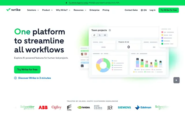
Organized Digital Workspace — like well-lit, interactive blueprints on a high-resolution display.
Color palette
Primary Call-to-Action buttons, active indicators, brand highlights. This vivid green is the primary brand accent, conveying energy and action.
Prominent brand elements, hero sections (bottom section). This multi-stage green gradient is a critical brand visual, hinting at depth and dynamism.
Interactive elements like links, selected states, and icon accents. A clear, cool blue for actionable items.
Primary text, prominent headings, button text on light backgrounds, dark footer background elements. The core dark neutral.
Page background, card backgrounds, text on dark interactive elements. Provides clean, open space.
Secondary background for sections and cards, button backgrounds. Adds visual texture without strong contrast.
Secondary text, descriptive body copy, card headings. A slightly warmer, muted dark for informational density.
Tertiary text, subtle borders, inactive elements. Soft, cool gray for less hierarchical information.
Divider lines, subtle shadows, UI elements borders. A very light, cool gray for structural definition.
Typography
- Weights
- 400, 600, 700
- Sizes
- 12px, 13px, 14px, 16px, 18px, 20px, 24px, 32px, 48px, 64px
- Line height
- 1.1, 1.2, 1.25, 1.3, 1.38, 1.4, 1.5, 1.6, 2
- Letter spacing
- -0.48px at 48px, -0.64px at 64px, etc.
- Fallback
- Inter
Primary typeface for all UI elements, headings, body text, and interactive components. The variable weights and specific OpenType features allow for precise typographic control and a consistent brand voice across all sizes.
Spacing & shape
Components
Transparent background with 'Midnight Graphite' text, '#162136', and a thin 'Midnight Graphite' border. Rounded corners at 4px. Padding 3px vertical, 10px horizontal.
Transparent background with black text, '#000000', and a thin black border. Pill shape with 24px radius. No specific vertical padding, 0px horizontal.
'Subtle Gray' background, '#f2f5fa', with browser default link blue text '#0000ee'. Pill shape with 40px radius. No specific vertical padding, 32px horizontal. This likely represents an active state or a login button.
'Cloud White' background, '#ffffff', with 'Midnight Graphite' text, '#162136'. Input has a 'Midnight Graphite' border and 0px radius. Padding 22px top, 2px bottom, 20px left.
Transparent background, 'Cloud White' text, '#ffffff', and a 'Midnight Graphite' border, '#162136'. 0px radius. Padding 22px top, 2px bottom, 20px left. Placeholder text seems to be 'Slate Indigo' #2b3a57.
Guidelines
- Use TT Norms Pro for all text, applying specific weights (400, 600, 700) from the typography scale according to role.
- Prioritize 'Wrike Green' (#00e05c) for all primary calls-to-action to maximize brand recognition and user engagement.
- Apply 20px border radius for all content cards to maintain a soft yet structured appearance.
- Maintain a clear visual hierarchy by limiting shadows to '#162136' text and navigation elements, using `rgba(24, 31, 56, 0.25) 0px 25px 45px -45px`.
- Utilize 'Subtle Gray' (#f2f5fa) for secondary backgrounds and minor interactive elements, creating light contrast without harshness.
- Incorporate the 'Deep Space Gradient' where significant brand emphasis is required, such as hero sections or key promotional areas.
- Ensure input fields have a solid 'Midnight Graphite' border (#162136) to clearly delineate interactive areas.
- Do not introduce additional bold or semibold weights beyond TT Norms Pro 600 or 700 within body text contexts.
- Avoid using bright, high-saturation colors other than 'Wrike Green' (#00e05c) for interactive elements to prevent visual clutter.
- Do not apply `box-shadow` effects to standard content cards; their elevation is managed by background color distinction.
- Refrain from using sharp, 0px radius corners on buttons; maintain a minimum of 4px radius for all interactive buttons.
- Do not use dark text colors on dark backgrounds without sufficient contrast; ensure a ratio of at least 16:1 for accessibility, generally 'Cloud White' (#ffffff) on 'Midnight Graphite' (#162136).
About this system
ShowHide
This system projects an image of digital precision and intelligent organization. It uses a restrained palette of muted blues and grays, punctuated by a vibrant, almost neon, green used sparingly for active elements. The overall impression is one of approachable authority, where clarity and structured information presentation are prioritized. Slightly rounded corners on cards and buttons soften the otherwise crisp, modern aesthetic of system-like interfaces.
The page maintains a centered max-width of 1220px for primary content, set against a full-width background. The hero section is a split layout: prominent headline on the left and a detailed product UI illustration composed of layered elements on the right. Section rhythms are defined by alternating background colors (Cloud White and Subtle Gray) and are separated by a consistent '64px' section gap. Content is often arranged in symmetrical two-column layouts featuring text and imagery/cards. A three-column card grid is used for displaying features. The footer utilizes a dark background with white text and features a more complex grid for links. The header is a sticky top bar containing the brand logo, navigation, and primary CTAs.
This site features a mixture of abstract product graphics and tightly cropped, clean product screenshots with UI overlays. The graphics often integrate the brand's vibrant green, using geometric shapes and subtle gradients to imply data flow and connectivity. Photography, when present, consists of professional, staged and slightly desaturated shots of individuals utilizing computers in a work context, often with blurred backgrounds, serving to humanize the technical aspect. Icons are primarily outlined, monochrome using 'Midnight Graphite' or 'System Blue', with a consistent stroke weight. The overall role of imagery is to explain and reinforce the product's capabilities in a highly organized and polished manner, balancing visual interest with informational clarity.
Reminiscent of Asana, Monday.com, ClickUp, Jira.
# Wrike — Style Reference
> Organized Digital Workspace — like well-lit, interactive blueprints on a high-resolution display.

**Theme:** light

**Site:** https://wrike.com

This system projects an image of digital precision and intelligent organization. It uses a restrained palette of muted blues and grays, punctuated by a vibrant, almost neon, green used sparingly for active elements. The overall impression is one of approachable authority, where clarity and structured information presentation are prioritized. Slightly rounded corners on cards and buttons soften the otherwise crisp, modern aesthetic of system-like interfaces.

## Tokens — Colors

| Name | Value | Token | Role |
|------|------|------|------|
| Wrike Green | `#00e05c` | `--color-wrike-green` | Primary Call-to-Action buttons, active indicators, brand highlights. This vivid green is the primary brand accent, conveying energy and action. |
| Deep Space Gradient | `#00b259` | `--color-deep-space-gradient` | Prominent brand elements, hero sections (bottom section). This multi-stage green gradient is a critical brand visual, hinting at depth and dynamism. |
| System Blue | `#0073d3` | `--color-system-blue` | Interactive elements like links, selected states, and icon accents. A clear, cool blue for actionable items. |
| Midnight Graphite | `#162136` | `--color-midnight-graphite` | Primary text, prominent headings, button text on light backgrounds, dark footer background elements. The core dark neutral. |
| Cloud White | `#ffffff` | `--color-cloud-white` | Page background, card backgrounds, text on dark interactive elements. Provides clean, open space. |
| Subtle Gray | `#f2f5fa` | `--color-subtle-gray` | Secondary background for sections and cards, button backgrounds. Adds visual texture without strong contrast. |
| Slate Indigo | `#2b3a57` | `--color-slate-indigo` | Secondary text, descriptive body copy, card headings. A slightly warmer, muted dark for informational density. |
| Ash Gray | `#657694` | `--color-ash-gray` | Tertiary text, subtle borders, inactive elements. Soft, cool gray for less hierarchical information. |
| Light Cloud | `#c1c9d8` | `--color-light-cloud` | Divider lines, subtle shadows, UI elements borders. A very light, cool gray for structural definition. |

## Tokens — Typography

### TT Norms Pro
- **Substitute:** Inter
- **Weights:** 400, 600, 700
- **Sizes:** 12px, 13px, 14px, 16px, 18px, 20px, 24px, 32px, 48px, 64px
- **Line height:** 1.1, 1.2, 1.25, 1.3, 1.38, 1.4, 1.5, 1.6, 2
- **Letter spacing:** -0.48px at 48px, -0.64px at 64px, etc.
- **Role:** Primary typeface for all UI elements, headings, body text, and interactive components. The variable weights and specific OpenType features allow for precise typographic control and a consistent brand voice across all sizes.

## Tokens — Type Scale

Major Third (1.25) from 16px base.

| Role | Size | Line height | Letter spacing |
|------|------|------|------|
| caption | 12px | 1.5 | — |
| body | 16px | 1.5 | — |
| body-lg | 18px | 1.4 | — |
| subheading | 20px | 1.25 | — |
| heading | 24px | 1.2 | — |
| heading-lg | 32px | 1.2 | — |
| display-sm | 48px | 1.1 | -0.48px |
| display | 64px | 1.1 | -0.64px |

## Tokens — Spacing

- **Max width:** 1220px
- **Section gap:** 64px
- **Element gap:** 4px

## Tokens — Radius

- **Buttons:** 12px
- **Cards:** 20px
- **input:** 0px
- **largeButton:** 40px
- **smallButton:** 4px

## Layout

The page maintains a centered max-width of 1220px for primary content, set against a full-width background. The hero section is a split layout: prominent headline on the left and a detailed product UI illustration composed of layered elements on the right. Section rhythms are defined by alternating background colors (Cloud White and Subtle Gray) and are separated by a consistent '64px' section gap. Content is often arranged in symmetrical two-column layouts featuring text and imagery/cards. A three-column card grid is used for displaying features. The footer utilizes a dark background with white text and features a more complex grid for links. The header is a sticky top bar containing the brand logo, navigation, and primary CTAs.

## Imagery

This site features a mixture of abstract product graphics and tightly cropped, clean product screenshots with UI overlays. The graphics often integrate the brand's vibrant green, using geometric shapes and subtle gradients to imply data flow and connectivity. Photography, when present, consists of professional, staged and slightly desaturated shots of individuals utilizing computers in a work context, often with blurred backgrounds, serving to humanize the technical aspect. Icons are primarily outlined, monochrome using 'Midnight Graphite' or 'System Blue', with a consistent stroke weight. The overall role of imagery is to explain and reinforce the product's capabilities in a highly organized and polished manner, balancing visual interest with informational clarity.

## Components

### CTA Button Group

### AI Feature Cards

### Dark CTA Banner with Email Input

### Secondary Ghost Button
*Subordinate action*

Transparent background with 'Midnight Graphite' text, '#162136', and a thin 'Midnight Graphite' border. Rounded corners at 4px. Padding 3px vertical, 10px horizontal.

### Pill Ghost Button
*Navigation or tertiary action*

Transparent background with black text, '#000000', and a thin black border. Pill shape with 24px radius. No specific vertical padding, 0px horizontal.

### Nav Button
*Navigation links*

'Subtle Gray' background, '#f2f5fa', with browser default link blue text '#0000ee'. Pill shape with 40px radius. No specific vertical padding, 32px horizontal. This likely represents an active state or a login button.

### Input Field
*User data entry*

'Cloud White' background, '#ffffff', with 'Midnight Graphite' text, '#162136'. Input has a 'Midnight Graphite' border and 0px radius. Padding 22px top, 2px bottom, 20px left.

### Dark Section Input Field
*Input field on dark backgrounds*

Transparent background, 'Cloud White' text, '#ffffff', and a 'Midnight Graphite' border, '#162136'. 0px radius. Padding 22px top, 2px bottom, 20px left. Placeholder text seems to be 'Slate Indigo' #2b3a57.

## Guidelines

### Do

- Use TT Norms Pro for all text, applying specific weights (400, 600, 700) from the typography scale according to role.
- Prioritize 'Wrike Green' (#00e05c) for all primary calls-to-action to maximize brand recognition and user engagement.
- Apply 20px border radius for all content cards to maintain a soft yet structured appearance.
- Maintain a clear visual hierarchy by limiting shadows to '#162136' text and navigation elements, using `rgba(24, 31, 56, 0.25) 0px 25px 45px -45px`.
- Utilize 'Subtle Gray' (#f2f5fa) for secondary backgrounds and minor interactive elements, creating light contrast without harshness.
- Incorporate the 'Deep Space Gradient' where significant brand emphasis is required, such as hero sections or key promotional areas.
- Ensure input fields have a solid 'Midnight Graphite' border (#162136) to clearly delineate interactive areas.

### Don't

- Do not introduce additional bold or semibold weights beyond TT Norms Pro 600 or 700 within body text contexts.
- Avoid using bright, high-saturation colors other than 'Wrike Green' (#00e05c) for interactive elements to prevent visual clutter.
- Do not apply `box-shadow` effects to standard content cards; their elevation is managed by background color distinction.
- Refrain from using sharp, 0px radius corners on buttons; maintain a minimum of 4px radius for all interactive buttons.
- Do not use dark text colors on dark backgrounds without sufficient contrast; ensure a ratio of at least 16:1 for accessibility, generally 'Cloud White' (#ffffff) on 'Midnight Graphite' (#162136).

## Agent Prompt Guide

Quick Color Reference:
- Text (primary): #162136
- Background (page): #ffffff
- CTA (Wrike Green): #00e05c
- Border (input): #162136
- Accent (System Blue): #0073d3

Example Component Prompts:
- Create a primary call-to-action button: background #00e05c, text #162136, TT Norms Pro weight 700 size 16px, border-radius 12px, padding 14px 22px.
- Render a feature card: background #f2f5fa, border-radius 20px, with a heading at TT Norms Pro weight 600 size 24px #162136, and body text at TT Norms Pro weight 400 size 16px #2b3a57.
- Design an input field: background #ffffff, border 1px solid #162136, text color #162136, padding 22px 20px 2px 20px, TT Norms Pro weight 400 size 16px.
- Generate a secondary ghost button: background transparent, text #162136, border 1px solid #162136, TT Norms Pro weight 600 size 13px, border-radius 4px, padding 3px 10px.
More like this







Keep what you find
A free account saves references to boards and can send you a weekly email of picks based on what you save.
To see every result, go Pro.