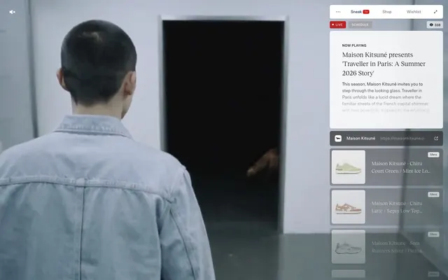
Preview image. Unlock full-res
Overlaid fashion showcase
Color palette
Red action color for filled buttons, selected navigation states, and focused conversion moments.
Border color for interactive elements and links, decorative accents
Primary text, icon default, border lines on neutral elements
Main page background, card surfaces, form inputs
Strongest text contrast, prominent icon and badge borders, background for overlaid elements
Muted background for interactive links/cards, secondary text
Subtle background for badges and secondary surfaces
Peripheral text for copyright, subtle body text
Background for inactive buttons or secondary interactive states
Typography
- Weights
- 400, 500
- Sizes
- 8px, 9px, 10px, 11px, 12px, 13px, 14px
- Line height
- 1, 1.2, 1.5, 2.1
- Letter spacing
- 0.036em at 14px, 0.122em at 8px
- Fallback
- Inter
Primary UI text for labels, buttons, navigation, and detailed information. Its compact nature supports high information density with active tracking.
- Weights
- 400
- Sizes
- 16px, 21px
- Line height
- 1.4, 1.5
- Letter spacing
- normal
- Fallback
- Playfair Display
Headlines and descriptive body copy, providing an elegant counterpoint to the more utilitarian NTNeuss. The normal letter spacing contributes to its legibility at larger sizes.
Spacing & shape
Elevation
Components
Filled button with 'Action Crimson' (#ba2223) background and 'Canvas White' text. Has a 4px `borderRadius` and generous horizontal padding (19px left, 11px right) with 5px vertical padding, indicating a clear, prominent action element.
Ghost button with 'Silver Mist' (#b5b5b5) background, 'Canvas White' text, and a 4px `borderRadius`. Uses 11px horizontal padding and 5px vertical padding to indicate selectable but non-primary status.
Transparent button with 'Canvas White' text and a 6px `borderRadius`. Minimal padding of 6px horizontal and 1px vertical, used for top-level navigation items like 'Sneak TV'.
A card with 'Canvas White' (#ffffff) background at 83% opacity, 6px `borderRadius`, and a subtle `boxShadow` of `rgba(0, 0, 0, 0.08) 1px 1px 6px -1px`. Generous internal padding (40px horizontal, 40px top, 8px bottom) for main content display.
A card with no background, no border radius, and no shadow, used for individual product listings within a scrollable list. Minimal 0px padding, maintaining a dense layout for product browsing.
Input field with 'Canvas White' (#ffffff) background, 'Midnight Graphite' (#3d3d3d) text and border, and 6px `borderRadius`. Features 10px vertical padding and 30px right padding with 0px left padding, suggesting an icon might occupy the left space.
Badge with 'Pale Ash' (#f0eeed) background and 'Deep Space' (#000000) text. Has a 4px `borderRadius` and compact 7px horizontal, 2px vertical padding. Used to categorize items, e.g., 'Mens'.
Guidelines
- Prioritize 'Canvas White' (#ffffff) and 'Pale Ash' (#f0eeed) for distinct surface levels, reserving 'Canvas White' for primary content cards and 'Pale Ash' for secondary badges or backgrounds.
- Use 'Action Crimson' (#ba2223) exclusively for vital call-to-action buttons and live indicators to maintain its impact and visual hierarchy.
- Apply `borderRadius` of 6px for most interactive elements like cards, buttons, and inputs, but use 4px for smaller interactive elements like badges.
- Employ the `rgba(0, 0, 0, 0.08) 1px 1px 6px -1px` shadow for subtle elevation on primary content cards, avoiding heavy or multiple shadows.
- Maintain high information density with NTNeuss at small sizes and active `letterSpacing` for UI elements (0.036em-0.122em).
- Utilize 6px as the primary `elementGap` for tight vertical spacing between UI elements within a compact layout.
- Ensure 'Midnight Graphite' (#3d3d3d) is the default for most body and interactive text for maximum readability on light backgrounds.
- Avoid introducing new saturated colors; adhere strictly to 'Action Crimson' (#ba2223) as the sole vibrant brand accent.
- Do not use heavy shadows or gradients; rely on subtle elevation and clean surface breaks for visual hierarchy.
- Refrain from drastically altering default letter spacing for RecklessNeue-Book; it is intended for fluid readability.
- Do not use border radii larger than 6px for typical UI components, except for specific decorative elements that require 26px.
- Avoid excessive padding on interactive elements; maintain the compact density seen across buttons and badges.
- Do not use dark backgrounds for primary content areas; the theme is predominantly light with overlaid elements.
- Do not introduce complex animations or transitions; stick to provided durations and `ease` timing for a moderate, efficient feel.
About this system
ShowHide
Sneak in Peace presents a digital fashion platform characterized by a clean, contained UI overlaid on a dynamic background. Its aesthetic balances high-contrast text on bright surfaces with muted interactive elements and a singular vivid red accent for active states. Typography is compact and precise, maintaining a high information density while card-based layouts organize content with subtle elevation.
The page exhibits a full-bleed background often featuring dynamic video or photography, over which a contained, right-aligned UI panel floats. The hero section is characterized by this overlaid panel structure. Content within the UI panel is arranged in a consistent vertical flow, featuring a main informational card followed by a scrollable list of compact product item cards. There is no strict grid for main content outside the panel, but product items within the list appear as uniform, vertically stacked elements. Navigation is minimal, consisting of a top-bar with text links and subtle indicators, while the main UI panel acts as a dynamic content display.
Imagery features tightly cropped product photography on neutral backgrounds, often with model hands interacting with items. Product focus is paramount, with little to no lifestyle context. Iconography is minimalist, likely outlined or solid, with a clean stroke weight, primarily monochrome and functional. Graphics are used sparingly, serving as decorative accents or navigational aids without overwhelming the UI. The overall density is image-heavy in product listings but balanced in informational sections.
Reminiscent of GOAT, Farfetch, SSENSE.
# Sneak in Peace — Style Reference
> Overlaid fashion showcase

**Theme:** light

**Site:** https://www.sneakinpeace.com

Sneak in Peace presents a digital fashion platform characterized by a clean, contained UI overlaid on a dynamic background. Its aesthetic balances high-contrast text on bright surfaces with muted interactive elements and a singular vivid red accent for active states. Typography is compact and precise, maintaining a high information density while card-based layouts organize content with subtle elevation.

## Tokens — Colors

| Name | Value | Token | Role |
|------|------|------|------|
| Action Crimson | `#ba2223` | `--color-action-crimson` | Red action color for filled buttons, selected navigation states, and focused conversion moments. |
| Digital Violet | `#142161` | `--color-digital-violet` | Border color for interactive elements and links, decorative accents |
| Midnight Graphite | `#3d3d3d` | `--color-midnight-graphite` | Primary text, icon default, border lines on neutral elements |
| Canvas White | `#ffffff` | `--color-canvas-white` | Main page background, card surfaces, form inputs |
| Deep Space | `#000000` | `--color-deep-space` | Strongest text contrast, prominent icon and badge borders, background for overlaid elements |
| Concrete Gray | `#8d8d8d` | `--color-concrete-gray` | Muted background for interactive links/cards, secondary text |
| Pale Ash | `#f0eeed` | `--color-pale-ash` | Subtle background for badges and secondary surfaces |
| Wolf Gray | `#9e9e9e` | `--color-wolf-gray` | Peripheral text for copyright, subtle body text |
| Silver Mist | `#b5b5b5` | `--color-silver-mist` | Background for inactive buttons or secondary interactive states |

## Tokens — Typography

### NTNeuss
- **Substitute:** Inter
- **Weights:** 400, 500
- **Sizes:** 8px, 9px, 10px, 11px, 12px, 13px, 14px
- **Line height:** 1, 1.2, 1.5, 2.1
- **Letter spacing:** 0.036em at 14px, 0.122em at 8px
- **Role:** Primary UI text for labels, buttons, navigation, and detailed information. Its compact nature supports high information density with active tracking.

### RecklessNeue-Book
- **Substitute:** Playfair Display
- **Weights:** 400
- **Sizes:** 16px, 21px
- **Line height:** 1.4, 1.5
- **Letter spacing:** normal
- **Role:** Headlines and descriptive body copy, providing an elegant counterpoint to the more utilitarian NTNeuss. The normal letter spacing contributes to its legibility at larger sizes.

## Tokens — Type Scale

Minor Second (1.067) from 12px base.

| Role | Size | Line height | Letter spacing |
|------|------|------|------|
| caption | 10px | 1.5 | — |
| body-sm | 11px | 1.5 | — |
| body | 12px | 1.5 | — |
| body-lg | 13px | 1.5 | — |
| heading-sm | 14px | 1.5 | — |

## Tokens — Spacing

- **Section gap:** 40px
- **Card padding:** 40px
- **Element gap:** 6px

## Tokens — Radius

- **Buttons:** 6px
- **Inputs:** 6px
- **Cards:** 6px
- **badges:** 4px
- **tags:** 26px

## Tokens — Elevation

- **Product Info Card (Detailed):** `rgba(0, 0, 0, 0.08) 1px 1px 6px -1px`

## Layout

The page exhibits a full-bleed background often featuring dynamic video or photography, over which a contained, right-aligned UI panel floats. The hero section is characterized by this overlaid panel structure. Content within the UI panel is arranged in a consistent vertical flow, featuring a main informational card followed by a scrollable list of compact product item cards. There is no strict grid for main content outside the panel, but product items within the list appear as uniform, vertically stacked elements. Navigation is minimal, consisting of a top-bar with text links and subtle indicators, while the main UI panel acts as a dynamic content display.

## Imagery

Imagery features tightly cropped product photography on neutral backgrounds, often with model hands interacting with items. Product focus is paramount, with little to no lifestyle context. Iconography is minimalist, likely outlined or solid, with a clean stroke weight, primarily monochrome and functional. Graphics are used sparingly, serving as decorative accents or navigational aids without overwhelming the UI. The overall density is image-heavy in product listings but balanced in informational sections.

## Components

### Live Indicator Button
*Primary Call to Action*

Filled button with 'Action Crimson' (#ba2223) background and 'Canvas White' text. Has a 4px `borderRadius` and generous horizontal padding (19px left, 11px right) with 5px vertical padding, indicating a clear, prominent action element.

### Ghost Schedule Button
*Secondary Action*

Ghost button with 'Silver Mist' (#b5b5b5) background, 'Canvas White' text, and a 4px `borderRadius`. Uses 11px horizontal padding and 5px vertical padding to indicate selectable but non-primary status.

### Navigation Link Button
*Tertiary Navigation Link*

Transparent button with 'Canvas White' text and a 6px `borderRadius`. Minimal padding of 6px horizontal and 1px vertical, used for top-level navigation items like 'Sneak TV'.

### Product Info Card (Detailed)
*Content Display, Primary Information Card*

A card with 'Canvas White' (#ffffff) background at 83% opacity, 6px `borderRadius`, and a subtle `boxShadow` of `rgba(0, 0, 0, 0.08) 1px 1px 6px -1px`. Generous internal padding (40px horizontal, 40px top, 8px bottom) for main content display.

### Product Item Card (Compact)
*List Item, Product Thumbnail*

A card with no background, no border radius, and no shadow, used for individual product listings within a scrollable list. Minimal 0px padding, maintaining a dense layout for product browsing.

### Search Input Field
*User Input*

Input field with 'Canvas White' (#ffffff) background, 'Midnight Graphite' (#3d3d3d) text and border, and 6px `borderRadius`. Features 10px vertical padding and 30px right padding with 0px left padding, suggesting an icon might occupy the left space.

### Category Badge
*Categorization Label*

Badge with 'Pale Ash' (#f0eeed) background and 'Deep Space' (#000000) text. Has a 4px `borderRadius` and compact 7px horizontal, 2px vertical padding. Used to categorize items, e.g., 'Mens'.

## Guidelines

### Do

- Prioritize 'Canvas White' (#ffffff) and 'Pale Ash' (#f0eeed) for distinct surface levels, reserving 'Canvas White' for primary content cards and 'Pale Ash' for secondary badges or backgrounds.
- Use 'Action Crimson' (#ba2223) exclusively for vital call-to-action buttons and live indicators to maintain its impact and visual hierarchy.
- Apply `borderRadius` of 6px for most interactive elements like cards, buttons, and inputs, but use 4px for smaller interactive elements like badges.
- Employ the `rgba(0, 0, 0, 0.08) 1px 1px 6px -1px` shadow for subtle elevation on primary content cards, avoiding heavy or multiple shadows.
- Maintain high information density with NTNeuss at small sizes and active `letterSpacing` for UI elements (0.036em-0.122em).
- Utilize 6px as the primary `elementGap` for tight vertical spacing between UI elements within a compact layout.
- Ensure 'Midnight Graphite' (#3d3d3d) is the default for most body and interactive text for maximum readability on light backgrounds.

### Don't

- Avoid introducing new saturated colors; adhere strictly to 'Action Crimson' (#ba2223) as the sole vibrant brand accent.
- Do not use heavy shadows or gradients; rely on subtle elevation and clean surface breaks for visual hierarchy.
- Refrain from drastically altering default letter spacing for RecklessNeue-Book; it is intended for fluid readability.
- Do not use border radii larger than 6px for typical UI components, except for specific decorative elements that require 26px.
- Avoid excessive padding on interactive elements; maintain the compact density seen across buttons and badges.
- Do not use dark backgrounds for primary content areas; the theme is predominantly light with overlaid elements.
- Do not introduce complex animations or transitions; stick to provided durations and `ease` timing for a moderate, efficient feel.

## Agent Prompt Guide

Quick Color Reference:
text: #3d3d3d
background: #ffffff
border: #3d3d3d
accent: #142161
primary action: #ba2223 (filled action)

Example Component Prompts:
1. Create a primary action button: 'Live Indicator Button' with text 'LIVE', background 'Action Crimson' (#ba2223), text 'Canvas White' (#ffffff), 4px radius, 5px vertical padding, 19px left padding, 11px right padding.
2. Create a product information card: 'Product Info Card (Detailed)' with background 'Canvas White' (#ffffff) at 83% opacity, 6px radius, `boxShadow` `rgba(0, 0, 0, 0.08) 1px 1px 6px -1px`, 40px horizontal padding, 40px top padding, 8px bottom padding.
3. Create a category badge: 'Category Badge' with text 'Mens', background 'Pale Ash' (#f0eeed), text 'Deep Space' (#000000), 4px radius, 7px horizontal padding, 2px vertical padding, using NTNeuss weight 400 at 9px with 0.06em letter spacing.
4. Create a secondary action button: 'Ghost Schedule Button' with text 'SCHEDULE', background 'Silver Mist' (#b5b5b5), text 'Canvas White' (#ffffff), 4px radius, 5px vertical padding, 11px horizontal padding.
More like this









Keep what you find
A free account saves references to boards and can send you a weekly email of picks based on what you save.
To see every result, go Pro.