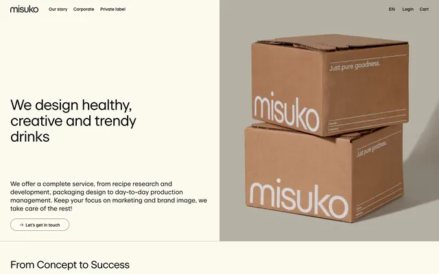
Preview image. Unlock full-res
Organic minimalism, gentle contrast.
Color palette
Page background, primary surface for most content blocks, provides a warm, natural base
Secondary background for cards, slight elevation from the canvas layer, used for subtle grouping
Primary text, headings, icons, navigation links, and subtle button borders — provides strong contrast against light backgrounds
Input borders, subtle dividers, and contextual UI elements — a soft, almost imperceptible line
Muted text, secondary information, and card borders — offers lower contrast for less prominent content
Typography
- Weights
- 400, 500
- Sizes
- 14px, 21px, 30px, 34px, 48px
- Line height
- 0.97, 1.08, 1.12, 1.2, 1.29, 1.36, 1.79, 2.86
- Letter spacing
- -1.73px at 48px, -0.73px at 34px, -0.66px at 30px, -0.5px at 21px, -0.28px at 14px
- Fallback
- Inter
Primary brand typeface for all headings, body text, and UI elements. Its clean, geometric form with subtle humanist touches creates a sense of modern refinement. The specific stylistic sets ('ss02', 'ss04', 'ss05') are integral to its unique character, providing brand distinction.
Spacing & shape
Components
Text-only button for secondary actions or navigation, transparent background against the current surface. Uses Deep Licorice for text. No distinct padding, relying on natural text spacing.
Features a transparent background with a 1px Deep Licorice border. Has 20px padding on all sides and a 0px border-radius, maintaining a sharp, defined edge. Text is Deep Licorice and uses a 500 weight Beausite.
Background is Soft Vanilla with no border or shadow, providing a subtle lift from the Canvas Almond base. Incorporates 34px padding on all sides for internal content. Used for feature listings or informational blocks.
Transparent background with no border or shadow. Contains 34px padding on all sides, useful for content blocks that require more breathing room within a larger section. Often paired with Charcoal Gray text for secondary information.
Transparent background with a 1px Light Pebble bottom border. Features 9px top/bottom padding and 17px left padding. Text and placeholder text are Deep Licorice. Focus state shows a Deep Licorice border.
A text link with a 20px border-radius, giving it a pill-like appearance. Text is Deep Licorice, often underlined on hover, indicating interaction. No explicit background color, inheriting from its parent.
Guidelines
- Prioritize text content against Canvas Almond (#fcf9ee) or Soft Vanilla (#f2efe3) backgrounds to ensure high readability.
- Use Beausite font family with specified `font-feature-settings` for all text elements to maintain brand distinctiveness.
- Define content sections primarily through subtle background color shifts between Canvas Almond (#fcf9ee) and Soft Vanilla (#f2efe3), rather than heavy borders or shadows.
- Apply Deep Licorice (#000000) for all primary text, headings, and outlines of interactive elements to maintain high contrast and clarity.
- Maintain generous spacing, with 17px for `elementGap` and 34px for `cardPadding`, creating an open and airy feel.
- Utilize Charcoal Gray (#6a6965) for all secondary and tertiary information to create a visual hierarchy without visual clutter.
- All interactive links that convey an action should have a 20px border-radius to adopt the signature rounded pill shape.
- Avoid using bold, saturated colors for backgrounds or large areas; confine color to subtle accents or imagery.
- Do not introduce strong drop shadows; the system relies on minimal elevation and background shifts.
- Do not deviate from the Beausite typeface or its specific font feature settings; it is critical to brand identity.
- Avoid tight element spacing; the 'comfortable' density is a core characteristic of the layout.
- Do not use generic system fonts; the custom 'Beausite' font is a cornerstone of the visual style.
- Do not use square or rectangular buttons or links for primary actions; the 20px `border-radius` is a key brand identifier for interactive elements.
About this system
ShowHide
Misuko's design system evokes a calm, natural modernity, reminiscent of bespoke packaging. It builds on a stark light canvas with rich dark typography, punctuated by a recessive, earthy accent color. The visual identity emphasizes spaciousness and precise detailing, using subtle textural shifts in backgrounds and minimal borders to define discrete content blocks without heavy visual weight. Components are designed for clarity and understated presence, allowing content and product imagery to take precedence.
The page maintains a centered max-width content area, ensuring readability and visual focus. The hero section is a split layout with text on the left and full-bleed imagery on the right. Content sections generally follow a consistent vertical rhythm with comfortable spacing, often alternating between left-aligned text blocks and right-aligned visuals or feature lists. A prominent pattern includes 3-column card grids for features, all with consistent padding. The navigation is a sticky top bar, minimally interrupting the content flow.
The site primarily uses product photography and lifestyle imagery, often featuring food and drink. Photography is generally high-key with soft lighting, sometimes on plain white or desaturated backgrounds (like the cardboard boxes). Product imagery is tightly cropped, showcasing the items without excessive context. Small decorative icons are largely line-based with a thin stroke, typically rendered in Deep Licorice outlines or using the brand's primary text color to integrate seamlessly with the UI, serving an explanatory role rather than a heavy decorative one. Density of imagery is moderate, balancing descriptive visuals with ample negative space.
Reminiscent of Oatly, Harry's, Aesop.
# Spécialiste Belge — Style Reference
> Organic minimalism, gentle contrast.

**Theme:** light

**Site:** https://misuko.be

Misuko's design system evokes a calm, natural modernity, reminiscent of bespoke packaging. It builds on a stark light canvas with rich dark typography, punctuated by a recessive, earthy accent color. The visual identity emphasizes spaciousness and precise detailing, using subtle textural shifts in backgrounds and minimal borders to define discrete content blocks without heavy visual weight. Components are designed for clarity and understated presence, allowing content and product imagery to take precedence.

## Tokens — Colors

| Name | Value | Token | Role |
|------|------|------|------|
| Canvas Almond | `#fcf9ee` | `--color-canvas-almond` | Page background, primary surface for most content blocks, provides a warm, natural base |
| Soft Vanilla | `#f2efe3` | `--color-soft-vanilla` | Secondary background for cards, slight elevation from the canvas layer, used for subtle grouping |
| Deep Licorice | `#000000` | `--color-deep-licorice` | Primary text, headings, icons, navigation links, and subtle button borders — provides strong contrast against light backgrounds |
| Light Pebble | `#bcbab2` | `--color-light-pebble` | Input borders, subtle dividers, and contextual UI elements — a soft, almost imperceptible line |
| Charcoal Gray | `#6a6965` | `--color-charcoal-gray` | Muted text, secondary information, and card borders — offers lower contrast for less prominent content |

## Tokens — Typography

### Beausite
- **Substitute:** Inter
- **Weights:** 400, 500
- **Sizes:** 14px, 21px, 30px, 34px, 48px
- **Line height:** 0.97, 1.08, 1.12, 1.2, 1.29, 1.36, 1.79, 2.86
- **Letter spacing:** -1.73px at 48px, -0.73px at 34px, -0.66px at 30px, -0.5px at 21px, -0.28px at 14px
- **Role:** Primary brand typeface for all headings, body text, and UI elements. Its clean, geometric form with subtle humanist touches creates a sense of modern refinement. The specific stylistic sets ('ss02', 'ss04', 'ss05') are integral to its unique character, providing brand distinction.

## Tokens — Type Scale

Perfect Fourth (1.333) from 14px base.

| Role | Size | Line height | Letter spacing |
|------|------|------|------|
| body | 14px | 1.79 | -0.28px |
| subheading | 21px | 1.36 | -0.5px |
| heading | 30px | 1.2 | -0.66px |
| heading-lg | 34px | 1.12 | -0.73px |
| display | 48px | 0.97 | -1.73px |

## Tokens — Spacing

- **Section gap:** 20px
- **Card padding:** 34px
- **Element gap:** 17px

## Tokens — Radius

- **links:** 20px

## Layout

The page maintains a centered max-width content area, ensuring readability and visual focus. The hero section is a split layout with text on the left and full-bleed imagery on the right. Content sections generally follow a consistent vertical rhythm with comfortable spacing, often alternating between left-aligned text blocks and right-aligned visuals or feature lists. A prominent pattern includes 3-column card grids for features, all with consistent padding. The navigation is a sticky top bar, minimally interrupting the content flow.

## Imagery

The site primarily uses product photography and lifestyle imagery, often featuring food and drink. Photography is generally high-key with soft lighting, sometimes on plain white or desaturated backgrounds (like the cardboard boxes). Product imagery is tightly cropped, showcasing the items without excessive context. Small decorative icons are largely line-based with a thin stroke, typically rendered in Deep Licorice outlines or using the brand's primary text color to integrate seamlessly with the UI, serving an explanatory role rather than a heavy decorative one. Density of imagery is moderate, balancing descriptive visuals with ample negative space.

## Components

### Ghost Button
*Interactive element*

Text-only button for secondary actions or navigation, transparent background against the current surface. Uses Deep Licorice for text. No distinct padding, relying on natural text spacing.

### Outlined Call-to-Action Button
*Primary interactive element*

Features a transparent background with a 1px Deep Licorice border. Has 20px padding on all sides and a 0px border-radius, maintaining a sharp, defined edge. Text is Deep Licorice and uses a 500 weight Beausite.

### Content Card
*Information grouping and display*

Background is Soft Vanilla with no border or shadow, providing a subtle lift from the Canvas Almond base. Incorporates 34px padding on all sides for internal content. Used for feature listings or informational blocks.

### Informational Card (Padded)
*Detailed content display*

Transparent background with no border or shadow. Contains 34px padding on all sides, useful for content blocks that require more breathing room within a larger section. Often paired with Charcoal Gray text for secondary information.

### Text Input Field
*User data entry*

Transparent background with a 1px Light Pebble bottom border. Features 9px top/bottom padding and 17px left padding. Text and placeholder text are Deep Licorice. Focus state shows a Deep Licorice border.

### Rounded Action Link
*Inline navigation or primary call to action*

A text link with a 20px border-radius, giving it a pill-like appearance. Text is Deep Licorice, often underlined on hover, indicating interaction. No explicit background color, inheriting from its parent.

## Guidelines

### Do

- Prioritize text content against Canvas Almond (#fcf9ee) or Soft Vanilla (#f2efe3) backgrounds to ensure high readability.
- Use Beausite font family with specified `font-feature-settings` for all text elements to maintain brand distinctiveness.
- Define content sections primarily through subtle background color shifts between Canvas Almond (#fcf9ee) and Soft Vanilla (#f2efe3), rather than heavy borders or shadows.
- Apply Deep Licorice (#000000) for all primary text, headings, and outlines of interactive elements to maintain high contrast and clarity.
- Maintain generous spacing, with 17px for `elementGap` and 34px for `cardPadding`, creating an open and airy feel.
- Utilize Charcoal Gray (#6a6965) for all secondary and tertiary information to create a visual hierarchy without visual clutter.
- All interactive links that convey an action should have a 20px border-radius to adopt the signature rounded pill shape.

### Don't

- Avoid using bold, saturated colors for backgrounds or large areas; confine color to subtle accents or imagery.
- Do not introduce strong drop shadows; the system relies on minimal elevation and background shifts.
- Do not deviate from the Beausite typeface or its specific font feature settings; it is critical to brand identity.
- Avoid tight element spacing; the 'comfortable' density is a core characteristic of the layout.
- Do not use generic system fonts; the custom 'Beausite' font is a cornerstone of the visual style.
- Do not use square or rectangular buttons or links for primary actions; the 20px `border-radius` is a key brand identifier for interactive elements.

## Agent Prompt Guide

Quick Color Reference:
text: #000000
background: #fcf9ee
border: #bcbab2
accent: no distinct accent color
primary action: no distinct CTA color

Example Component Prompts:
1. Create a Hero Section: Background is Canvas Almond (#fcf9ee). Heading is Beausite weight 400 at 48px, color Deep Licorice (#000000), letter-spacing -1.73px. Body text is Beausite weight 400 at 14px, color Deep Licorice (#000000), letter-spacing -0.28px. Below body text, add a Rounded Action Link with 'Let's get in touch' text, using Deep Licorice (#000000) for text color and 20px border-radius.
2. Create a Content Card for features: Background Soft Vanilla (#f2efe3), no border or shadow, 34px padding. Inside, use a heading Beausite weight 500 at 30px, color Deep Licorice (#000000), letter-spacing -0.66px. Body text Beausite weight 400 at 14px, color Charcoal Gray (#6a6965), letter-spacing -0.28px.
3. Create an Input Field: Transparent background. Bottom border is 1px Light Pebble (#bcbab2). 9px vertical padding, 17px left padding. Text in Deep Licorice (#000000), using Beausite weight 400 at 14px, letter-spacing -0.28px for both text and placeholder. Label above input is Deep Licorice (#000000) and Beausite weight 400 at 14px.
More like this









Keep what you find
A free account saves references to boards and can send you a weekly email of picks based on what you save.
To see every result, go Pro.