Preview image. Unlock full-res
Playful block playground
Color palette
Primary page background for hero sections and expansive content zones, evoking a warm, inviting atmosphere
Background for certain cards and content sections, adding depth and a distinct visual interruption to the warm canvas
Primary action background, indicating interactivity with a high-energy pop, and used for decorative fills
Secondary button backgrounds and decorative elements, providing a cooler accent hue
Highlight text, decorative fills, and border accents, drawing immediate attention to key phrases and elements
Green accent for outlined action borders, linked labels, and lightweight interactive emphasis. Use as a supporting accent, not as a status color
Primary text, borders, and solid button fills, providing strong contrast against all backgrounds
Secondary text, button text on dark backgrounds, and footer background, acting as a clean counterpoint
Subtle background for UI elements, offering a slight visual break from pure white
Typography
- Weights
- 400, 500, 700
- Sizes
- 14px, 16px, 17px, 18px, 19px, 22px
- Line height
- 1, 1.2, 1.21
- Letter spacing
- -0.0180em, -0.0160em, -0.0150em, -0.0140em, -0.0130em, -0.0110em
- Fallback
- Inter
General body text, links, and various UI elements. Its range of weights and sizes provides versatility for content hierarchy and interactive states.
- Weights
- 400, 700
- Sizes
- 16px, 50px, 56px, 62px, 80px, 110px, 220px
- Line height
- 0.87, 1, 1.05, 1.2
- Letter spacing
- -0.0360em, -0.0320em, -0.0250em, -0.0180em, -0.0160em, -0.0050em, -0.0010em
- Fallback
- Oswald
Dominant font for headings and impactful display text. Its inherent boldness, combined with tight line heights and negative letter-spacing, creates a commanding, space-efficient presence.
- Weights
- 400
- Sizes
- 14px, 16px, 18px, 22px
- Line height
- 1.2, 1.21
- Letter spacing
- -0.0180em, -0.0160em, -0.0140em, -0.0110em
- Fallback
- Open Sans
Used for specific button labels and navigation items, offering a slightly more relaxed feel than 'Body' to contrast interactive elements.
- Weights
- 400
- Sizes
- 12px, 14px, 16px
- Line height
- 1.2
- Letter spacing
- -0.0210em, -0.0180em, -0.0160em
- Fallback
- Inter
Small text and button labels, maintaining legibility at smaller sizes with slightly tighter tracking.
- Weights
- 400
- Sizes
- 13px
- Line height
- 1.2
- Letter spacing
- normal
- Fallback
- Arial
Fallback or specific utility text, relying on system font accessibility.
- Weights
- 400
- Sizes
- 16px
- Line height
- 1.2
- Letter spacing
- -0.0160em
- Fallback
- Comic Neue
Specific decorative text, providing a distinctive, hand-drawn aesthetic.
- Weights
- 400
- Sizes
- 18px
- Line height
- 1.2
- Letter spacing
- -0.0140em
- Fallback
- Epilogue
Used for distinctive button labels, offering a subtle, elegant touch for important actions.
Spacing & shape
Components
Transparent background, 'Absolute Black' text or 'Pure White' on dark backgrounds. No border, 'Regular' or 'Body' font family at 16px, 0px border radius, 16px padding on all sides for clickable area.
Transparent background, 'Absolute Black' text, 100px border radius, with a 1px 'Absolute Black' border. No horizontal/vertical padding detected, suggesting an icon button or minimal text treatment.
Transparent background, 'Pure White' text, 100px border radius, with a 1px 'Pure White' border. No horizontal/vertical padding detected, suggesting an icon button or minimal text treatment.
'Absolute Black' background, 'Pure White' text, 100px border radius, 16px vertical padding, 14px horizontal padding on right and 16px on left.
'Electric Lime' background, 'Absolute Black' text, 100px border radius, 16px padding. This is the most persuasive button style.
Background 'Deep Violet', 0px border radius, no box shadow, 40px top padding, 24px horizontal padding, 140px bottom padding. Large internal padding for generous content framing.
Guidelines
- Always use 'Absolute Black' (#000000) for primary text on light backgrounds and 'Pure White' (#ffffff) on dark backgrounds.
- Apply a 100px border radius to all interactive buttons for a consistent, soft pill shape.
- Use 'Electric Lime' (#e4ff60) specifically for primary call-to-action button backgrounds.
- Employ 'Deep Violet' (#adabff) for prominent content cards to differentiate them from the main canvas.
- Layer large, angled photographic cutouts to create a dynamic and energetic visual composition.
- Utilize 'Black' font family at large sizes for headlines (50-220px) with tight line heights to ensure a commanding presence.
- Maintain a comfortable density with a base spacing unit of 4px and elemental gaps around 16px.
- Do not use generic gray tones for primary interactive elements; always use chromatic colors for emphasis.
- Avoid subtle shadows or gradients on component surfaces; stick to flat, vibrant color blocks or crisp borders.
- Do not use small, delicate fonts for headlines; always leverage the 'Black' font family for impact.
- Never use square corners for buttons; always apply the 100px border radius for a distinct visual identity.
- Do not place images in simple, contained boxes; allow them to break out of their bounds or appear dynamically angled.
- Avoid highly ornate or complex typography; the system favors bold, direct, and efficient typefaces.
- Do not introduce additional background colors outside of the defined 'Amber Canvas', 'Deep Violet', 'Electric Lime', and 'Soft Gray' for major sections.
About this system
ShowHide
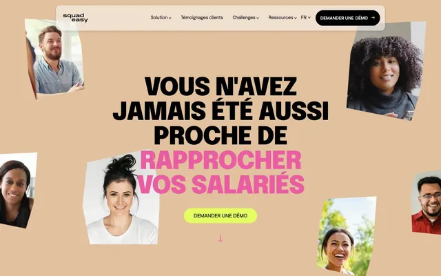
SquadEasy's design system evokes a playful, high-contrast digital environment. It uses bold, unadorned typography set against vibrant, geometric color blocks and photo cutouts. The layout is dynamic, featuring angled visual elements and prominent typography to create a sense of directness and energy. Color is employed in large, flat regions and as vivid accents, while component styling is typically crisp with generous radii, prioritizing impact over subtle detail.
The page primarily uses a full-bleed layout for background color blocks and hero sections, with text content often centered or presented in two-column arrangements. The hero features a bold, centered headline overlaying the 'Amber Canvas' background with dynamic, angled photo cutouts. Sections alternate between solid color backgrounds (like 'Amber Canvas' and 'Deep Violet') with strong vertical spacing provided by a section gap of 100px. Content blocks, such as testimonial cards, often use a grid-like structure. Elements within sections generally maintain a max-width for readability, but the backgrounds extend full-width. Navigation is a sticky top bar with a centered logo, text links, and a prominent pill-shaped CTA button.
Imagery primarily consists of high-contrast, candid lifestyle photography featuring diverse individuals, often cropped tightly and presented as angled, unmasked cutouts. These images are used decoratively to add a human element and dynamic energy, frequently layered over solid color blocks. Icons are minimal, utilizing bold strokes or fills in black or accent colors. Product screenshots are contained within device mockups, maintaining a clean, focused presentation.
Reminiscent of Stripe, Linear, Figma, Notion.
# SquadEasy — Style Reference
> Playful block playground

**Theme:** light

**Site:** https://www.squadeasy.com

SquadEasy's design system evokes a playful, high-contrast digital environment. It uses bold, unadorned typography set against vibrant, geometric color blocks and photo cutouts. The layout is dynamic, featuring angled visual elements and prominent typography to create a sense of directness and energy. Color is employed in large, flat regions and as vivid accents, while component styling is typically crisp with generous radii, prioritizing impact over subtle detail.

## Tokens — Colors

| Name | Value | Token | Role |
|------|------|------|------|
| Amber Canvas | `#e1c19e` | `--color-amber-canvas` | Primary page background for hero sections and expansive content zones, evoking a warm, inviting atmosphere |
| Deep Violet | `#adabff` | `--color-deep-violet` | Background for certain cards and content sections, adding depth and a distinct visual interruption to the warm canvas |
| Electric Lime | `#e4ff60` | `--color-electric-lime` | Primary action background, indicating interactivity with a high-energy pop, and used for decorative fills |
| Sky Blue | `#7fb6e6` | `--color-sky-blue` | Secondary button backgrounds and decorative elements, providing a cooler accent hue |
| Hot Pink | `#ea5da3` | `--color-hot-pink` | Highlight text, decorative fills, and border accents, drawing immediate attention to key phrases and elements |
| Forest Green | `#6fb853` | `--color-forest-green` | Green accent for outlined action borders, linked labels, and lightweight interactive emphasis. Use as a supporting accent, not as a status color |
| Absolute Black | `#000000` | `--color-absolute-black` | Primary text, borders, and solid button fills, providing strong contrast against all backgrounds |
| Pure White | `#ffffff` | `--color-pure-white` | Secondary text, button text on dark backgrounds, and footer background, acting as a clean counterpoint |
| Soft Gray | `#f6f6f6` | `--color-soft-gray` | Subtle background for UI elements, offering a slight visual break from pure white |

## Tokens — Typography

### Body
- **Substitute:** Inter
- **Weights:** 400, 500, 700
- **Sizes:** 14px, 16px, 17px, 18px, 19px, 22px
- **Line height:** 1, 1.2, 1.21
- **Letter spacing:** -0.0180em, -0.0160em, -0.0150em, -0.0140em, -0.0130em, -0.0110em
- **Role:** General body text, links, and various UI elements. Its range of weights and sizes provides versatility for content hierarchy and interactive states.

### Black
- **Substitute:** Oswald
- **Weights:** 400, 700
- **Sizes:** 16px, 50px, 56px, 62px, 80px, 110px, 220px
- **Line height:** 0.87, 1, 1.05, 1.2
- **Letter spacing:** -0.0360em, -0.0320em, -0.0250em, -0.0180em, -0.0160em, -0.0050em, -0.0010em
- **Role:** Dominant font for headings and impactful display text. Its inherent boldness, combined with tight line heights and negative letter-spacing, creates a commanding, space-efficient presence.

### Regular
- **Substitute:** Open Sans
- **Weights:** 400
- **Sizes:** 14px, 16px, 18px, 22px
- **Line height:** 1.2, 1.21
- **Letter spacing:** -0.0180em, -0.0160em, -0.0140em, -0.0110em
- **Role:** Used for specific button labels and navigation items, offering a slightly more relaxed feel than 'Body' to contrast interactive elements.

### Medium
- **Substitute:** Inter
- **Weights:** 400
- **Sizes:** 12px, 14px, 16px
- **Line height:** 1.2
- **Letter spacing:** -0.0210em, -0.0180em, -0.0160em
- **Role:** Small text and button labels, maintaining legibility at smaller sizes with slightly tighter tracking.

### Arial
- **Substitute:** Arial
- **Weights:** 400
- **Sizes:** 13px
- **Line height:** 1.2
- **Letter spacing:** normal
- **Role:** Fallback or specific utility text, relying on system font accessibility.

### Sharpie
- **Substitute:** Comic Neue
- **Weights:** 400
- **Sizes:** 16px
- **Line height:** 1.2
- **Letter spacing:** -0.0160em
- **Role:** Specific decorative text, providing a distinctive, hand-drawn aesthetic.

### Epilogue
- **Substitute:** Epilogue
- **Weights:** 400
- **Sizes:** 18px
- **Line height:** 1.2
- **Letter spacing:** -0.0140em
- **Role:** Used for distinctive button labels, offering a subtle, elegant touch for important actions.

## Tokens — Type Scale

Perfect Fourth (1.333) from 16px base.

| Role | Size | Line height | Letter spacing |
|------|------|------|------|
| caption | 12px | 1.2 | -0.252px |
| body-sm | 14px | 1.21 | -0.252px |
| body | 16px | 1.2 | -0.256px |
| subheading | 18px | 1.2 | -0.252px |
| heading-sm | 22px | 1.2 | -0.242px |
| heading | 50px | 1.05 | -1.6px |
| heading-lg | 56px | 1 | -1.4px |
| display | 80px | 0.87 | -2.88px |

## Tokens — Spacing

- **Section gap:** 100px
- **Card padding:** 16px
- **Element gap:** 16px

## Tokens — Radius

- **Buttons:** 100px
- **Cards:** 0px
- **misc:** 10px
- **navElements:** 14px

## Layout

The page primarily uses a full-bleed layout for background color blocks and hero sections, with text content often centered or presented in two-column arrangements. The hero features a bold, centered headline overlaying the 'Amber Canvas' background with dynamic, angled photo cutouts. Sections alternate between solid color backgrounds (like 'Amber Canvas' and 'Deep Violet') with strong vertical spacing provided by a section gap of 100px. Content blocks, such as testimonial cards, often use a grid-like structure. Elements within sections generally maintain a max-width for readability, but the backgrounds extend full-width. Navigation is a sticky top bar with a centered logo, text links, and a prominent pill-shaped CTA button.

## Imagery

Imagery primarily consists of high-contrast, candid lifestyle photography featuring diverse individuals, often cropped tightly and presented as angled, unmasked cutouts. These images are used decoratively to add a human element and dynamic energy, frequently layered over solid color blocks. Icons are minimal, utilizing bold strokes or fills in black or accent colors. Product screenshots are contained within device mockups, maintaining a clean, focused presentation.

## Components

### Text Link Button
*Navigation and secondary actions.*

Transparent background, 'Absolute Black' text or 'Pure White' on dark backgrounds. No border, 'Regular' or 'Body' font family at 16px, 0px border radius, 16px padding on all sides for clickable area.

### Pill Ghost Button (Black)
*Outlined secondary actions.*

Transparent background, 'Absolute Black' text, 100px border radius, with a 1px 'Absolute Black' border. No horizontal/vertical padding detected, suggesting an icon button or minimal text treatment.

### Pill Ghost Button (White)
*Outlined secondary actions on dark backgrounds.*

Transparent background, 'Pure White' text, 100px border radius, with a 1px 'Pure White' border. No horizontal/vertical padding detected, suggesting an icon button or minimal text treatment.

### Pill Filled Button (Black)
*Primary action within a neutral context.*

'Absolute Black' background, 'Pure White' text, 100px border radius, 16px vertical padding, 14px horizontal padding on right and 16px on left.

### Pill Filled Button (Electric Lime)
*Prominent calls to action.*

'Electric Lime' background, 'Absolute Black' text, 100px border radius, 16px padding. This is the most persuasive button style.

### Info Card (Squared)
*Content presentation with a distinctive background.*

Background 'Deep Violet', 0px border radius, no box shadow, 40px top padding, 24px horizontal padding, 140px bottom padding. Large internal padding for generous content framing.

## Guidelines

### Do

- Always use 'Absolute Black' (#000000) for primary text on light backgrounds and 'Pure White' (#ffffff) on dark backgrounds.
- Apply a 100px border radius to all interactive buttons for a consistent, soft pill shape.
- Use 'Electric Lime' (#e4ff60) specifically for primary call-to-action button backgrounds.
- Employ 'Deep Violet' (#adabff) for prominent content cards to differentiate them from the main canvas.
- Layer large, angled photographic cutouts to create a dynamic and energetic visual composition.
- Utilize 'Black' font family at large sizes for headlines (50-220px) with tight line heights to ensure a commanding presence.
- Maintain a comfortable density with a base spacing unit of 4px and elemental gaps around 16px.

### Don't

- Do not use generic gray tones for primary interactive elements; always use chromatic colors for emphasis.
- Avoid subtle shadows or gradients on component surfaces; stick to flat, vibrant color blocks or crisp borders.
- Do not use small, delicate fonts for headlines; always leverage the 'Black' font family for impact.
- Never use square corners for buttons; always apply the 100px border radius for a distinct visual identity.
- Do not place images in simple, contained boxes; allow them to break out of their bounds or appear dynamically angled.
- Avoid highly ornate or complex typography; the system favors bold, direct, and efficient typefaces.
- Do not introduce additional background colors outside of the defined 'Amber Canvas', 'Deep Violet', 'Electric Lime', and 'Soft Gray' for major sections.

## Agent Prompt Guide

**Quick Color Reference**
- text: #000000
- background: #e1c19e
- border: #000000
- accent: #ea5da3
- primary action: #000000 (filled action)

**3-5 Example Component Prompts**
- Create a Primary Action Button: #000000 background, #ffffff text, 9999px radius, compact pill padding. Use this filled treatment for the main CTA.
- Create a testimonial card: 'Deep Violet' background (#adabff), no border radius, 40px top padding, 24px horizontal padding, 140px bottom padding. Body text 'Body' 16px weight 400 #000000.
- Create a navigation link: No background, 'Absolute Black' text, 'Regular' 16px font, no border, no radius. Hover state: text changes to 'Hot Pink' (#ea5da3).
- Create a ghost button: Transparent background, 'Forest Green' (#6fb853) text, 1px 'Forest Green' (#6fb853) border, 100px radius. No padding specified by system, implying visual icon or minimal text.
More like this









Keep what you find
A free account saves references to boards and can send you a weekly email of picks based on what you save.
To see every result, go Pro.