
Preview image. Unlock full-res
Vivid Purple Actuator
Color palette
Primary heading and body text, button text on yellow. This deep blue-gray provides strong contrast and a sense of authority
Primary action background, interactive element highlights, and key brand accents. This vivid violet acts as a strong activation signal; Decorative background gradient. Often appears in conjunction with transparent areas
Card background, decorative surface. A muted, cool green providing a soft, secondary surface treatment
Secondary action background, decorative gradient elements. A vivid yellow for contrast and emphasis; Decorative background gradient. Often appears in conjunction with transparent areas
Lightest button background, soft background for interactive elements
Card backgrounds, section backgrounds. A very light, slightly tinted base for UI elements
Page backgrounds, elevated card surfaces, primary text on dark backgrounds
Hairline borders, dividers, subtle separators
Secondary text, dark iconography
Muted body text, subtle background tint
Typography
- Weights
- 400, 500, 600, 900
- Sizes
- 14px, 16px, 20px, 24px, 28px, 48px, 56px, 110px
- Line height
- 1.1, 1.43, 1.5, 1.7
- Letter spacing
- -0.0200em at 110px, -0.0100em at 56px, 0.0200em at 14px, 0.0800em at 16px
- Fallback
- Inter
Primary typeface for all UI elements, headings, and body text. The range of weights and negative letter-spacing on larger sizes creates a confident yet refined presence.
- Weights
- 700
- Sizes
- 13px, 16px
- Line height
- 1.4
- Letter spacing
- 0.0800em at 13px, 0.0800em at 16px
- Fallback
- Space Mono
Used for code snippets or technical annotations, providing a distinct, monospace feel.
Spacing & shape
Components
Background: Stark Violet (#381fd1), Text: Cloud White (#ffffff). Padding: 6px vertical, 24px horizontal. Border Radius: 6px. Uses ArminGrotesk.
Background: Stark Gold (#fedb63), Text: Midnight Ink (#10284b). Padding: 6px vertical, 24px horizontal. Border Radius: 6px. Uses ArminGrotesk.
Background: transparent, Text: Cloud White (#ffffff). Padding: 0px vertical, 8px horizontal. Border Radius: 6px. Uses ArminGrotesk.
Background: Lavender Mist (#e5e0ff), Text: Stark Violet (#381fd1). Padding: 24px all sides. Border Radius: 20px. Uses ArminGrotesk.
Background: Seafoam Mint (#99d6cc). Padding: 64px all sides. Border Radius: 40px. No shadow.
Background: Linen Canvas (#faf5ff). Padding: 56px all sides. Border Radius: 40px. No shadow.
Background: Linen Canvas (#faf5ff). Padding: 24px all sides. Border Radius: 12px. No shadow.
Guidelines
- Use Stark Violet (#381fd1) exclusively for primary interactive actions or key brand accents to ensure focus.
- Apply ArminGrotesk weight 900 for all main headings (display, heading-lg) to convey impact.
- Maintain a clear visual hierarchy by utilizing Midnight Ink (#10284b) for primary text and Carbon Black (#000000) for secondary or supporting text.
- Employ Outline Gray (#e5e7eb) for all hairline borders and dividers to maintain a light, open aesthetic.
- Use a consistent border-radius of 6px for interactive buttons and 12px for content cards, reserving 40px for larger, decorative cards.
- Ensure generous spacing around content with sections separated by 48px and card content padded by 24px.
- Pair Stark Gold (#fedb63) with Midnight Ink (#10284b) text for secondary call-to-action buttons, creating a vibrant contrast.
- Do not use saturated colors for large background areas unless it is the hero section utilizing Stark Violet (#381fd1).
- Avoid arbitrary use of shadows; most cards and surfaces should remain flat or use very subtle elevation, as indicated by the absence of explicit shadow tokens.
- Do not introduce new typefaces; rely solely on ArminGrotesk and RobotoMono for all typographic needs.
- Refrain from using more than two distinct accent colors on a single screen to prevent visual clutter and maintain focus on Stark Violet.
- Do not break the established spacing rhythm; for example, avoid small, inconsistent element gaps other than the default 8px.
- Do not use generic gray tones when specific neutral tints like Linen Canvas (#faf5ff) or Bone White (#f6f6eb) are available for surfaces and muted text.
- Avoid applying strong gradients unless they are the specific linear-gradient patterns using Stark Gold or Stark Violet against transparent backgrounds for decorative purposes.
About this system
ShowHide
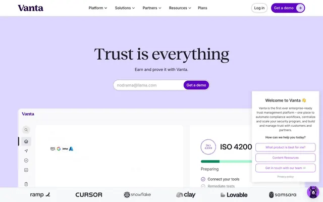
Stark employs a clean, purposeful aesthetic built around a vivid purple accent against a largely achromatic backdrop. Its visual language prioritizes clear communication through robust typography and generous spacing, allowing functional elements to stand out. Component surfaces are light, with subtle shadow usage, focusing on content over heavy decoration. The overall impression is one of efficiency and directness, with the purple acting as a focused 'activate' signal.
The page primarily uses a max-width contained layout for content sections, set against full-bleed backgrounds that alternate between Cloud White and Linen Canvas. The hero section is full-bleed Stark Violet with a large, centered white headline and supporting body text. Content beyond the hero typically follows a two-column distribution, often alternating text-left/image-right. Feature sections sometimes employ a 4-column card grid. Vertical spacing is generous and consistent, with sections clearly delineated by background changes and a typical section gap of 48px. The navigation is a sticky top bar with a logo, text links, and two distinct action buttons.
This system primarily uses product screenshots that are full-bleed or strategically placed on light backgrounds, often with a slight perspective to reveal multiple application windows. Illustrations, when present, are flat, outlined, geometric, and use a limited brand-color palette (Stark Violet, Stark Gold, and muted blues/greens) to explain concepts rather than merely decorate. Icons are outlined, mono-color (usually Carbon Black or Stark Violet), with a medium stroke weight. Imagery is present but the UI remains text-dominant, with visuals serving to explain or showcase the product rather than create atmosphere.
Reminiscent of Figma, Linear, Notion, Asana.
# Stark — Style Reference
> Vivid Purple Actuator

**Theme:** light

**Site:** https://www.getstark.co

Stark employs a clean, purposeful aesthetic built around a vivid purple accent against a largely achromatic backdrop. Its visual language prioritizes clear communication through robust typography and generous spacing, allowing functional elements to stand out. Component surfaces are light, with subtle shadow usage, focusing on content over heavy decoration. The overall impression is one of efficiency and directness, with the purple acting as a focused 'activate' signal.

## Tokens — Colors

| Name | Value | Token | Role |
|------|------|------|------|
| Midnight Ink | `#10284b` | `--color-midnight-ink` | Primary heading and body text, button text on yellow. This deep blue-gray provides strong contrast and a sense of authority |
| Stark Violet | `#381fd1` | `--color-stark-violet` | Primary action background, interactive element highlights, and key brand accents. This vivid violet acts as a strong activation signal; Decorative background gradient. Often appears in conjunction with transparent areas |
| Seafoam Mint | `#99d6cc` | `--color-seafoam-mint` | Card background, decorative surface. A muted, cool green providing a soft, secondary surface treatment |
| Stark Gold | `#fedb63` | `--color-stark-gold` | Secondary action background, decorative gradient elements. A vivid yellow for contrast and emphasis; Decorative background gradient. Often appears in conjunction with transparent areas |
| Lavender Mist | `#e5e0ff` | `--color-lavender-mist` | Lightest button background, soft background for interactive elements |
| Linen Canvas | `#faf5ff` | `--color-linen-canvas` | Card backgrounds, section backgrounds. A very light, slightly tinted base for UI elements |
| Cloud White | `#ffffff` | `--color-cloud-white` | Page backgrounds, elevated card surfaces, primary text on dark backgrounds |
| Outline Gray | `#e5e7eb` | `--color-outline-gray` | Hairline borders, dividers, subtle separators |
| Carbon Black | `#000000` | `--color-carbon-black` | Secondary text, dark iconography |
| Bone White | `#f6f6eb` | `--color-bone-white` | Muted body text, subtle background tint |

## Tokens — Typography

### ArminGrotesk
- **Substitute:** Inter
- **Weights:** 400, 500, 600, 900
- **Sizes:** 14px, 16px, 20px, 24px, 28px, 48px, 56px, 110px
- **Line height:** 1.1, 1.43, 1.5, 1.7
- **Letter spacing:** -0.0200em at 110px, -0.0100em at 56px, 0.0200em at 14px, 0.0800em at 16px
- **Role:** Primary typeface for all UI elements, headings, and body text. The range of weights and negative letter-spacing on larger sizes creates a confident yet refined presence.

### RobotoMono
- **Substitute:** Space Mono
- **Weights:** 700
- **Sizes:** 13px, 16px
- **Line height:** 1.4
- **Letter spacing:** 0.0800em at 13px, 0.0800em at 16px
- **Role:** Used for code snippets or technical annotations, providing a distinct, monospace feel.

## Tokens — Type Scale

Major Third (1.25) from 16px base.

| Role | Size | Line height | Letter spacing |
|------|------|------|------|
| caption | 13px | 1.4 | 1.04px |
| body | 16px | 1.5 | 0.08em |
| subheading | 20px | 1.5 | — |
| heading-sm | 24px | 1.5 | — |
| heading | 28px | 1.43 | — |
| heading-lg | 48px | 1.1 | — |
| display | 56px | 1.1 | -0.56px |

## Tokens — Spacing

- **Section gap:** 48px
- **Card padding:** 24px
- **Element gap:** 8px

## Tokens — Radius

- **Buttons:** 6px
- **Cards:** 12px
- **tags:** 20px

## Layout

The page primarily uses a max-width contained layout for content sections, set against full-bleed backgrounds that alternate between Cloud White and Linen Canvas. The hero section is full-bleed Stark Violet with a large, centered white headline and supporting body text. Content beyond the hero typically follows a two-column distribution, often alternating text-left/image-right. Feature sections sometimes employ a 4-column card grid. Vertical spacing is generous and consistent, with sections clearly delineated by background changes and a typical section gap of 48px. The navigation is a sticky top bar with a logo, text links, and two distinct action buttons.

## Imagery

This system primarily uses product screenshots that are full-bleed or strategically placed on light backgrounds, often with a slight perspective to reveal multiple application windows. Illustrations, when present, are flat, outlined, geometric, and use a limited brand-color palette (Stark Violet, Stark Gold, and muted blues/greens) to explain concepts rather than merely decorate. Icons are outlined, mono-color (usually Carbon Black or Stark Violet), with a medium stroke weight. Imagery is present but the UI remains text-dominant, with visuals serving to explain or showcase the product rather than create atmosphere.

## Components

### Primary Action Button
*Filled button for primary calls to action.*

Background: Stark Violet (#381fd1), Text: Cloud White (#ffffff). Padding: 6px vertical, 24px horizontal. Border Radius: 6px. Uses ArminGrotesk.

### Secondary Action Button
*Filled button for secondary calls to action.*

Background: Stark Gold (#fedb63), Text: Midnight Ink (#10284b). Padding: 6px vertical, 24px horizontal. Border Radius: 6px. Uses ArminGrotesk.

### Ghost Internal Link Button
*Minimal button for internal navigation links, often in headers or footers.*

Background: transparent, Text: Cloud White (#ffffff). Padding: 0px vertical, 8px horizontal. Border Radius: 6px. Uses ArminGrotesk.

### Information Card Button
*Larger area button used for descriptive information, often within a card layout.*

Background: Lavender Mist (#e5e0ff), Text: Stark Violet (#381fd1). Padding: 24px all sides. Border Radius: 20px. Uses ArminGrotesk.

### Feature Card (Teal)
*Informational card highlighted with a distinct background.*

Background: Seafoam Mint (#99d6cc). Padding: 64px all sides. Border Radius: 40px. No shadow.

### Feature Card (Lavender)
*Informational card with a soft background.*

Background: Linen Canvas (#faf5ff). Padding: 56px all sides. Border Radius: 40px. No shadow.

### Nested UI Card
*Card used for encapsulating UI elements or content, often found within other sections.*

Background: Linen Canvas (#faf5ff). Padding: 24px all sides. Border Radius: 12px. No shadow.

## Guidelines

### Do

- Use Stark Violet (#381fd1) exclusively for primary interactive actions or key brand accents to ensure focus.
- Apply ArminGrotesk weight 900 for all main headings (display, heading-lg) to convey impact.
- Maintain a clear visual hierarchy by utilizing Midnight Ink (#10284b) for primary text and Carbon Black (#000000) for secondary or supporting text.
- Employ Outline Gray (#e5e7eb) for all hairline borders and dividers to maintain a light, open aesthetic.
- Use a consistent border-radius of 6px for interactive buttons and 12px for content cards, reserving 40px for larger, decorative cards.
- Ensure generous spacing around content with sections separated by 48px and card content padded by 24px.
- Pair Stark Gold (#fedb63) with Midnight Ink (#10284b) text for secondary call-to-action buttons, creating a vibrant contrast.

### Don't

- Do not use saturated colors for large background areas unless it is the hero section utilizing Stark Violet (#381fd1).
- Avoid arbitrary use of shadows; most cards and surfaces should remain flat or use very subtle elevation, as indicated by the absence of explicit shadow tokens.
- Do not introduce new typefaces; rely solely on ArminGrotesk and RobotoMono for all typographic needs.
- Refrain from using more than two distinct accent colors on a single screen to prevent visual clutter and maintain focus on Stark Violet.
- Do not break the established spacing rhythm; for example, avoid small, inconsistent element gaps other than the default 8px.
- Do not use generic gray tones when specific neutral tints like Linen Canvas (#faf5ff) or Bone White (#f6f6eb) are available for surfaces and muted text.
- Avoid applying strong gradients unless they are the specific linear-gradient patterns using Stark Gold or Stark Violet against transparent backgrounds for decorative purposes.

## Agent Prompt Guide

Quick Color Reference:
text: #10284b
background: #ffffff
border: #e5e7eb
accent: #381fd1
primary action: #381fd1 (filled action)

Example Component Prompts:
1. Create a primary hero heading: ArminGrotesk 56px weight 900, Cloud White (#ffffff), letter-spacing -0.56px. Centered within a full-bleed Stark Violet (#381fd1) background. Below it, add body text: ArminGrotesk 20px weight 400, Cloud White (#ffffff), line-height 1.5.
2. Design a primary call-to-action button: Stark Violet (#381fd1) background, Cloud White (#ffffff) text, 6px radius. Text: ArminGrotesk 16px weight 500, with 6px vertical padding and 24px horizontal padding.
3. Implement a secondary button: Stark Gold (#fedb63) background, Midnight Ink (#10284b) text, 6px radius. Text: ArminGrotesk 16px weight 500, with 6px vertical padding and 24px horizontal padding.
4. Build an informational card with distinct background: Seafoam Mint (#99d6cc) background, 40px radius. Use Midnight Ink (#10284b) for any internal heading (ArminGrotesk 24px, weight 600) and Cloud White (#ffffff) for body text (ArminGrotesk 16px, weight 400). Padding: 64px all sides.
More like this









Keep what you find
A free account saves references to boards and can send you a weekly email of picks based on what you save.
To see every result, go Pro.