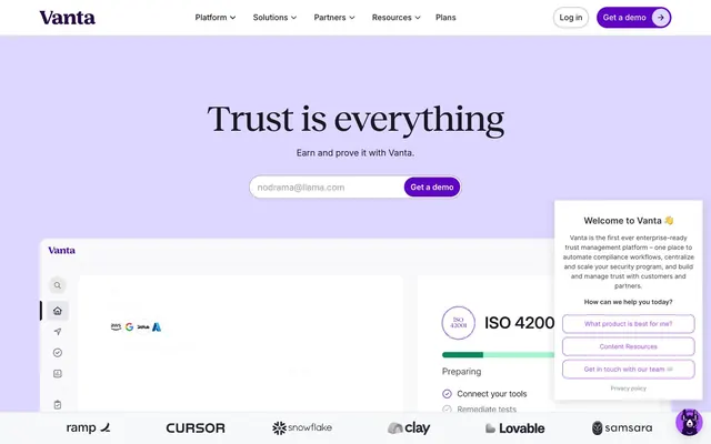
Preview image. Unlock full-res
Regal Clarity on White Canvas
Color palette
Footer background, secondary brand elements, text on vivid backgrounds
Primary action buttons, interactive elements, brand accents
Link colors, badge text, decorative icon accents
Hero background, soft brand washes
Supporting background color, subtle brand elevation
Page backgrounds, card surfaces, form inputs, button backgrounds
Subtle section backgrounds, alternative light surfaces
Subtle accents for UI elements, light border accents
Functional borders, dividers, subtle outlines
Secondary borders, ghost button outlines, disabled states
Tertiary text, subtle fills, supporting icons
Secondary text, link text, muted headings
Primary text, main headings, critical information
Warning badges, informational highlights
Typography
- Weights
- 400, 500, 600, 700
- Sizes
- 10px, 12px, 14px, 16px, 18px, 20px, 24px, 32px, 40px
- Line height
- 1.3, 1.35, 1.43, 1.5, 1.6
- Letter spacing
- -0.0020em
- Fallback
- system-ui
Functional UI text: body copy, navigation, buttons, labels. Its variable nature allows for precise weight control for hierarchy.
- Weights
- 400, 500
- Sizes
- 30px, 42px, 56px, 72px, 90px
- Line height
- 1.1, 1.2, 1.25
- Letter spacing
- -0.0180em
- Fallback
- serif
Headline text, where its serif elegance softens the technical feel of the content. The lighter weights provide authority through grace.
Spacing & shape
Components
Filled with Vanta Purple (#5e05c4), white text (Vanta White), and a full-rounded (999px) border. Padding is 8px vertical, 12px horizontal.
Transparent background, Midnight Ink (#181822) text, minimal padding (8px vertical, 10.4px horizontal) and a full-rounded (999px) border.
Canvas White (#ffffff) background, Midnight Ink (#181822) text, full-rounded (999px) border of Muted Ash (#9e9fb7) at 1.5px. Padding is 13.6px vertical, 16px horizontal.
Canvas White (#ffffff) background, 16px border-radius, no shadow. Padding internal content at 32px all around.
Transparent background, 0px border-radius, no shadow. Internal padding of 32px.
Transparent background with Royal Violet (#8f47d5) text. No padding or border-radius.
Warning Gold (#ffbe0f) background with Deep Plum (#260048) text. No border-radius, 4px horizontal padding.
Guidelines
- Use Midnight Ink (#181822) for all primary body text and main headings to ensure strong contrast and readability.
- Apply Canvas White (#ffffff) as the default background for most content sections and interactive components.
- Utilize Vanta Purple (#5e05c4) exclusively for primary calls to action, such as 'Get a demo' buttons.
- Maintain a 999px border-radius for all interactive elements like buttons and input fields to ensure a consistent friendly, modern feel.
- Establish hierarchy in headings by using Reckless font, applying its smaller letter-spacing values (-0.0180em to -0.0120em) for larger sizes.
- Use Border Fog (#dfdfe9) or Muted Ash (#9e9fb7) for all hairline borders and subtle dividers.
- Prioritize Inter Variable for all functional text, maintaining -0.0020em letter-spacing for consistency.
- Do not introduce strong shadows; rely on subtle borders or background color shifts for element separation.
- Avoid using highly saturated colors for large background areas; reserve them for accents and interactive elements.
- Do not deviate from the full-rounded (999px) radius for buttons and input fields; this is a signature shape.
- Never use Reckless font for body text or other small functional elements; it is reserved for headlines.
- Do not use generic blue for links or interactive elements; all brand interaction should use Royal Violet (#8f47d5) or Vanta Purple (#5e05c4).
- Avoid dense stacking of information; provide ample white space, leveraging Cloud Gray (#eaeaf1) or Background Snow (#f7f8fa) for breathing room.
- Do not use bright or vibrant photography; imagery should be understated, product-focused, or abstract to allow UI to dominate.
About this system
ShowHide
Vanta projects a refined, authoritative presence through a primarily achromatic palette accented by deep, vivid violets. Stark white backgrounds provide a sense of expansive clarity, acting as a clean canvas for content. Typography is precise and impactful, balancing a custom sans-serif for functional elements with a sophisticated serif for headlines. Components are lightweight and well-defined by subtle borders, emphasizing content over heavy ornamentation. Elevation is minimal, achieved through soft borders and contained interactions rather than prominent shadows.
The page uses a maximum-width contained layout rather than full-bleed, with content centered. The hero section is full-bleed but employs a lighter background tone (Misty Lavender) with a large, centered headline and a centered sign-up form. Sections alternate a subtle visual rhythm, primarily using Canvas White and Background Snow. Content is typically arranged in clear, symmetrical blocks, often with centered stacks for text and calls to action. Feature sections use a 3-column card grid. Vertical spacing between logical blocks is generous, providing a comfortable density. Navigation is a persistent top bar featuring a minimal logo, clear text links, and distinct 'Log in' (ghost) and 'Get a demo' (filled) buttons.
This site prominently features product screenshots and abstract, geometric illustrations. Product shots are typically contained within cards, showcasing clean UI with minimal surrounding context, emphasizing functionality. Illustrations are often flat or subtly dimensional, using muted brand colors or achromatic tones, serving as decorative accents or explanatory visuals. Icons are predominantly outlined, featuring a moderate stroke weight in either Midnight Ink or Royal Violet, providing clear visual cues without being heavy. Imagery serves as explanatory content, clarifying complex processes rather than creating mood. The overall density is balanced, with imagery carefully placed to break up text blocks without overwhelming the content.
Reminiscent of Ramp, Gusto, Linear, Okta, Brex.
# Vanta — Style Reference
> Regal Clarity on White Canvas

**Theme:** light

**Site:** https://www.vanta.com

Vanta projects a refined, authoritative presence through a primarily achromatic palette accented by deep, vivid violets. Stark white backgrounds provide a sense of expansive clarity, acting as a clean canvas for content. Typography is precise and impactful, balancing a custom sans-serif for functional elements with a sophisticated serif for headlines. Components are lightweight and well-defined by subtle borders, emphasizing content over heavy ornamentation. Elevation is minimal, achieved through soft borders and contained interactions rather than prominent shadows.

## Tokens — Colors

| Name | Value | Token | Role |
|------|------|------|------|
| Deep Plum | `#260048` | `--color-deep-plum` | Footer background, secondary brand elements, text on vivid backgrounds |
| Vanta Purple | `#5e05c4` | `--color-vanta-purple` | Primary action buttons, interactive elements, brand accents |
| Royal Violet | `#8f47d5` | `--color-royal-violet` | Link colors, badge text, decorative icon accents |
| Misty Lavender | `#ddd6ff` | `--color-misty-lavender` | Hero background, soft brand washes |
| Sky Lavender | `#cdd2f8` | `--color-sky-lavender` | Supporting background color, subtle brand elevation |
| Canvas White | `#ffffff` | `--color-canvas-white` | Page backgrounds, card surfaces, form inputs, button backgrounds |
| Background Snow | `#f7f8fa` | `--color-background-snow` | Subtle section backgrounds, alternative light surfaces |
| Cloud Gray | `#eaeaf1` | `--color-cloud-gray` | Subtle accents for UI elements, light border accents |
| Border Fog | `#dfdfe9` | `--color-border-fog` | Functional borders, dividers, subtle outlines |
| Muted Ash | `#9e9fb7` | `--color-muted-ash` | Secondary borders, ghost button outlines, disabled states |
| Stone Gray | `#6d6e87` | `--color-stone-gray` | Tertiary text, subtle fills, supporting icons |
| Dark Charcoal | `#484960` | `--color-dark-charcoal` | Secondary text, link text, muted headings |
| Midnight Ink | `#181822` | `--color-midnight-ink` | Primary text, main headings, critical information |
| Warning Gold | `#ffbe0f` | `--color-warning-gold` | Warning badges, informational highlights |

## Tokens — Typography

### Inter Variable
- **Substitute:** system-ui
- **Weights:** 400, 500, 600, 700
- **Sizes:** 10px, 12px, 14px, 16px, 18px, 20px, 24px, 32px, 40px
- **Line height:** 1.3, 1.35, 1.43, 1.5, 1.6
- **Letter spacing:** -0.0020em
- **Role:** Functional UI text: body copy, navigation, buttons, labels. Its variable nature allows for precise weight control for hierarchy.

### Reckless
- **Substitute:** serif
- **Weights:** 400, 500
- **Sizes:** 30px, 42px, 56px, 72px, 90px
- **Line height:** 1.1, 1.2, 1.25
- **Letter spacing:** -0.0180em
- **Role:** Headline text, where its serif elegance softens the technical feel of the content. The lighter weights provide authority through grace.

## Tokens — Type Scale

Perfect Fourth (1.333) from 16px base.

| Role | Size | Line height | Letter spacing |
|------|------|------|------|
| caption | 10px | 1.6 | -0.2px |
| body | 16px | 1.5 | -0.32px |
| subheading | 20px | 1.43 | -0.4px |
| heading-sm | 24px | 1.35 | -0.48px |
| heading | 32px | 1.3 | -0.64px |
| heading-lg | 42px | 1.1 | -0.714px |
| display | 56px | 1.1 | -0.784px |

## Tokens — Spacing

- **Section gap:** 32px
- **Card padding:** 32px
- **Element gap:** 16px

## Tokens — Radius

- **Default:** 8px
- **Buttons:** 999px
- **Inputs:** 999px
- **Cards:** 16px

## Layout

The page uses a maximum-width contained layout rather than full-bleed, with content centered. The hero section is full-bleed but employs a lighter background tone (Misty Lavender) with a large, centered headline and a centered sign-up form. Sections alternate a subtle visual rhythm, primarily using Canvas White and Background Snow. Content is typically arranged in clear, symmetrical blocks, often with centered stacks for text and calls to action. Feature sections use a 3-column card grid. Vertical spacing between logical blocks is generous, providing a comfortable density. Navigation is a persistent top bar featuring a minimal logo, clear text links, and distinct 'Log in' (ghost) and 'Get a demo' (filled) buttons.

## Imagery

This site prominently features product screenshots and abstract, geometric illustrations. Product shots are typically contained within cards, showcasing clean UI with minimal surrounding context, emphasizing functionality. Illustrations are often flat or subtly dimensional, using muted brand colors or achromatic tones, serving as decorative accents or explanatory visuals. Icons are predominantly outlined, featuring a moderate stroke weight in either Midnight Ink or Royal Violet, providing clear visual cues without being heavy. Imagery serves as explanatory content, clarifying complex processes rather than creating mood. The overall density is balanced, with imagery carefully placed to break up text blocks without overwhelming the content.

## Components

### Primary Filled Button
*Call to action button for primary actions*

Filled with Vanta Purple (#5e05c4), white text (Vanta White), and a full-rounded (999px) border. Padding is 8px vertical, 12px horizontal.

### Ghost Navigation Button
*Secondary navigation or subtle actions*

Transparent background, Midnight Ink (#181822) text, minimal padding (8px vertical, 10.4px horizontal) and a full-rounded (999px) border.

### Outlined Input Field
*Text input areas for forms*

Canvas White (#ffffff) background, Midnight Ink (#181822) text, full-rounded (999px) border of Muted Ash (#9e9fb7) at 1.5px. Padding is 13.6px vertical, 16px horizontal.

### Elevated Content Card
*Container for features or grouped information*

Canvas White (#ffffff) background, 16px border-radius, no shadow. Padding internal content at 32px all around.

### Feature Highlight Card
*Cards within hero section or for key features*

Transparent background, 0px border-radius, no shadow. Internal padding of 32px.

### Brand Chip Badge
*Informational tags or status indicators*

Transparent background with Royal Violet (#8f47d5) text. No padding or border-radius.

### Warning Badge
*Notification or status badge indicating a warning*

Warning Gold (#ffbe0f) background with Deep Plum (#260048) text. No border-radius, 4px horizontal padding.

## Guidelines

### Do

- Use Midnight Ink (#181822) for all primary body text and main headings to ensure strong contrast and readability.
- Apply Canvas White (#ffffff) as the default background for most content sections and interactive components.
- Utilize Vanta Purple (#5e05c4) exclusively for primary calls to action, such as 'Get a demo' buttons.
- Maintain a 999px border-radius for all interactive elements like buttons and input fields to ensure a consistent friendly, modern feel.
- Establish hierarchy in headings by using Reckless font, applying its smaller letter-spacing values (-0.0180em to -0.0120em) for larger sizes.
- Use Border Fog (#dfdfe9) or Muted Ash (#9e9fb7) for all hairline borders and subtle dividers.
- Prioritize Inter Variable for all functional text, maintaining -0.0020em letter-spacing for consistency.

### Don't

- Do not introduce strong shadows; rely on subtle borders or background color shifts for element separation.
- Avoid using highly saturated colors for large background areas; reserve them for accents and interactive elements.
- Do not deviate from the full-rounded (999px) radius for buttons and input fields; this is a signature shape.
- Never use Reckless font for body text or other small functional elements; it is reserved for headlines.
- Do not use generic blue for links or interactive elements; all brand interaction should use Royal Violet (#8f47d5) or Vanta Purple (#5e05c4).
- Avoid dense stacking of information; provide ample white space, leveraging Cloud Gray (#eaeaf1) or Background Snow (#f7f8fa) for breathing room.
- Do not use bright or vibrant photography; imagery should be understated, product-focused, or abstract to allow UI to dominate.

## Agent Prompt Guide

Quick Color Reference:
- text: #181822
- background: #f7f8fa
- border: #dfdfe9
- accent: #5e05c4
- primary action: #5e05c4 (filled action)

Example Component Prompts:
- Create a hero section with a Misty Lavender (#ddd6ff) background. Headline 'Trust is everything' at 56px Reckless weight 500, #181822, letter-spacing -0.784px. Below, a Ghost Navigation Button with 'Learn more' text in #181822, border #9e9fb7, 999px radius, 8px vertical 10.4px horizontal padding.
- Design a feature card: Canvas White (#ffffff) background, 16px radius, no shadow. Inside, use a heading 'Compliance' at 24px Inter Variable weight 700, #181822, line-height 1.35. Body text at 16px Inter Variable weight 400, #484960.
- Create a Primary Action Button: #5e05c4 background, #ffffff text, 9999px radius, compact pill padding. Use this filled treatment for the main CTA.
- Create an input field: Canvas White (#ffffff) background, 999px border-radius, border 1.5px solid Muted Ash (#9e9fb7). Placeholder text should be #484960 at 16px Inter Variable weight 400. Internal padding 13.6px vertical, 16px horizontal.
- Display a Warning Badge with text 'Review' using Warning Gold (#ffbe0f) background and Deep Plum (#260048) text, no border-radius and 4px horizontal padding.
More like this









Keep what you find
A free account saves references to boards and can send you a weekly email of picks based on what you save.
To see every result, go Pro.