Preview image. Unlock full-res
Antique Paper Workspace
Color palette
Yellow decorative accent for icons, marks, and small graphic details. Do not promote it to the primary CTA color
Page backgrounds, card surfaces, and general UI canvas. Provides a warm, desaturated base
Decorative strokes, subtle borders, and placeholder text. A medium-dark gray for understated separation
Secondary text, link borders, and inactive icon fills. Slightly darker than Muted Ash for increased legibility
Primary body text, headings, and strong borders. Provides high contrast against light backgrounds
Icon fills and specific graphic elements, used sparingly for strong contrast
Typography
- Weights
- 400, 500
- Sizes
- 12px, 14px, 48px, 68px, 104px, 136px
- Line height
- 0.92, 1, 1.33, 1.43, 1.67
- Letter spacing
- -0.76px at 104px, -0.67px at 68px, -0.34px at 48px, 0.85px at 14px, 0.6px at 12px
- Fallback
- Montserrat
Display headings and section titles. The wide letter-spacing on larger sizes creates a distinctive, open aesthetic that is both modern and hints at classic print layouts. Tighter spacing on small text maintains legibility.
- Weights
- 400, 600
- Sizes
- 10px, 14px, 16px, 20px, 32px, 48px
- Line height
- 1.17, 1.25, 1.4, 1.43, 1.5, 1.6
- Letter spacing
- 0.214em at 10px, 0.1em at 14px
- Fallback
- Inter
Body copy, links, functional UI text, and subheadings. A highly legible sans-serif for everyday content and interaction.
Spacing & shape
Elevation
Components
Background is Oatmeal Canvas (#e5dfd5). Features a subtle 1px solid border of Charcoal Text (#333333). Corner radius is 8px. Padding is 16px.
Text color is Storm Gray (#676460) or Charcoal Text (#333333). When acting as a button, it has a 1px border using Charcoal Text (#333333) or Storm Gray (#676460) but no background fill. Radius is 0px.
Icons typically use Amber Accent (#ffb546) or Solid Black (#000000) for fill. No distinct background or border, relying on the icon itself for visual weight.
Text color is Charcoal Text (#333333). No background color and no border. Padding is 0px with 0px border radius for tight integration.
Guidelines
- Use Oatmeal Canvas (#e5dfd5) as the primary background for all major sections and containers.
- Apply GT Pressura Standard for all display-level typography, ensuring high letter-spacing on larger sizes for a distinctive open feel.
- Define UI element separation using Charcoal Text (#333333) or Muted Ash (#73706b) 1px solid borders, avoiding heavy shadows.
- Reserve Amber Accent (#ffb546) for critical interactive elements like active icons or subtle state indicators.
- Maintain a clear content hierarchy using Inter for body and functional text, with varying weights for emphasis at 10px-48px sizes.
- Apply 8px radius for general components and cards, and 28px for larger interactive containers, maintaining a soft, friendly feel.
- Utilize 16px for horizontal and vertical element gaps to ensure consistent breathing room and clear content separation.
- Do not use dark or primary colored backgrounds for entire sections; the canvas should remain light and desaturated.
- Avoid bold or heavy font weights for headlines; use GT Pressura Standard 400/500 with generous letter-spacing to create visual impact.
- Do not over-saturate colored elements; the Amber Accent (#ffb546) is designed to be a pop against a muted palette, not compete with it.
- Avoid using multiple colors for text styles beyond Charcoal Text (#333333) and Storm Gray (#676460); maintain a monochromatic text palette.
- Do not introduce complex shadows or gradients; rely on subtle borders and high contrast for definition.
- Never compromise the wide letter-spacing for GT Pressura Standard headings; it is crucial to the brand's typographic identity.
- Do not apply padding below 16px for cards; this system prioritizes a comfortable, uncrowded density.
About this system
ShowHide
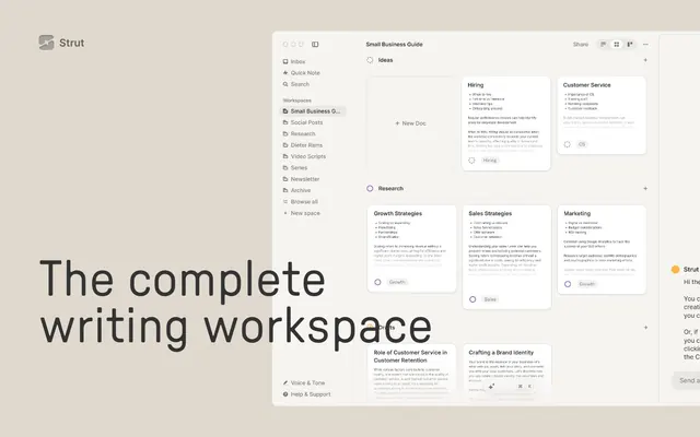
Strut's design system uses an antique paper aesthetic with modern, structured typography for a focused writing environment. A warm, desaturated canvas color sets a muted backdrop for crisp UI elements, defined by subtle borders rather than heavy shadows. The primary accent color is a soft, vivid yellow, used sparingly to highlight functional iconography and interactive elements. Component weights are ghost-like and delicate, prioritizing content over chrome.
The page uses a full-bleed layout for its hero section, featuring a centered headline over a background that extends edge-to-edge. Subsequent sections typically follow a max-width contained pattern, with content centered within a comfortable reading width. Section rhythm is marked by consistent vertical spacing of 96px, with no alternating background colors between sections. Content is arranged in alternating text-left/image-right (and vice versa) patterns, often with text descriptions beside product screenshots. Minor elements can appear in multi-column grids (e.g., 2 or 3 features). The overall density is comfortable, with generous breathing room between content blocks. Navigation is a minimal top bar with simple text links and a 'Strut' logo.
This design system uses product screenshots as its primary visual language. These screenshots are typically contained within UI frames, presented at a slight angle or as direct, clean depictions of the software interface. They serve an explanatory and product-showcase role, demonstrating features in context rather than purely decorative. There is an absence of lifestyle photography or complex illustrations; the focus is on the UI itself. Icons are minimal, mostly monochromatic outlines, using Solid Black (#000000) or Amber Accent (#ffb546) as fills, indicating functionality rather than adding decorative flair. Imagery density is moderate, carefully balanced with text blocks.
Reminiscent of Notion, Linear, Hey.com, Basecamp.
# Strut — Style Reference
> Antique Paper Workspace

**Theme:** light

**Site:** https://strut.so

Strut's design system uses an antique paper aesthetic with modern, structured typography for a focused writing environment. A warm, desaturated canvas color sets a muted backdrop for crisp UI elements, defined by subtle borders rather than heavy shadows. The primary accent color is a soft, vivid yellow, used sparingly to highlight functional iconography and interactive elements. Component weights are ghost-like and delicate, prioritizing content over chrome.

## Tokens — Colors

| Name | Value | Token | Role |
|------|------|------|------|
| Amber Accent | `#ffb546` | `--color-amber-accent` | Yellow decorative accent for icons, marks, and small graphic details. Do not promote it to the primary CTA color |
| Oatmeal Canvas | `#e5dfd5` | `--color-oatmeal-canvas` | Page backgrounds, card surfaces, and general UI canvas. Provides a warm, desaturated base |
| Muted Ash | `#73706b` | `--color-muted-ash` | Decorative strokes, subtle borders, and placeholder text. A medium-dark gray for understated separation |
| Storm Gray | `#676460` | `--color-storm-gray` | Secondary text, link borders, and inactive icon fills. Slightly darker than Muted Ash for increased legibility |
| Charcoal Text | `#333333` | `--color-charcoal-text` | Primary body text, headings, and strong borders. Provides high contrast against light backgrounds |
| Solid Black | `#000000` | `--color-solid-black` | Icon fills and specific graphic elements, used sparingly for strong contrast |

## Tokens — Typography

### GT Pressura Standard
- **Substitute:** Montserrat
- **Weights:** 400, 500
- **Sizes:** 12px, 14px, 48px, 68px, 104px, 136px
- **Line height:** 0.92, 1, 1.33, 1.43, 1.67
- **Letter spacing:** -0.76px at 104px, -0.67px at 68px, -0.34px at 48px, 0.85px at 14px, 0.6px at 12px
- **Role:** Display headings and section titles. The wide letter-spacing on larger sizes creates a distinctive, open aesthetic that is both modern and hints at classic print layouts. Tighter spacing on small text maintains legibility.

### Inter
- **Substitute:** Inter
- **Weights:** 400, 600
- **Sizes:** 10px, 14px, 16px, 20px, 32px, 48px
- **Line height:** 1.17, 1.25, 1.4, 1.43, 1.5, 1.6
- **Letter spacing:** 0.214em at 10px, 0.1em at 14px
- **Role:** Body copy, links, functional UI text, and subheadings. A highly legible sans-serif for everyday content and interaction.

## Tokens — Type Scale

| Role | Size | Line height | Letter spacing |
|------|------|------|------|
| caption | 10px | 1.6 | 2.14px |
| body | 14px | 1.43 | 1px |
| body-lg | 16px | 1.5 | — |
| subheading | 20px | 1.4 | — |
| heading-sm | 32px | 1.25 | — |
| heading | 48px | 1.33 | -3.4px |
| heading-lg | 68px | 1 | -6.7px |
| display | 136px | 0.92 | -7.6px |

## Tokens — Spacing

- **Section gap:** 96px
- **Card padding:** 16px
- **Element gap:** 16px

## Tokens — Radius

- **Default:** 8px
- **Cards:** 8px
- **badges:** 0px
- **containers:** 28px
- **elements:** 24px

## Tokens — Elevation

- **Card/Modal:** `rgba(0, 0, 0, 0.5) 0px 1px 0px 0px inset, rgba(0, 0, 0, 0.5) 0px 1px 0px 0px`

## Layout

The page uses a full-bleed layout for its hero section, featuring a centered headline over a background that extends edge-to-edge. Subsequent sections typically follow a max-width contained pattern, with content centered within a comfortable reading width. Section rhythm is marked by consistent vertical spacing of 96px, with no alternating background colors between sections. Content is arranged in alternating text-left/image-right (and vice versa) patterns, often with text descriptions beside product screenshots. Minor elements can appear in multi-column grids (e.g., 2 or 3 features). The overall density is comfortable, with generous breathing room between content blocks. Navigation is a minimal top bar with simple text links and a 'Strut' logo.

## Imagery

This design system uses product screenshots as its primary visual language. These screenshots are typically contained within UI frames, presented at a slight angle or as direct, clean depictions of the software interface. They serve an explanatory and product-showcase role, demonstrating features in context rather than purely decorative. There is an absence of lifestyle photography or complex illustrations; the focus is on the UI itself. Icons are minimal, mostly monochromatic outlines, using Solid Black (#000000) or Amber Accent (#ffb546) as fills, indicating functionality rather than adding decorative flair. Imagery density is moderate, carefully balanced with text blocks.

## Components

### Interactive Card
*Standard content containers for features and workspace elements.*

Background is Oatmeal Canvas (#e5dfd5). Features a subtle 1px solid border of Charcoal Text (#333333). Corner radius is 8px. Padding is 16px.

### Ghost Button/Link
*Used for secondary actions and text-based interactive elements.*

Text color is Storm Gray (#676460) or Charcoal Text (#333333). When acting as a button, it has a 1px border using Charcoal Text (#333333) or Storm Gray (#676460) but no background fill. Radius is 0px.

### Icon Button
*Small, functional buttons identified by an icon.*

Icons typically use Amber Accent (#ffb546) or Solid Black (#000000) for fill. No distinct background or border, relying on the icon itself for visual weight.

### Badge (Neutral Text)
*Indicative labels without a background.*

Text color is Charcoal Text (#333333). No background color and no border. Padding is 0px with 0px border radius for tight integration.

## Guidelines

### Do

- Use Oatmeal Canvas (#e5dfd5) as the primary background for all major sections and containers.
- Apply GT Pressura Standard for all display-level typography, ensuring high letter-spacing on larger sizes for a distinctive open feel.
- Define UI element separation using Charcoal Text (#333333) or Muted Ash (#73706b) 1px solid borders, avoiding heavy shadows.
- Reserve Amber Accent (#ffb546) for critical interactive elements like active icons or subtle state indicators.
- Maintain a clear content hierarchy using Inter for body and functional text, with varying weights for emphasis at 10px-48px sizes.
- Apply 8px radius for general components and cards, and 28px for larger interactive containers, maintaining a soft, friendly feel.
- Utilize 16px for horizontal and vertical element gaps to ensure consistent breathing room and clear content separation.

### Don't

- Do not use dark or primary colored backgrounds for entire sections; the canvas should remain light and desaturated.
- Avoid bold or heavy font weights for headlines; use GT Pressura Standard 400/500 with generous letter-spacing to create visual impact.
- Do not over-saturate colored elements; the Amber Accent (#ffb546) is designed to be a pop against a muted palette, not compete with it.
- Avoid using multiple colors for text styles beyond Charcoal Text (#333333) and Storm Gray (#676460); maintain a monochromatic text palette.
- Do not introduce complex shadows or gradients; rely on subtle borders and high contrast for definition.
- Never compromise the wide letter-spacing for GT Pressura Standard headings; it is crucial to the brand's typographic identity.
- Do not apply padding below 16px for cards; this system prioritizes a comfortable, uncrowded density.

## Agent Prompt Guide

Quick Color Reference:
text: #333333
background: #e5dfd5
border: #333333
accent: #ffb546
primary action: no distinct CTA color

Example Component Prompts:
1. Create a Hero section: Oatmeal Canvas (#e5dfd5) background. Centered headline 'The complete writing workspace' in GT Pressura Standard weight 400, size 136px, Charcoal Text (#333333), letter-spacing -7.6px. Subheading 'Capture notes, organize projects' in Inter weight 400, size 20px, Charcoal Text (#333333), line-height 1.4.
2. Create an Interactive Card: Oatmeal Canvas (#e5dfd5) background, 8px radius. 1px solid Charcoal Text (#333333) border. Padding 16px. Headline 'My Project Ideas' in Inter weight 600, size 16px, Charcoal Text (#333333). Body text 'Outline your next big idea' in Inter weight 400, size 14px, Storm Gray (#676460).
3. Create a Ghost Link with Icon: Text 'Read More' in Storm Gray (#676460), Inter weight 400, size 14px. Prepend an icon filled with Amber Accent (#ffb546). No background or border. Margin 8px right of icon.
More like this









Keep what you find
A free account saves references to boards and can send you a weekly email of picks based on what you save.
To see every result, go Pro.