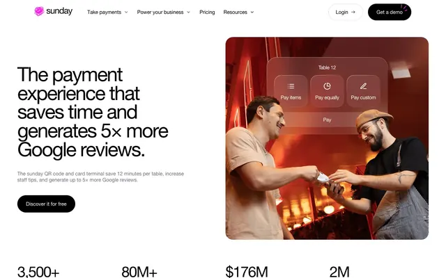
Preview image. Unlock full-res
Monochromatic Precision, Neon Pulse
Color palette
Pink state accent for badges, validation surfaces, and short status labels. Do not promote it to the primary CTA color
Page backgrounds, card surfaces, ghost button text and borders
Primary text, button backgrounds, strong borders
Muted text, placeholder text
Light border lines, input outlines
Secondary navigation text, subtle icon accents
Tertiary navigation text, faint shadow tint
Fine separators, very light text
Typography
- Weights
- 400
- Sizes
- 12px, 14px, 16px, 18px, 24px, 32px, 48px, 64px, 200px
- Line height
- 0.8, 0.95, 1, 1.13, 1.14, 1.2, 1.25, 1.33, 1.78
- Letter spacing
- -0.0500em at 200px (display), -0.0300em at 64px (display-lg), -0.0100em at 48px (heading-lg), 0.0800em at 12-14px (caption/badge) and normal at other sizes.
- Fallback
- Arial, sans-serif
The sole typeface, Helvetica Neue, is used across all text elements. Its clean, geometric form supports the modern aesthetic. Varying weights, sizes, and a precise letter-spacing system create hierarchy, ensuring impact for headlines and legibility for body text without introducing visual noise.
Spacing & shape
Elevation
Components
Filled button with 'Midnight Ink' background, 'Canvas White' text, and a distinctive pill-shaped '64px' border-radius. Padding is `0px` vertical and `28px` horizontal.
Text-only button with 'Midnight Ink' text, transparent background, and no border-radius. Used for navigation or less prominent actions. Padding is `0`.
Card with a subtle light gray background 'rgba(14, 7, 29, 0.04)', '16px' border-radius, and generous '40px' padding on all sides. No shadow.
Large card with 'rgba(14, 7, 29, 0.04)' background and an asymmetric '48px 0px 0px 48px' border-radius. Features substantial '80px' padding.
Input field with transparent background, 'Midnight Ink' text, 'Subtle Gray' placeholder, a '16px' border-radius, and a '1px solid Border Ash' bottom border. '16px' padding on left, right, and top.
Top fixed navigation with 'Canvas White' background and a subtle shadow 'rgba(0, 0, 0, 0.15) 0px 12px 60px 0px'. Elements spaced by `8px`. Interactive items use 'Midnight Ink' for primary, 'Accent Slate' for secondary.
Text badge ('Vivid Orchid' text, transparent background) indicating a specific status or category, often seen in all caps with `0.08em` letter-spacing. Has a '100px' (pill-shaped) border-radius when actively used.
Guidelines
- Prioritize high-contrast text against backgrounds; use 'Midnight Ink' on 'Canvas White' or vice-versa.
- Apply 'Vivid Orchid' sparingly, only for interactive elements, highlights, and status indicators to maintain its impact.
- Use 'Helvetica Neue' universally for all typography, adjusting size, weight, and letter-spacing to establish hierarchy.
- Maintain a comfortable density with '8px' element gaps and '16px' card padding for all standard content blocks.
- Implement soft, rounded corners with '16px' radius for cards and inputs, and a distinct '64px' radius for primary buttons.
- Employ the navigation bar's shadow 'rgba(0, 0, 0, 0.15) 0px 12px 60px 0px' for key elevated elements only, such as fixed headers or modals.
- Ensure section transitions are clear using '56px' vertical spacing between distinct content blocks or by alternating surface backgrounds.
- Avoid introducing additional saturated colors; 'Vivid Orchid' is the sole accent color.
- Do not use overly bold or heavy typography; 'Helvetica Neue' weight 400 is the standard, and heavier weights should be avoided even for large headlines.
- Refrain from using hard, square corners; embrace the '16px' and '64px' radii as a signature characteristic.
- Do not add additional box-shadows beyond the single defined nav shadow; elevation is kept minimal.
- Avoid decorative imagery that competes with the UI or introduces new color palettes.
- Do not vary line-height significantly from the established type scale; maintain a precise, compact rhythm.
- Never use '0px' border-radius on interactive elements unless specifically for a ghost link, as all actionable components have distinct rounding.
About this system
ShowHide
sunday's visual system evokes a sleek, high-tech interface with a strong sense of precision. Its foundation is a stark monochrome canvas, primarily white with deep black accents, creating high contrast. Interactivity is signaled by a singular, vibrant pinkish-purple hue, used sparingly for emphasis. Typography is impactful yet restrained, maintaining clarity in a compact layout. Components are lightweight, featuring soft rounded corners and subtle elevation for hierarchy, avoiding heavy visual elements to maintain an airy feel.
The page maintains a centered, max-width '1328px' contained layout. The hero section features a left-aligned, commanding headline adjacent to a product visual on the right, creating an engaging split-layout. Subsequent sections largely follow a consistent vertical rhythm with '56px' section gaps. Content often alternates between dark and light backgrounds. Feature sections implement a card-grid pattern, sometimes with asymmetric '48px 0px 0px 48px' radii for visual distinction, presenting information in compact, digestible blocks. The navigation is a sticky top bar, providing global access with a subtle elevation shadow.
The imagery features highly polished product screenshots and candid, high-quality photography, often depicting people interacting with the payment system in a restaurant setting. Product shots tend to be isolated or tightly cropped, emphasizing the device or app interface. Photography is realistic, well-lit, and clean, with a focus on human connection and ease of use. Icons, when present, are simple, outlined, and monochromatic, typically 'Midnight Ink' or 'Accent Slate'. The density of imagery is balanced, serving to punctuate text sections and demonstrate product features rather than overwhelming the page.
Reminiscent of Stripe, Revolut, Linear, Plaid.
# sunday — Style Reference
> Monochromatic Precision, Neon Pulse

**Theme:** light

**Site:** https://sundayapp.com

sunday's visual system evokes a sleek, high-tech interface with a strong sense of precision. Its foundation is a stark monochrome canvas, primarily white with deep black accents, creating high contrast. Interactivity is signaled by a singular, vibrant pinkish-purple hue, used sparingly for emphasis. Typography is impactful yet restrained, maintaining clarity in a compact layout. Components are lightweight, featuring soft rounded corners and subtle elevation for hierarchy, avoiding heavy visual elements to maintain an airy feel.

## Tokens — Colors

| Name | Value | Token | Role |
|------|------|------|------|
| Vivid Orchid | `#ff17e9` | `--color-vivid-orchid` | Pink state accent for badges, validation surfaces, and short status labels. Do not promote it to the primary CTA color |
| Canvas White | `#ffffff` | `--color-canvas-white` | Page backgrounds, card surfaces, ghost button text and borders |
| Midnight Ink | `#000000` | `--color-midnight-ink` | Primary text, button backgrounds, strong borders |
| Subtle Gray | `#736f7c` | `--color-subtle-gray` | Muted text, placeholder text |
| Border Ash | `#dedede` | `--color-border-ash` | Light border lines, input outlines |
| Accent Slate | `#7f7f7f` | `--color-accent-slate` | Secondary navigation text, subtle icon accents |
| Ghost Shadow | `#8b8893` | `--color-ghost-shadow` | Tertiary navigation text, faint shadow tint |
| Divider Silver | `#bdbdbd` | `--color-divider-silver` | Fine separators, very light text |

## Tokens — Typography

### Helvetica Neue
- **Substitute:** Arial, sans-serif
- **Weights:** 400
- **Sizes:** 12px, 14px, 16px, 18px, 24px, 32px, 48px, 64px, 200px
- **Line height:** 0.8, 0.95, 1, 1.13, 1.14, 1.2, 1.25, 1.33, 1.78
- **Letter spacing:** -0.0500em at 200px (display), -0.0300em at 64px (display-lg), -0.0100em at 48px (heading-lg), 0.0800em at 12-14px (caption/badge) and normal at other sizes.
- **Role:** The sole typeface, Helvetica Neue, is used across all text elements. Its clean, geometric form supports the modern aesthetic. Varying weights, sizes, and a precise letter-spacing system create hierarchy, ensuring impact for headlines and legibility for body text without introducing visual noise.

## Tokens — Type Scale

Perfect Fifth (1.5) from 16px base.

| Role | Size | Line height | Letter spacing |
|------|------|------|------|
| caption | 12px | 1.78 | 0.96px |
| body-sm | 14px | 1.2 | 1.12px |
| body | 16px | 1.25 | — |
| subheading | 18px | 1.14 | — |
| heading | 24px | 1.13 | — |
| heading-lg | 48px | 0.95 | -0.48px |
| display-lg | 64px | 0.8 | -1.92px |
| display | 200px | 1 | -10px |

## Tokens — Spacing

- **Max width:** 1328px
- **Section gap:** 56px
- **Card padding:** 16px
- **Element gap:** 8px

## Tokens — Radius

- **Buttons:** 64px
- **Inputs:** 16px
- **Cards:** 16px
- **badges:** 100px
- **large-cards:** 48px 0px 0px 48px

## Tokens — Elevation

- **Navigation Bar:** `rgba(0, 0, 0, 0.15) 0px 12px 60px 0px`

## Layout

The page maintains a centered, max-width '1328px' contained layout. The hero section features a left-aligned, commanding headline adjacent to a product visual on the right, creating an engaging split-layout. Subsequent sections largely follow a consistent vertical rhythm with '56px' section gaps. Content often alternates between dark and light backgrounds. Feature sections implement a card-grid pattern, sometimes with asymmetric '48px 0px 0px 48px' radii for visual distinction, presenting information in compact, digestible blocks. The navigation is a sticky top bar, providing global access with a subtle elevation shadow.

## Imagery

The imagery features highly polished product screenshots and candid, high-quality photography, often depicting people interacting with the payment system in a restaurant setting. Product shots tend to be isolated or tightly cropped, emphasizing the device or app interface. Photography is realistic, well-lit, and clean, with a focus on human connection and ease of use. Icons, when present, are simple, outlined, and monochromatic, typically 'Midnight Ink' or 'Accent Slate'. The density of imagery is balanced, serving to punctuate text sections and demonstrate product features rather than overwhelming the page.

## Components

### Primary Filled Button
*Call to action*

Filled button with 'Midnight Ink' background, 'Canvas White' text, and a distinctive pill-shaped '64px' border-radius. Padding is `0px` vertical and `28px` horizontal.

### Ghost Link Button
*Secondary action or link*

Text-only button with 'Midnight Ink' text, transparent background, and no border-radius. Used for navigation or less prominent actions. Padding is `0`.

### Standard Card
*Content container, feature display*

Card with a subtle light gray background 'rgba(14, 7, 29, 0.04)', '16px' border-radius, and generous '40px' padding on all sides. No shadow.

### Asymmetric Section Card
*Prominent content section*

Large card with 'rgba(14, 7, 29, 0.04)' background and an asymmetric '48px 0px 0px 48px' border-radius. Features substantial '80px' padding.

### Text Input Field
*User data entry*

Input field with transparent background, 'Midnight Ink' text, 'Subtle Gray' placeholder, a '16px' border-radius, and a '1px solid Border Ash' bottom border. '16px' padding on left, right, and top.

### Navigation Bar
*Global navigation*

Top fixed navigation with 'Canvas White' background and a subtle shadow 'rgba(0, 0, 0, 0.15) 0px 12px 60px 0px'. Elements spaced by `8px`. Interactive items use 'Midnight Ink' for primary, 'Accent Slate' for secondary.

### Highlight Badge
*Categorization, status indicator*

Text badge ('Vivid Orchid' text, transparent background) indicating a specific status or category, often seen in all caps with `0.08em` letter-spacing. Has a '100px' (pill-shaped) border-radius when actively used.

## Guidelines

### Do

- Prioritize high-contrast text against backgrounds; use 'Midnight Ink' on 'Canvas White' or vice-versa.
- Apply 'Vivid Orchid' sparingly, only for interactive elements, highlights, and status indicators to maintain its impact.
- Use 'Helvetica Neue' universally for all typography, adjusting size, weight, and letter-spacing to establish hierarchy.
- Maintain a comfortable density with '8px' element gaps and '16px' card padding for all standard content blocks.
- Implement soft, rounded corners with '16px' radius for cards and inputs, and a distinct '64px' radius for primary buttons.
- Employ the navigation bar's shadow 'rgba(0, 0, 0, 0.15) 0px 12px 60px 0px' for key elevated elements only, such as fixed headers or modals.
- Ensure section transitions are clear using '56px' vertical spacing between distinct content blocks or by alternating surface backgrounds.

### Don't

- Avoid introducing additional saturated colors; 'Vivid Orchid' is the sole accent color.
- Do not use overly bold or heavy typography; 'Helvetica Neue' weight 400 is the standard, and heavier weights should be avoided even for large headlines.
- Refrain from using hard, square corners; embrace the '16px' and '64px' radii as a signature characteristic.
- Do not add additional box-shadows beyond the single defined nav shadow; elevation is kept minimal.
- Avoid decorative imagery that competes with the UI or introduces new color palettes.
- Do not vary line-height significantly from the established type scale; maintain a precise, compact rhythm.
- Never use '0px' border-radius on interactive elements unless specifically for a ghost link, as all actionable components have distinct rounding.

## Agent Prompt Guide

Quick Color Reference:
text: #000000
background: #ffffff
border: #dedede
accent: #ff17e9
primary action: no distinct CTA color

Example Component Prompts:
No distinct primary action color was observed; use the extracted neutral button treatments instead of inventing a filled CTA color.
2. Design a feature card: 'rgba(14, 7, 29, 0.04)' background, 16px radius, 40px padding. Inside, use 'Midnight Ink' for a heading at 24px (heading) and 'Subtle Gray' for body text at 16px (body).
3. Generate a primary navigation bar: 'Canvas White' background, 8px element gap. Use 'Midnight Ink' for active links and 'Accent Slate' for inactive links. Apply the navigation bar shadow `rgba(0, 0, 0, 0.15) 0px 12px 60px 0px`.
More like this









Keep what you find
A free account saves references to boards and can send you a weekly email of picks based on what you save.
To see every result, go Pro.