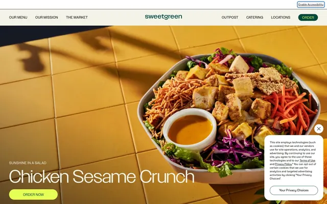
Preview image. Unlock full-res
Farmer's market clarity
Color palette
Primary action backgrounds, vibrant highlights, badges — a burst of natural energy
Primary text for actions, interactive elements, and certain headings; provides deep contrast
Primary text, deep shadows, essential borders, and subtle dark backgrounds for footer elements
Canvas background, prominent surface accents, and muted text elements
Secondary surface backgrounds, card backgrounds — a soft, desaturated green base
Tertiary surface backgrounds, warmer card backgrounds
Muted text, ghost button borders and text
Subtle shadow color, creating a soft, warm elevation under cards
Decorative lines, strict borders, icon fills, and ultra-high contrast text where absolute legibility is required
Typography
- Weights
- 400, 700
- Sizes
- 12px, 14px, 16px, 18px, 20px, 24px
- Line height
- 1, 1.2, 1.25, 1.33, 1.38, 2.21, 2.64
- Letter spacing
- 0.0100em, 0.0170em, 0.0300em, 0.0500em
- Fallback
- Inter
A versatile workhorse for body text, navigation, and smaller headings. The slightly wider tracking for smaller sizes maintains legibility and an open, friendly feel.
- Weights
- 400
- Sizes
- 40px, 70px, 80px
- Line height
- 0.85, 1
- Letter spacing
- -0.0470em
- Fallback
- Montserrat
Display headlines and hero text. The extra-light 'Grenette' at 200 weight with tighter tracking creates an ephemeral, almost whispered presence, making the large headlines feel refined rather than imposing.
- Weights
- 400
- Sizes
- 12px, 14px
- Line height
- 1.29, 1.33
- Letter spacing
- 0.017
SweetSansText-Regular — detected in extracted data but not described by AI
- Weights
- 200
- Sizes
- 48px
- Line height
- 1
- Letter spacing
- -0.047
Grenette — detected in extracted data but not described by AI
Spacing & shape
Elevation
Components
Filled with Fresh Sprout (#e6ff55) background, Garden Patch (#00473c) text, and a highly rounded 1000px border-radius. Padding is generous at 15px top, 60px right, 13px bottom, 60px left.
Transparent background, Stone Grey (#8c8c82) text and 1px border, with 4px border-radius. No explicit padding, relying on natural text spacing.
Filled with Garden Patch (#00473c) background, Fresh Sprout (#e6ff55) text, and a 1000px border-radius. Padding is tighter at 7px top, 16px right, 5px bottom, 16px left.
Uses Willow Mist (#d8e5d6) or Grain Sand (#e8dcc6) as background. Has a 24px border-radius and a subtle shadow: rgba(14, 21, 14, 0.4) 3px 3px 32px -10px. Internal padding is 24px all around for content.
Transparent background, Soil Shadow (#0e150e) 1px border, with an 8px border-radius. Text color is Soil Shadow (#0e150e). Padding is 12px top/bottom, 16px left, and 50px right to accommodate visual elements.
Filled with Fresh Sprout (#e6ff55) background, Pitch Black (#000000) text, and 20px border-radius. Padding is 3px top, 20px right, 0px bottom, 20px left.
Guidelines
- Always use Fresh Sprout (#e6ff55) exclusively for primary action backgrounds and brand highlights to maintain its energetic impact.
- Apply the 1000px border-radius token for all primary and navigation filled buttons to achieve a distinct pill shape.
- Prioritize text legibility by pairing Soil Shadow (#0e150e) or Garden Patch (#00473c) on Field Cream (#f4f3e7) or Willow Mist (#d8e5d6) backgrounds.
- Utilize 'Grenette' font at weight 200 for large display headlines to convey authority through subtlety and restraint.
- Maintain a clear visual hierarchy with generous vertical spacing, using the sectionGap of '40px' between major content blocks.
- Introduce card elevation sparingly using the rgba(14, 21, 14, 0.4) 3px 3px 32px -10px shadow for interactive elements or featured content.
- Employ the 24px border-radius for cards and content containers to soften their edges and contribute an organic feel.
- Do not use Fresh Sprout (#e6ff55) for general text or borders, as it dulls its impact as an accent.
- Avoid solid, sharp-edged rectangles for interactive elements; opt for rounded corners, especially 20px for badges and 1000px for buttons.
- Do not use 'SweetSansText' for large, impactful headlines; reserve the distinctive 'Grenette' for hero text and primary titles.
- Refrain from heavy, dark background sections unless explicitly for a footer or dedicated dark mode component.
- Avoid using multiple chromatic colors together; let Fresh Sprout be the primary splash of color.
- Do not introduce complex drop shadows or hard outlines; elements should feel light and naturally elevated or integrated.
- Never use excessive or inconsistent letter-spacing; adhere to the specified tracking for each font style and size.
About this system
ShowHide
Sweetgreen cultivates a fresh, approachable aesthetic with a primary focus on ingredient transparency and natural vitality. Its visual language balances an organic, handcrafted feel with clean, modern utility. A vibrant, almost neon green-yellow acts as a spirited accent against an otherwise muted, earthy palette of desaturated greens and soft off-whites, echoing fresh produce against natural backdrops. Typography is friendly yet confident, pairing a distinct, light-weight display face for headlines with a clean sans-serif for body text. Components are light, favoring generous organic radii and subtle elevation.
The page uses a maximum content width of 1440px, centered on the screen. The hero section is full-width with a visual-dominant background, featuring a large, centered headline and a prominent primary action button. Content sections often alternate between soft, muted background colors (Willow Mist, Grain Sand, Field Cream) and utilize a two-column layout with text and imagery side-by-side or stacked. A flexible grid displays product cards, typically in a three-column arrangement. Navigation is a persistent top bar with essential links and a 'Order' button, providing quick access and brand consistency.
Photography features vibrant, high-key close-ups of food and fresh ingredients, often arranged in bowls or on light-colored rustic surfaces. The treatment focuses on natural light and rich, true-to-life colors, with minimal styling beyond presentation. Product shots are typically isolated or minimally contextualized to emphasize the raw elements. Small, functional icons are filled, with a medium stroke weight where outlines exist, often in Pitch Black (achromatic). Imagery serves primarily to showcase the product irresistibly, acting as explanatory content and appetite stimulant.
Reminiscent of Chipotle, Erewhon Market, Trader Joe's, Whole Foods Market.
# sweetgreen — Style Reference
> Farmer's market clarity

**Theme:** light

**Site:** https://www.sweetgreen.com

Sweetgreen cultivates a fresh, approachable aesthetic with a primary focus on ingredient transparency and natural vitality. Its visual language balances an organic, handcrafted feel with clean, modern utility. A vibrant, almost neon green-yellow acts as a spirited accent against an otherwise muted, earthy palette of desaturated greens and soft off-whites, echoing fresh produce against natural backdrops. Typography is friendly yet confident, pairing a distinct, light-weight display face for headlines with a clean sans-serif for body text. Components are light, favoring generous organic radii and subtle elevation.

## Tokens — Colors

| Name | Value | Token | Role |
|------|------|------|------|
| Fresh Sprout | `#e6ff55` | `--color-fresh-sprout` | Primary action backgrounds, vibrant highlights, badges — a burst of natural energy |
| Garden Patch | `#00473c` | `--color-garden-patch` | Primary text for actions, interactive elements, and certain headings; provides deep contrast |
| Soil Shadow | `#0e150e` | `--color-soil-shadow` | Primary text, deep shadows, essential borders, and subtle dark backgrounds for footer elements |
| Field Cream | `#f4f3e7` | `--color-field-cream` | Canvas background, prominent surface accents, and muted text elements |
| Willow Mist | `#d8e5d6` | `--color-willow-mist` | Secondary surface backgrounds, card backgrounds — a soft, desaturated green base |
| Grain Sand | `#e8dcc6` | `--color-grain-sand` | Tertiary surface backgrounds, warmer card backgrounds |
| Stone Grey | `#8c8c82` | `--color-stone-grey` | Muted text, ghost button borders and text |
| Charcoal Haze | `#9fa19f` | `--color-charcoal-haze` | Subtle shadow color, creating a soft, warm elevation under cards |
| Pitch Black | `#000000` | `--color-pitch-black` | Decorative lines, strict borders, icon fills, and ultra-high contrast text where absolute legibility is required |

## Tokens — Typography

### SweetSansText
- **Substitute:** Inter
- **Weights:** 400, 700
- **Sizes:** 12px, 14px, 16px, 18px, 20px, 24px
- **Line height:** 1, 1.2, 1.25, 1.33, 1.38, 2.21, 2.64
- **Letter spacing:** 0.0100em, 0.0170em, 0.0300em, 0.0500em
- **Role:** A versatile workhorse for body text, navigation, and smaller headings. The slightly wider tracking for smaller sizes maintains legibility and an open, friendly feel.

### SweetSans | Grenette
- **Substitute:** Montserrat
- **Weights:** 400
- **Sizes:** 40px, 70px, 80px
- **Line height:** 0.85, 1
- **Letter spacing:** -0.0470em
- **Role:** Display headlines and hero text. The extra-light 'Grenette' at 200 weight with tighter tracking creates an ephemeral, almost whispered presence, making the large headlines feel refined rather than imposing.

### SweetSansText-Regular
- **Weights:** 400
- **Sizes:** 12px, 14px
- **Line height:** 1.29, 1.33
- **Letter spacing:** 0.017
- **Role:** SweetSansText-Regular — detected in extracted data but not described by AI

### Grenette
- **Weights:** 200
- **Sizes:** 48px
- **Line height:** 1
- **Letter spacing:** -0.047
- **Role:** Grenette — detected in extracted data but not described by AI

## Tokens — Type Scale

| Role | Size | Line height | Letter spacing |
|------|------|------|------|
| caption | 12px | 1.2 | — |
| body-sm | 14px | 1.29 | 0.17px |
| body | 16px | 1.25 | — |
| subheading | 18px | 1.33 | — |
| heading-sm | 20px | 1.25 | — |
| heading | 24px | 1 | — |
| heading-lg | 40px | 0.85 | — |
| display | 70px | 0.85 | — |

## Tokens — Spacing

- **Max width:** 1440px
- **Section gap:** 40px
- **Card padding:** 24px
- **Element gap:** 8px

## Tokens — Radius

- **Buttons:** 1000px
- **Inputs:** 8px
- **Cards:** 24px
- **Images:** 20px
- **badges:** 20px
- **links:** 4px

## Tokens — Elevation

- **Product Card:** `rgba(14, 21, 14, 0.4) 3px 3px 32px -10px`
- **Interactive Button:** `rgba(14, 21, 14, 0.4) 3px 3px 32px -10px`

## Layout

The page uses a maximum content width of 1440px, centered on the screen. The hero section is full-width with a visual-dominant background, featuring a large, centered headline and a prominent primary action button. Content sections often alternate between soft, muted background colors (Willow Mist, Grain Sand, Field Cream) and utilize a two-column layout with text and imagery side-by-side or stacked. A flexible grid displays product cards, typically in a three-column arrangement. Navigation is a persistent top bar with essential links and a 'Order' button, providing quick access and brand consistency.

## Imagery

Photography features vibrant, high-key close-ups of food and fresh ingredients, often arranged in bowls or on light-colored rustic surfaces. The treatment focuses on natural light and rich, true-to-life colors, with minimal styling beyond presentation. Product shots are typically isolated or minimally contextualized to emphasize the raw elements. Small, functional icons are filled, with a medium stroke weight where outlines exist, often in Pitch Black (achromatic). Imagery serves primarily to showcase the product irresistibly, acting as explanatory content and appetite stimulant.

## Components

### Primary Action Button
*Main call-to-action button for initiating key processes.*

Filled with Fresh Sprout (#e6ff55) background, Garden Patch (#00473c) text, and a highly rounded 1000px border-radius. Padding is generous at 15px top, 60px right, 13px bottom, 60px left.

### Ghost Link Button
*Secondary action or navigation link within content.*

Transparent background, Stone Grey (#8c8c82) text and 1px border, with 4px border-radius. No explicit padding, relying on natural text spacing.

### Navigation Action Button
*Compact primary action within navigation bars.*

Filled with Garden Patch (#00473c) background, Fresh Sprout (#e6ff55) text, and a 1000px border-radius. Padding is tighter at 7px top, 16px right, 5px bottom, 16px left.

### Product Card
*Display for individual menu items or feature blocks.*

Uses Willow Mist (#d8e5d6) or Grain Sand (#e8dcc6) as background. Has a 24px border-radius and a subtle shadow: rgba(14, 21, 14, 0.4) 3px 3px 32px -10px. Internal padding is 24px all around for content.

### Interactive Input Field
*Used for user data entry in forms.*

Transparent background, Soil Shadow (#0e150e) 1px border, with an 8px border-radius. Text color is Soil Shadow (#0e150e). Padding is 12px top/bottom, 16px left, and 50px right to accommodate visual elements.

### Accent Badge
*Highlights key attributes or status.*

Filled with Fresh Sprout (#e6ff55) background, Pitch Black (#000000) text, and 20px border-radius. Padding is 3px top, 20px right, 0px bottom, 20px left.

## Guidelines

### Do

- Always use Fresh Sprout (#e6ff55) exclusively for primary action backgrounds and brand highlights to maintain its energetic impact.
- Apply the 1000px border-radius token for all primary and navigation filled buttons to achieve a distinct pill shape.
- Prioritize text legibility by pairing Soil Shadow (#0e150e) or Garden Patch (#00473c) on Field Cream (#f4f3e7) or Willow Mist (#d8e5d6) backgrounds.
- Utilize 'Grenette' font at weight 200 for large display headlines to convey authority through subtlety and restraint.
- Maintain a clear visual hierarchy with generous vertical spacing, using the sectionGap of '40px' between major content blocks.
- Introduce card elevation sparingly using the rgba(14, 21, 14, 0.4) 3px 3px 32px -10px shadow for interactive elements or featured content.
- Employ the 24px border-radius for cards and content containers to soften their edges and contribute an organic feel.

### Don't

- Do not use Fresh Sprout (#e6ff55) for general text or borders, as it dulls its impact as an accent.
- Avoid solid, sharp-edged rectangles for interactive elements; opt for rounded corners, especially 20px for badges and 1000px for buttons.
- Do not use 'SweetSansText' for large, impactful headlines; reserve the distinctive 'Grenette' for hero text and primary titles.
- Refrain from heavy, dark background sections unless explicitly for a footer or dedicated dark mode component.
- Avoid using multiple chromatic colors together; let Fresh Sprout be the primary splash of color.
- Do not introduce complex drop shadows or hard outlines; elements should feel light and naturally elevated or integrated.
- Never use excessive or inconsistent letter-spacing; adhere to the specified tracking for each font style and size.

## Agent Prompt Guide

### Quick Color Reference
text: #0e150e
background: #f4f3e7
border: #0e150e
accent: #e6ff55
primary action: #e6ff55 (filled action)

### 3-5 Example Component Prompts
1. Create a Primary Action Button: #e6ff55 background, #000000 text, 9999px radius, compact pill padding. Use this filled treatment for the main CTA.
2. Create a product listing card: Willow Mist (#d8e5d6) background, 24px border-radius, shadow rgba(14, 21, 14, 0.4) 3px 3px 32px -10px, 24px padding. Title 'Spicy Thai Salad' using 'SweetSansText' font, weight 700, size 24px, lineHeight 1.0, Soil Shadow (#0e150e) color. Body text 'Fresh greens with a kick.' using 'SweetSansText' font, weight 400, size 16px, lineHeight 1.25, Soil Shadow (#0e150e) color.
3. Create a navigation bar: Field Cream (#f4f3e7) background. Left aligned link 'Our Menu' using 'SweetSansText' font, weight 400, size 16px, lineHeight 1.25, Soil Shadow (#0e150e) color. Right aligned small Navigation Action Button 'Order' and then another link like 'Locations'.
4. Create an input field: transparent background, Soil Shadow (#0e150e) 1px border, 8px border-radius. Placeholder text 'Enter your email' in Stone Grey (#8c8c82), actual text input in Soil Shadow (#0e150e), padding 12px top/bottom, 16px left, 50px right.
More like this









Keep what you find
A free account saves references to boards and can send you a weekly email of picks based on what you save.
To see every result, go Pro.