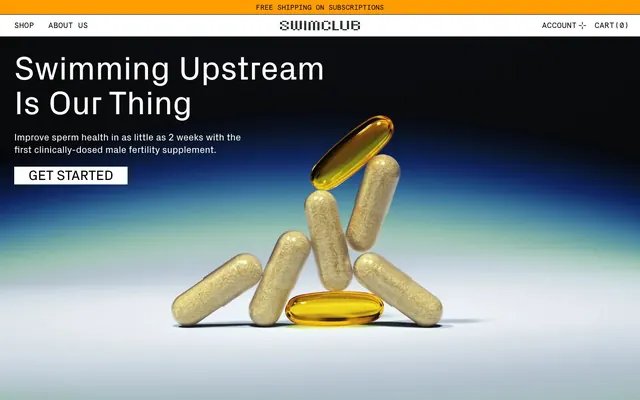
Preview image. Unlock full-res
Scientific precision, stark contrast
Color palette
Accent backgrounds for highlight sections, indicators, and as a strong supporting color
Hero section background, creating depth and a sense of calm
Primary text, strong borders, dark backgrounds in mixed sections, button text on light backgrounds
Page backgrounds, card surfaces, button backgrounds, text on dark backgrounds
Dominant canvas color, subtle background for sections and footers
Muted text, secondary information, auxiliary borders
Faint borders, decorative elements, ghost button states
Soft transition for surface backgrounds, adding subtle texture
Typography
- Weights
- 400, 700
- Sizes
- 12px, 15px, 16px, 17px, 21px, 31px, 37px, 52px, 74px
- Line height
- 1.05, 1.1, 1.3, 1.7
- Letter spacing
- normal
- Fallback
- Inter
Primary typeface for most text elements including body, headings, and navigation. Its clean, geometric form provides a modern and authoritative tone.
- Weights
- 400
- Sizes
- 15px, 17px
- Line height
- 1.1, 1.2
- Letter spacing
- 0.0200em
- Fallback
- Space Mono
Used for specific functional text, like links in navigation or data points, providing a technical, precise feel with its monospaced appearance and slight tracking.
- Weights
- 400
- Sizes
- 96px, 105px
- Line height
- 1
- Letter spacing
- normal
- Fallback
- Pixelify Sans
Exclusive display font for impactful numerical data or special headlines, giving a distinctive retro-digital, scientific-data aesthetic. The large size and pixelated style are key to its identity.
Spacing & shape
Components
Ghost button with no background, black text, and a 1px solid black border. Used for navigation and primary actions that need prominence without a filled background. Text is Px Grotesk, weight 400. Padding zero for nav elements. Color #000000, border #000000, radius 0px.
Solid white background button with black text. Used for primary calls to action like 'GET STARTED'. Text is Px Grotesk, weight 400. Color #000000, background #ffffff, border #000000, radius 0px.
Lightly tinted background, black text, and a 0px border. For less prominent actions or active states that require a subtle visual cue. Text Px Grotesk, weight 400. Color #000000, background oklab(0 0 0 / 0.05), radius 0px. Padding 32px all around.
Transparent background button with muted black text and muted black border. Used for inactive or less emphasized actions. Text Px Grotesk, weight 400. Color oklab(0 0 0 / 0.3), border oklab(0 0 0 / 0.3), radius 0px.
Standard input field with a white background and black text. Features a 0px border. Text is Px Grotesk. Color #000000, background #ffffff. Padding 0px top/bottom, 8px left/right.
Rectangular container with a white background and a 1px solid black border. Houses text content. Padding 32px, radius 0px.
A full-width section with a Sunset Orange (#ff9e00) background. Contains contrast text and distinct pixelated numbers for stats. This defines a visually important content block. Padding is substantial and consistent.
Guidelines
- Prioritize Px Grotesk for all body and heading text, reserving Apercu Mono Pro for technical details and Swimclub for large numerical displays.
- Use Midnight Ink (#000000) for primary text on light backgrounds and Canvas White (#ffffff) for text on dark or Sunset Orange (#ff9e00) backgrounds to maintain contrast.
- Employ Atlantic Fog (#d2dce1) as the default background for general page sections, creating a subtle visual distinction from pure white content blocks.
- Maintain a strict 0px border-radius for all interactive elements and containers, emphasizing a sharp, precise brand aesthetic.
- Utilize liberal padding, especially '32px' for cards and buttons, and '120px' for vertical section gaps, to create a comfortable, spacious layout.
- Employ the Oceanic Gradient as a background for hero sections or prominent visual blocks to introduce subtle depth and visual interest.
- Use Sunset Orange (#ff9e00) sparingly as an accent color for highlight sections or critical information, ensuring it stands out against the neutral palette.
- Avoid using rounded corners; the system's aesthetic is defined by sharp, precise edges.
- Do not introduce additional vibrant colors; Sunset Orange (#ff9e00) is the only chromatic accent.
- Refrain from using heavy shadows or complex elevation; components should feel grounded and part of the surface.
- Do not deviate from the specified typography families, weights, or the intentional use of Apercu Mono Pro for data and Swimclub for large numbers.
- Avoid tight spacing; maintain the comfortable density with `120px` section gaps and `32px` card/button padding.
- Do not use gradients as primary fills for interactive elements; they are reserved for background depth.
- Introduce no new border styles beyond solid 1px lines; the system relies on clean, unambiguous divisions.
About this system
ShowHide
SwimClub projects authority through a deliberate contrast of quiet, near-monochromatic UI with a singular vivid orange accent, and a blend of modern grotesk typography with a distinctive pixelated display font for key statistics. The design feels grounded and scientific, utilizing strong visual hierarchy and a comfortable density. Subtle gradients add depth to backgrounds, while component treatments remain lightweight, emphasizing content over heavy decoration.
Reminiscent of Huel, Glossier, Magic Spoon, Whoop.
# SwimClub — Style Reference
> Scientific precision, stark contrast

**Theme:** light

**Site:** https://swimclub.co

SwimClub projects authority through a deliberate contrast of quiet, near-monochromatic UI with a singular vivid orange accent, and a blend of modern grotesk typography with a distinctive pixelated display font for key statistics. The design feels grounded and scientific, utilizing strong visual hierarchy and a comfortable density. Subtle gradients add depth to backgrounds, while component treatments remain lightweight, emphasizing content over heavy decoration.

## Tokens — Colors

| Name | Value | Token | Role |
|------|------|------|------|
| Sunset Orange | `#ff9e00` | `--color-sunset-orange` | Accent backgrounds for highlight sections, indicators, and as a strong supporting color |
| Oceanic Gradient | `#417390` | `--color-oceanic-gradient` | Hero section background, creating depth and a sense of calm |
| Midnight Ink | `#000000` | `--color-midnight-ink` | Primary text, strong borders, dark backgrounds in mixed sections, button text on light backgrounds |
| Canvas White | `#ffffff` | `--color-canvas-white` | Page backgrounds, card surfaces, button backgrounds, text on dark backgrounds |
| Atlantic Fog | `#d2dce1` | `--color-atlantic-fog` | Dominant canvas color, subtle background for sections and footers |
| Mid-Gray | `#666666` | `--color-mid-gray` | Muted text, secondary information, auxiliary borders |
| Silver Dust | `#b3b3b3` | `--color-silver-dust` | Faint borders, decorative elements, ghost button states |
| Subtle Surface Gradient | `#d2dce0` | `--color-subtle-surface-gradient` | Soft transition for surface backgrounds, adding subtle texture |

## Tokens — Typography

### Px Grotesk
- **Substitute:** Inter
- **Weights:** 400, 700
- **Sizes:** 12px, 15px, 16px, 17px, 21px, 31px, 37px, 52px, 74px
- **Line height:** 1.05, 1.1, 1.3, 1.7
- **Letter spacing:** normal
- **Role:** Primary typeface for most text elements including body, headings, and navigation. Its clean, geometric form provides a modern and authoritative tone.

### Apercu Mono Pro
- **Substitute:** Space Mono
- **Weights:** 400
- **Sizes:** 15px, 17px
- **Line height:** 1.1, 1.2
- **Letter spacing:** 0.0200em
- **Role:** Used for specific functional text, like links in navigation or data points, providing a technical, precise feel with its monospaced appearance and slight tracking.

### Swimclub
- **Substitute:** Pixelify Sans
- **Weights:** 400
- **Sizes:** 96px, 105px
- **Line height:** 1
- **Letter spacing:** normal
- **Role:** Exclusive display font for impactful numerical data or special headlines, giving a distinctive retro-digital, scientific-data aesthetic. The large size and pixelated style are key to its identity.

## Tokens — Type Scale

Perfect Fourth (1.333) from 12px base.

| Role | Size | Line height | Letter spacing |
|------|------|------|------|
| caption | 12px | 1.7 | — |
| body-sm | 15px | 1.7 | — |
| subheading | 21px | 1.3 | — |
| heading-sm | 31px | 1.1 | — |
| heading | 37px | 1.1 | — |
| heading-lg | 52px | 1.05 | — |
| display | 74px | 1.05 | — |

## Tokens — Spacing

- **Section gap:** 120px
- **Card padding:** 32px
- **Element gap:** 4px

## Tokens — Radius

- **Default:** 0px
- **Buttons:** 0px
- **Inputs:** 0px

## Components

### Primary Ghost Button
*Interactive element, calls to action*

Ghost button with no background, black text, and a 1px solid black border. Used for navigation and primary actions that need prominence without a filled background. Text is Px Grotesk, weight 400. Padding zero for nav elements. Color #000000, border #000000, radius 0px.

### Filled White Button
*Interactive element, calls to action*

Solid white background button with black text. Used for primary calls to action like 'GET STARTED'. Text is Px Grotesk, weight 400. Color #000000, background #ffffff, border #000000, radius 0px.

### Subtle Accent Button
*Secondary interactive element, filtering, categorization*

Lightly tinted background, black text, and a 0px border. For less prominent actions or active states that require a subtle visual cue. Text Px Grotesk, weight 400. Color #000000, background oklab(0 0 0 / 0.05), radius 0px. Padding 32px all around.

### Muted Border Button
*Tertiary interactive element, inactive states*

Transparent background button with muted black text and muted black border. Used for inactive or less emphasized actions. Text Px Grotesk, weight 400. Color oklab(0 0 0 / 0.3), border oklab(0 0 0 / 0.3), radius 0px.

### Text Input (Default)
*Form element*

Standard input field with a white background and black text. Features a 0px border. Text is Px Grotesk. Color #000000, background #ffffff. Padding 0px top/bottom, 8px left/right.

### Info Card
*Content container, feature display*

Rectangular container with a white background and a 1px solid black border. Houses text content. Padding 32px, radius 0px.

### Highlight Section
*Prominent information display*

A full-width section with a Sunset Orange (#ff9e00) background. Contains contrast text and distinct pixelated numbers for stats. This defines a visually important content block. Padding is substantial and consistent.

## Guidelines

### Do

- Prioritize Px Grotesk for all body and heading text, reserving Apercu Mono Pro for technical details and Swimclub for large numerical displays.
- Use Midnight Ink (#000000) for primary text on light backgrounds and Canvas White (#ffffff) for text on dark or Sunset Orange (#ff9e00) backgrounds to maintain contrast.
- Employ Atlantic Fog (#d2dce1) as the default background for general page sections, creating a subtle visual distinction from pure white content blocks.
- Maintain a strict 0px border-radius for all interactive elements and containers, emphasizing a sharp, precise brand aesthetic.
- Utilize liberal padding, especially '32px' for cards and buttons, and '120px' for vertical section gaps, to create a comfortable, spacious layout.
- Employ the Oceanic Gradient as a background for hero sections or prominent visual blocks to introduce subtle depth and visual interest.
- Use Sunset Orange (#ff9e00) sparingly as an accent color for highlight sections or critical information, ensuring it stands out against the neutral palette.

### Don't

- Avoid using rounded corners; the system's aesthetic is defined by sharp, precise edges.
- Do not introduce additional vibrant colors; Sunset Orange (#ff9e00) is the only chromatic accent.
- Refrain from using heavy shadows or complex elevation; components should feel grounded and part of the surface.
- Do not deviate from the specified typography families, weights, or the intentional use of Apercu Mono Pro for data and Swimclub for large numbers.
- Avoid tight spacing; maintain the comfortable density with `120px` section gaps and `32px` card/button padding.
- Do not use gradients as primary fills for interactive elements; they are reserved for background depth.
- Introduce no new border styles beyond solid 1px lines; the system relies on clean, unambiguous divisions.

## Agent Prompt Guide

Quick Color Reference:
- text: #000000
- background: #d2dce1
- border: #000000
- accent: #ff9e00
- primary action: no distinct CTA color

Example Component Prompts:
- Create a hero section: full-bleed background using the Oceanic Gradient, centered 'Swimming Upstream Is Our Thing' heading in Px Grotesk weight 700 at 74px size with Canvas White text, followed by supporting text Px Grotesk weight 400 at 17px size with Canvas White text, and a 'GET STARTED' filled white button (#ffffff background, #000000 text, 0px radius, 32px padding).
- Create a statistics section: full-bleed Sunset Orange (#ff9e00) background, with a centered 'The State of Men’s Reproductive Health' heading Px Grotesk weight 700 at 31px size with Midnight Ink text. Below that, display three statistics horizontally, each using Swimclub font weight 400 at 96px size with Midnight Ink text, and a descriptive caption in Px Grotesk weight 400 at 15px size with Midnight Ink text. Each stat block should have 24px horizontal padding and 32px vertical padding.
- Create a content card: Canvas White (#ffffff) background, 1px Midnight Ink (#000000) border, 0px radius, with 32px padding on all sides. Inside, a Px Grotesk heading weight 700 at 21px size with Midnight Ink text, and Px Grotesk body text weight 400 at 16px size with Mid-Gray text.
- Create a subtly accented interactive panel entry: oklab(0 0 0 / 0.05) background, with a Px Grotesk heading weight 400 at 16px size with Midnight Ink text, and a descriptive subtitle Px Grotesk weight 400 at 12px size with Mid-Gray text. No border, 0px radius, 32px padding on all sides.
More like this









Keep what you find
A free account saves references to boards and can send you a weekly email of picks based on what you save.
To see every result, go Pro.