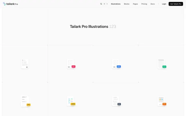
Preview image. Unlock full-res
Gallery of Digital Artifacts — like a minimalist gallery showcasing pixel-perfect UI elements on subtly textured white walls.
Color palette
Accent color for interactive elements, primary buttons, and highlight states – brings a futuristic energy.
Accent color for illustrative elements and subtle background gradients, suggesting growth and innovation.
Muted violet for subtle accents and backgrounds within illustrations, providing a softer brand touch.
Vivid orange for specific secondary accents or informational highlights, drawing attention when needed.
Vivid green for positive indicators, financial gains, or as an illustrative accent.
Vivid blue for informational cues, links, and illustrative accents, conveying clarity.
Vivid yellow-orange for small illustrative tags or highlights, indicating a type or category.
Vivid green for specific application UI elements.
A dynamic gradient primarily used for header backgrounds or prominent feature sections, suggesting fluidity and modernity.
Primary text, prominent icons, dark backgrounds for contrast sections.
Page background, card surfaces, interactive indicator highlights.
Default borders, subtle dividers, secondary background.
Secondary text, muted icons, subtle background for text sections.
Box shadows, deeper background tones.
Tertiary text, background for subtle interactive elements.
Placeholder text, disabled element text.
Muted text, less prominent borders.
Subtle borders and background accents.
Subtle shadows, disabled state borders.
Darker background accents, specific text elements.
Hint text, less prominent UI elements.
Vivid red for error states or specific interactive accents.
Typography
- Weights
- 400, 500, 600, 700
- Sizes
- 10px, 11px, 12px, 13px, 14px, 16px, 18px, 20px, 30px
- Line height
- 1, 1.2, 1.25, 1.33, 1.4, 1.43, 1.5, 1.56, 1.63, 1.71
- Letter spacing
- normal
- Fallback
- system-ui, -apple-system, BlinkMacSystemFont, 'Segoe UI', Roboto, Helvetica, Arial, sans-serif, 'Apple Color Emoji', 'Segoe UI Emoji', 'Segoe UI Symbol'
Primary UI text for body content, navigation, buttons, and headings. Its clean, neutral presence ensures readability across all UI elements.
- Weights
- 100, 400, 600
- Sizes
- 10px, 12px, 24px, 30px
- Line height
- 1.2, 1.33, 1.5
- Letter spacing
- normal
- Fallback
- monospace
Used for code snippets, command line interfaces, and technical labels to convey precision and data-centric accuracy.
- Weights
- 400
- Sizes
- 14px
- Line height
- 1.43
- Letter spacing
- normal
- Fallback
- 'Mulish', sans-serif
A secondary body font for specific descriptive text, providing a slightly softer counterpoint to the primary sans-serif.
Spacing & shape
Elevation
Components
Ghost button with `Ink Black` text on transparent background, subtle `Silver Gray` border and `6px` border-radius. Padding: `8px` vertical, `16px` horizontal.
Ghost button with `Ghost White` text on transparent background, bordered by a translucent white, `6px` border-radius. Padding: `8px` vertical, `16px` horizontal.
Ghost button with `Ink Black` text on transparent background, `6px` border-radius. Padding: `0px` vertical, `4-8px` horizontal.
Ghost button with `Ink Black` text on transparent background, `8px` border-radius. Padding: `8px` vertical, `12px` horizontal.
Card with `oklab(0.999994 0.0000455678 0.0000200868 / 0.75)` background, `0px` border-radius, no shadow. Padding: `32px` all sides.
Card with `oklab(0.984998 -0.00000956655 0.0000230074 / 0.75)` background, `40px` top-left, `40px` top-right, `0px` bottom-left/right border-radius. Subtle shadow: `oklab(0 0 0 / 0.075) 0px 0px 0px 1px, oklab(0 0 0 / 0.065) 0px 4px 6px -1px, oklab(0 0 0 / 0.065) 0px 2px 4px -2px`. Padding: `8px` top/sides, `0px` bottom.
Card with `Ghost White` background, `16px` border-radius. Prominent shadow: `oklab(0 0 0 / 0.075) 0px 0px 0px 1px, oklab(0 0 0 / 0.065) 0px 10px 15px -3px, oklab(0 0 0 / 0.065) 0px 4px 6px -4px`. Padding: `32px` all sides.
Card with `Ghost White` background, `32px` top-left, `32px` top-right, `0px` bottom-left/right border-radius. Subtle shadow: `oklab(0 0 0 / 0.075) 0px 0px 0px 1px, oklab(0 0 0 / 0.065) 0px 1px 3px 0px, oklab(0 0 0 / 0.065) 0px 1px 2px -1px`. Padding: `8px` top, `24px` sides, `64px` bottom.
Input field with a translucent `oklab(0.141 0.00136173 -0.00480696 / 0.05)` background, `Ink Black` text, `4px` border-radius. Border: `oklab(0.141 0.00136173 -0.00480696 / 0.075)`. Padding: `2px` vertical, `8px` horizontal.
Guidelines
- Prioritize `Ghost White` (#ffffff) for page backgrounds and large surface areas to maintain an open, minimalist feel.
- Use `Ink Black` (#09090b) for primary text and headings, ensuring high contrast against light backgrounds.
- Apply `Violet Glow` (#615fff) exclusively for primary interactive elements like buttons and active states to guide user attention.
- Construct depth through subtle, layered box-shadows (e.g., `oklab(0 0 0 / 0.075) 0px 0px 0px 1px, oklab(0 0 0 / 0.065) 0px 10px 15px -3px, oklab(0 0 0 / 0.065) 0px 4px 6px -4px`) rather than hard borders for cards and elevated components.
- Vary card corner radii, including asymmetric options (e.g., `40px` top-rounded, `0px` bottom) to create a dynamic and modern grid layout.
- Use `ui-sans-serif` at weight 400 for all body text to ensure optimal readability and neutrality across the UI.
- Adhere to an `8px` element gap for consistent and compact spacing between most UI components.
- Avoid using multiple vibrant chromatic colors concurrently; reserve them for specific interactive elements or within illustrations.
- Do not introduce strong, opaque borders on cards or sections; rely on subtle `Silver Gray` (#e4e4e7) or transparent outlines.
- Refrain from using heavy shadows that obscure content; elevation should be perceived as subtle lifts, not dark depths.
- Do not use generic sans-serif fonts where `Geist Mono` is intended for a technical or code-like context.
- Avoid large negative spacing or white space beyond `48px` between main sections; maintain a compact information density.
- Do not default to uniform `6px` radius for all elements; strategically apply `16px`, `32px`, or `40px` radii to cards for visual rhythm.
About this system
ShowHide
Tailark Pro presents an airy, contemporary aesthetic that feels like an interactive museum exhibition of digital components. It achieves this with an almost entirely achromatic palette, punctuated by carefully selected, vibrant accents on interactive elements or illustrative details. The use of multiple shades of near-white for backgrounds and surfaces, combined with subtle, layered box-shadows, creates depth and structure without heavy lines or strong color contrasts. Typography is primarily utilitarian sans-serif, anchoring the UI, while a mono-spaced font adds a technical, precision-engineered feel to code-like elements. Asymmetric and varied border radii on cards create a dynamic, modern presentation.
The page primarily uses a max-width contained layout, approximately 1200px, centered horizontally. The hero section is full-width with a dark gradient background, centrally aligning its headline. Content sections below often feature alternating `Ghost White` and very subtle `Silver Gray` or `Translucent Elevated Card` backgrounds, creating a soft band rhythm. Content is arranged in modular grids, particularly prominent in the illustration gallery with a consistent `8px` element gap. A notable pattern is the use of 2-column or 3-column card grids, with cards featuring varied corner radii for visual interest. The header is sticky, compact, and contains primary navigation and action buttons.
The site uses a mix of highly stylized illustrations and product-like UI mockups. Illustrations are dimensional and often represent digital artifacts, documents, or data visualizations, set against white or subtly tinted backgrounds. They often feature brand accent colors like `Violet Glow` or `Emerald Spark`. UI mockups are clean, sharp, and focused on showcasing product interfaces. Icons are monochromatic or duo-toned with `Ink Black` and an accent color, frequently outlined with a small stroke weight, and have a modern, geometric style. Imagery acts as both decorative atmosphere and explanatory content, creating a gallery-like feel where every visual element is a curated piece.
Reminiscent of Stripe, Linear, Vercel, Figma.
# Tailark Pro — Style Reference
> Gallery of Digital Artifacts — like a minimalist gallery showcasing pixel-perfect UI elements on subtly textured white walls.

**Theme:** light

**Site:** https://pro.tailark.com/illustrations

Tailark Pro presents an airy, contemporary aesthetic that feels like an interactive museum exhibition of digital components. It achieves this with an almost entirely achromatic palette, punctuated by carefully selected, vibrant accents on interactive elements or illustrative details. The use of multiple shades of near-white for backgrounds and surfaces, combined with subtle, layered box-shadows, creates depth and structure without heavy lines or strong color contrasts. Typography is primarily utilitarian sans-serif, anchoring the UI, while a mono-spaced font adds a technical, precision-engineered feel to code-like elements. Asymmetric and varied border radii on cards create a dynamic, modern presentation.

## Tokens — Colors

| Name | Value | Token | Role |
|------|------|------|------|
| Violet Glow | `#615fff` | `--color-violet-glow` | Accent color for interactive elements, primary buttons, and highlight states – brings a futuristic energy. |
| Teal Burst | `#64debe` | `--color-teal-burst` | Accent color for illustrative elements and subtle background gradients, suggesting growth and innovation. |
| Lavender Mist | `#b0afff` | `--color-lavender-mist` | Muted violet for subtle accents and backgrounds within illustrations, providing a softer brand touch. |
| Sunstone | `#e17100` | `--color-sunstone` | Vivid orange for specific secondary accents or informational highlights, drawing attention when needed. |
| Emerald Spark | `#00d492` | `--color-emerald-spark` | Vivid green for positive indicators, financial gains, or as an illustrative accent. |
| Sky Blue | `#2b7fff` | `--color-sky-blue` | Vivid blue for informational cues, links, and illustrative accents, conveying clarity. |
| Tangerine | `#fe9a00` | `--color-tangerine` | Vivid yellow-orange for small illustrative tags or highlights, indicating a type or category. |
| Forest Green | `#00bc7d` | `--color-forest-green` | Vivid green for specific application UI elements. |
| Gradient Turquoise Green | `#00e0d9` | `--color-gradient-turquoise-green` | A dynamic gradient primarily used for header backgrounds or prominent feature sections, suggesting fluidity and modernity. |
| Ink Black | `#09090b` | `--color-ink-black` | Primary text, prominent icons, dark backgrounds for contrast sections. |
| Ghost White | `#ffffff` | `--color-ghost-white` | Page background, card surfaces, interactive indicator highlights. |
| Silver Gray | `#e4e4e7` | `--color-silver-gray` | Default borders, subtle dividers, secondary background. |
| Dim Gray | `#52525c` | `--color-dim-gray` | Secondary text, muted icons, subtle background for text sections. |
| Charcoal Black | `#404040` | `--color-charcoal-black` | Box shadows, deeper background tones. |
| Steel Gray | `#5f5f61` | `--color-steel-gray` | Tertiary text, background for subtle interactive elements. |
| Light Pearl | `#848485` | `--color-light-pearl` | Placeholder text, disabled element text. |
| Cloud Gray | `#d4d4d8` | `--color-cloud-gray` | Muted text, less prominent borders. |
| Pebble Gray | `#c2c2c2` | `--color-pebble-gray` | Subtle borders and background accents. |
| Dusty Gray | `#a6a6a6` | `--color-dusty-gray` | Subtle shadows, disabled state borders. |
| Dark Granite | `#474748` | `--color-dark-granite` | Darker background accents, specific text elements. |
| Slate Blue | `#71717b` | `--color-slate-blue` | Hint text, less prominent UI elements. |
| Crimson | `#ff2056` | `--color-crimson` | Vivid red for error states or specific interactive accents. |

## Tokens — Typography

### ui-sans-serif
- **Substitute:** system-ui, -apple-system, BlinkMacSystemFont, 'Segoe UI', Roboto, Helvetica, Arial, sans-serif, 'Apple Color Emoji', 'Segoe UI Emoji', 'Segoe UI Symbol'
- **Weights:** 400, 500, 600, 700
- **Sizes:** 10px, 11px, 12px, 13px, 14px, 16px, 18px, 20px, 30px
- **Line height:** 1, 1.2, 1.25, 1.33, 1.4, 1.43, 1.5, 1.56, 1.63, 1.71
- **Letter spacing:** normal
- **Role:** Primary UI text for body content, navigation, buttons, and headings. Its clean, neutral presence ensures readability across all UI elements.

### Geist Mono
- **Substitute:** monospace
- **Weights:** 100, 400, 600
- **Sizes:** 10px, 12px, 24px, 30px
- **Line height:** 1.2, 1.33, 1.5
- **Letter spacing:** normal
- **Role:** Used for code snippets, command line interfaces, and technical labels to convey precision and data-centric accuracy.

### Mulish
- **Substitute:** 'Mulish', sans-serif
- **Weights:** 400
- **Sizes:** 14px
- **Line height:** 1.43
- **Letter spacing:** normal
- **Role:** A secondary body font for specific descriptive text, providing a slightly softer counterpoint to the primary sans-serif.

## Tokens — Type Scale

Augmented Fourth (1.414) from 14px base.

| Role | Size | Line height | Letter spacing |
|------|------|------|------|
| caption | 10px | 1.5 | — |
| body | 14px | 1.43 | — |
| heading | 20px | 1.25 | — |
| display | 30px | 1.2 | — |

## Tokens — Spacing

- **Section gap:** 48px
- **Card padding:** 12px
- **Element gap:** 8px

## Tokens — Radius

- **Default:** 6px
- **Buttons:** 6px
- **Cards:** 16px
- **extraLargeCards:** 40px
- **input:** 4px
- **largeCards:** 32px

## Tokens — Elevation

- **Elevated Card Top Rounded:** `oklab(0 0 0 / 0.075) 0px 0px 0px 1px, oklab(0 0 0 / 0.065) 0px 4px 6px -1px, oklab(0 0 0 / 0.065) 0px 2px 4px -2px`
- **Standard Elevated Card:** `oklab(0 0 0 / 0.075) 0px 0px 0px 1px, oklab(0 0 0 / 0.065) 0px 10px 15px -3px, oklab(0 0 0 / 0.065) 0px 4px 6px -4px`
- **Dynamic Elevated Card Top Rounded:** `oklab(0 0 0 / 0.075) 0px 0px 0px 1px, oklab(0 0 0 / 0.065) 0px 1px 3px 0px, oklab(0 0 0 / 0.065) 0px 1px 2px -1px`

## Layout

The page primarily uses a max-width contained layout, approximately 1200px, centered horizontally. The hero section is full-width with a dark gradient background, centrally aligning its headline. Content sections below often feature alternating `Ghost White` and very subtle `Silver Gray` or `Translucent Elevated Card` backgrounds, creating a soft band rhythm. Content is arranged in modular grids, particularly prominent in the illustration gallery with a consistent `8px` element gap. A notable pattern is the use of 2-column or 3-column card grids, with cards featuring varied corner radii for visual interest. The header is sticky, compact, and contains primary navigation and action buttons.

## Imagery

The site uses a mix of highly stylized illustrations and product-like UI mockups. Illustrations are dimensional and often represent digital artifacts, documents, or data visualizations, set against white or subtly tinted backgrounds. They often feature brand accent colors like `Violet Glow` or `Emerald Spark`. UI mockups are clean, sharp, and focused on showcasing product interfaces. Icons are monochromatic or duo-toned with `Ink Black` and an accent color, frequently outlined with a small stroke weight, and have a modern, geometric style. Imagery acts as both decorative atmosphere and explanatory content, creating a gallery-like feel where every visual element is a curated piece.

## Components

### Invoice Card

### File Type Badge Grid

### Chat & Notification Cards

### Default Button
*Interactive element*

Ghost button with `Ink Black` text on transparent background, subtle `Silver Gray` border and `6px` border-radius. Padding: `8px` vertical, `16px` horizontal.

### White Text Button
*Secondary action*

Ghost button with `Ghost White` text on transparent background, bordered by a translucent white, `6px` border-radius. Padding: `8px` vertical, `16px` horizontal.

### Small Button
*Compact action*

Ghost button with `Ink Black` text on transparent background, `6px` border-radius. Padding: `0px` vertical, `4-8px` horizontal.

### Rounded Small Button
*Compact action with softer edges*

Ghost button with `Ink Black` text on transparent background, `8px` border-radius. Padding: `8px` vertical, `12px` horizontal.

### Illustration Card
*Displaying illustration or feature previews*

Card with `oklab(0.999994 0.0000455678 0.0000200868 / 0.75)` background, `0px` border-radius, no shadow. Padding: `32px` all sides.

### Elevated Card Top Rounded
*Container for content, elevated off the surface*

Card with `oklab(0.984998 -0.00000956655 0.0000230074 / 0.75)` background, `40px` top-left, `40px` top-right, `0px` bottom-left/right border-radius. Subtle shadow: `oklab(0 0 0 / 0.075) 0px 0px 0px 1px, oklab(0 0 0 / 0.065) 0px 4px 6px -1px, oklab(0 0 0 / 0.065) 0px 2px 4px -2px`. Padding: `8px` top/sides, `0px` bottom.

### Standard Elevated Card
*General content container with elevation*

Card with `Ghost White` background, `16px` border-radius. Prominent shadow: `oklab(0 0 0 / 0.075) 0px 0px 0px 1px, oklab(0 0 0 / 0.065) 0px 10px 15px -3px, oklab(0 0 0 / 0.065) 0px 4px 6px -4px`. Padding: `32px` all sides.

### Dynamic Elevated Card Top Rounded
*Feature card with distinct top visual*

Card with `Ghost White` background, `32px` top-left, `32px` top-right, `0px` bottom-left/right border-radius. Subtle shadow: `oklab(0 0 0 / 0.075) 0px 0px 0px 1px, oklab(0 0 0 / 0.065) 0px 1px 3px 0px, oklab(0 0 0 / 0.065) 0px 1px 2px -1px`. Padding: `8px` top, `24px` sides, `64px` bottom.

### Interactive Input
*Single-line text input field*

Input field with a translucent `oklab(0.141 0.00136173 -0.00480696 / 0.05)` background, `Ink Black` text, `4px` border-radius. Border: `oklab(0.141 0.00136173 -0.00480696 / 0.075)`. Padding: `2px` vertical, `8px` horizontal.

## Guidelines

### Do

- Prioritize `Ghost White` (#ffffff) for page backgrounds and large surface areas to maintain an open, minimalist feel.
- Use `Ink Black` (#09090b) for primary text and headings, ensuring high contrast against light backgrounds.
- Apply `Violet Glow` (#615fff) exclusively for primary interactive elements like buttons and active states to guide user attention.
- Construct depth through subtle, layered box-shadows (e.g., `oklab(0 0 0 / 0.075) 0px 0px 0px 1px, oklab(0 0 0 / 0.065) 0px 10px 15px -3px, oklab(0 0 0 / 0.065) 0px 4px 6px -4px`) rather than hard borders for cards and elevated components.
- Vary card corner radii, including asymmetric options (e.g., `40px` top-rounded, `0px` bottom) to create a dynamic and modern grid layout.
- Use `ui-sans-serif` at weight 400 for all body text to ensure optimal readability and neutrality across the UI.
- Adhere to an `8px` element gap for consistent and compact spacing between most UI components.

### Don't

- Avoid using multiple vibrant chromatic colors concurrently; reserve them for specific interactive elements or within illustrations.
- Do not introduce strong, opaque borders on cards or sections; rely on subtle `Silver Gray` (#e4e4e7) or transparent outlines.
- Refrain from using heavy shadows that obscure content; elevation should be perceived as subtle lifts, not dark depths.
- Do not use generic sans-serif fonts where `Geist Mono` is intended for a technical or code-like context.
- Avoid large negative spacing or white space beyond `48px` between main sections; maintain a compact information density.
- Do not default to uniform `6px` radius for all elements; strategically apply `16px`, `32px`, or `40px` radii to cards for visual rhythm.

## Agent Prompt Guide

### Quick Color Reference
- Primary Text: `#09090b` (Ink Black)
- Page Background: `#ffffff` (Ghost White)
- Call to Action: `#615fff` (Violet Glow)
- Default Border: `#e4e4e7` (Silver Gray)
- Secondary Text: `#52525c` (Dim Gray)

### 3-5 Example Component Prompts
- Create a navigation link: `Ink Black` text, `ui-sans-serif` weight 400, size 14px, on a transparent background, with `4px` padding right and left. On hover, apply `Violet Glow` to text.
- Create a standard elevated card: `Ghost White` background, `16px` border-radius, `oklab(0 0 0 / 0.075) 0px 0px 0px 1px, oklab(0 0 0 / 0.065) 0px 10px 15px -3px, oklab(0 0 0 / 0.065) 0px 4px 6px -4px` shadow, and `32px` padding on all sides. Use `Ink Black` for headline (`ui-sans-serif` 30px, weight 700) and `Dim Gray` for body text (`ui-sans-serif` 14px, weight 400, lineHeight 1.43).
- Create a primary action button: `Violet Glow` background, `Ghost White` text (`ui-sans-serif` 14px, weight 600), `6px` border-radius, `8px` vertical and `16px` horizontal padding. Apply a subtle ghost shadow `oklab(0.141 0.00136173 -0.00480696 / 0.05) 0px 0px 0px 1px`.
- Create an input field: Background `oklab(0.141 0.00136173 -0.00480696 / 0.05)`, text `Ink Black`, border `oklab(0.141 0.00136173 -0.00480696 / 0.075)`, `4px` border-radius, `2px` vertical and `8px` horizontal padding. Placeholder text should be `Light Pearl`.
- Create a top-rounded feature card: Background `Ghost White`, `32px` top-left and top-right radius (0px elsewhere), `oklab(0 0 0 / 0.075) 0px 0px 0px 1px, oklab(0 0 0 / 0.065) 0px 1px 3px 0px, oklab(0 0 0 / 0.065) 0px 1px 2px -1px` shadow. Padding should be `8px` top, `24px` sides, and `64px` bottom.
More like this









Keep what you find
A free account saves references to boards and can send you a weekly email of picks based on what you save.
To see every result, go Pro.