Preview image. Unlock full-res
Digital collage playground
Color palette
Violet wash for highlight backgrounds, decorative bands, and soft emphasis behind content. Do not promote it to the primary CTA color
Green wash for highlight backgrounds, decorative bands, and soft emphasis behind content. Do not promote it to the primary CTA color
Call-to-action button backgrounds when needing a warmer, inviting tone
Green action color for filled buttons, selected navigation states, and focused conversion moments.
Hairline borders, dividers, input outlines, and card edges on light surfaces. Do not promote it to the primary CTA color
Primary text, major headings, borders, and some navigation backgrounds. Establishes strong contrast against white
Light surface backgrounds, borders on subtle elements, card backgrounds, and button borders
Subtle borders and dividers, enhancing visual separation without harshness
Secondary text, descriptive paragraphs, and decorative text elements, providing readability without overpowering headings
Paragraph text and informational content, darker than subtle for improved legibility
Body text and list items, offering high contrast against light backgrounds
Typography
- Weights
- 400, 600, 700, 900
- Sizes
- 12px, 14px, 15px, 16px, 17px, 20px, 25px
- Line height
- 1, 1.2, 1.25
- Letter spacing
- 0.0940em
- Fallback
- system-ui, sans-serif
Primary UI font for buttons, body text, icons, navigation, and list items. Its variable nature allows for a range of expressive weights while maintaining legibility across small text to prominent labels.
- Weights
- 400, 700
- Sizes
- 28px, 32px, 44px, 48px
- Line height
- 1.25, 2.94
- Letter spacing
- normal
- Fallback
- sans-serif
Used for a range of smaller headings and subheadings, providing a clean, modern contrast to the more decorative display fonts.
- Weights
- 400
- Sizes
- 58px, 195px
- Line height
- 1.25
- Letter spacing
- normal
- Fallback
- serif
A prominent display serif font reserved for large, impactful headlines, conveying a sophisticated and editorial feel. The extremely large 195px size is a unique brand statement, suggesting a bold, artistic identity.
- Weights
- 400
- Sizes
- 106px
- Line height
- 1
- Letter spacing
- normal
- Fallback
- cursive
Used for large, decorative headings, providing a distinct, hand-crafted, and artisanal character. This is a signature brand choice, differentiating text with a unique visual texture.
- Weights
- 400
- Sizes
- 32px
- Line height
- 1.25
- Letter spacing
- normal
- Fallback
- serif
A classic serif font used sparingly, likely for specific thematic headings to evoke a traditional or established aesthetic.
- Weights
- 400
- Sizes
- 32px
- Line height
- 1
- Letter spacing
- normal
- Fallback
- cursive
A hand-drawn style font utilized for whimsical or personal headings, reinforcing the playful, customizable nature of the brand. Its casual appearance counterbalances other more formal or structured typography.
Spacing & shape
Elevation
Components
Has a background of rgba(0,0,0,0) with white text, and a border radius of 15px 8px 8px 15px or 8px 15px 15px 8px, suggesting a playful, asymmetrical pill shape for navigation. Padding is minimal to keep the button compact.
Features rgba(0,0,0,0) background, white text and a rounded 8px radius. Used for 'Login' and 'Sign Up' in the header, indicating secondary importance.
Uses a transparent background with black text and a charcoal border of rgba(0, 0, 0, 0.24). Has a 5px border radius, providing a slightly more defined boundary than ghost buttons. Padding is 0px 8px 0px 8px.
Background can be Primary Purple (#7012e2) or Warm Accent Orange (#925f52). Has a 6px border radius, white text, and horizontal padding of 27.0912px, creating a prominent, clickable area.
Background can be Vibrant Green (#72dd95) or Fresh Accent Green (#12e2b0). Has a 6px border radius, white text, and horizontal padding of 27.0912px, offering a distinct but equally prominent option.
Background is Stone Gray (#c1c1c5), with a subtle shadow of rgba(0, 0, 0, 0.08) 1px 1px 3px 0px. Features an 8px border radius and 14px padding on all sides, creating a soft, elevated container.
Can have a background of Primary Purple (#7012e2), Vibrant Green (#72dd95), or a muted blue (#7289da). Features a 6px border radius and no shadow, creating a flat, colorful block.
A square button with a Fresh Accent Green (#12e2b0) background and a 6px border radius. Contains white text and padding to center the 'Edit' label, often found affixed in a corner for quick access.
Guidelines
- Prioritize Canvas White (#ffffff) for dominant backgrounds to maintain a clean, open feel.
- Use Ink Black (#000000) for primary text and significant borders to ensure high contrast and readability.
- Apply Primary Purple (#7012e2) or Vibrant Green (#72dd95) for primary filled button backgrounds to create visual pop and clear calls to action.
- Set the border-radius to 8px for most interactive elements like buttons and cards to ensure a consistent, friendly softness.
- Employ NationalPark-Variable for all body text and UI elements, leveraging its varied weights for hierarchy.
- Reserve Playfair Display and Calistoga for impactful headlines and display text, embracing their distinctive character.
- Use 14px for internal card padding and 16px as a general element gap to create comfortable density in layouts.
- Avoid using more than two distinct chromatic brand colors per section to prevent visual clutter; focus on one primary and one secondary.
- Do not use dark backgrounds for large content blocks unless it's a specific, controlled section that needs strong visual separation.
- Never compromise text legibility by placing light text on similarly light backgrounds; always refer to contrast ratios.
- Do not deviate from the specified border-radius values for buttons and cards; inconsistency undermines the system's playful yet refined feel.
- Do not overuse the decorative display fonts; they are intended for impact and should be balanced with more legible sans-serifs.
- Avoid arbitrary custom spacing values; adhere to the 16px element gap and 14px card padding for consistency.
- Do not apply heavy or multiple shadows; the design uses subtle elevation to maintain a lightweight aesthetic.
About this system
ShowHide
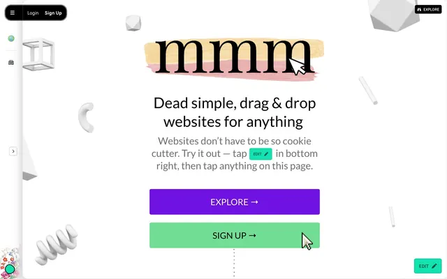
mmm.page employs a playful, collage-like aesthetic with a canvas of crisp white and an array of contrasting, vibrant colors for interactive elements. Typography mixes expressive display fonts with legible sans-serifs, contributing to an eccentric yet functional feel. Components are lightweight with subtle shadows, and interactions are punctuated by bold, often contrasting, accent colors. The overall impression is one of creative freedom and approachability, eschewing rigidity for spontaneous charm.
The page uses a full-bleed layout for the background, but content within is primarily centered within an implicit container. The hero pattern features a large, centered headline (`Calistoga` or `Playfair Display`) over a white background, flanked by abstract 3D shapes. Section rhythm exhibits consistent vertical spacing (sectionGap 40px) between content blocks, without strong visual dividers or alternating background bands. Content arranges in centered stacks for headlines and CTAs, with implied two-column layouts for descriptive text (though not explicitly clear in the data). Navigation is a sticky top bar with ghost/pill buttons on a black background, and a left-aligned sidebar containing minimal icons on a light background. The density is relatively spacious, allowing individual elements and typography to breathe.
The imagery aesthetic is characterized by abstract 3D geometric shapes and organic, playful forms rendered in white or light gray, scattered across the white canvas. These elements act as decorative atmosphere rather than conveying specific content. Photography is absent, and illustrations are minimal, like the brushstroke under the logo. Icons are outlined, simple, and monochrome, often in Ink Black, reinforcing the clean UI. The overall density is text-dominant, allowing the few graphic elements to stand out as charming accents.
Reminiscent of Remix, Figma, ClickUp, Carrd.
# mmm.page — Style Reference
> Digital collage playground

**Theme:** light

**Site:** https://mmm.page

mmm.page employs a playful, collage-like aesthetic with a canvas of crisp white and an array of contrasting, vibrant colors for interactive elements. Typography mixes expressive display fonts with legible sans-serifs, contributing to an eccentric yet functional feel. Components are lightweight with subtle shadows, and interactions are punctuated by bold, often contrasting, accent colors. The overall impression is one of creative freedom and approachability, eschewing rigidity for spontaneous charm.

## Tokens — Colors

| Name | Value | Token | Role |
|------|------|------|------|
| Primary Purple | `#7012e2` | `--color-primary-purple` | Violet wash for highlight backgrounds, decorative bands, and soft emphasis behind content. Do not promote it to the primary CTA color |
| Vibrant Green | `#72dd95` | `--color-vibrant-green` | Green wash for highlight backgrounds, decorative bands, and soft emphasis behind content. Do not promote it to the primary CTA color |
| Warm Accent Orange | `#925f52` | `--color-warm-accent-orange` | Call-to-action button backgrounds when needing a warmer, inviting tone |
| Fresh Accent Green | `#12e2b0` | `--color-fresh-accent-green` | Green action color for filled buttons, selected navigation states, and focused conversion moments. |
| Canvas White | `#ffffff` | `--color-canvas-white` | Hairline borders, dividers, input outlines, and card edges on light surfaces. Do not promote it to the primary CTA color |
| Ink Black | `#000000` | `--color-ink-black` | Primary text, major headings, borders, and some navigation backgrounds. Establishes strong contrast against white |
| Stone Gray | `#c1c1c5` | `--color-stone-gray` | Light surface backgrounds, borders on subtle elements, card backgrounds, and button borders |
| Faint Line Gray | `#d6d6d6` | `--color-faint-line-gray` | Subtle borders and dividers, enhancing visual separation without harshness |
| Subtle Text Gray | `#6f6f6f` | `--color-subtle-text-gray` | Secondary text, descriptive paragraphs, and decorative text elements, providing readability without overpowering headings |
| Mid Text Gray | `#666666` | `--color-mid-text-gray` | Paragraph text and informational content, darker than subtle for improved legibility |
| Dark Text Gray | `#373c3b` | `--color-dark-text-gray` | Body text and list items, offering high contrast against light backgrounds |

## Tokens — Typography

### NationalPark-Variable
- **Substitute:** system-ui, sans-serif
- **Weights:** 400, 600, 700, 900
- **Sizes:** 12px, 14px, 15px, 16px, 17px, 20px, 25px
- **Line height:** 1, 1.2, 1.25
- **Letter spacing:** 0.0940em
- **Role:** Primary UI font for buttons, body text, icons, navigation, and list items. Its variable nature allows for a range of expressive weights while maintaining legibility across small text to prominent labels.

### Lato
- **Substitute:** sans-serif
- **Weights:** 400, 700
- **Sizes:** 28px, 32px, 44px, 48px
- **Line height:** 1.25, 2.94
- **Letter spacing:** normal
- **Role:** Used for a range of smaller headings and subheadings, providing a clean, modern contrast to the more decorative display fonts.

### Playfair Display
- **Substitute:** serif
- **Weights:** 400
- **Sizes:** 58px, 195px
- **Line height:** 1.25
- **Letter spacing:** normal
- **Role:** A prominent display serif font reserved for large, impactful headlines, conveying a sophisticated and editorial feel. The extremely large 195px size is a unique brand statement, suggesting a bold, artistic identity.

### Calistoga
- **Substitute:** cursive
- **Weights:** 400
- **Sizes:** 106px
- **Line height:** 1
- **Letter spacing:** normal
- **Role:** Used for large, decorative headings, providing a distinct, hand-crafted, and artisanal character. This is a signature brand choice, differentiating text with a unique visual texture.

### Times New Roman
- **Substitute:** serif
- **Weights:** 400
- **Sizes:** 32px
- **Line height:** 1.25
- **Letter spacing:** normal
- **Role:** A classic serif font used sparingly, likely for specific thematic headings to evoke a traditional or established aesthetic.

### Patrick Hand SC
- **Substitute:** cursive
- **Weights:** 400
- **Sizes:** 32px
- **Line height:** 1
- **Letter spacing:** normal
- **Role:** A hand-drawn style font utilized for whimsical or personal headings, reinforcing the playful, customizable nature of the brand. Its casual appearance counterbalances other more formal or structured typography.

## Tokens — Type Scale

Perfect Fourth (1.333) from 12px base.

| Role | Size | Line height | Letter spacing |
|------|------|------|------|
| caption | 12px | 1 | 0.094em |
| body-sm | 14px | 1 | 0.094em |
| body-lg | 17px | 1 | 0.094em |
| subheading | 20px | 1 | 0.094em |
| heading-sm | 28px | 1.25 | — |
| heading | 32px | 1.25 | — |
| heading-lg | 44px | 1.25 | — |
| display | 58px | 1.25 | — |
| display-lg | 106px | 1 | — |

## Tokens — Spacing

- **Section gap:** 40px
- **Card padding:** 14px
- **Element gap:** 16px

## Tokens — Radius

- **Buttons:** 8px
- **Cards:** 8px
- **largeElements:** 19px
- **navItems:** 8px
- **smallElements:** 1px

## Tokens — Elevation

- **Elevated Content Card:** `rgba(0, 0, 0, 0.08) 1px 1px 3px 0px`
- **Hover/Focus State Button:** `rgba(255, 255, 255, 0.32) 0px 0px 0px 1px`

## Layout

The page uses a full-bleed layout for the background, but content within is primarily centered within an implicit container. The hero pattern features a large, centered headline (`Calistoga` or `Playfair Display`) over a white background, flanked by abstract 3D shapes. Section rhythm exhibits consistent vertical spacing (sectionGap 40px) between content blocks, without strong visual dividers or alternating background bands. Content arranges in centered stacks for headlines and CTAs, with implied two-column layouts for descriptive text (though not explicitly clear in the data). Navigation is a sticky top bar with ghost/pill buttons on a black background, and a left-aligned sidebar containing minimal icons on a light background. The density is relatively spacious, allowing individual elements and typography to breathe.

## Imagery

The imagery aesthetic is characterized by abstract 3D geometric shapes and organic, playful forms rendered in white or light gray, scattered across the white canvas. These elements act as decorative atmosphere rather than conveying specific content. Photography is absent, and illustrations are minimal, like the brushstroke under the logo. Icons are outlined, simple, and monochrome, often in Ink Black, reinforcing the clean UI. The overall density is text-dominant, allowing the few graphic elements to stand out as charming accents.

## Components

### Navigation Tab Button
*Pill-shaped header navigation item*

Has a background of rgba(0,0,0,0) with white text, and a border radius of 15px 8px 8px 15px or 8px 15px 15px 8px, suggesting a playful, asymmetrical pill shape for navigation. Padding is minimal to keep the button compact.

### Ghost Header Button
*Minimal header action button*

Features rgba(0,0,0,0) background, white text and a rounded 8px radius. Used for 'Login' and 'Sign Up' in the header, indicating secondary importance.

### Text Outline Button
*Subtle call to action or secondary action button*

Uses a transparent background with black text and a charcoal border of rgba(0, 0, 0, 0.24). Has a 5px border radius, providing a slightly more defined boundary than ghost buttons. Padding is 0px 8px 0px 8px.

### Filled Primary Action Button
*Main call to action button*

Background can be Primary Purple (#7012e2) or Warm Accent Orange (#925f52). Has a 6px border radius, white text, and horizontal padding of 27.0912px, creating a prominent, clickable area.

### Filled Secondary Action Button
*Alternative call to action button*

Background can be Vibrant Green (#72dd95) or Fresh Accent Green (#12e2b0). Has a 6px border radius, white text, and horizontal padding of 27.0912px, offering a distinct but equally prominent option.

### Elevated Content Card
*Displays grouped content with subtle visual separation*

Background is Stone Gray (#c1c1c5), with a subtle shadow of rgba(0, 0, 0, 0.08) 1px 1px 3px 0px. Features an 8px border radius and 14px padding on all sides, creating a soft, elevated container.

### Flat Color Card
*Used for showcasing features or highly visual content*

Can have a background of Primary Purple (#7012e2), Vibrant Green (#72dd95), or a muted blue (#7289da). Features a 6px border radius and no shadow, creating a flat, colorful block.

### Floating Edit Button
*Persistent action button for direct interaction*

A square button with a Fresh Accent Green (#12e2b0) background and a 6px border radius. Contains white text and padding to center the 'Edit' label, often found affixed in a corner for quick access.

## Guidelines

### Do

- Prioritize Canvas White (#ffffff) for dominant backgrounds to maintain a clean, open feel.
- Use Ink Black (#000000) for primary text and significant borders to ensure high contrast and readability.
- Apply Primary Purple (#7012e2) or Vibrant Green (#72dd95) for primary filled button backgrounds to create visual pop and clear calls to action.
- Set the border-radius to 8px for most interactive elements like buttons and cards to ensure a consistent, friendly softness.
- Employ NationalPark-Variable for all body text and UI elements, leveraging its varied weights for hierarchy.
- Reserve Playfair Display and Calistoga for impactful headlines and display text, embracing their distinctive character.
- Use 14px for internal card padding and 16px as a general element gap to create comfortable density in layouts.

### Don't

- Avoid using more than two distinct chromatic brand colors per section to prevent visual clutter; focus on one primary and one secondary.
- Do not use dark backgrounds for large content blocks unless it's a specific, controlled section that needs strong visual separation.
- Never compromise text legibility by placing light text on similarly light backgrounds; always refer to contrast ratios.
- Do not deviate from the specified border-radius values for buttons and cards; inconsistency undermines the system's playful yet refined feel.
- Do not overuse the decorative display fonts; they are intended for impact and should be balanced with more legible sans-serifs.
- Avoid arbitrary custom spacing values; adhere to the 16px element gap and 14px card padding for consistency.
- Do not apply heavy or multiple shadows; the design uses subtle elevation to maintain a lightweight aesthetic.

## Agent Prompt Guide

Quick Color Reference:
text: #000000
background: #ffffff
border: #c1c1c5
accent: #7012e2
primary action: #12e2b0 (filled action)

Example Component Prompts:
1. Create a Primary Action Button: #12e2b0 background, #000000 text, 9999px radius, compact pill padding. Use this filled treatment for the main CTA.
2. Create an elevated content card containing a brief description: Stone Gray (#c1c1c5) background, 8px border-radius, 14px padding, and a subtle shadow (rgba(0, 0, 0, 0.08) 1px 1px 3px 0px). Use Dark Text Gray (#373c3b) for body text at 16px size, NationalPark-Variable, weight 400, line-height 1.0, 0.0940em letter-spacing.
3. Create a descriptive heading: 'Dead simple, drag & drop websites for anything'. Use Lato, weight 400, size 44px, line-height 1.25, normal letter spacing, and Ink Black (#000000) color.
4. Create a hero section with a brand headline: Calistoga, weight 400, size 106px, line-height 1.0, normal letter spacing, Ink Black (#000000) color. Place it on a Canvas White (#ffffff) background, surrounded by subtle abstract geometric shapes.
More like this









Keep what you find
A free account saves references to boards and can send you a weekly email of picks based on what you save.
To see every result, go Pro.