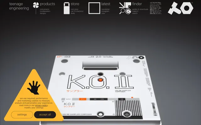
Preview image. Unlock full-res
engineered precision against industrial gray
Color palette
Interactive elements, 'buy now' links, and accents. Its vividness draws attention to key actions.
Occasionally used for decorative fills, notably in SVG icons, less frequently for UI elements.
Page background, primary display surface.
Secondary surface, used for darker interactive states or background elements, often paired with lighter text.
Primary text color for maximum contrast, borders, and some background elements in high-contrast sections.
Muted text, subtle borders, and sometimes as a background fill for iconography or subtle navigation states.
Decorative borders around elements, muted text for secondary information.
Typography
- Weights
- 100, 300
- Sizes
- 13px, 19px, 24px, 26px
- Line height
- 1.11, 1.15, 1.5
- Fallback
- Inter
General body text, navigation elements, links, and detailed product descriptions. The variety of thin weights keeps text light and airy.
- Weights
- 300
- Sizes
- 40px
- Line height
- 1.11
- Fallback
- Inter
Headlines and prominent display text. The singular light weight (300) is a signature choice, creating an understated impact, making the text feel designed rather than shouted.
Spacing & shape
Components
Text links using te-20 font at 13px, weight 300, color Ink (#000000) on Canvas background. On hover, the text color changes to Electric Blue (#0071bb).
Displays products with 'EP-133 K.O. II' as heading text in te-20, size 19px, color Ink (#000000). A 'buy now' link is shown in Electric Blue (#0071bb) at 13px. Background is Canvas (#f6f8f7) with solid borders in Smoke (#b2b2b2) or Steel (#e5e5e5), with an element gap of 15px.
Links within the footer use te-20 font, Steel (#e5e5e5) text color on a Graphite (#0f0e12) background.
A full-width banner at the top of the page with a Graphite (#0f0e12) background, featuring white icons and text. Uses te-20 at various sizes for labels and descriptors.
A triangular overlay with a yellow background, black border, and black text. Contains two functional buttons: 'settings' and 'accept all'. Black text on yellow background for readability.
Guidelines
- Prioritize the ultra-light 'te-20' and 'te-40' typefaces, especially for headlines, to maintain the brand's understated authority.
- Use Electric Blue (#0071bb) exclusively for interactive elements and calls to action.
- Implement high-contrast pairings of Ink (#000000) text on Canvas (#f6f8f7) backgrounds for primary content.
- Define clear visual hierarchy through font weights (te-40 for main headings, te-20 for body and smaller elements), rather than size alone.
- Maintain generous spacing with 15px for element gaps and 66px for section gaps, contributing to the 'comfortable' density.
- Employ Steel (#e5e5e5) and Smoke (#b2b2b2) for subtle borders and muted text to provide visual structure without heavy lines.
- Leverage the Canvas (#f6f8f7) background as the primary stage, ensuring products and content remain the focal point.
- Avoid using bold or heavy font weights for headlines; the brand identity is built on a whisper-thin typographic aesthetic.
- Do not introduce new vibrant colors outside of Electric Blue (#0071bb) for interactive elements, as this dilutes the monochromatic focus.
- Refrain from adding decorative shadows or complex embellishments; the design system favors clean, flat surfaces.
- Do not use Electric Blue (#0071bb) for non-interactive text or purely decorative elements, as it's reserved for action.
- Avoid excessive rounding of corners; the design system maintains sharp, precise edge treatments.
- Do not allow text to crowd; ensure ample 15px element spacing and 66px section padding is consistently applied.
About this system
ShowHide
This system feels like a minimalist architectural blueprint, where products are spotlighted against a backdrop of muted industrial grays. The deliberate use of extremely thin custom typography, particularly for headings, creates a subtle, almost whispered authority. Interactive elements are marked by a singular vivid blue against a monochromatic field, acting like technical indicator lights. Sharp angles and high-contrast text on neutral surfaces define the system's precise and functional aesthetic.
The page primarily utilizes a max-width contained layout with centered content, though the main navigation and the hero section can stretch full-bleed visually. The hero typically features a large product image, often against a dark or gray background, with minimal, centered text elements. Sections maintain a consistent vertical rhythm, often separated by distinct background shifts between Canvas (#f6f8f7) and a darker neutral. Content is arranged in alternating image-left, text-right, or vice-versa patterns, and product displays often use a simple, predictable grid. Navigation is a prominent, full-width top bar, generally sticky or highly visible, using a high-contrast ink-on-canvas or steel-on-graphite palette.
The visual language focuses heavily on product photography, presenting devices in a precise, almost clinical manner. Products are often isolated or shown in context against plain, industrial gray or white backgrounds, emphasizing their form and detailing. The style is primarily clean and contained, with sharp edges and no visible rounding. Photography is brightly lit, showcasing product textures and features clearly, avoiding lifestyle contexts. Icons are minimalist, outlined, and monochromatic, often using Steel (#e5e5e5) on darker backgrounds or Ink (#000000) on lighter ones, serving a functional and informational role.
Reminiscent of AIAIAI, Oura Ring, Minimalist websites for audio equipment brands generally, Acme Made.
# teenage engineering — Style Reference
> engineered precision against industrial gray

**Theme:** light

**Site:** https://teenage.engineering

This system feels like a minimalist architectural blueprint, where products are spotlighted against a backdrop of muted industrial grays. The deliberate use of extremely thin custom typography, particularly for headings, creates a subtle, almost whispered authority. Interactive elements are marked by a singular vivid blue against a monochromatic field, acting like technical indicator lights. Sharp angles and high-contrast text on neutral surfaces define the system's precise and functional aesthetic.

## Tokens — Colors

| Name | Value | Token | Role |
|------|------|------|------|
| Electric Blue | `#0071bb` | `--color-electric-blue` | Interactive elements, 'buy now' links, and accents. Its vividness draws attention to key actions. |
| Verdant Accent | `#006837` | `--color-verdant-accent` | Occasionally used for decorative fills, notably in SVG icons, less frequently for UI elements. |
| Canvas | `#f6f8f7` | `--color-canvas` | Page background, primary display surface. |
| Graphite | `#0f0e12` | `--color-graphite` | Secondary surface, used for darker interactive states or background elements, often paired with lighter text. |
| Ink | `#000000` | `--color-ink` | Primary text color for maximum contrast, borders, and some background elements in high-contrast sections. |
| Steel | `#e5e5e5` | `--color-steel` | Muted text, subtle borders, and sometimes as a background fill for iconography or subtle navigation states. |
| Smoke | `#b2b2b2` | `--color-smoke` | Decorative borders around elements, muted text for secondary information. |

## Tokens — Typography

### te-20
- **Substitute:** Inter
- **Weights:** 100, 300
- **Sizes:** 13px, 19px, 24px, 26px
- **Line height:** 1.11, 1.15, 1.5
- **Role:** General body text, navigation elements, links, and detailed product descriptions. The variety of thin weights keeps text light and airy.

### te-40
- **Substitute:** Inter
- **Weights:** 300
- **Sizes:** 40px
- **Line height:** 1.11
- **Role:** Headlines and prominent display text. The singular light weight (300) is a signature choice, creating an understated impact, making the text feel designed rather than shouted.

## Tokens — Type Scale

Perfect Fourth (1.333) from 19px base.

| Role | Size | Line height | Letter spacing |
|------|------|------|------|
| caption | 13px | 1.5 | — |
| body | 19px | 1.15 | — |
| subheading | 24px | 1.11 | — |
| heading | 26px | 1.11 | — |
| display | 40px | 1.11 | — |

## Tokens — Spacing

- **Section gap:** 66px
- **Card padding:** 22px
- **Element gap:** 15px

## Tokens — Radius

- **Default:** 0px

## Layout

The page primarily utilizes a max-width contained layout with centered content, though the main navigation and the hero section can stretch full-bleed visually. The hero typically features a large product image, often against a dark or gray background, with minimal, centered text elements. Sections maintain a consistent vertical rhythm, often separated by distinct background shifts between Canvas (#f6f8f7) and a darker neutral. Content is arranged in alternating image-left, text-right, or vice-versa patterns, and product displays often use a simple, predictable grid. Navigation is a prominent, full-width top bar, generally sticky or highly visible, using a high-contrast ink-on-canvas or steel-on-graphite palette.

## Imagery

The visual language focuses heavily on product photography, presenting devices in a precise, almost clinical manner. Products are often isolated or shown in context against plain, industrial gray or white backgrounds, emphasizing their form and detailing. The style is primarily clean and contained, with sharp edges and no visible rounding. Photography is brightly lit, showcasing product textures and features clearly, avoiding lifestyle contexts. Icons are minimalist, outlined, and monochromatic, often using Steel (#e5e5e5) on darker backgrounds or Ink (#000000) on lighter ones, serving a functional and informational role.

## Components

### Primary Navigation Link
*Navigation element*

Text links using te-20 font at 13px, weight 300, color Ink (#000000) on Canvas background. On hover, the text color changes to Electric Blue (#0071bb).

### Product Grid Item
*Product display*

Displays products with 'EP-133 K.O. II' as heading text in te-20, size 19px, color Ink (#000000). A 'buy now' link is shown in Electric Blue (#0071bb) at 13px. Background is Canvas (#f6f8f7) with solid borders in Smoke (#b2b2b2) or Steel (#e5e5e5), with an element gap of 15px.

### Footer Link
*Utility link*

Links within the footer use te-20 font, Steel (#e5e5e5) text color on a Graphite (#0f0e12) background.

### Promotional Banner (Top)
*Brand communication*

A full-width banner at the top of the page with a Graphite (#0f0e12) background, featuring white icons and text. Uses te-20 at various sizes for labels and descriptors.

### Cookie Consent Banner
*Legal disclosure*

A triangular overlay with a yellow background, black border, and black text. Contains two functional buttons: 'settings' and 'accept all'. Black text on yellow background for readability.

## Guidelines

### Do

- Prioritize the ultra-light 'te-20' and 'te-40' typefaces, especially for headlines, to maintain the brand's understated authority.
- Use Electric Blue (#0071bb) exclusively for interactive elements and calls to action.
- Implement high-contrast pairings of Ink (#000000) text on Canvas (#f6f8f7) backgrounds for primary content.
- Define clear visual hierarchy through font weights (te-40 for main headings, te-20 for body and smaller elements), rather than size alone.
- Maintain generous spacing with 15px for element gaps and 66px for section gaps, contributing to the 'comfortable' density.
- Employ Steel (#e5e5e5) and Smoke (#b2b2b2) for subtle borders and muted text to provide visual structure without heavy lines.
- Leverage the Canvas (#f6f8f7) background as the primary stage, ensuring products and content remain the focal point.

### Don't

- Avoid using bold or heavy font weights for headlines; the brand identity is built on a whisper-thin typographic aesthetic.
- Do not introduce new vibrant colors outside of Electric Blue (#0071bb) for interactive elements, as this dilutes the monochromatic focus.
- Refrain from adding decorative shadows or complex embellishments; the design system favors clean, flat surfaces.
- Do not use Electric Blue (#0071bb) for non-interactive text or purely decorative elements, as it's reserved for action.
- Avoid excessive rounding of corners; the design system maintains sharp, precise edge treatments.
- Do not allow text to crowd; ensure ample 15px element spacing and 66px section padding is consistently applied.

## Agent Prompt Guide

Quick Color Reference:
text: #000000
background: #f6f8f7
border: #e5e5e5
accent: #0071bb
primary action: no distinct CTA color

Example Component Prompts:
Create a product card for an item named 'EP-133 K.O. II'. The main text is 'EP-133 K.O. II' in te-20 weight 300 at 19px, color Ink (#000000). Below that, add a sub-text 'buy now' in te-20 weight 300 at 13px, color Electric Blue (#0071bb). The card background is Canvas (#f6f8f7) with 0px radius and a 1px border in Steel (#e5e5e5). Maintain an element gap of 15px between text elements.

Generate a dark navigation bar. Background is Graphite (#0f0e12). Links like 'products' are in te-20 weight 300 at 13px, color Steel (#e5e5e5). Icons are also color Steel (#e5e5e5). The navigation should be full-width with 66px padding on the sides.

Design a footer section. Background color Graphite (#0f0e12). All text links, such as 'newsletter' or 'contact', should be in te-20 weight 300 at 13px, color Steel (#e5e5e5). The footer has 33px padding top and bottom and 66px padding left and right.
More like this









Keep what you find
A free account saves references to boards and can send you a weekly email of picks based on what you save.
To see every result, go Pro.