Preview image. Unlock full-res
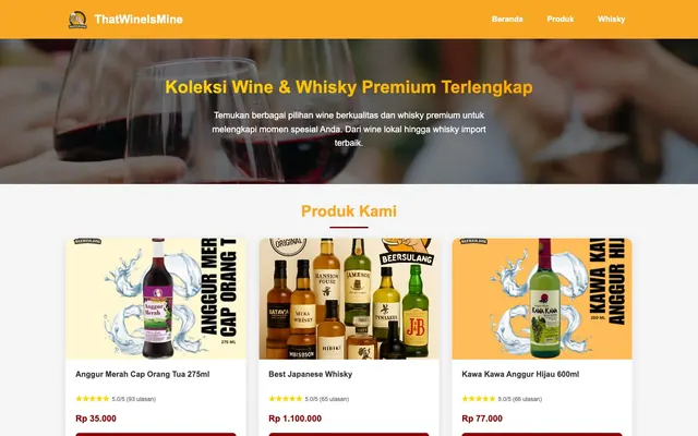
Warm Product Showroom. Brightly lit cards present products with a clear, direct aesthetic.
Color palette
Decorative highlights, branding elements, and borders around highlighted sections or products
Red action color for filled buttons, selected navigation states, and focused conversion moments.; Subtle background gradient for interactive elements, providing a touch of depth to primary actions
Accent gradient for specific sections or elements requiring additional visual emphasis, complementing the primary accent
Page backgrounds, card surfaces, ghost button text and borders, navigation active states
Subtle borders, divider lines, and secondary background elements to provide visual separation
Primary text color for headings, body text, and general UI text – ensures strong readability against light backgrounds
Secondary text for helper text, less prominent labels, and descriptive body copy
Subtle tint used in button shadows, adding a hint of warmth to elevated elements
Typography
- Weights
- 400, 600, 700
- Sizes
- 12px, 14px, 16px, 18px, 20px, 24px, 32px, 36px
- Line height
- 1.2, 1.3, 1.6
- Fallback
- system-ui
General body text, product descriptions, pricing, and navigation links. Provides a clean and legible foundation for content.
- Weights
- 400, 600, 700
- Sizes
- 12px, 14px, 16px, 18px, 20px, 24px, 32px, 36px
- Line height
- 1.2, 1.3, 1.6
- Fallback
- system-ui
Headings and prominent titles. Used for section titles like 'Produk Kami' and within the hero section to draw attention.
- Weights
- 400, 600, 700
- Sizes
- 12px, 14px, 16px, 18px, 20px, 24px, 32px, 36px
- Line height
- 1.2, 1.3, 1.6
- Fallback
- system-ui
Small, bold text for key labels, product names in cards, and interactive elements like buttons, providing emphasis without increasing size.
Spacing & shape
Elevation
Components
Text: Arial, 400 weight, 16px. Active state has a 4px rounded border and Canvas White background. Padding is 15px vertical, 20px horizontal.
White text on transparent background, 30px border radius, 15px vertical padding, 40px horizontal padding, 1px white border. Font is Arial 400, 16px.
Canvas White background, 15px border radius. No internal padding to allow full-bleed image usage. Features a subtle Ash Gray border and a soft Graphite shadow: rgba(0, 0, 0, 0.1) 0px 4px 15px 0px.
Wine Red solid background with Canvas White text (Arial 700, 16px). Has a 8px border radius, 12px vertical padding, and 40px horizontal padding. Features a subtle Wine Red shadow: rgba(139, 0, 0, 0.3) 0px 4px 15px 0px.
Graphite text (Arial, 400 weight, 14px) for numerical ratings and review count, paired with Goldenrod Accent for star icons. Arranged with a 5px right margin between elements.
Graphite text (Arial, 700 weight, 20px) for the main price indication. Accompanied by Steel Gray (Arial, 400 weight, 14px) for currency or additional price info if present.
Guidelines
- Use Graphite (#333333) for all primary text elements to ensure high contrast and readability.
- Apply Wine Red (#8b0000) for primary call-to-action button backgrounds and important interactive links.
- Maintain a comfortable information density using an element gap of 20px and a section gap of 113px.
- Ensure all cards have a 15px border radius and the rgba(0, 0, 0, 0.1) 0px 4px 15px 0px shadow for consistent elevation.
- Use Arial font family for all text elements, leveraging weights 400 for body, 600 for headings, and 700 for bold labels.
- Apply Goldenrod Accent (#f9a825) sparingly for decorative highlights, badges, and to draw attention to specific product features or banners.
- Implement a 30px border radius for key interactive buttons in the header, while primary action buttons within content use an 8px radius.
- Do not use highly saturated colors for large background areas; reserve Canvas White (#ffffff) and Ash Gray (#f0f0f0) for primary surfaces.
- Avoid using multiple font families; stick strictly to Arial across all typographic elements.
- Do not introduce shadows without the prescribed rgba(0, 0, 0, 0.1) 0px 4px 15px 0px for cards or rgba(139, 0, 0, 0.3) 0px 4px 15px 0px for buttons.
- Do not deviate from the established 15px border radius for cards or 8px for CTA buttons.
- Avoid excessive use of the Goldenrod Accent (#f9a825) that might compete with the Wine Red (#8b0000) primary actions.
- Do not use generic black for text; always use Graphite (#333333) or Steel Gray (#666666) depending on hierarchy.
- Do not use padding inside product cards: images should bleed to the edge to maximize product visibility.
About this system
ShowHide
ThatWineIsMine presents a warm, inventory-focused shop experience. A classic light theme with high contrast text and a vivid red accent color creates clear calls to action and highlights product details. Product cards are central, featuring soft shadows and prominent imagery, grounded by clear pricing and review details. The layout prioritizes product visibility with clear sectioning and comfortable spacing.
The page adheres to a max-width of 1200px, with content centered. The hero section is full-bleed, featuring a background image with a centered headline and supporting text. Content is arranged in distinct sections, with a prominent 'Produk Kami' section presenting a grid of product cards. The primary layout for product display is a multi-column grid, showcasing product cards with uniform sizing. Vertical spacing between sections is generous (113px), providing breathing room. Navigation is a simple top bar, with the brand logo left-aligned and navigation links right-aligned.
The site heavily relies on product-focused photography and digital illustrations. Photography features tight crops of wine and whisky bottles, often on a clean white or slightly textured background, with no lifestyle context. These product images frequently include dynamic water splash-like digital illustrations that emphasize movement and refreshment. Icons, where present, are minimal and functional, typically filled. Imagery's role is primarily product showcase, with a high density of visuals relative to text within product listings, making the products the hero of each card.
Reminiscent of The Whisky Exchange, Wine.com, Drizly.
# ThatWineIsMine — Style Reference
> Warm Product Showroom. Brightly lit cards present products with a clear, direct aesthetic.

**Theme:** light

**Site:** https://thatwineismine.sg

ThatWineIsMine presents a warm, inventory-focused shop experience. A classic light theme with high contrast text and a vivid red accent color creates clear calls to action and highlights product details. Product cards are central, featuring soft shadows and prominent imagery, grounded by clear pricing and review details. The layout prioritizes product visibility with clear sectioning and comfortable spacing.

## Tokens — Colors

| Name | Value | Token | Role |
|------|------|------|------|
| Goldenrod Accent | `#f9a825` | `--color-goldenrod-accent` | Decorative highlights, branding elements, and borders around highlighted sections or products |
| Wine Red | `#8b0000` | `--color-wine-red` | Red action color for filled buttons, selected navigation states, and focused conversion moments.; Subtle background gradient for interactive elements, providing a touch of depth to primary actions |
| Goldenrod Gradient | `#ffa500` | `--color-goldenrod-gradient` | Accent gradient for specific sections or elements requiring additional visual emphasis, complementing the primary accent |
| Canvas White | `#ffffff` | `--color-canvas-white` | Page backgrounds, card surfaces, ghost button text and borders, navigation active states |
| Ash Gray | `#f0f0f0` | `--color-ash-gray` | Subtle borders, divider lines, and secondary background elements to provide visual separation |
| Graphite | `#333333` | `--color-graphite` | Primary text color for headings, body text, and general UI text – ensures strong readability against light backgrounds |
| Steel Gray | `#666666` | `--color-steel-gray` | Secondary text for helper text, less prominent labels, and descriptive body copy |
| Shadow Tint | `#d5abab` | `--color-shadow-tint` | Subtle tint used in button shadows, adding a hint of warmth to elevated elements |

## Tokens — Typography

### Arial
- **Substitute:** system-ui
- **Weights:** 400, 600, 700
- **Sizes:** 12px, 14px, 16px, 18px, 20px, 24px, 32px, 36px
- **Line height:** 1.2, 1.3, 1.6
- **Role:** General body text, product descriptions, pricing, and navigation links. Provides a clean and legible foundation for content.

### Arial
- **Substitute:** system-ui
- **Weights:** 400, 600, 700
- **Sizes:** 12px, 14px, 16px, 18px, 20px, 24px, 32px, 36px
- **Line height:** 1.2, 1.3, 1.6
- **Role:** Headings and prominent titles. Used for section titles like 'Produk Kami' and within the hero section to draw attention.

### Arial
- **Substitute:** system-ui
- **Weights:** 400, 600, 700
- **Sizes:** 12px, 14px, 16px, 18px, 20px, 24px, 32px, 36px
- **Line height:** 1.2, 1.3, 1.6
- **Role:** Small, bold text for key labels, product names in cards, and interactive elements like buttons, providing emphasis without increasing size.

## Tokens — Type Scale

| Role | Size | Line height | Letter spacing |
|------|------|------|------|
| caption | 12px | 1.6 | — |
| body-sm | 14px | 1.6 | — |
| body | 16px | 1.6 | — |
| subheading | 18px | 1.6 | — |
| heading-sm | 20px | 1.6 | — |
| heading | 24px | 1.3 | — |
| heading-lg | 32px | 1.3 | — |
| display | 36px | 1.3 | — |

## Tokens — Spacing

- **Max width:** 1200px
- **Section gap:** 113px
- **Element gap:** 20px

## Tokens — Radius

- **Buttons:** 30px
- **Cards:** 15px
- **links:** 8px
- **navigationItems:** 4px

## Tokens — Elevation

- **Vivid Product Card:** `rgba(0, 0, 0, 0.1) 0px 4px 15px 0px`
- **Wine Red Action Button:** `rgba(139, 0, 0, 0.3) 0px 4px 15px 0px`

## Layout

The page adheres to a max-width of 1200px, with content centered. The hero section is full-bleed, featuring a background image with a centered headline and supporting text. Content is arranged in distinct sections, with a prominent 'Produk Kami' section presenting a grid of product cards. The primary layout for product display is a multi-column grid, showcasing product cards with uniform sizing. Vertical spacing between sections is generous (113px), providing breathing room. Navigation is a simple top bar, with the brand logo left-aligned and navigation links right-aligned.

## Imagery

The site heavily relies on product-focused photography and digital illustrations. Photography features tight crops of wine and whisky bottles, often on a clean white or slightly textured background, with no lifestyle context. These product images frequently include dynamic water splash-like digital illustrations that emphasize movement and refreshment. Icons, where present, are minimal and functional, typically filled. Imagery's role is primarily product showcase, with a high density of visuals relative to text within product listings, making the products the hero of each card.

## Components

### Navigation Link
*Header navigation items*

Text: Arial, 400 weight, 16px. Active state has a 4px rounded border and Canvas White background. Padding is 15px vertical, 20px horizontal.

### Ghost Header Button
*Secondary action in header*

White text on transparent background, 30px border radius, 15px vertical padding, 40px horizontal padding, 1px white border. Font is Arial 400, 16px.

### Vivid Product Card
*Displays individual product listings*

Canvas White background, 15px border radius. No internal padding to allow full-bleed image usage. Features a subtle Ash Gray border and a soft Graphite shadow: rgba(0, 0, 0, 0.1) 0px 4px 15px 0px.

### Wine Red Action Button
*Primary Call to Action buttons, like 'Lihat Detail'*

Wine Red solid background with Canvas White text (Arial 700, 16px). Has a 8px border radius, 12px vertical padding, and 40px horizontal padding. Features a subtle Wine Red shadow: rgba(139, 0, 0, 0.3) 0px 4px 15px 0px.

### Product Rating Text
*Displays product star rating and review count*

Graphite text (Arial, 400 weight, 14px) for numerical ratings and review count, paired with Goldenrod Accent for star icons. Arranged with a 5px right margin between elements.

### Product Price Text
*Displays the price of a product*

Graphite text (Arial, 700 weight, 20px) for the main price indication. Accompanied by Steel Gray (Arial, 400 weight, 14px) for currency or additional price info if present.

## Guidelines

### Do

- Use Graphite (#333333) for all primary text elements to ensure high contrast and readability.
- Apply Wine Red (#8b0000) for primary call-to-action button backgrounds and important interactive links.
- Maintain a comfortable information density using an element gap of 20px and a section gap of 113px.
- Ensure all cards have a 15px border radius and the rgba(0, 0, 0, 0.1) 0px 4px 15px 0px shadow for consistent elevation.
- Use Arial font family for all text elements, leveraging weights 400 for body, 600 for headings, and 700 for bold labels.
- Apply Goldenrod Accent (#f9a825) sparingly for decorative highlights, badges, and to draw attention to specific product features or banners.
- Implement a 30px border radius for key interactive buttons in the header, while primary action buttons within content use an 8px radius.

### Don't

- Do not use highly saturated colors for large background areas; reserve Canvas White (#ffffff) and Ash Gray (#f0f0f0) for primary surfaces.
- Avoid using multiple font families; stick strictly to Arial across all typographic elements.
- Do not introduce shadows without the prescribed rgba(0, 0, 0, 0.1) 0px 4px 15px 0px for cards or rgba(139, 0, 0, 0.3) 0px 4px 15px 0px for buttons.
- Do not deviate from the established 15px border radius for cards or 8px for CTA buttons.
- Avoid excessive use of the Goldenrod Accent (#f9a825) that might compete with the Wine Red (#8b0000) primary actions.
- Do not use generic black for text; always use Graphite (#333333) or Steel Gray (#666666) depending on hierarchy.
- Do not use padding inside product cards: images should bleed to the edge to maximize product visibility.

## Agent Prompt Guide

Quick Color Reference:
text: #333333
background: #ffffff
border: #f0f0f0
accent: #f9a825
primary action: no distinct CTA color

Example Component Prompts:
Create a product card: Canvas White background, 15px radius, rgba(0, 0, 0, 0.1) 0px 4px 15px 0px shadow. Inside, stack a product image (full-bleed, top), product title (Graphite, Arial 700, 16px), star rating (Goldenrod Accent), review count (Steel Gray, Arial 400, 14px), and price (Graphite, Arial 700, 20px). Add a Wine Red Action Button at the bottom.

Create a header navigation link: text 'Produk', Arial 400, 16px, Graphite color. On hover/active, apply a 4px Canvas White border radius and Canvas White background with a 15px vertical, 20px horizontal padding.

Create a 'Lihat Detail' button: Wine Red background, 8px border radius, Canvas White text (Arial 700, 16px). Padding 12px vertical, 40px horizontal, with a rgba(139, 0, 0, 0.3) 0px 4px 15px 0px shadow.

Create a hero section headline: 'Koleksi Wine & Whisky Premium Terlengkap' in Arial 600, 36px, Canvas White text. Center align it within the full-bleed hero background, with Steel Gray subtext in Arial 400, 18px below it.
More like this









Keep what you find
A free account saves references to boards and can send you a weekly email of picks based on what you save.
To see every result, go Pro.