Preview image. Unlock full-res
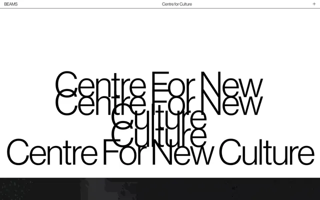
Industrial monochrome canvas
Color palette
Hero section background — deep, warm, and earthy, evoking an aged, material quality
Hairline borders, dividers, input outlines, and card edges on light surfaces. Do not promote it to the primary CTA color
Neutral form states, badge text, and quiet UI feedback where color should stay understated. Do not promote it to the primary CTA color
Typography
- Weights
- 400
- Sizes
- 19px, 29px, 38px, 95px, 160px
- Line height
- 0.9, 1, 1.1, 1.95, 2.9
- Letter spacing
- -0.0300em
- Fallback
- Helvetica Neue
All textual content — headlines, body, links, buttons, inputs. Its consistent use at various scales reinforces a unified, minimalist, and precise brand voice. The tight letter spacing ensures a compact, considered appearance.
Spacing & shape
Components
Minimal button with Ink Black text on a Canvas White background, featuring a 1px Ink Black bottom border. No border radius. Padding: 0px top/bottom, 0px left/right. Font: NeueHaas-web, weight 400.
Minimal button with Canvas White text on a transparent background, featuring a 1px Canvas White bottom border. No border radius. Padding: 0px top/bottom, 40px left/right initially, shrinking to 15.2381px. Font: NeueHaas-web, weight 400.
Ink Black text on a transparent background, with a 1px Ink Black bottom border. No border radius. Padding: 0px top/left/right, 5.71429px bottom. Font: NeueHaas-web, weight 400.
Ink Black text on transparent. No border. Font: NeueHaas-web, weight 400. Text is uppercase for top-level links like 'BEAMS' and 'Centre for Culture'.
Guidelines
- Prioritize Ink Black text (#000000) on Canvas White (#ffffff) backgrounds for all primary content, ensuring maximum legibility.
- Use NeueHaas-web font family consistently across all text elements, leveraging its singular weight (400) and varying sizes for hierarchy.
- Apply a letter-spacing of -0.0300em (approx. -0.9px at 30px up to -4.8px at 160px) to all text for a compact, editorial feel.
- Maintain a strict 0px border-radius system; all corners must be sharp and unrounded.
- Utilize Ink Black (#000000) bottom borders as the primary visual indicator for interactive elements like buttons and input fields.
- Ensure generous vertical spacing with a base unit of 6px, creating a comfortable density where sections and elements breathe.
- Avoid using any colors outside of the monochrome Ink Black and Canvas White, except for the Terra Cotta gradient for distinct hero or atmospheric sections.
- Do not introduce shadows or any form of elevation (e.g., box-shadow) for interactive elements or containers.
- Do not use heavily filled or overtly styled buttons; actions should be communicated primarily through text and minimal borders.
- Do not introduce decorative icons or illustrations that deviate from the stark, high-contrast aesthetic.
- Avoid mixed letter-spacing values across different text roles; `NeueHaas-web`'s inherent -0.0300em is a cornerstone.
- Do not vary line-height aggressively at smaller text sizes; stick to the specified values which are often condensed for headlines.
About this system
ShowHide
The Beams presents a stark, high-contrast visual system, built upon a monochrome palette and large-scale typography. It leverages raw, industrial aesthetics by minimizing decorative elements, relying instead on bold, unadorned text on clean white surfaces. Interaction is signaled through subtle borders and text-only links, avoiding visually heavy components to maintain an austere, content-forward focus.
The page maintains a maximum-width contained layout rather than being full-bleed. The hero section often features a full-viewport image or gradient with centered headline text. Section rhythm is often defined by large, distinct blocks, sometimes alternating between text-heavy and image-heavy, but always with consistent vertical spacing. Content arrangement leans towards centered stacks for headlines and body text, with occasional two-column layouts for descriptive paragraphs that alternate text and potentially inferred imagery from the layout. Navigation is a minimal top bar with left-aligned brand and centered primary links.
The site primarily uses photography, featuring wide-angle, low-key, industrial shots often with a warm, somewhat desaturated filter. Imagery acts as a decorative atmosphere rather than containing explicit content, often blurring into an abstract pattern, such as the Terra Cotta gradient with light streaks. It is typically full-bleed or large background elements, creating immersive sections. Icons appear minimal, outlined, and monochromatic, integrated subtly into the UI.
Reminiscent of AIGA, The New York Times, Bauhaus Archive, Artsy.
# The Beams — Style Reference
> Industrial monochrome canvas

**Theme:** light

**Site:** https://thebeamslondon.com

The Beams presents a stark, high-contrast visual system, built upon a monochrome palette and large-scale typography. It leverages raw, industrial aesthetics by minimizing decorative elements, relying instead on bold, unadorned text on clean white surfaces. Interaction is signaled through subtle borders and text-only links, avoiding visually heavy components to maintain an austere, content-forward focus.

## Tokens — Colors

| Name | Value | Token | Role |
|------|------|------|------|
| Terra Cotta | `#a05b38` | `--color-terra-cotta` | Hero section background — deep, warm, and earthy, evoking an aged, material quality |
| Canvas White | `#ffffff` | `--color-canvas-white` | Hairline borders, dividers, input outlines, and card edges on light surfaces. Do not promote it to the primary CTA color |
| Ink Black | `#000000` | `--color-ink-black` | Neutral form states, badge text, and quiet UI feedback where color should stay understated. Do not promote it to the primary CTA color |

## Tokens — Typography

### NeueHaas-web
- **Substitute:** Helvetica Neue
- **Weights:** 400
- **Sizes:** 19px, 29px, 38px, 95px, 160px
- **Line height:** 0.9, 1, 1.1, 1.95, 2.9
- **Letter spacing:** -0.0300em
- **Role:** All textual content — headlines, body, links, buttons, inputs. Its consistent use at various scales reinforces a unified, minimalist, and precise brand voice. The tight letter spacing ensures a compact, considered appearance.

## Tokens — Type Scale

| Role | Size | Line height | Letter spacing |
|------|------|------|------|
| body-sm | 19px | 1.95 | -0.57px |
| body | 29px | 1.95 | -0.87px |
| heading-sm | 38px | 1.1 | -1.14px |
| heading | 95px | 0.9 | -2.85px |
| display | 160px | 0.9 | -4.8px |

## Tokens — Spacing

- **Section gap:** 46px
- **Card padding:** 19px
- **Element gap:** 19px

## Tokens — Radius

- **none:** 0px

## Layout

The page maintains a maximum-width contained layout rather than being full-bleed. The hero section often features a full-viewport image or gradient with centered headline text. Section rhythm is often defined by large, distinct blocks, sometimes alternating between text-heavy and image-heavy, but always with consistent vertical spacing. Content arrangement leans towards centered stacks for headlines and body text, with occasional two-column layouts for descriptive paragraphs that alternate text and potentially inferred imagery from the layout. Navigation is a minimal top bar with left-aligned brand and centered primary links.

## Imagery

The site primarily uses photography, featuring wide-angle, low-key, industrial shots often with a warm, somewhat desaturated filter. Imagery acts as a decorative atmosphere rather than containing explicit content, often blurring into an abstract pattern, such as the Terra Cotta gradient with light streaks. It is typically full-bleed or large background elements, creating immersive sections. Icons appear minimal, outlined, and monochromatic, integrated subtly into the UI.

## Components

### Text Outline Button (Light)
*Secondary action button or navigation element.*

Minimal button with Ink Black text on a Canvas White background, featuring a 1px Ink Black bottom border. No border radius. Padding: 0px top/bottom, 0px left/right. Font: NeueHaas-web, weight 400.

### Text Outline Button (Dark)
*Secondary action button or navigation element on dark backgrounds.*

Minimal button with Canvas White text on a transparent background, featuring a 1px Canvas White bottom border. No border radius. Padding: 0px top/bottom, 40px left/right initially, shrinking to 15.2381px. Font: NeueHaas-web, weight 400.

### Text Input
*Standard text input field for forms.*

Ink Black text on a transparent background, with a 1px Ink Black bottom border. No border radius. Padding: 0px top/left/right, 5.71429px bottom. Font: NeueHaas-web, weight 400.

### Header Navigation Link
*Top-level navigation items.*

Ink Black text on transparent. No border. Font: NeueHaas-web, weight 400. Text is uppercase for top-level links like 'BEAMS' and 'Centre for Culture'.

## Guidelines

### Do

- Prioritize Ink Black text (#000000) on Canvas White (#ffffff) backgrounds for all primary content, ensuring maximum legibility.
- Use NeueHaas-web font family consistently across all text elements, leveraging its singular weight (400) and varying sizes for hierarchy.
- Apply a letter-spacing of -0.0300em (approx. -0.9px at 30px up to -4.8px at 160px) to all text for a compact, editorial feel.
- Maintain a strict 0px border-radius system; all corners must be sharp and unrounded.
- Utilize Ink Black (#000000) bottom borders as the primary visual indicator for interactive elements like buttons and input fields.
- Ensure generous vertical spacing with a base unit of 6px, creating a comfortable density where sections and elements breathe.

### Don't

- Avoid using any colors outside of the monochrome Ink Black and Canvas White, except for the Terra Cotta gradient for distinct hero or atmospheric sections.
- Do not introduce shadows or any form of elevation (e.g., box-shadow) for interactive elements or containers.
- Do not use heavily filled or overtly styled buttons; actions should be communicated primarily through text and minimal borders.
- Do not introduce decorative icons or illustrations that deviate from the stark, high-contrast aesthetic.
- Avoid mixed letter-spacing values across different text roles; `NeueHaas-web`'s inherent -0.0300em is a cornerstone.
- Do not vary line-height aggressively at smaller text sizes; stick to the specified values which are often condensed for headlines.

## Agent Prompt Guide

Quick Color Reference:
text: #000000
background: #ffffff
border: #000000
accent: #a05b38
primary action: no distinct CTA color

Example Component Prompts:
1. Create a primary hero section: use a deep Terra Cotta gradient (#a05b38 as hex, linear-gradient(287deg, rgba(230,126,79,1), rgba(160,91,56,1)) as gradient) as the background. Place 'Centre For New Culture' in NeueHaas-web, size 160px, weight 400, Canvas White (#ffffff) text, letter-spacing -4.8px, centered on the gradient.
2. Create a Text Outline Button (Dark): 'SIGN UP' in NeueHaas-web, size 19px, weight 400, Canvas White (#ffffff) text. Use a 1px Canvas White bottom border. Padding 0px top/bottom, 40px right, 15.2381px left. No border radius.
3. Create a text input field: 'Email Address' as placeholder (same styling as regular text inputs) in NeueHaas-web, size 19px, weight 400, Ink Black (#000000) text. Apply a 1px Ink Black bottom border. Padding 0px top/left/right, 5.71429px bottom. No border radius. Background is Canvas White.
More like this









Keep what you find
A free account saves references to boards and can send you a weekly email of picks based on what you save.
To see every result, go Pro.