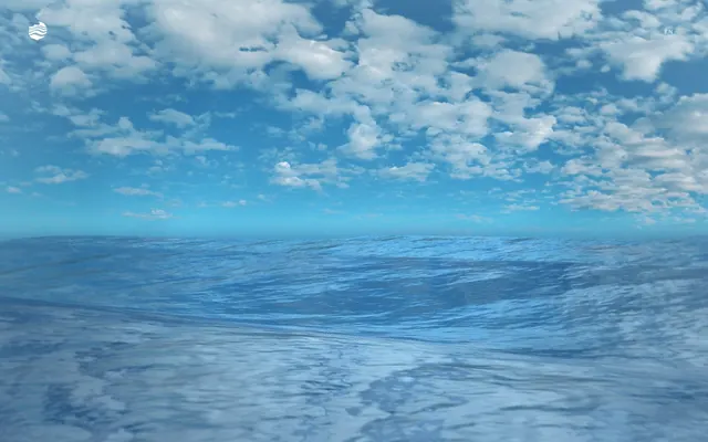
Preview image. Unlock full-res
Vast Blue Expanse
Color palette
Decorative accents, interactive element borders, default link and text color on light backgrounds. Implies fluidity without being overly saturated
Subtle border for ghost buttons and navigation elements, active text color. Provides a lighter, almost translucent variation of the primary brand blue
Page backgrounds, fills for decorative SVG elements. Serves as the primary neutral surface
Icon fills and occasional interface elements, providing high contrast against light surfaces
Typography
- Weights
- 400
- Sizes
- 11px, 14px
- Line height
- 1.5
- Letter spacing
- 0.152em
- Fallback
- Open Sans, sans-serif
Primary typeface for all text content including body, links, buttons, and navigation. Its consistent single weight emphasizes clarity and restraint, matching the minimal UI approach.
Spacing & shape
Components
Text color Sea Foam (#E5FAFF) with a 1px border in Sea Foam (#E5FAFF). Background is transparent. Padding is 0px in all directions. Uses TT Lakes, weight 400, typically 11px or 14px.
Guidelines
- Prioritize full-bleed, immersive imagery as background elements where appropriate.
- Use Sky Blue (#94E6FB) and Sea Foam (#E5FAFF) sparingly for inactive states, borders, or subtle text accents.
- Maintain a spacious, uncluttered layout with minimal UI elements to emphasize content.
- Utilize 0px border-radius for all interactive elements to maintain a sharp, deliberate edge.
- Ensure all text, including interactive elements, uses TT Lakes at weight 400 for consistency.
- Employ transparent backgrounds for most interactive components, relying on border-based visual cues.
- Avoid using saturated background colors or heavy shadows, as they create visual density inconsistent with the brand.
- Do not use solid background fills for primary buttons; instead, opt for ghost or border-only styles.
- Do not introduce additional font families or weights beyond TT Lakes 400.
- Avoid visually complex components or excessive decorative elements; keep UI simple and functional.
- Do not use varied border radii; maintain 0px radius for all corners.
- Avoid dense information blocks; break content into manageable, well-spaced sections.
About this system
ShowHide
The Sea We Breathe uses a serene, atmospheric design language focused on the interplay of water and sky. The visual system is minimal, utilizing large-scale imagery and almost monochrome interface elements to evoke a sense of calm and vastness. Interaction elements are almost invisible, relying on subtle borders and text color changes rather than solid fills. The typography is light and spacious, complementing the open, uncluttered layout.
The page primarily employs a full-bleed layout, where the hero section extends to the viewport edges, featuring a prominent atmospheric image as its background. Content is placed minimally on top of this background. The overall structure appears to be max-width contained for textual content within sections, although the hero explicitly breaks this. Vertical rhythm is suggested by deliberate spacing between implied sections, though no distinct dividers are present. Navigation is minimal, consisting of a top bar with a logo and a language selector, likely sticky to maintain presence over the expansive imagery.
The site predominantly uses full-bleed, expansive photographic imagery of open ocean and sky, creating an immersive atmospheric backdrop. The treatment is naturalistic and high-key, with no obvious stylistic filters or heavy post-processing. The imagery serves a decorative, atmospheric role, setting the mood rather than conveying specific product information. Icons are minimal, likely monochrome (white or black), and contribute to the clean, uncluttered aesthetic.
Reminiscent of The Ocean Cleanup, 4ocean, Monterey Bay Aquarium.
# The Sea We Breathe — Style Reference
> Vast Blue Expanse

**Theme:** light

**Site:** https://theseawebreathe.com

The Sea We Breathe uses a serene, atmospheric design language focused on the interplay of water and sky. The visual system is minimal, utilizing large-scale imagery and almost monochrome interface elements to evoke a sense of calm and vastness. Interaction elements are almost invisible, relying on subtle borders and text color changes rather than solid fills. The typography is light and spacious, complementing the open, uncluttered layout.

## Tokens — Colors

| Name | Value | Token | Role |
|------|------|------|------|
| Sky Blue | `#94e6fb` | `--color-sky-blue` | Decorative accents, interactive element borders, default link and text color on light backgrounds. Implies fluidity without being overly saturated |
| Sea Foam | `#e5faff` | `--color-sea-foam` | Subtle border for ghost buttons and navigation elements, active text color. Provides a lighter, almost translucent variation of the primary brand blue |
| Canvas White | `#ffffff` | `--color-canvas-white` | Page backgrounds, fills for decorative SVG elements. Serves as the primary neutral surface |
| Midnight Accent | `#000000` | `--color-midnight-accent` | Icon fills and occasional interface elements, providing high contrast against light surfaces |

## Tokens — Typography

### TT Lakes
- **Substitute:** Open Sans, sans-serif
- **Weights:** 400
- **Sizes:** 11px, 14px
- **Line height:** 1.5
- **Letter spacing:** 0.152em
- **Role:** Primary typeface for all text content including body, links, buttons, and navigation. Its consistent single weight emphasizes clarity and restraint, matching the minimal UI approach.

## Tokens — Type Scale

| Role | Size | Line height | Letter spacing |
|------|------|------|------|
| caption | 11px | 1.5 | 1.672px |
| body | 14px | 1.5 | 2.128px |

## Tokens — Spacing

- **Section gap:** 44px
- **Card padding:** 0px
- **Element gap:** 0px

## Tokens — Radius

- **Buttons:** 0px

## Layout

The page primarily employs a full-bleed layout, where the hero section extends to the viewport edges, featuring a prominent atmospheric image as its background. Content is placed minimally on top of this background. The overall structure appears to be max-width contained for textual content within sections, although the hero explicitly breaks this. Vertical rhythm is suggested by deliberate spacing between implied sections, though no distinct dividers are present. Navigation is minimal, consisting of a top bar with a logo and a language selector, likely sticky to maintain presence over the expansive imagery.

## Imagery

The site predominantly uses full-bleed, expansive photographic imagery of open ocean and sky, creating an immersive atmospheric backdrop. The treatment is naturalistic and high-key, with no obvious stylistic filters or heavy post-processing. The imagery serves a decorative, atmospheric role, setting the mood rather than conveying specific product information. Icons are minimal, likely monochrome (white or black), and contribute to the clean, uncluttered aesthetic.

## Components

### Ghost Navigation Button
*Interactive element to switch language or navigate secondary options.*

Text color Sea Foam (#E5FAFF) with a 1px border in Sea Foam (#E5FAFF). Background is transparent. Padding is 0px in all directions. Uses TT Lakes, weight 400, typically 11px or 14px.

## Guidelines

### Do

- Prioritize full-bleed, immersive imagery as background elements where appropriate.
- Use Sky Blue (#94E6FB) and Sea Foam (#E5FAFF) sparingly for inactive states, borders, or subtle text accents.
- Maintain a spacious, uncluttered layout with minimal UI elements to emphasize content.
- Utilize 0px border-radius for all interactive elements to maintain a sharp, deliberate edge.
- Ensure all text, including interactive elements, uses TT Lakes at weight 400 for consistency.
- Employ transparent backgrounds for most interactive components, relying on border-based visual cues.

### Don't

- Avoid using saturated background colors or heavy shadows, as they create visual density inconsistent with the brand.
- Do not use solid background fills for primary buttons; instead, opt for ghost or border-only styles.
- Do not introduce additional font families or weights beyond TT Lakes 400.
- Avoid visually complex components or excessive decorative elements; keep UI simple and functional.
- Do not use varied border radii; maintain 0px radius for all corners.
- Avoid dense information blocks; break content into manageable, well-spaced sections.

## Agent Prompt Guide

Create an Outlined Primary Action: Transparent background, #94e6fb border and text, 9999px radius, compact pill padding. Use it for the main CTA instead of a filled button.

Example Component Prompts:
1. Create a header navigation: transparent background, a logo on the left (assume white fill #ffffff), and a language switcher button ('EN') on the right. The language button should have transparent background, Sea Foam (#E5FAFF) text using TT Lakes 400 at 11px, a 1px Sea Foam (#E5FAFF) border, and 0px padding/radius.
2. Create a main page hero section: full-bleed background using expansive ocean imagery. Overlay a central headline in Sky Blue (#94E6FB), TT Lakes 400 at 56px, with minimal white (assume #ffffff) supporting text underneath using TT Lakes 400 at 14px.
3. Create a descriptive text block within a section: Canvas White (#ffffff) background. Text content is in Sky Blue (#94E6FB) using TT Lakes 400 at 14px, arranged with comfortable line heights consistent with the system's 1.5. No borders or shadows.
More like this









Keep what you find
A free account saves references to boards and can send you a weekly email of picks based on what you save.
To see every result, go Pro.