Preview image. Unlock full-res
Crisp geometry, playful pink.
Color palette
Headline accents, interactive states, decorative strokes, outlined button borders
Card borders for accent cards, subtle geometric background elements
Prominent card borders for key content
Page backgrounds, card surfaces, default text color on dark surfaces
Subtle background panels, light surface fills
Primary text, button backgrounds on dark buttons, interactive elements
Strongest text, icon fills, prominent borders
Subtle borders, dividers, ghost button borders
Secondary text, descriptive labels
Typography
- Weights
- 400
- Sizes
- 15px, 16px
- Line height
- 1.2, 1.25, 1.5
- Letter spacing
- normal
- Fallback
- Times New Roman
System font fallback, limited usage for small text elements.
- Weights
- 400, 500, 600, 700
- Sizes
- 14px, 15px, 16px, 17px, 18px
- Line height
- 1, 1.1, 1.2, 1.25, 1.33, 1.44, 1.47, 1.5, 1.53, 1.56, 1.6, 2.12
- Letter spacing
- -0.014em at 14px, -0.013em at 15px, -0.007em at 16px, -0.006em at 17px, -0.005em at 18px
Body text, navigation, buttons, and detailed content. Its clean, geometric forms support readability at various sizes.
- Weights
- 400, 500
- Sizes
- 19px, 24px, 32px, 36px, 40px, 48px, 60px, 72px
- Line height
- 1.1, 1.11, 1.16, 1.17, 1.19, 1.2, 1.25
- Letter spacing
- -0.035em at 72px, -0.03em at 60px, -0.029em at 48px, -0.024em at 40px, -0.022em at 36px, -0.019em at 32px, -0.012em at 24px, -0.004em at 19px
Primary headings and display text. The tight letter spacing at larger sizes creates a distinctive, sophisticated typographic presence.
Spacing & shape
Components
text-only, #56504d, padding 0 0 10px 0, no border, no background. The bottom border appears on hover/active.
background: rgba(0,0,0,0), text: #000000, border: 1px solid #000000, border-radius: 8px. No padding observed.
Background: rgba(0,0,0,0), text: #131110, border: 1px solid #c6c3c3, border-radius: 8px, padding: 5px 7.5px.
background: #131110, text: #ffffff, border: none, border-radius: 5px, padding: 0 15px.
background: #ffffff, border-radius: 8px, no shadow, padding: 25px 50px.
background: #fce7f3, border-radius: 8px, no shadow, padding: 30px, border: 1px solid #f9b4db.
Guidelines
- Use 'Graphite' (#131110) for primary text and filled buttons against light backgrounds.
- Apply 'Magenta Zing' (#e82183) judiciously as an accent for headlines, interactive states, and outlined button borders.
- Prioritize 'wulkan' font for all headings, adjusting letter-spacing according to its specific scale (e.g., -0.029em at 48px).
- Maintain a default border-radius of 8px for cards and most UI elements, while using 5px for primary action buttons.
- Implement tight letter-spacing for all display and heading-level text to establish a distinct typographic presence.
- Use 'Stone Gray' (#c6c3c3) for subtle borders and ghost button outlines to maintain a light, crisp aesthetic.
- Avoid heavy drop shadows or complex elevation; the system relies on flat surfaces and high contrast.
- Do not introduce new saturated primary colors; limit the palette to the established neutrals and 'Magenta Zing'.
- Do not use generic system fonts for headlines; the 'wulkan' typeface is integral to the brand's typographic identity.
- Refrain from creating highly dense content blocks; prioritize generous white space and clear visual separation.
- Avoid using 'Times' except for very specific, minor text elements where observed – it's a fallback, not a primary font.
- Do not deviate from the established padding values (e.g., 20px for cards, 0 15px for filled buttons) without strong justification.
About this system
ShowHide
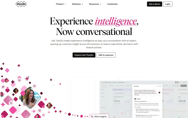
TheyDo employs a bright, geometric, and conversational aesthetic, balancing crisp achromatic UI with a vibrant, playful pink accent. The system favors strong contrasts, a clean information hierarchy, and a subtle interplay of sharp angles and soft curves within its visual elements. Prominent headlines with distinct letter spacing establish a confident, expert-driven tone, while a generous use of negative space creates an inviting, breathable user experience. The design avoids heavy shadows or complex textures, opting for a flat, modern appearance with a single vibrant accent.
The layout follows a centered max-width pattern rather than full-bleed, creating a contained and organized feel. The hero section is characterized by a prominent, centered headline, often with a secondary conversational element, and typically features a distinct geometric accent in the background. Sections alternate between clean white backgrounds and subtle 'Ash Gray' panels, providing clear visual breaks. Content is often arranged in symmetrical two-column or three-column grids, particularly for feature descriptions or cards, using consistent vertical spacing. Navigation is a persistent top bar with minimal elements and clear 'Get a demo' and 'Login' calls to action.
The visual language for imagery is minimal and functional. It features clean product screenshots integrated within the UI, often with a slightly desaturated or grayscale filter for supporting brands. Decorative elements consist of abstract geometric shapes (squares and rounded squares) in varying shades of pink, floating or arranged in diagonal patterns, providing a playful and dynamic accent to otherwise static sections. Icons are outlined, subtle, and mono-color, typically in 'Charcoal' or 'Magenta Zing', serving an explanatory role without dominating the content. Overall density is image-light, focusing on UI and illustration for branding rather than photographic content beyond partner logos.
Reminiscent of Linear, Amplitude, Typeform, Stripe.
# TheyDo — Style Reference
> Crisp geometry, playful pink.

**Theme:** light

**Site:** https://www.theydo.com

TheyDo employs a bright, geometric, and conversational aesthetic, balancing crisp achromatic UI with a vibrant, playful pink accent. The system favors strong contrasts, a clean information hierarchy, and a subtle interplay of sharp angles and soft curves within its visual elements. Prominent headlines with distinct letter spacing establish a confident, expert-driven tone, while a generous use of negative space creates an inviting, breathable user experience. The design avoids heavy shadows or complex textures, opting for a flat, modern appearance with a single vibrant accent.

## Tokens — Colors

| Name | Value | Token | Role |
|------|------|------|------|
| Magenta Zing | `#e82183` | `--color-magenta-zing` | Headline accents, interactive states, decorative strokes, outlined button borders |
| Light Pink Wash | `#fad6e9` | `--color-light-pink-wash` | Card borders for accent cards, subtle geometric background elements |
| Bubblegum Burst | `#f9b4db` | `--color-bubblegum-burst` | Prominent card borders for key content |
| Canvas | `#ffffff` | `--color-canvas` | Page backgrounds, card surfaces, default text color on dark surfaces |
| Ash Gray | `#fce7f3` | `--color-ash-gray` | Subtle background panels, light surface fills |
| Graphite | `#131110` | `--color-graphite` | Primary text, button backgrounds on dark buttons, interactive elements |
| Charcoal | `#000000` | `--color-charcoal` | Strongest text, icon fills, prominent borders |
| Stone Gray | `#c6c3c3` | `--color-stone-gray` | Subtle borders, dividers, ghost button borders |
| Muted Sage | `#7b7674` | `--color-muted-sage` | Secondary text, descriptive labels |

## Tokens — Typography

### Times
- **Substitute:** Times New Roman
- **Weights:** 400
- **Sizes:** 15px, 16px
- **Line height:** 1.2, 1.25, 1.5
- **Letter spacing:** normal
- **Role:** System font fallback, limited usage for small text elements.

### DM Sans
- **Weights:** 400, 500, 600, 700
- **Sizes:** 14px, 15px, 16px, 17px, 18px
- **Line height:** 1, 1.1, 1.2, 1.25, 1.33, 1.44, 1.47, 1.5, 1.53, 1.56, 1.6, 2.12
- **Letter spacing:** -0.014em at 14px, -0.013em at 15px, -0.007em at 16px, -0.006em at 17px, -0.005em at 18px
- **Role:** Body text, navigation, buttons, and detailed content. Its clean, geometric forms support readability at various sizes.

### wulkan
- **Weights:** 400, 500
- **Sizes:** 19px, 24px, 32px, 36px, 40px, 48px, 60px, 72px
- **Line height:** 1.1, 1.11, 1.16, 1.17, 1.19, 1.2, 1.25
- **Letter spacing:** -0.035em at 72px, -0.03em at 60px, -0.029em at 48px, -0.024em at 40px, -0.022em at 36px, -0.019em at 32px, -0.012em at 24px, -0.004em at 19px
- **Role:** Primary headings and display text. The tight letter spacing at larger sizes creates a distinctive, sophisticated typographic presence.

## Tokens — Type Scale

Perfect Fifth (1.5) from 14px base.

| Role | Size | Line height | Letter spacing |
|------|------|------|------|
| caption | 14px | 1.5 | -0.14px |
| heading-sm | 19px | 1.25 | -0.076em |
| heading | 24px | 1.2 | -0.288px |
| heading-lg | 32px | 1.19 | -0.608px |
| display | 72px | 1.11 | -2.52px |

## Tokens — Spacing

- **Section gap:** 80px
- **Card padding:** 20px
- **Element gap:** 15px

## Tokens — Radius

- **Default:** 8px
- **Buttons:** 5px
- **Cards:** 8px

## Layout

The layout follows a centered max-width pattern rather than full-bleed, creating a contained and organized feel. The hero section is characterized by a prominent, centered headline, often with a secondary conversational element, and typically features a distinct geometric accent in the background. Sections alternate between clean white backgrounds and subtle 'Ash Gray' panels, providing clear visual breaks. Content is often arranged in symmetrical two-column or three-column grids, particularly for feature descriptions or cards, using consistent vertical spacing. Navigation is a persistent top bar with minimal elements and clear 'Get a demo' and 'Login' calls to action.

## Imagery

The visual language for imagery is minimal and functional. It features clean product screenshots integrated within the UI, often with a slightly desaturated or grayscale filter for supporting brands. Decorative elements consist of abstract geometric shapes (squares and rounded squares) in varying shades of pink, floating or arranged in diagonal patterns, providing a playful and dynamic accent to otherwise static sections. Icons are outlined, subtle, and mono-color, typically in 'Charcoal' or 'Magenta Zing', serving an explanatory role without dominating the content. Overall density is image-light, focusing on UI and illustration for branding rather than photographic content beyond partner logos.

## Components

### Primary Navigation Text Button
*Unfilled text button for main navigation items with subtle `:hover` state*

text-only, #56504d, padding 0 0 10px 0, no border, no background. The bottom border appears on hover/active.

### Outline Nav Item Button
*Outlined button for secondary actions in header (e.g., login)*

background: rgba(0,0,0,0), text: #000000, border: 1px solid #000000, border-radius: 8px. No padding observed.

### Ghost Outline Button
*Ghost (transparent background) buttons with subtle borders.*

Background: rgba(0,0,0,0), text: #131110, border: 1px solid #c6c3c3, border-radius: 8px, padding: 5px 7.5px.

### Filled Dark Button
*Primary action button with a dark background.*

background: #131110, text: #ffffff, border: none, border-radius: 5px, padding: 0 15px.

### Subtle Information Card
*Cards for displaying information, often with a light background.*

background: #ffffff, border-radius: 8px, no shadow, padding: 25px 50px.

### Accented Content Card
*Cards for highlighted content, featuring a light pink background and border.*

background: #fce7f3, border-radius: 8px, no shadow, padding: 30px, border: 1px solid #f9b4db.

## Guidelines

### Do

- Use 'Graphite' (#131110) for primary text and filled buttons against light backgrounds.
- Apply 'Magenta Zing' (#e82183) judiciously as an accent for headlines, interactive states, and outlined button borders.
- Prioritize 'wulkan' font for all headings, adjusting letter-spacing according to its specific scale (e.g., -0.029em at 48px).
- Maintain a default border-radius of 8px for cards and most UI elements, while using 5px for primary action buttons.
- Implement tight letter-spacing for all display and heading-level text to establish a distinct typographic presence.
- Use 'Stone Gray' (#c6c3c3) for subtle borders and ghost button outlines to maintain a light, crisp aesthetic.

### Don't

- Avoid heavy drop shadows or complex elevation; the system relies on flat surfaces and high contrast.
- Do not introduce new saturated primary colors; limit the palette to the established neutrals and 'Magenta Zing'.
- Do not use generic system fonts for headlines; the 'wulkan' typeface is integral to the brand's typographic identity.
- Refrain from creating highly dense content blocks; prioritize generous white space and clear visual separation.
- Avoid using 'Times' except for very specific, minor text elements where observed – it's a fallback, not a primary font.
- Do not deviate from the established padding values (e.g., 20px for cards, 0 15px for filled buttons) without strong justification.

## Agent Prompt Guide

**Quick Color Reference:**
text: #131110
background: #ffffff
border: #c6c3c3
accent: #e82183
primary action: #131110 (filled action)

**Example Component Prompts:**
1. Create a `Hero Headline` with the text 'Experience intelligence, Now conversational'. 'Experience' and 'Now conversational' should be `wulkan` 72px, `Charcoal` (#000000), letter-spacing -2.52px. The word 'intelligence' should be `wulkan` 72px, `Magenta Zing` (#e82183), letter-spacing -2.52px.
2. Create a `Filled Dark Button` with the text 'Explore Ask TheyDo'. Use background `Graphite` (#131110), text `Canvas` (#ffffff), border-radius 5px, and horizontal padding 15px.
3. Create a `Ghost Outline Button` with the text 'Talk to a person'. Use transparent background, `Graphite` (#131110) text, 1px `Stone Gray` (#c6c3c3) border, border-radius 8px, and 5px vertical / 7.5px horizontal padding.
4. Create an `Accented Content Card` containing a headline and body text. The card should have `Ash Gray` (#fce7f3) background, a 1px `Bubblegum Burst` (#f9b4db) border, border-radius 8px, and 30px padding. Headline text should be `wulkan` 24px `Charcoal` (#000000), letter-spacing -0.288px. Body text should be `DM Sans` 16px `Graphite` (#131110), line-height 1.6.
More like this









Keep what you find
A free account saves references to boards and can send you a weekly email of picks based on what you save.
To see every result, go Pro.