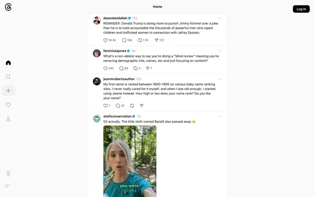
Preview image. Unlock full-res
Polaroid on white linen: clean, framed content on an understated, tactile canvas.
Color palette
Key interaction indicators, link text, borders for primary actions, decorative icons — provides a bold yet restrained brand accent
Standard hyperlink color that stands out from the primary content, often within body text
Soft icon strokes, subtle dividers, and low-emphasis decorative details. Do not promote it to the primary CTA color
Primary text and headings, prominent icons, filled button backgrounds
Subtle hairline dividers, lightweight borders separating content sections
Secondary text, disabled states, subtle icon fills, and ghost button borders
Tertiary text, less prominent icons, and fine details
Typography
- Weights
- 400, 600, 700
- Sizes
- 12px, 13px, 15px
- Line height
- 1.33, 1.4
- Letter spacing
- normal
- Fallback
- Inter, Arial, Helvetica Neue
All textual elements: body copy, links, buttons, icons, and headings. This choice emphasizes functional clarity over stylistic flair, fostering a neutral environment for user-generated content.
Spacing & shape
Elevation
Components
Solid 'Text Black' background, 'Canvas White' text, 10px border radius, 16px horizontal padding.
Transparent background, 'Text Black' icon/text, 1000px (pill) border radius, 0px padding. Uses the default text/icon color.
Transparent background, 'Text Black' icon, 50% border radius (circular), 0px padding.
No explicit border or background. Uses implied separation from the primary 'Canvas White' background. Content padding is subtle and derives from element spacing, with a global 18px radius for the overall post container.
Rendered in 'Active Violet' (#385898) with system-ui font, default weight, and normal letter spacing.
Rendered in 'Link Blue' (#0095f6) with system-ui font, default weight, and normal letter spacing.
Transparent background, 'Text Black' icon/text for inactive state. Active states are implied by other means, potentially the 'Active Violet' for a border or background.
Guidelines
- Use 'Canvas White' (#fafafa) as the dominant background for all major content areas.
- Apply 'Text Black' (#000000) for all primary text and main headings to ensure maximum contrast.
- Reserve 'Active Violet' (#385898) strictly for interactive elements such as primary action borders, links, or active/brand states.
- Utilize ghost buttons with a 1000px (pill) border radius for almost all interactive elements, except for the explicit 'Log in' button.
- Ensure all major cards and content sections have an 8px border radius, or 18px for feed posts for a softer appearance.
- Maintain a compact visual density, relying on minimal padding and tight element gaps, with a base unit of 4px.
- Employ system-ui for all typography to maintain a native feel and prioritize legibility and performance.
- Do not use saturated colors for large background areas or extensive design elements; color should be used sparingly for accent.
- Avoid heavy shadows for elevation; subtle, almost imperceptible shadows are preferred, if any.
- Do not introduce additional font families; restrict typography to system-ui to preserve consistency.
- Refrain from using strong borders or dividers between content sections; rely on spacing and subtle background differences for hierarchy.
- Do not clutter the layout with excessive imagery or complex graphical elements; content should remain the focal point.
- Avoid large, impactful headlines; typography generally remains smaller and more understated.
- Do not deviate from the established radii, especially the 1000px for buttons and 8px/18px for cards, as this is a key visual identifier.
About this system
ShowHide
Threads presents a clean, content-focused interface with a monochrome palette dominating the visual space. It leverages subtle gray tones for surface distinction and borders, emphasizing user-generated content and interactions. Typography is compact and functional, primarily rendered in black for high contrast against a light background. A single vibrant violet accent color is reserved for active states, links, and outlining interactive elements, acting as the primary point of brand expression.
The page primarily uses a max-width contained layout, approximately 900px wide, centered on a 'Canvas White' background. The hero pattern is subtle, with the 'Home' title being a small, centered text. Content runs in a continuous vertical feed, predominantly featuring single-column posts. Each post is a soft card with an 18px border radius, featuring an alternating or stacked media/text arrangement. Vertical rhythm is established by consistent spacing between posts and elements, with a more compact density within each post. Navigation is handled by a fixed left-hand sidebar for primary routes and a minimal top-right 'Log in' button.
Imagery use is moderate, primarily consisting of user-generated content (photography and video) which is often contained within a bordered frame or displayed with rounded corners. Photography appears naturalistic, with no specific color treatment or high-key/dark moods enforced. Product screenshots or abstract graphics are absent. Icons are simple, outlined black (text color) with a medium stroke weight, serving functional purposes rather than decorative. Image density is balanced within posts, allowing text to remain dominant, and images are primarily explanatory or content-driven, not decorative atmosphere.
Reminiscent of Twitter (X), LinkedIn Feed, Bluesky.
# Threads — Style Reference
> Polaroid on white linen: clean, framed content on an understated, tactile canvas.

**Theme:** light

**Site:** https://threads.net

Threads presents a clean, content-focused interface with a monochrome palette dominating the visual space. It leverages subtle gray tones for surface distinction and borders, emphasizing user-generated content and interactions. Typography is compact and functional, primarily rendered in black for high contrast against a light background. A single vibrant violet accent color is reserved for active states, links, and outlining interactive elements, acting as the primary point of brand expression.

## Tokens — Colors

| Name | Value | Token | Role |
|------|------|------|------|
| Active Violet | `#385898` | `--color-active-violet` | Key interaction indicators, link text, borders for primary actions, decorative icons — provides a bold yet restrained brand accent |
| Link Blue | `#0095f6` | `--color-link-blue` | Standard hyperlink color that stands out from the primary content, often within body text |
| Canvas White | `#fafafa` | `--color-canvas-white` | Soft icon strokes, subtle dividers, and low-emphasis decorative details. Do not promote it to the primary CTA color |
| Text Black | `#000000` | `--color-text-black` | Primary text and headings, prominent icons, filled button backgrounds |
| Border Light | `#d5d5d5` | `--color-border-light` | Subtle hairline dividers, lightweight borders separating content sections |
| Muted Gray | `#969696` | `--color-muted-gray` | Secondary text, disabled states, subtle icon fills, and ghost button borders |
| Subtle Detail Gray | `#424242` | `--color-subtle-detail-gray` | Tertiary text, less prominent icons, and fine details |

## Tokens — Typography

### system-ui
- **Substitute:** Inter, Arial, Helvetica Neue
- **Weights:** 400, 600, 700
- **Sizes:** 12px, 13px, 15px
- **Line height:** 1.33, 1.4
- **Letter spacing:** normal
- **Role:** All textual elements: body copy, links, buttons, icons, and headings. This choice emphasizes functional clarity over stylistic flair, fostering a neutral environment for user-generated content.

## Tokens — Type Scale

Major Second (1.125) from 15px base.

| Role | Size | Line height | Letter spacing |
|------|------|------|------|
| caption | 12px | 1.4 | — |
| body-sm | 13px | 1.4 | — |
| body | 15px | 1.4 | — |

## Tokens — Spacing

- **Section gap:** 24px
- **Card padding:** 16px
- **Element gap:** 12px

## Tokens — Radius

- **Buttons:** 1000px
- **Cards:** 8px
- **Images:** 8px
- **avatars:** 1000px
- **feedPosts:** 18px

## Tokens — Elevation

- **Card/Modal Shadow:** `rgba(0, 0, 0, 0.04) 0px 0px 12px 0px`
- **Scroll Shadow (Subtle):** `rgba(0, 0, 0, 0.04) 0px 0px 12px 0px, rgb(250, 250, 250) 0px 0px 0px 48px`

## Layout

The page primarily uses a max-width contained layout, approximately 900px wide, centered on a 'Canvas White' background. The hero pattern is subtle, with the 'Home' title being a small, centered text. Content runs in a continuous vertical feed, predominantly featuring single-column posts. Each post is a soft card with an 18px border radius, featuring an alternating or stacked media/text arrangement. Vertical rhythm is established by consistent spacing between posts and elements, with a more compact density within each post. Navigation is handled by a fixed left-hand sidebar for primary routes and a minimal top-right 'Log in' button.

## Imagery

Imagery use is moderate, primarily consisting of user-generated content (photography and video) which is often contained within a bordered frame or displayed with rounded corners. Photography appears naturalistic, with no specific color treatment or high-key/dark moods enforced. Product screenshots or abstract graphics are absent. Icons are simple, outlined black (text color) with a medium stroke weight, serving functional purposes rather than decorative. Image density is balanced within posts, allowing text to remain dominant, and images are primarily explanatory or content-driven, not decorative atmosphere.

## Components

### Primary Filled Button
*Represents the most critical action on the page, like 'Log In'.*

Solid 'Text Black' background, 'Canvas White' text, 10px border radius, 16px horizontal padding.

### Ghost Icon Button
*Used for secondary, un-emphasized actions in navigation or content.*

Transparent background, 'Text Black' icon/text, 1000px (pill) border radius, 0px padding. Uses the default text/icon color.

### Ghost Icon Button - Rounded
*Used for specific icon actions like the 'Create' button in the sidebar.*

Transparent background, 'Text Black' icon, 50% border radius (circular), 0px padding.

### Feed Post Card
*Container for individual content posts in the feed.*

No explicit border or background. Uses implied separation from the primary 'Canvas White' background. Content padding is subtle and derives from element spacing, with a global 18px radius for the overall post container.

### Active Link Text
*Text style for interactive links and primary brand emphasis.*

Rendered in 'Active Violet' (#385898) with system-ui font, default weight, and normal letter spacing.

### Standard Link Text
*Standard hyperlinked text, generally for off-site or secondary references.*

Rendered in 'Link Blue' (#0095f6) with system-ui font, default weight, and normal letter spacing.

### Sidebar Navigation Item
*Individual navigation items in the left sidebar.*

Transparent background, 'Text Black' icon/text for inactive state. Active states are implied by other means, potentially the 'Active Violet' for a border or background.

## Guidelines

### Do

- Use 'Canvas White' (#fafafa) as the dominant background for all major content areas.
- Apply 'Text Black' (#000000) for all primary text and main headings to ensure maximum contrast.
- Reserve 'Active Violet' (#385898) strictly for interactive elements such as primary action borders, links, or active/brand states.
- Utilize ghost buttons with a 1000px (pill) border radius for almost all interactive elements, except for the explicit 'Log in' button.
- Ensure all major cards and content sections have an 8px border radius, or 18px for feed posts for a softer appearance.
- Maintain a compact visual density, relying on minimal padding and tight element gaps, with a base unit of 4px.
- Employ system-ui for all typography to maintain a native feel and prioritize legibility and performance.

### Don't

- Do not use saturated colors for large background areas or extensive design elements; color should be used sparingly for accent.
- Avoid heavy shadows for elevation; subtle, almost imperceptible shadows are preferred, if any.
- Do not introduce additional font families; restrict typography to system-ui to preserve consistency.
- Refrain from using strong borders or dividers between content sections; rely on spacing and subtle background differences for hierarchy.
- Do not clutter the layout with excessive imagery or complex graphical elements; content should remain the focal point.
- Avoid large, impactful headlines; typography generally remains smaller and more understated.
- Do not deviate from the established radii, especially the 1000px for buttons and 8px/18px for cards, as this is a key visual identifier.

## Agent Prompt Guide

Quick Color Reference:
text: #000000
background: #fafafa
border: #d5d5d5
accent: #385898
primary action: #385898 (outlined action border)

Example Component Prompts:
1. Create a ghost button: background transparent, text 'Text Black' (#000000), 1000px border radius, 0px padding. Label 'Submit'.
2. Create a feed post card: 'Canvas White' (#fafafa) background, 18px border radius. Include 'Text Black' (#000000) for body text at 13px system-ui, and 'Muted Gray' (#969696) for timestamps at 12px system-ui. Add a subtle shadow using rgba(0, 0, 0, 0.04) 0px 0px 12px 0px.
3. Create an active link: 'Active Violet' (#385898) text color, system-ui font at 13px, no underscore. Label 'Read More'.
4. Create a filled log-in button: 'Text Black' (#000000) background, 'Canvas White' (#fafafa) text color, 10px border radius, horizontal padding 16px. Label 'Log in'.
More like this







Keep what you find
A free account saves references to boards and can send you a weekly email of picks based on what you save.
To see every result, go Pro.