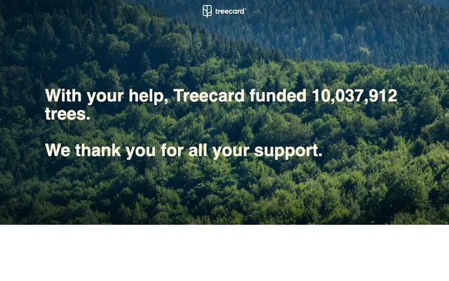
Preview image. Unlock full-res
Forest canopy tranquility
Color palette
Background for primary content sections, branding elements, and accent borders. It evokes the brand's nature-centric mission
Primary text on dark backgrounds, secondary backgrounds, and subtle surface fills
Dark borders and separators for elevated surfaces and inverted UI. Do not promote it to the primary CTA color
Typography
- Weights
- 400, 600
- Sizes
- 14px, 20px, 55px
- Line height
- 1, 1.06, 1.4
- Fallback
- Montserrat
Primary typeface for all headings and body text. Its strong yet clean geometry projects a modern, trustworthy image. The 55px at 1.0 lineHeight makes headlines impactful without being aggressive.
- Weights
- 400
- Sizes
- 12px
- Line height
- 1
- Fallback
- Arial
Fallback for small system text and captions.
Spacing & shape
Guidelines
- Always use 'Forest Canopy' (#143437) as the primary background for sections containing large, prominent text.
- Render all prominent text and headings in 'Parchment White' (#fff4df) when on a 'Forest Canopy' background for maximum contrast and readability.
- Utilize Gilroy font with a weight of 600 for all main headings.
- Maintain generous padding; apply 144px for horizontal spacing and 10-16px for vertical padding within contained elements.
- Prioritize natural imagery, such as dense forest landscapes, as background elements, ensuring text readability with appropriate contrast.
- Avoid using highly saturated, non-brand colors; the palette is intentionally restrained.
- Do not introduce complex gradients or shadows; the surface treatment is flat and understated.
- Do not use type sizes smaller than 12px; legibility is paramount.
- Avoid tight content blocks; embrace spacious layouts and ample negative space.
- Do not deviate from Gilroy for primary text and headings; it defines the brand's typographic voice.
About this system
ShowHide
Treecard embraces a natural, confident visual language, defined by a deep forest green and a striking crisp white for text. The design is spacious, allowing content to breathe over muted background imagery. Typography is bold yet clear, leveraging a custom sans-serif to establish a distinct, trustworthy voice. The system prioritizes clarity and a strong connection to its environmental mission with minimal embellishments.
The page structure utilizes a full-bleed background image, over which content is centered. There's a clear separation between a dominant hero-like section (forest background with large white text) and what appears to be a stark white lower section, suggesting an alternating content band structure. Content within the hero area is vertically stacked and left-aligned, using ample padding around text blocks. The layout emphasizes strong visual impact with imagery and clear, prominent typography.
The imagery prominently features lush, dense forest landscapes. These are treated as large, full-bleed background elements, often overlaid with text. The photography is natural, with rich green tones, emphasizing breadth and depth rather than specific objects. The role of imagery is primarily decorative atmosphere, grounding the brand in its environmental mission. Density is high, with imagery often dominating the visual canvas, supporting text as an overlay.
Reminiscent of Ecosia, Headspace, Allbirds, Patagonia.
# Treecard — Style Reference
> Forest canopy tranquility

**Theme:** light

**Site:** https://www.treecard.org

Treecard embraces a natural, confident visual language, defined by a deep forest green and a striking crisp white for text. The design is spacious, allowing content to breathe over muted background imagery. Typography is bold yet clear, leveraging a custom sans-serif to establish a distinct, trustworthy voice. The system prioritizes clarity and a strong connection to its environmental mission with minimal embellishments.

## Tokens — Colors

| Name | Value | Token | Role |
|------|------|------|------|
| Forest Canopy | `#143437` | `--color-forest-canopy` | Background for primary content sections, branding elements, and accent borders. It evokes the brand's nature-centric mission |
| Parchment White | `#fff4df` | `--color-parchment-white` | Primary text on dark backgrounds, secondary backgrounds, and subtle surface fills |
| Deep Shadow | `#333333` | `--color-deep-shadow` | Dark borders and separators for elevated surfaces and inverted UI. Do not promote it to the primary CTA color |

## Tokens — Typography

### Gilroy
- **Substitute:** Montserrat
- **Weights:** 400, 600
- **Sizes:** 14px, 20px, 55px
- **Line height:** 1, 1.06, 1.4
- **Role:** Primary typeface for all headings and body text. Its strong yet clean geometry projects a modern, trustworthy image. The 55px at 1.0 lineHeight makes headlines impactful without being aggressive.

### sans-serif
- **Substitute:** Arial
- **Weights:** 400
- **Sizes:** 12px
- **Line height:** 1
- **Role:** Fallback for small system text and captions.

## Tokens — Type Scale

| Role | Size | Line height | Letter spacing |
|------|------|------|------|
| caption | 14px | 1.06 | — |
| body-sm | 20px | 1.06 | — |
| body | 55px | 1.06 | — |

## Tokens — Spacing

- **Card padding:** 16px
- **Element gap:** 144px

## Layout

The page structure utilizes a full-bleed background image, over which content is centered. There's a clear separation between a dominant hero-like section (forest background with large white text) and what appears to be a stark white lower section, suggesting an alternating content band structure. Content within the hero area is vertically stacked and left-aligned, using ample padding around text blocks. The layout emphasizes strong visual impact with imagery and clear, prominent typography.

## Imagery

The imagery prominently features lush, dense forest landscapes. These are treated as large, full-bleed background elements, often overlaid with text. The photography is natural, with rich green tones, emphasizing breadth and depth rather than specific objects. The role of imagery is primarily decorative atmosphere, grounding the brand in its environmental mission. Density is high, with imagery often dominating the visual canvas, supporting text as an overlay.

## Guidelines

### Do

- Always use 'Forest Canopy' (#143437) as the primary background for sections containing large, prominent text.
- Render all prominent text and headings in 'Parchment White' (#fff4df) when on a 'Forest Canopy' background for maximum contrast and readability.
- Utilize Gilroy font with a weight of 600 for all main headings.
- Maintain generous padding; apply 144px for horizontal spacing and 10-16px for vertical padding within contained elements.
- Prioritize natural imagery, such as dense forest landscapes, as background elements, ensuring text readability with appropriate contrast.

### Don't

- Avoid using highly saturated, non-brand colors; the palette is intentionally restrained.
- Do not introduce complex gradients or shadows; the surface treatment is flat and understated.
- Do not use type sizes smaller than 12px; legibility is paramount.
- Avoid tight content blocks; embrace spacious layouts and ample negative space.
- Do not deviate from Gilroy for primary text and headings; it defines the brand's typographic voice.

## Agent Prompt Guide

Quick Color Reference: text: #fff4df, background: #143437, border: #143437, accent: #143437, primary action: no distinct CTA color

Example Component Prompts:
1. Create a hero section: 'Forest Canopy' (#143437) background image of a forest, centered headline "With your help, Treecard funded 10,037,912 trees." in 'Parchment White' (#fff4df) at Gilroy 55px (weight 600, lineHeight 1.0). Followed by subtext "We thank you for all your support." in 'Parchment White' (#fff4df) at Gilroy 20px (weight 400, lineHeight 1.06).
2. Create a navigation text link: "Treecard" text in 'Deep Shadow' (#333333) at Gilroy 14px (weight 400, lineHeight 1.4) with an active border of 'Deep Shadow' (#333333).
3. Create a content card: 'Parchment White' (#fff4df) background, with a 10px top and bottom padding, text "Learn More" in 'Forest Canopy' (#143437) at Gilroy 14px (weight 400, lineHeight 1.4).
More like this









Keep what you find
A free account saves references to boards and can send you a weekly email of picks based on what you save.
To see every result, go Pro.