Preview image. Unlock full-res
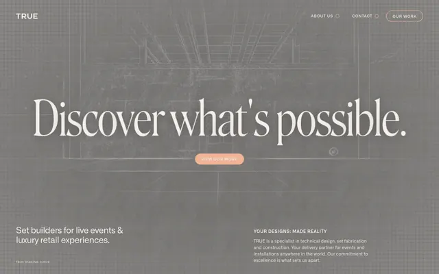
Architectural blueprint on aged parchment
Color palette
Orange outline accent for tags, dividers, and focused UI edges. Do not promote it to the primary CTA color
Page background, primary dark text, subtle borders — grounds the design in a deep, almost charcoal base
Primary light text, ghost button borders, accents within a darker canvas — suggests a tactile, natural paper texture
Typography
- Weights
- 300
- Sizes
- 158px
- Line height
- 1
- Letter spacing
- -0.0200em
- Fallback
- Playfair Display
Expressive display headings — its delicate weight and generous size at 158px create an authoritative, almost monumental statement of luxury.
- Weights
- 400, 500, 600
- Sizes
- 9px, 12px, 14px, 28px
- Line height
- 1, 1.15, 1.2, 1.3, 1.5, 1.71
- Letter spacing
- -0.0200em, 0.0200em, 0.0230em, 0.0600em, 0.1000em
- Fallback
- Inter
Functional text including body, navigation, and button labels — its versatility across weights and compact letter spacing ensures clear information delivery.
Spacing & shape
Components
Uses Roslindale at 158px, weight 300, with a letter-spacing of -0.0200em, in Parchment White (#f5efeb). Placed centrally, defining the page's grand statement.
Text in Alliance, Parchment White (#f5efeb), 9px, weight 400. Has a 1px border in Parchment White (#f5efeb) with an 80px border-radius, creating a pill shape. Padding is 7.7px vertical and 21px horizontal. Transparent background.
Filled with Amber Peach (#f1b497) background. Text is Alliance, Parchment White (#f5efeb), 9px, weight 400. Features an 80px border-radius. Padding is 7.7px vertical and 21px horizontal. Appears as a pill-shaped element.
Uses Alliance, Blueprint Canvas (#111111) or Parchment White (#f5efeb) depending on section background, at 14px, weight 400. Tight letter spacing for efficient reading.
Alliance, 9px, weight 400, in Parchment White (#f5efeb).
Guidelines
- Always use Blueprint Canvas (#111111) for page backgrounds and primary dark text.
- Apply Parchment White (#f5efeb) for primary light text on dark backgrounds and for ghost button borders.
- Reserve Amber Peach (#f1b497) for key accents, selected navigation highlights, and the primary 'Our Work' button fill.
- Employ Roslindale (sub: Playfair Display) for large, expressive headlines (158px, weight 300, ls -0.0200em) to convey gravitas.
- Utilize Alliance (sub: Inter) for all functional text, varying weights (400, 500, 600) and sizes (9px, 12px, 14px) as needed for hierarchy.
- Implement an 80px border-radius for all interactive elements like buttons and navigation items to maintain a consistent soft, pill-like shape.
- Maintain a compact spacing density, with an element gap of 8px and section vertical spacing of 53px.
- Do not introduce bright, vibrant colors; maintain the muted, earthy palette of Blueprint Canvas, Parchment White, and Amber Peach.
- Avoid sharp, angular corners; consistently apply the 80px border-radius for all applicable UI elements.
- Do not use generic system fonts for display headings; Roslindale's unique character is central to the brand's sophisticated feel.
- Avoid excessive use of elevation or heavy shadows; the system relies on subtle borders and color shifts for separation.
- Do not deviate from the defined letter-spacing values for Alliance; precise tracking is essential for its compact appearance.
- Do not use Parchment White (#f5efeb) on amber backgrounds due to insufficient contrast (1.6:1 ratio).
- Avoid making any element overtly 'loud'; the design emphasizes understated luxury through subtle contrasts and refined details.
About this system
ShowHide
True Staging establishes a serious yet refined industrial aesthetic, using a deep gray canvas punctuated by an antiqued peachy-orange accent. Typography pairs a classic serif for large expressive headlines with a clean sans-serif for functional text, setting up a contrast between permanence and precision. Components emphasize subtle outlining and generous border radii, lending a soft, approachable feel despite the muted palette. The overall impression is one of understated luxury and meticulous craftsmanship.
The page employs a full-bleed layout, particularly for the hero section, which features a large, centered headline over an architectural graphic background. Content is centrally aligned within this wide canvas, using large, negative space. The header features right-aligned navigation items, subtly outlined. Subsequent content sections appear to follow a consistent vertical rhythm, though specific sectioning is less explicit than a banded approach; instead, it relies on visual weight and typography.
The site uses subtle, abstract blueprint-style graphics overlaid on a textured dark background for atmospheric effect. These graphics are largely monochromatic, serving as an underlying visual motif rather than direct content. All imagery is decorative, establishing a mood of construction and precision, without featuring photography or product showcases. The density is image-light, with UI and typography dominating the visual space.
Reminiscent of Fendi, Bottega Veneta, Linear, Acme Co..
# True Staging — Style Reference
> Architectural blueprint on aged parchment

**Theme:** dark

**Site:** https://www.truestaging.co.uk

True Staging establishes a serious yet refined industrial aesthetic, using a deep gray canvas punctuated by an antiqued peachy-orange accent. Typography pairs a classic serif for large expressive headlines with a clean sans-serif for functional text, setting up a contrast between permanence and precision. Components emphasize subtle outlining and generous border radii, lending a soft, approachable feel despite the muted palette. The overall impression is one of understated luxury and meticulous craftsmanship.

## Tokens — Colors

| Name | Value | Token | Role |
|------|------|------|------|
| Amber Peach | `#f1b497` | `--color-amber-peach` | Orange outline accent for tags, dividers, and focused UI edges. Do not promote it to the primary CTA color |
| Blueprint Canvas | `#111111` | `--color-blueprint-canvas` | Page background, primary dark text, subtle borders — grounds the design in a deep, almost charcoal base |
| Parchment White | `#f5efeb` | `--color-parchment-white` | Primary light text, ghost button borders, accents within a darker canvas — suggests a tactile, natural paper texture |

## Tokens — Typography

### Roslindale
- **Substitute:** Playfair Display
- **Weights:** 300
- **Sizes:** 158px
- **Line height:** 1
- **Letter spacing:** -0.0200em
- **Role:** Expressive display headings — its delicate weight and generous size at 158px create an authoritative, almost monumental statement of luxury.

### Alliance
- **Substitute:** Inter
- **Weights:** 400, 500, 600
- **Sizes:** 9px, 12px, 14px, 28px
- **Line height:** 1, 1.15, 1.2, 1.3, 1.5, 1.71
- **Letter spacing:** -0.0200em, 0.0200em, 0.0230em, 0.0600em, 0.1000em
- **Role:** Functional text including body, navigation, and button labels — its versatility across weights and compact letter spacing ensures clear information delivery.

## Tokens — Type Scale

| Role | Size | Line height | Letter spacing |
|------|------|------|------|
| body | 14px | 1.2 | 0.02em |
| subheading | 28px | 1.3 | -0.02em |
| display | 158px | 1 | -0.02em |

## Tokens — Spacing

- **Section gap:** 53px
- **Card padding:** 21px
- **Element gap:** 8px

## Tokens — Radius

- **Buttons:** 80px
- **navigationItems:** 80px
- **otherElements:** 80px

## Layout

The page employs a full-bleed layout, particularly for the hero section, which features a large, centered headline over an architectural graphic background. Content is centrally aligned within this wide canvas, using large, negative space. The header features right-aligned navigation items, subtly outlined. Subsequent content sections appear to follow a consistent vertical rhythm, though specific sectioning is less explicit than a banded approach; instead, it relies on visual weight and typography.

## Imagery

The site uses subtle, abstract blueprint-style graphics overlaid on a textured dark background for atmospheric effect. These graphics are largely monochromatic, serving as an underlying visual motif rather than direct content. All imagery is decorative, establishing a mood of construction and precision, without featuring photography or product showcases. The density is image-light, with UI and typography dominating the visual space.

## Components

### Hero Headline
*Primary page title*

Uses Roslindale at 158px, weight 300, with a letter-spacing of -0.0200em, in Parchment White (#f5efeb). Placed centrally, defining the page's grand statement.

### Ghost Navigation Item
*Secondary navigation and non-primary actions*

Text in Alliance, Parchment White (#f5efeb), 9px, weight 400. Has a 1px border in Parchment White (#f5efeb) with an 80px border-radius, creating a pill shape. Padding is 7.7px vertical and 21px horizontal. Transparent background.

### Primary Action Button
*Call to action button for 'Our Work'*

Filled with Amber Peach (#f1b497) background. Text is Alliance, Parchment White (#f5efeb), 9px, weight 400. Features an 80px border-radius. Padding is 7.7px vertical and 21px horizontal. Appears as a pill-shaped element.

### Body Text
*Standard informative text*

Uses Alliance, Blueprint Canvas (#111111) or Parchment White (#f5efeb) depending on section background, at 14px, weight 400. Tight letter spacing for efficient reading.

### Footer Detail Text
*Copyright and minor informational text*

Alliance, 9px, weight 400, in Parchment White (#f5efeb).

## Guidelines

### Do

- Always use Blueprint Canvas (#111111) for page backgrounds and primary dark text.
- Apply Parchment White (#f5efeb) for primary light text on dark backgrounds and for ghost button borders.
- Reserve Amber Peach (#f1b497) for key accents, selected navigation highlights, and the primary 'Our Work' button fill.
- Employ Roslindale (sub: Playfair Display) for large, expressive headlines (158px, weight 300, ls -0.0200em) to convey gravitas.
- Utilize Alliance (sub: Inter) for all functional text, varying weights (400, 500, 600) and sizes (9px, 12px, 14px) as needed for hierarchy.
- Implement an 80px border-radius for all interactive elements like buttons and navigation items to maintain a consistent soft, pill-like shape.
- Maintain a compact spacing density, with an element gap of 8px and section vertical spacing of 53px.

### Don't

- Do not introduce bright, vibrant colors; maintain the muted, earthy palette of Blueprint Canvas, Parchment White, and Amber Peach.
- Avoid sharp, angular corners; consistently apply the 80px border-radius for all applicable UI elements.
- Do not use generic system fonts for display headings; Roslindale's unique character is central to the brand's sophisticated feel.
- Avoid excessive use of elevation or heavy shadows; the system relies on subtle borders and color shifts for separation.
- Do not deviate from the defined letter-spacing values for Alliance; precise tracking is essential for its compact appearance.
- Do not use Parchment White (#f5efeb) on amber backgrounds due to insufficient contrast (1.6:1 ratio).
- Avoid making any element overtly 'loud'; the design emphasizes understated luxury through subtle contrasts and refined details.

## Agent Prompt Guide

Quick Color Reference:
text: #f5efeb
background: #111111
border: #f5efeb
accent: #f1b497
primary action: no distinct CTA color

Example Component Prompts:
No distinct primary action color was observed; use the extracted neutral button treatments instead of inventing a filled CTA color.

Generate two columns of text in a section with a Blueprint Canvas background: Left column with subheading 'Set builders for live events & luxury retail experiences.' in Alliance 28px weight 400, #f5efeb. Right column with body text 'YOUR DESIGNS: MADE REALITY...' in Alliance 14px weight 400, #f5efeb, with a margin-bottom of 14px after initial line.
More like this









Keep what you find
A free account saves references to boards and can send you a weekly email of picks based on what you save.
To see every result, go Pro.