Preview image. Unlock full-res
Vivid chartreuse on concrete
Color palette
Primary action buttons, active state indicators, prominent headings, decorative accents — creates high-energy focal points against the neutral palette
Primary text, icon fills, strong borders, dark surface background where appropriate for contrast
Secondary text, less prominent borders
Subtle link text, tertiary borders, ghost icon fills
Page backgrounds, input fields, card surfaces
Typography
- Weights
- 400
- Sizes
- 16px
- Line height
- 1.6
- Fallback
- DM Mono
Supporting text for smaller elements, product details, and footer content. Its unique character adds subtle brand distinctiveness without shouting.
- Weights
- 400
- Sizes
- 13px, 16px, 18px, 20px, 22px, 26px, 38px
- Line height
- 1.3, 1.4, 1.6
- Fallback
- Inter
Body copy, input text, smaller headings, interactive elements like navigation links and buttons. Provides clear readability at various scales with a confident, open tone.
- Weights
- 400
- Sizes
- 32px, 72px
- Line height
- 1.1, 1.15
- Fallback
- Inter
Primary headlines and section titles. The regularity combined with generous sizing creates a strong, yet approachable presence.
Spacing & shape
Components
Filled with Chartreuse Flash (#e3fc03), text in Midnight Ink (#000000), 50px border-radius, 16px padding on all sides. This button is a distinct, high-contrast focal point.
Transparent background, text in Midnight Ink (#000000), 0px border-radius, 0px padding. This component is essentially text-based, relying on position and interaction for presence.
Background is Canvas White (#ffffff), text in Midnight Ink (#000000), 50px border-radius, 16px vertical padding, 32px horizontal padding. Offers a clean, friendly input experience.
Background is Canvas White (#ffffff), 16px border-radius for the card itself and images within. Padding dynamically varies but commonly uses 16px around content and imagery to define clean boundaries.
WhyteRegular font, 72px size, 1.1 line-height, Midnight Ink (#000000) or Chartreuse Flash (#e3fc03) color depending on background contrast. Commands attention with directness.
WhyteBook font, 16px size for most items, 400 weight, Midnight Ink (#000000) for high contrast or Slate Text (#323232) for secondary information, with a text-based price like $137. Uses 5px bottom padding.
Guidelines
- Use Chartreuse Flash (#e3fc03) exclusively for primary calls to action or key interactive highlights; avoid decorative overuse.
- Pair Midnight Ink (#000000) text on Canvas White (#ffffff) or Chartreuse Flash (#e3fc03) backgrounds to maintain AAA contrast levels.
- Apply a 50px border-radius to all interactive elements like buttons and input fields for a consistent soft, yet defined, touch.
- Maintain a clear vertical rhythm using 68px for major section separation and 10px between smaller elements.
- Employ WhyteRegular (400) at 72px for hero headlines to establish a bold, impactful brand voice.
- Group product images with a 16px border-radius, ensuring they sit cleanly within their card containers.
- Do not introduce additional saturated colors; the Chartreuse Flash (#e3fc03) should remain the single prominent chromatic accent.
- Avoid using border-radius values other than 0px, 8px, 16px, or 50px to prevent visual inconsistency.
- Do not deviate from the specified WhyteInktrapRegular, WhyteBook, and WhyteRegular font families; substitute only when absolutely necessary and with a close visual match.
- Do not use subtle shadows or gradients; the system relies on flat surfaces and high contrast for visual definition.
- Avoid heavily decorated components; rely on color, shape, and typography for visual hierarchy and brand expression.
- Do not use generic system fonts in place of the custom typefaces; the specific character of the type is integral to the brand's identity.
About this system
ShowHide
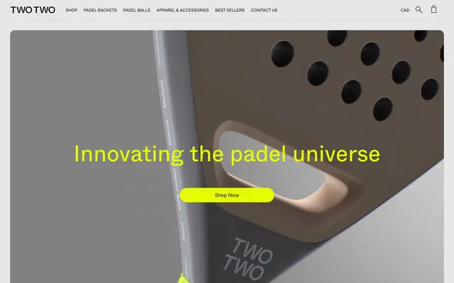
TWOTWO embraces a bold, athletic visual language defined by strong contrasts and a singular, vibrant accent. The monochromatic canvas of dark grays and white provides a neutral backdrop for vivid chartreuse, which acts as the brand's energetic signature. Typography is direct and confident, echoing a sense of unadorned quality. Components are minimal, relying on shape and color for impact rather than complex ornamentation, creating a focused and dynamic user experience.
The page adheres to a mostly contained, centered page model, with content held within a comfortable maximum width. The hero section is full-bleed with a dark (but not black) overlay, featuring a prominent, centered headline in Chartreuse Flash overlaid on a product shot. Main sections feature consistent vertical spacing, often with product grids (e.g., 3-column layouts) or vertically stacked content blocks. There's a strong visual rhythm of alternation between a full-width hero and then contained, clearly delineated product sections. Navigation is a simple, sticky top header with textual links and key icons.
The visual language is dominated by product photography, specifically tight crops of padel rackets and gear. Images are highly focused on the product itself, with a neutral, often gray, studio background that isolates the item. There's no lifestyle photography, suggesting a brand that prioritizes the object's form and function. Iconography, where present, appears to be monochrome (Midnight Ink or Ghost Gray) and outlined, with a clean, functional aesthetic. Imagery serves primarily to showcase and explain product features, with a high density of visual content on product listing pages.
Reminiscent of A.P.C., Away, Rapha, Aesop.
# TWOTWO — Style Reference
> Vivid chartreuse on concrete

**Theme:** light

**Site:** https://twotwo-official.com

TWOTWO embraces a bold, athletic visual language defined by strong contrasts and a singular, vibrant accent. The monochromatic canvas of dark grays and white provides a neutral backdrop for vivid chartreuse, which acts as the brand's energetic signature. Typography is direct and confident, echoing a sense of unadorned quality. Components are minimal, relying on shape and color for impact rather than complex ornamentation, creating a focused and dynamic user experience.

## Tokens — Colors

| Name | Value | Token | Role |
|------|------|------|------|
| Chartreuse Flash | `#e3fc03` | `--color-chartreuse-flash` | Primary action buttons, active state indicators, prominent headings, decorative accents — creates high-energy focal points against the neutral palette |
| Midnight Ink | `#000000` | `--color-midnight-ink` | Primary text, icon fills, strong borders, dark surface background where appropriate for contrast |
| Slate Text | `#323232` | `--color-slate-text` | Secondary text, less prominent borders |
| Ghost Gray | `#1a1a1a` | `--color-ghost-gray` | Subtle link text, tertiary borders, ghost icon fills |
| Canvas White | `#ffffff` | `--color-canvas-white` | Page backgrounds, input fields, card surfaces |

## Tokens — Typography

### WhyteInktrapRegular
- **Substitute:** DM Mono
- **Weights:** 400
- **Sizes:** 16px
- **Line height:** 1.6
- **Role:** Supporting text for smaller elements, product details, and footer content. Its unique character adds subtle brand distinctiveness without shouting.

### WhyteBook
- **Substitute:** Inter
- **Weights:** 400
- **Sizes:** 13px, 16px, 18px, 20px, 22px, 26px, 38px
- **Line height:** 1.3, 1.4, 1.6
- **Role:** Body copy, input text, smaller headings, interactive elements like navigation links and buttons. Provides clear readability at various scales with a confident, open tone.

### WhyteRegular
- **Substitute:** Inter
- **Weights:** 400
- **Sizes:** 32px, 72px
- **Line height:** 1.1, 1.15
- **Role:** Primary headlines and section titles. The regularity combined with generous sizing creates a strong, yet approachable presence.

## Tokens — Type Scale

Major Third (1.25) from 18px base.

| Role | Size | Line height | Letter spacing |
|------|------|------|------|
| caption | 13px | 1.4 | — |
| body-sm | 16px | 1.6 | — |
| body | 18px | 1.6 | — |
| subheading | 20px | 1.3 | — |
| heading-sm | 22px | 1.3 | — |
| heading | 26px | 1.3 | — |
| heading-lg | 32px | 1.15 | — |
| display | 72px | 1.1 | — |

## Tokens — Spacing

- **Section gap:** 68px
- **Card padding:** 32px
- **Element gap:** 10px

## Tokens — Radius

- **General:** 8px
- **Buttons:** 50px
- **Inputs:** 50px
- **Cards:** 16px
- **productImages:** 16px

## Layout

The page adheres to a mostly contained, centered page model, with content held within a comfortable maximum width. The hero section is full-bleed with a dark (but not black) overlay, featuring a prominent, centered headline in Chartreuse Flash overlaid on a product shot. Main sections feature consistent vertical spacing, often with product grids (e.g., 3-column layouts) or vertically stacked content blocks. There's a strong visual rhythm of alternation between a full-width hero and then contained, clearly delineated product sections. Navigation is a simple, sticky top header with textual links and key icons.

## Imagery

The visual language is dominated by product photography, specifically tight crops of padel rackets and gear. Images are highly focused on the product itself, with a neutral, often gray, studio background that isolates the item. There's no lifestyle photography, suggesting a brand that prioritizes the object's form and function. Iconography, where present, appears to be monochrome (Midnight Ink or Ghost Gray) and outlined, with a clean, functional aesthetic. Imagery serves primarily to showcase and explain product features, with a high density of visual content on product listing pages.

## Components

### Primary Action Button
*The main call to action element, demanding attention.*

Filled with Chartreuse Flash (#e3fc03), text in Midnight Ink (#000000), 50px border-radius, 16px padding on all sides. This button is a distinct, high-contrast focal point.

### Navigation Link / Ghost Button
*Used for navigation and secondary actions where visual weight should be minimal.*

Transparent background, text in Midnight Ink (#000000), 0px border-radius, 0px padding. This component is essentially text-based, relying on position and interaction for presence.

### Search Input Field
*Standard input for user data entry.*

Background is Canvas White (#ffffff), text in Midnight Ink (#000000), 50px border-radius, 16px vertical padding, 32px horizontal padding. Offers a clean, friendly input experience.

### Product Card
*Container for individual product listings.*

Background is Canvas White (#ffffff), 16px border-radius for the card itself and images within. Padding dynamically varies but commonly uses 16px around content and imagery to define clean boundaries.

### Hero Headline
*Dominant text for primary page messages.*

WhyteRegular font, 72px size, 1.1 line-height, Midnight Ink (#000000) or Chartreuse Flash (#e3fc03) color depending on background contrast. Commands attention with directness.

### Product Gallery Item Title
*Labels for products listed in a grid.*

WhyteBook font, 16px size for most items, 400 weight, Midnight Ink (#000000) for high contrast or Slate Text (#323232) for secondary information, with a text-based price like $137. Uses 5px bottom padding.

## Guidelines

### Do

- Use Chartreuse Flash (#e3fc03) exclusively for primary calls to action or key interactive highlights; avoid decorative overuse.
- Pair Midnight Ink (#000000) text on Canvas White (#ffffff) or Chartreuse Flash (#e3fc03) backgrounds to maintain AAA contrast levels.
- Apply a 50px border-radius to all interactive elements like buttons and input fields for a consistent soft, yet defined, touch.
- Maintain a clear vertical rhythm using 68px for major section separation and 10px between smaller elements.
- Employ WhyteRegular (400) at 72px for hero headlines to establish a bold, impactful brand voice.
- Group product images with a 16px border-radius, ensuring they sit cleanly within their card containers.

### Don't

- Do not introduce additional saturated colors; the Chartreuse Flash (#e3fc03) should remain the single prominent chromatic accent.
- Avoid using border-radius values other than 0px, 8px, 16px, or 50px to prevent visual inconsistency.
- Do not deviate from the specified WhyteInktrapRegular, WhyteBook, and WhyteRegular font families; substitute only when absolutely necessary and with a close visual match.
- Do not use subtle shadows or gradients; the system relies on flat surfaces and high contrast for visual definition.
- Avoid heavily decorated components; rely on color, shape, and typography for visual hierarchy and brand expression.
- Do not use generic system fonts in place of the custom typefaces; the specific character of the type is integral to the brand's identity.

## Agent Prompt Guide

Quick Color Reference:
- text: #000000
- background: #ffffff
- border: #000000
- accent: #e3fc03
- primary action: #e3fc03 (filled action)

Example Component Prompts:
- Create a hero section: full-bleed background set to a dark neutral color, with a prominent product image and 'Innovating the padel universe' headline centered in Chartreuse Flash (#e3fc03), WhyteRegular font, 72px size, 1.1 line-height. Below the headline, include a 'Shop Now' button with a Chartreuse Flash (#e3fc03) background, Midnight Ink (#000000) text, 50px radius, 16px padding.
- Design a product listing card: Canvas White (#ffffff) background, 16px radius. Display a product image with 16px radius, a product title ('Drop Racket - PLAY TWO - Jade Green') in WhyteBook, 16px, 400 weight, Midnight Ink (#000000). Add a price '$137' below in Midnight Ink (#000000) with 5px bottom padding. Include a 'Shop Now' button with Chartreuse Flash (#e3fc03) background, Midnight Ink (#000000) text, 50px radius, 16px padding.
- Create a simple navigation link: 'Padel Rackets' in WhyteBook font, 16px size, 400 weight, Midnight Ink (#000000), 0px padding, no background.
More like this









Keep what you find
A free account saves references to boards and can send you a weekly email of picks based on what you save.
To see every result, go Pro.