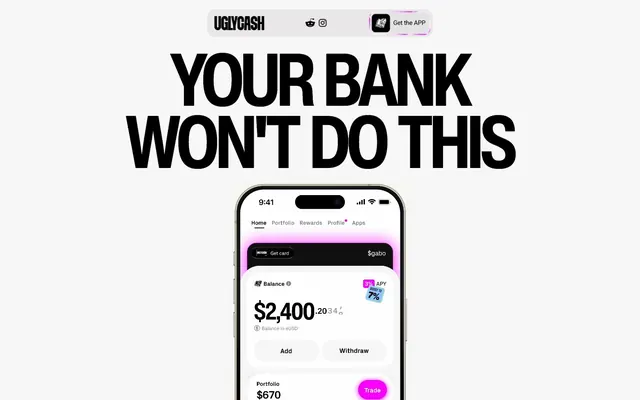
Preview image. Unlock full-res
High-contrast digital pop: Bold black text on bright canvas, punctuated by vivid neons.
Color palette
Vivid accent for cards, graphic elements
Vivid accent for cards, graphic elements, data visualization
Vivid accent for links, graphic elements, small interactive highlights
Page backgrounds, default surfaces beyond explicit cards
Subtle background for UI elements, dividers
Content card backgrounds, elevated surfaces
Primary text, headings, strong borders, dark card backgrounds, interactive elements
Dark card backgrounds, secondary dark surfaces
Muted text, secondary body copy
Tertiary body copy, small print, helper text
Distinctive card background for specific content blocks
Subtle metallic gradient for decorative elements, card borders
Typography
- Weights
- 400
- Sizes
- 12px
- Line height
- 1.2
- Letter spacing
- normal
- Fallback
- Arial
System default for small utility text, captions, and fallback body copy.
- Weights
- 700, 900
- Sizes
- 20px, 64px, 85px, 164px
- Line height
- 0.85, 0.94, 1.2
- Letter spacing
- -0.033em
- Fallback
- Montserrat Black
Display and primary headings – bold, compact, and impactful, defined by tight letter-spacing for a modern, aggressive presence.
- Weights
- 400, 500, 700
- Sizes
- 12px, 14px, 18px, 20px, 24px
- Line height
- 1.17, 1.2, 1.22, 1.29, 1.33, 1.4
- Letter spacing
- -0.02em
- Fallback
- Inter
Body copy and subheadings – provides readability at various sizes with a slightly condensed feel.
- Weights
- 400
- Sizes
- 38px
- Line height
- 1.2
Miss Fajardose — detected in extracted data but not described by AI
Spacing & shape
Components
Transparent background, Carbon Black text and border. No border-radius, for a stark, flat look. Padding is 10px vertically by 5px horizontally. Text uses a system sans-serif font at 12px.
Carbon Black background with 100px border-radius creating a pill shape. Text is the browser default link color rgb(0,0,238). Zero vertical padding, 24px horizontal padding. Prompts interaction through shape.
Translucent dark gray background rgba(237, 237, 237, 0.15), 16px border-radius. Text is the browser default link color rgb(0,0,238). Zero vertical padding, 24px horizontal padding. Used for 'Get the APP'.
Polar White background, 16px border-radius, no shadow. Zero padding, content manages its own internal spacing.
Cream Card background (#e7e3bf), 46px border-radius for an oversized, playful shape. No shadow, zero padding.
Can be Carbon Black (#000000), Deep Graphite (#3a3a3a), or #000100 background. Features an oversized 38px or 43px border-radius. No shadow, zero padding. Used for presenting app screenshots or abstract graphics.
Guidelines
- Use Canvas Ice (#f2f2f2) for the primary page background to maintain the light theme.
- Employ Helvetica Now Display Cn Bold with a letter-spacing of -0.033em for all major headlines to convey impact and density.
- Apply 10px elementGap for most interactive and content grouping, providing comfortable visual separation.
- Utilize 16px border-radius for standard cards, images, and links to maintain a consistent soft containment.
- Ensure all body text uses Inter font with a letter-spacing of -0.02em to support readability while retaining a modern feel.
- Use Power Pink (#fa00ff), Sky Blue (#02bbff), and Lime Pop (#adff02) as vivid accents against predominantly achromatic surfaces.
- Implement 96px for sectionGap to provide ample vertical whitespace between major content blocks.
- Avoid using light, subtle headlines; all significant text should be in Carbon Black (#000000) for maximum contrast.
- Do not introduce new border-radius values; stick to 16px, 46px, 43px, 38px from the defined system.
- Refrain from adding drop shadows; the design relies on stark contrast and distinct colorful accents, not depth perception.
- Do not use generic button styles; always apply either the Ghost Button Inverse, Pill Accent Button, or Rounded Accent Button tokens.
- Avoid breaking the high-contrast principle; never use a low-contrast color pairing for fundamental text or interactive elements.
- Do not use generic sans-serif for body text; always prefer Inter for its distinct visual rhythm and letter-spacing.
About this system
ShowHide
UGLYCASH embraces a stark, high-contrast digital-first aesthetic with deeply saturated accent colors that pop against a near-white canvas and stark black typography. The visual style is bold, with large, confident headlines and playful, oversized rounded corners for interactive elements and content cards. Imagery is integrated directly into the UI as product showcases rather than decorative backdrops. The system balances aggressive typography with a comfortable, open layout.
The page primarily uses a full-bleed layout, allowing content to stretch across the full width, though some sections appear to have an implicit centered content area. The hero pattern features a dominant, center-aligned headline over a soft background, often followed by product visuals. Sections are separated by comfortable `sectionGap` (96px) and maintain a spacious vertical rhythm, avoiding dense information blocks. Content arrangement often alternates between large headlines, centered product showcases, and multi-column grids for features, typically 3 columns. Navigation is handled by a minimal top bar with social links and a 'Get the APP' action button.
Imagery primarily consists of clean, isolated product screenshots of the UGLYCASH app or abstract graphics with a highly saturated, neon color palette. These visuals are often integrated directly into cards, appearing as contained elements rather than full-bleed backgrounds. The app screenshots are sharp, showcasing UI details clearly without excessive styling or context. Icons are simple, outlined or filled, and primarily mono-color, often in Carbon Black or one of the vivid accent colors. The role of imagery is primarily explanatory content and product showcase, with a moderate density.
Reminiscent of Revolut, Cash App, Chime, Monzo.
# UGLYCASH — Style Reference
> High-contrast digital pop: Bold black text on bright canvas, punctuated by vivid neons.

**Theme:** light

**Site:** https://ugly.cash

UGLYCASH embraces a stark, high-contrast digital-first aesthetic with deeply saturated accent colors that pop against a near-white canvas and stark black typography. The visual style is bold, with large, confident headlines and playful, oversized rounded corners for interactive elements and content cards. Imagery is integrated directly into the UI as product showcases rather than decorative backdrops. The system balances aggressive typography with a comfortable, open layout.

## Tokens — Colors

| Name | Value | Token | Role |
|------|------|------|------|
| Power Pink | `#fa00ff` | `--color-power-pink` | Vivid accent for cards, graphic elements |
| Sky Blue | `#02bbff` | `--color-sky-blue` | Vivid accent for cards, graphic elements, data visualization |
| Lime Pop | `#adff02` | `--color-lime-pop` | Vivid accent for links, graphic elements, small interactive highlights |
| Canvas Ice | `#f2f2f2` | `--color-canvas-ice` | Page backgrounds, default surfaces beyond explicit cards |
| Ghost Gray | `#e6e4e4` | `--color-ghost-gray` | Subtle background for UI elements, dividers |
| Polar White | `#ffffff` | `--color-polar-white` | Content card backgrounds, elevated surfaces |
| Carbon Black | `#000000` | `--color-carbon-black` | Primary text, headings, strong borders, dark card backgrounds, interactive elements |
| Deep Graphite | `#3a3a3a` | `--color-deep-graphite` | Dark card backgrounds, secondary dark surfaces |
| Muted Stone | `#6e6e6e` | `--color-muted-stone` | Muted text, secondary body copy |
| Soft Stone | `#888888` | `--color-soft-stone` | Tertiary body copy, small print, helper text |
| Cream Card | `#e7e3bf` | `--color-cream-card` | Distinctive card background for specific content blocks |
| Metal Gradient Light | `#817d72` | `--color-metal-gradient-light` | Subtle metallic gradient for decorative elements, card borders |

## Tokens — Typography

### sans-serif
- **Substitute:** Arial
- **Weights:** 400
- **Sizes:** 12px
- **Line height:** 1.2
- **Letter spacing:** normal
- **Role:** System default for small utility text, captions, and fallback body copy.

### Helvetica Now Display Cn Bold
- **Substitute:** Montserrat Black
- **Weights:** 700, 900
- **Sizes:** 20px, 64px, 85px, 164px
- **Line height:** 0.85, 0.94, 1.2
- **Letter spacing:** -0.033em
- **Role:** Display and primary headings – bold, compact, and impactful, defined by tight letter-spacing for a modern, aggressive presence.

### Inter
- **Substitute:** Inter
- **Weights:** 400, 500, 700
- **Sizes:** 12px, 14px, 18px, 20px, 24px
- **Line height:** 1.17, 1.2, 1.22, 1.29, 1.33, 1.4
- **Letter spacing:** -0.02em
- **Role:** Body copy and subheadings – provides readability at various sizes with a slightly condensed feel.

### Miss Fajardose
- **Weights:** 400
- **Sizes:** 38px
- **Line height:** 1.2
- **Role:** Miss Fajardose — detected in extracted data but not described by AI

## Tokens — Type Scale

| Role | Size | Line height | Letter spacing |
|------|------|------|------|
| caption | 12px | 1.2 | -0.24px |
| body-sm | 14px | 1.4 | -0.28px |
| body | 18px | 1.22 | -0.36px |
| subheading | 20px | 1.17 | -0.4px |
| heading | 64px | 0.94 | -2.11px |
| display | 164px | 0.85 | -5.41px |

## Tokens — Spacing

- **Section gap:** 96px
- **Card padding:** 20px
- **Element gap:** 10px

## Tokens — Radius

- **Default:** 16px
- **large:** 46px
- **pill:** 100px
- **small:** 1px

## Layout

The page primarily uses a full-bleed layout, allowing content to stretch across the full width, though some sections appear to have an implicit centered content area. The hero pattern features a dominant, center-aligned headline over a soft background, often followed by product visuals. Sections are separated by comfortable `sectionGap` (96px) and maintain a spacious vertical rhythm, avoiding dense information blocks. Content arrangement often alternates between large headlines, centered product showcases, and multi-column grids for features, typically 3 columns. Navigation is handled by a minimal top bar with social links and a 'Get the APP' action button.

## Imagery

Imagery primarily consists of clean, isolated product screenshots of the UGLYCASH app or abstract graphics with a highly saturated, neon color palette. These visuals are often integrated directly into cards, appearing as contained elements rather than full-bleed backgrounds. The app screenshots are sharp, showcasing UI details clearly without excessive styling or context. Icons are simple, outlined or filled, and primarily mono-color, often in Carbon Black or one of the vivid accent colors. The role of imagery is primarily explanatory content and product showcase, with a moderate density.

## Components

### Ghost Button Inverse
*Minimal interactive element for secondary actions or navigation.*

Transparent background, Carbon Black text and border. No border-radius, for a stark, flat look. Padding is 10px vertically by 5px horizontally. Text uses a system sans-serif font at 12px.

### Pill Accent Button
*Primary Call to Action, visually distinct and inviting interaction.*

Carbon Black background with 100px border-radius creating a pill shape. Text is the browser default link color rgb(0,0,238). Zero vertical padding, 24px horizontal padding. Prompts interaction through shape.

### Rounded Accent Button
*Secondary action or featured link, with a soft background.*

Translucent dark gray background rgba(237, 237, 237, 0.15), 16px border-radius. Text is the browser default link color rgb(0,0,238). Zero vertical padding, 24px horizontal padding. Used for 'Get the APP'.

### White Information Card
*Standard container for content blocks and feature explanations.*

Polar White background, 16px border-radius, no shadow. Zero padding, content manages its own internal spacing.

### Cream Accent Card
*Highlight card for special features, uses a distinct neutral background.*

Cream Card background (#e7e3bf), 46px border-radius for an oversized, playful shape. No shadow, zero padding.

### Dark Graphic Card
*Visual cards that integrate product imagery or bold graphics.*

Can be Carbon Black (#000000), Deep Graphite (#3a3a3a), or #000100 background. Features an oversized 38px or 43px border-radius. No shadow, zero padding. Used for presenting app screenshots or abstract graphics.

## Guidelines

### Do

- Use Canvas Ice (#f2f2f2) for the primary page background to maintain the light theme.
- Employ Helvetica Now Display Cn Bold with a letter-spacing of -0.033em for all major headlines to convey impact and density.
- Apply 10px elementGap for most interactive and content grouping, providing comfortable visual separation.
- Utilize 16px border-radius for standard cards, images, and links to maintain a consistent soft containment.
- Ensure all body text uses Inter font with a letter-spacing of -0.02em to support readability while retaining a modern feel.
- Use Power Pink (#fa00ff), Sky Blue (#02bbff), and Lime Pop (#adff02) as vivid accents against predominantly achromatic surfaces.
- Implement 96px for sectionGap to provide ample vertical whitespace between major content blocks.

### Don't

- Avoid using light, subtle headlines; all significant text should be in Carbon Black (#000000) for maximum contrast.
- Do not introduce new border-radius values; stick to 16px, 46px, 43px, 38px from the defined system.
- Refrain from adding drop shadows; the design relies on stark contrast and distinct colorful accents, not depth perception.
- Do not use generic button styles; always apply either the Ghost Button Inverse, Pill Accent Button, or Rounded Accent Button tokens.
- Avoid breaking the high-contrast principle; never use a low-contrast color pairing for fundamental text or interactive elements.
- Do not use generic sans-serif for body text; always prefer Inter for its distinct visual rhythm and letter-spacing.

## Agent Prompt Guide

**Quick Color Reference:**
text: #000000
background: #f2f2f2
border: #000000
accent: #fa00ff
primary action: no distinct CTA color

**3-5 Example Component Prompts:**
1. Create a hero section with a centered headline: 'YOUR BANK WON'T DO THIS' using Helvetica Now Display Cn Bold, size 164px, weight 900, hex #000000, letter-spacing -5.41px. Ensure the background is Canvas Ice (#f2f2f2).
2. Generate a feature card: White Information Card with 'Earn' as the heading using Inter font 20px, weight 700, and a body text describing earning. Below it, add a small Lime Pop (#adff02) square accent.
3. Create a navigation bar: Ghost Button Inverse 'More videos' to the left, a Pill Accent Button to the right (background: #000000, text: rgb(0,0,238), border-radius 100px, 24px horizontal padding), and a Rounded Accent Button 'Get the APP' (background: rgba(237, 237, 237, 0.15), text: rgb(0,0,238), border-radius 16px, 24px horizontal padding) next to it.
More like this









Keep what you find
A free account saves references to boards and can send you a weekly email of picks based on what you save.
To see every result, go Pro.