Preview image. Unlock full-res
Gallery Canvas, Monochromatic Depth
Color palette
Primary text, outline buttons, input borders and labels, navigation accents, subtle surface backgrounds
Page background, light card surfaces, occasional input fills
Subtle text on darker backgrounds, light button borders
Alternative button background for emphasized actions
Typography
- Weights
- 400
- Sizes
- 13px, 15px, 16px, 30px, 48px
- Line height
- 1.1, 1.13, 1.2, 1.37, 1.38, 1.41, 1.5, 1.77
- Letter spacing
- -0.96px at 48px, 0.45px at 15px
- Fallback
- Arial
Primary typeface for all UI elements, including headings, body text, and navigation. Its varied letter-spacing creates a sense of gravitas for large titles and subtle refinement for smaller text.
- Weights
- 400
- Sizes
- 15px
- Line height
- 1.5
- Letter spacing
- normal
- Fallback
- Helvetica Neue
Secondary typeface, appears to be used for specific informational elements or branding. Provides a slightly different texture without diverging from the overall monochromatic aesthetic.
Spacing & shape
Components
Text in Carbon (#24241f) on a transparent background, with 0px padding and radius. Relies purely on typography for definition.
Background Obsidian (#333333), text Ghost White (#e5e5e5), with 10px vertical and 30px horizontal padding, and 0px border-radius. Provides a strong visual cue through solid fill.
Transparent background, Carbon (#24241f) text, with an implicit 1px bottom border in Carbon, 1px top/bottom padding and 12px right padding. Border-radius is 3px for subtle softening.
Transparent background, Fog Canvas (#d1d3cf) text, with a 1px border in Fog Canvas at the bottom. Padding is 1px top/bottom and 2px left/right, and 3px border-radius.
White background, Fog Canvas (#d1d3cf) text, with a 1px border in a lighter gray (#d0d0d0) at the bottom. Padding is 1px top/bottom and 2px left/right, and 3px border-radius.
Transparent background, Carbon (#24241f) text, 0px border-radius and 0px padding. Used for minimal, text-only badging.
Guidelines
- Use Carbon (#24241f) for all primary text elements, ensuring strong contrast against lighter backgrounds.
- Apply Fog Canvas (#d1d3cf) as the default page and light surface background color.
- Employ the GP typeface at 48px with 1.13 line height and -0.96px letter-spacing for prominent headings to create a declarative statement.
- Define interactive elements such as navigation links with Carbon (#24241f) text and a transparent background, using no padding or borders.
- Apply 0px border-radius to most layout-level components like cards and buttons to maintain a structured, stark aesthetic, except for input fields which use 3px radius.
- Use 1px borders in the primary text color (Carbon, #24241f) or background color (Fog Canvas, #d1d3cf) for subtle delineation of sections and interactive states.
- Maintain a comfortable density with element gaps typically around 13px, creating visual breathing room without appearing sparse.
- Avoid using highly saturated or chromatic colors; strict adherence to the neutral palette (Carbon, Fog Canvas, Ghost White, Obsidian) is key.
- Do not introduce complex shadow effects or gradients; the design relies on flat surfaces and high contrast for depth.
- Refrain from using border-radius values other than 0px for most primary UI elements, or 3px for inputs, to maintain the architectural precision.
- Do not animate elements with durations outside of the established moderate timing (0.15s, 0.25s, 0.3s) or easing curves.
- Avoid decorative imagery that competes with product photography or overwhelms the minimalist UI; imagery should be contained and functional.
- Do not deviate from the specified GP and GTStandard-M typography families, as they are central to the brand's voice.
- Do not add unnecessary padding or decorative flourishes to buttons; they should remain stark and functional.
About this system
ShowHide
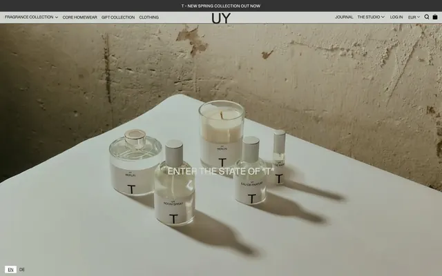
UY Studio employs a stark, gallery-like aesthetic, using high-contrast neutrals and minimal design elements. The visual system features large type for impactful statements, discreet navigation, and a strong emphasis on product presentation. Borders and typography create structural rhythm, avoiding heavy backgrounds or decorative gradients to foreground content. Components feel austere and understated, relying on subtle line work and precise spacing for definition.
The page primarily uses a full-bleed layout, particularly in the hero section, with content often centered or spanning the full width. The hero features a large product image with a centrally placed, large-type headline. Subsequent sections often employ a grid system for product display, with columns of equal width and height, maintaining consistent vertical rhythm. There's a minimal use of padding for these product grids, creating a dense, organized presentation. The overall layout balances content density for product listings with generous white space around key marketing messages, such as the footer invitation to 'NEVER MISS A DROP'. Navigation is a sticky top bar, providing persistent access across the site.
The imagery is product-focused photography, presenting items in a clean, staged, and often minimal setting. Products are typically isolated or sparsely arranged on simple surfaces like white tables or concrete, highlighting textures and forms without elaborate backdrops. The color treatment is subdued, natural, and consistent with the achromatic UI, allowing the product's natural hues to emerge. This creates a gallery-like atmosphere, emphasizing product materiality and craftsmanship. Icons, when present, are simple, outlined, and monochromatic, matching the overall UI's understated elegance. Imagery is a primary content driver, occupying significant visual space to showcase products directly.
Reminiscent of Aēsop, COS, Our Legacy, Studio Nicholson.
# UY Studio — Style Reference
> Gallery Canvas, Monochromatic Depth

**Theme:** light

**Site:** https://www.uy-studio.com

UY Studio employs a stark, gallery-like aesthetic, using high-contrast neutrals and minimal design elements. The visual system features large type for impactful statements, discreet navigation, and a strong emphasis on product presentation. Borders and typography create structural rhythm, avoiding heavy backgrounds or decorative gradients to foreground content. Components feel austere and understated, relying on subtle line work and precise spacing for definition.

## Tokens — Colors

| Name | Value | Token | Role |
|------|------|------|------|
| Carbon | `#24241f` | `--color-carbon` | Primary text, outline buttons, input borders and labels, navigation accents, subtle surface backgrounds |
| Fog Canvas | `#d1d3cf` | `--color-fog-canvas` | Page background, light card surfaces, occasional input fills |
| Ghost White | `#e5e5e5` | `--color-ghost-white` | Subtle text on darker backgrounds, light button borders |
| Obsidian | `#333333` | `--color-obsidian` | Alternative button background for emphasized actions |

## Tokens — Typography

### GP
- **Substitute:** Arial
- **Weights:** 400
- **Sizes:** 13px, 15px, 16px, 30px, 48px
- **Line height:** 1.1, 1.13, 1.2, 1.37, 1.38, 1.41, 1.5, 1.77
- **Letter spacing:** -0.96px at 48px, 0.45px at 15px
- **Role:** Primary typeface for all UI elements, including headings, body text, and navigation. Its varied letter-spacing creates a sense of gravitas for large titles and subtle refinement for smaller text.

### GTStandard-M
- **Substitute:** Helvetica Neue
- **Weights:** 400
- **Sizes:** 15px
- **Line height:** 1.5
- **Letter spacing:** normal
- **Role:** Secondary typeface, appears to be used for specific informational elements or branding. Provides a slightly different texture without diverging from the overall monochromatic aesthetic.

## Tokens — Type Scale

| Role | Size | Line height | Letter spacing |
|------|------|------|------|
| caption | 13px | 1.77 | 0.45px |
| heading | 30px | 1.38 | — |
| display | 48px | 1.13 | -0.96px |

## Tokens — Spacing

- **Section gap:** 143px
- **Card padding:** 13px
- **Element gap:** 13px

## Tokens — Radius

- **input:** 3px

## Layout

The page primarily uses a full-bleed layout, particularly in the hero section, with content often centered or spanning the full width. The hero features a large product image with a centrally placed, large-type headline. Subsequent sections often employ a grid system for product display, with columns of equal width and height, maintaining consistent vertical rhythm. There's a minimal use of padding for these product grids, creating a dense, organized presentation. The overall layout balances content density for product listings with generous white space around key marketing messages, such as the footer invitation to 'NEVER MISS A DROP'. Navigation is a sticky top bar, providing persistent access across the site.

## Imagery

The imagery is product-focused photography, presenting items in a clean, staged, and often minimal setting. Products are typically isolated or sparsely arranged on simple surfaces like white tables or concrete, highlighting textures and forms without elaborate backdrops. The color treatment is subdued, natural, and consistent with the achromatic UI, allowing the product's natural hues to emerge. This creates a gallery-like atmosphere, emphasizing product materiality and craftsmanship. Icons, when present, are simple, outlined, and monochromatic, matching the overall UI's understated elegance. Imagery is a primary content driver, occupying significant visual space to showcase products directly.

## Components

### Ghost Header Button
*Navigation and secondary actions in the header*

Text in Carbon (#24241f) on a transparent background, with 0px padding and radius. Relies purely on typography for definition.

### Filled Action Button
*Primary call to action button*

Background Obsidian (#333333), text Ghost White (#e5e5e5), with 10px vertical and 30px horizontal padding, and 0px border-radius. Provides a strong visual cue through solid fill.

### Product Input Field
*Standard text input field*

Transparent background, Carbon (#24241f) text, with an implicit 1px bottom border in Carbon, 1px top/bottom padding and 12px right padding. Border-radius is 3px for subtle softening.

### Footer Input Field
*Input field in the footer for subscribing*

Transparent background, Fog Canvas (#d1d3cf) text, with a 1px border in Fog Canvas at the bottom. Padding is 1px top/bottom and 2px left/right, and 3px border-radius.

### Search Input Field
*Search or filter input field within product listings*

White background, Fog Canvas (#d1d3cf) text, with a 1px border in a lighter gray (#d0d0d0) at the bottom. Padding is 1px top/bottom and 2px left/right, and 3px border-radius.

### Product Badge
*Small informational label or tag*

Transparent background, Carbon (#24241f) text, 0px border-radius and 0px padding. Used for minimal, text-only badging.

## Guidelines

### Do

- Use Carbon (#24241f) for all primary text elements, ensuring strong contrast against lighter backgrounds.
- Apply Fog Canvas (#d1d3cf) as the default page and light surface background color.
- Employ the GP typeface at 48px with 1.13 line height and -0.96px letter-spacing for prominent headings to create a declarative statement.
- Define interactive elements such as navigation links with Carbon (#24241f) text and a transparent background, using no padding or borders.
- Apply 0px border-radius to most layout-level components like cards and buttons to maintain a structured, stark aesthetic, except for input fields which use 3px radius.
- Use 1px borders in the primary text color (Carbon, #24241f) or background color (Fog Canvas, #d1d3cf) for subtle delineation of sections and interactive states.
- Maintain a comfortable density with element gaps typically around 13px, creating visual breathing room without appearing sparse.

### Don't

- Avoid using highly saturated or chromatic colors; strict adherence to the neutral palette (Carbon, Fog Canvas, Ghost White, Obsidian) is key.
- Do not introduce complex shadow effects or gradients; the design relies on flat surfaces and high contrast for depth.
- Refrain from using border-radius values other than 0px for most primary UI elements, or 3px for inputs, to maintain the architectural precision.
- Do not animate elements with durations outside of the established moderate timing (0.15s, 0.25s, 0.3s) or easing curves.
- Avoid decorative imagery that competes with product photography or overwhelms the minimalist UI; imagery should be contained and functional.
- Do not deviate from the specified GP and GTStandard-M typography families, as they are central to the brand's voice.
- Do not add unnecessary padding or decorative flourishes to buttons; they should remain stark and functional.

## Agent Prompt Guide

Quick Color Reference:
text: #24241f
background: #d1d3cf
border: #24241f
accent: no distinct accent color
primary action: no distinct CTA color

Example Component Prompts:
1. Create a primary navigation link: text Carbon (#24241f), transparent background, GP typeface at 15px, 1.5 line height, 0px padding and radius. Add a subtle 1px bottom border in Carbon (#24241f) on hover.
2. Create a large hero headline: text Carbon (#24241f), GP typeface at 48px, 1.13 line height, -0.96px letter-spacing, centered on a full-bleed product image.
3. Create a secondary action button: text Ghost White (#e5e5e5), background Obsidian (#333333), GP typeface at 13px, 10px vertical and 30px horizontal padding, 0px border-radius.
More like this









Keep what you find
A free account saves references to boards and can send you a weekly email of picks based on what you save.
To see every result, go Pro.