Preview image. Unlock full-res
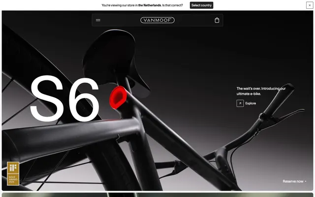
monochrome canvas, functional red accents
VanMoof's design system relies on a stark, contemporary aesthetic, leveraging a predominantly monochrome palette to emphasize product visuals. Components are lightweight and often outlined, with minimal elevation, creating a sense of understated sophistication. Typography is precise and utilitarian, giving an authoritative yet accessible feel. The overall presentation prioritizes directness and clarity, allowing product design and functional accents to take center stage. Use '#222222' for all primary text and button backgrounds against light canvases. Apply '#e5e7eb' as the default border color for all ghost buttons and subtle UI dividers. Maintain a clear hierarchical order in typography, using the Unica77LLWeb family for headings (e.g., 280px, 80px) and body text (e.g., 14px, 16px). Ensure all interactive elements and cards use a 2px or 8px border-radius, prioritizing 2px for smaller interactive elements like buttons. Utilize 'Ignition Red' (#ff0000) only for specific, high-impact product accents or critical status indicators, never for general UI. Structure page sections with a '24px' vertical gap between major content blocks to ensure breathing room. Employ a base spacing unit of '8px' for padding and gaps between smaller elements within components. Avoid using multiple chromatic colors; limit color accents strictly to 'Ignition Red' for product highlights. Do not introduce complex shadows; maintain a flat or minimally elevated visual style. Refrain from using decorative gradients on UI elements; the system prefers solid colors and clean outlines. Do not deviate from the specified Unica77LLWeb and Unica77Mono font families; no system fonts are permitted. Avoid excessive imagery; when present, it should be high-contrast and product-focused, complementing the monochrome UI. Do not use generic button styles; always adhere to the Ghost Outline (Light/Dark) or Primary Filled button specifications. Never use radii other than 2px or 8px; custom or interpolated corner rounding is not permitted.