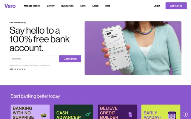
Preview image. Unlock full-res
Vibrant Financial Canvas
Color palette
Primary action buttons, active navigation items, brand accents in headings, card backgrounds
Alternate button background for secondary actions, subtle brand accent
Decorative backgrounds, accent outlines, highlight text
Accent backgrounds, bold text highlights, strong borders for graphic elements
Accent backgrounds, bold text highlights, strong borders for graphic elements
Accent buttons, feature highlights, and decorative outlines
Decorative highlight, visual emphasis for icons or specific textual elements
Decorative highlights, accent borders, accent text
Text color against vibrant backgrounds, subtle borders, card text
Page backgrounds, card surfaces, input fields, navigation backgrounds
Primary text, prominent icons, strong borders
Secondary text, subtle backgrounds for content blocks, footer text
Muted text, disabled states, subtle button backgrounds
Subtle surface differentiation, faint backgrounds for cards or sections
Backgrounds for specific content sections, accent text within those sections
Typography
- Weights
- 400, 450, 500
- Sizes
- 12px, 14px, 16px, 18px, 20px, 22px, 28px, 36px, 44px, 52px, 72px
- Line height
- 0.92
- Letter spacing
- -0.0200em at 72px, -0.0190em at 52px, -0.0130em at 44px, normal at 16px
- Fallback
- Helvetica Neue
The primary typeface for all textual content, from body to large headings. Its controlled letter-spacing on larger sizes provides a sophisticated yet readable presence.
- Weights
- 450, 700
- Sizes
- 32px, 56px, 76px, 96px, 115px, 147px
- Line height
- 0.8
- Letter spacing
- -0.0100em
- Fallback
- Bebas Neue
Used for hero headlines and impactful statements, its compressed nature and tight tracking create a bold, direct visual voice.
- Weights
- 400
- Sizes
- 13px
- Line height
- 1.2
- Letter spacing
- normal
- Fallback
- Arial
Fallback and utilitarian text in specific body and icon contexts, ensuring system-level availability.
- Weights
- 400
- Sizes
- 16px
- Line height
- 1.2
- Letter spacing
- normal
- Fallback
- Times New Roman
Used sparingly for specific content or button contexts, acting as a stylistic counterpoint in a primarily sans-serif design.
- Weights
- 500
- Sizes
- 14px
- Line height
- 1.14
- Letter spacing
- -0.0040em
- Fallback
- Montserrat
A secondary sans-serif for body text, providing a slightly different texture while maintaining readability, with a subtle letter-spacing adjustment.
Spacing & shape
Components
Filled with Regal Violet (#8c58d0), white text, and 4px border radius. Padding is 13px vertical, 32px horizontal. Text uses Neue Haas Grotesk Display.
White background with Midnight Ink (#000000) text and a subtle border in rgba(0, 28, 45, 0.14). Features 4px border radius and 16px of padding on all sides. Placeholder text is primary text color.
Transparent background, Midnight Ink (#000000) text, and no border radius. Provides visual hierarchy between active items and other links.
Solid background in brand colors (e.g., Regal Violet #8c58d0, Forest Green #183428, Limelight #d4e84b), no border radius, and no box shadow. Features generous 64px vertical and 80px horizontal padding.
Transparent background, no border radius, and no box shadow. Padding is 0px.
White background with Regal Violet (#8c58d0) text and 4px border radius. Padding is 13px vertical, 32px horizontal. Text uses Neue Haas Grotesk Display.
Filled with Storm Gray (#939393), Midnight Ink (#000000) text, and a circular 50% border radius. Zero padding for a compact size.
Guidelines
- Use Regal Violet (#8c58d0) for primary interactive elements, ensuring strong contrast against white or dark backgrounds.
- Apply 4px border-radius consistently for all interactive components like buttons and input fields.
- Employ National 2 Compressed for large, impactful headlines to create a bold, direct visual statement.
- Maintain a clear visual hierarchy with Neue Haas Grotesk Display, using varying weights and letter-spacing to differentiate content roles.
- Prioritize Canvas White (#ffffff) as the dominant background, using blocks of saturated brand/accent colors to define sections and emphasize content.
- Utilize 24px as the standard `elementGap` for horizontal and vertical spacing between components and elements.
- Ensure input fields have a subtle border of rgba(0, 28, 45, 0.14) against a white background to distinguish them clearly.
- Avoid using highly saturated colors for large paragraphs of body text; reserve them for accents, headings, or interactive elements.
- Do not introduce new border radii beyond the established 4px for interactive elements and 0px for full-bleed content blocks.
- Refrain from using shadows for elevation; rely on color blocks and subtle borders for visual separation.
- Do not deviate from the specified letter-spacing values for Neue Haas Grotesk Display and National 2 Compressed, as they are crucial to the brand's typographic identity.
- Avoid arbitrary use of the accent color palette; deploy colors like Limelight (#d4e84b) and Burnt Orange (#ed6c52) intentionally for highlights and feature differentiation.
- Do not use generic system fonts unless explicitly specified for fallback; prioritize Neue Haas Grotesk Display and National 2 Compressed.
- Do not apply decorative gradients; the system relies on solid color blocks and sharp color transitions for visual dynamism.
About this system
ShowHide
Varo uses a vibrant, confident design language to convey financial accessibility. It primarily features a clean white canvas frequently punctuated by bold, saturated blocks of color for branding and accentuation. Typography is assertive, primarily using a custom grotesque sans-serif with controlled letter-spacing, giving a modern and approachable feel. Interactive elements are clearly delineated with a dominant purple accent, while a subtle elevation strategy ensures a lightweight, fluid user experience.
The page primarily uses a full-bleed layout, allowing content sections to extend edge-to-edge, but often contains content within implied horizontal guides. The hero section often features a split layout with prominent headlines and input forms on the left, paired with lifestyle product photography on the right. Section rhythms are defined by alternating background colors, moving from Canvas White to bold brand colors like Regal Violet or various accent colors. Content is arranged in alternating text-left/image-right or image-left/text-right patterns, creating a dynamic flow down the page. Feature sections frequently utilize a 3-column grid of distinct color blocks. The density is relatively spacious, with clear vertical separation between major content blocks. Navigation is handled by a sticky top bar.
The imagery primarily features product screenshots of the Varo mobile app, often held by diverse individuals in a modern, casual setting, conveying ease of use and approachability for a broad audience. Photography is generally bright with natural light, focusing on the product interface. Illustrations are geometric and abstract, using brand colors to create dynamic backgrounds or callouts, such as the colorful blocks for feature sections. Icons are filled, with moderate stroke weights, and are mono-color, reinforcing functional clarity. Imagery density varies; some sections are image-heavy, while others are text-dominant with smaller decorative graphics. The overall role of imagery is to contextually showcase the product and graphically support content with brand-aligned visuals.
Reminiscent of Chime, Monzo, Revolut, Ally Bank.
# Varo Bank — Style Reference
> Vibrant Financial Canvas

**Theme:** light

**Site:** https://www.varomoney.com

Varo uses a vibrant, confident design language to convey financial accessibility. It primarily features a clean white canvas frequently punctuated by bold, saturated blocks of color for branding and accentuation. Typography is assertive, primarily using a custom grotesque sans-serif with controlled letter-spacing, giving a modern and approachable feel. Interactive elements are clearly delineated with a dominant purple accent, while a subtle elevation strategy ensures a lightweight, fluid user experience.

## Tokens — Colors

| Name | Value | Token | Role |
|------|------|------|------|
| Regal Violet | `#8c58d0` | `--color-regal-violet` | Primary action buttons, active navigation items, brand accents in headings, card backgrounds |
| Lavender Bloom | `#cdb0fa` | `--color-lavender-bloom` | Alternate button background for secondary actions, subtle brand accent |
| Sunrise Yellow | `#fdf0af` | `--color-sunrise-yellow` | Decorative backgrounds, accent outlines, highlight text |
| Deep Plum | `#42185f` | `--color-deep-plum` | Accent backgrounds, bold text highlights, strong borders for graphic elements |
| Forest Green | `#183428` | `--color-forest-green` | Accent backgrounds, bold text highlights, strong borders for graphic elements |
| Limelight | `#d4e84b` | `--color-limelight` | Accent buttons, feature highlights, and decorative outlines |
| Burnt Orange | `#ed6c52` | `--color-burnt-orange` | Decorative highlight, visual emphasis for icons or specific textual elements |
| Sunset Blush | `#f2a295` | `--color-sunset-blush` | Decorative highlights, accent borders, accent text |
| Golden Earth | `#4a4216` | `--color-golden-earth` | Text color against vibrant backgrounds, subtle borders, card text |
| Canvas White | `#ffffff` | `--color-canvas-white` | Page backgrounds, card surfaces, input fields, navigation backgrounds |
| Midnight Ink | `#000000` | `--color-midnight-ink` | Primary text, prominent icons, strong borders |
| Graphite | `#1c1c1c` | `--color-graphite` | Secondary text, subtle backgrounds for content blocks, footer text |
| Storm Gray | `#939393` | `--color-storm-gray` | Muted text, disabled states, subtle button backgrounds |
| Pale Mist | `#eff2f5` | `--color-pale-mist` | Subtle surface differentiation, faint backgrounds for cards or sections |
| Warm Linen | `#faefdc` | `--color-warm-linen` | Backgrounds for specific content sections, accent text within those sections |

## Tokens — Typography

### Neue Haas Grotesk Display
- **Substitute:** Helvetica Neue
- **Weights:** 400, 450, 500
- **Sizes:** 12px, 14px, 16px, 18px, 20px, 22px, 28px, 36px, 44px, 52px, 72px
- **Line height:** 0.92
- **Letter spacing:** -0.0200em at 72px, -0.0190em at 52px, -0.0130em at 44px, normal at 16px
- **Role:** The primary typeface for all textual content, from body to large headings. Its controlled letter-spacing on larger sizes provides a sophisticated yet readable presence.

### National 2 Compressed
- **Substitute:** Bebas Neue
- **Weights:** 450, 700
- **Sizes:** 32px, 56px, 76px, 96px, 115px, 147px
- **Line height:** 0.8
- **Letter spacing:** -0.0100em
- **Role:** Used for hero headlines and impactful statements, its compressed nature and tight tracking create a bold, direct visual voice.

### Arial
- **Substitute:** Arial
- **Weights:** 400
- **Sizes:** 13px
- **Line height:** 1.2
- **Letter spacing:** normal
- **Role:** Fallback and utilitarian text in specific body and icon contexts, ensuring system-level availability.

### Times
- **Substitute:** Times New Roman
- **Weights:** 400
- **Sizes:** 16px
- **Line height:** 1.2
- **Letter spacing:** normal
- **Role:** Used sparingly for specific content or button contexts, acting as a stylistic counterpoint in a primarily sans-serif design.

### Metropolis
- **Substitute:** Montserrat
- **Weights:** 500
- **Sizes:** 14px
- **Line height:** 1.14
- **Letter spacing:** -0.0040em
- **Role:** A secondary sans-serif for body text, providing a slightly different texture while maintaining readability, with a subtle letter-spacing adjustment.

## Tokens — Type Scale

Minor Third (1.2) from 14px base.

| Role | Size | Line height | Letter spacing |
|------|------|------|------|
| caption | 12px | 1.56 | 0.036em |
| body | 14px | 1.14 | -0.004em |
| heading-sm | 18px | 1.27 | — |
| heading | 20px | 1.22 | — |
| heading-lg | 22px | 1.2 | — |
| display | 28px | 1.17 | -0.013em |
| display-lg | 36px | 1.11 | -0.019em |
| display-xl | 44px | 1 | -0.019em |
| display-xxl | 52px | 0.96 | -0.019em |
| display-xxxl | 72px | 0.92 | -0.02em |

## Tokens — Spacing

- **Section gap:** 48px
- **Card padding:** 16px
- **Element gap:** 24px

## Tokens — Radius

- **Buttons:** 4px
- **Inputs:** 4px
- **Images:** 4px
- **menus:** 4px

## Layout

The page primarily uses a full-bleed layout, allowing content sections to extend edge-to-edge, but often contains content within implied horizontal guides. The hero section often features a split layout with prominent headlines and input forms on the left, paired with lifestyle product photography on the right. Section rhythms are defined by alternating background colors, moving from Canvas White to bold brand colors like Regal Violet or various accent colors. Content is arranged in alternating text-left/image-right or image-left/text-right patterns, creating a dynamic flow down the page. Feature sections frequently utilize a 3-column grid of distinct color blocks. The density is relatively spacious, with clear vertical separation between major content blocks. Navigation is handled by a sticky top bar.

## Imagery

The imagery primarily features product screenshots of the Varo mobile app, often held by diverse individuals in a modern, casual setting, conveying ease of use and approachability for a broad audience. Photography is generally bright with natural light, focusing on the product interface. Illustrations are geometric and abstract, using brand colors to create dynamic backgrounds or callouts, such as the colorful blocks for feature sections. Icons are filled, with moderate stroke weights, and are mono-color, reinforcing functional clarity. Imagery density varies; some sections are image-heavy, while others are text-dominant with smaller decorative graphics. The overall role of imagery is to contextually showcase the product and graphically support content with brand-aligned visuals.

## Components

### Primary Action Button
*Calls to action that drive key user journeys.*

Filled with Regal Violet (#8c58d0), white text, and 4px border radius. Padding is 13px vertical, 32px horizontal. Text uses Neue Haas Grotesk Display.

### Text Input Field
*Standard user data entry.*

White background with Midnight Ink (#000000) text and a subtle border in rgba(0, 28, 45, 0.14). Features 4px border radius and 16px of padding on all sides. Placeholder text is primary text color.

### Ghost Navigation Button
*Interactive elements within the navigation bar.*

Transparent background, Midnight Ink (#000000) text, and no border radius. Provides visual hierarchy between active items and other links.

### Feature Card (Full-Bleed Color)
*Highlighted sections promoting specific product features.*

Solid background in brand colors (e.g., Regal Violet #8c58d0, Forest Green #183428, Limelight #d4e84b), no border radius, and no box shadow. Features generous 64px vertical and 80px horizontal padding.

### Feature Card (Text-Only)
*Content blocks that emphasize text and visual separation.*

Transparent background, no border radius, and no box shadow. Padding is 0px.

### Secondary Action Button
*Alternate calls to action or less prominent interactive elements.*

White background with Regal Violet (#8c58d0) text and 4px border radius. Padding is 13px vertical, 32px horizontal. Text uses Neue Haas Grotesk Display.

### Icon Button (Circular)
*Small, functional, and decorative interactive icons, often for utilities.*

Filled with Storm Gray (#939393), Midnight Ink (#000000) text, and a circular 50% border radius. Zero padding for a compact size.

## Guidelines

### Do

- Use Regal Violet (#8c58d0) for primary interactive elements, ensuring strong contrast against white or dark backgrounds.
- Apply 4px border-radius consistently for all interactive components like buttons and input fields.
- Employ National 2 Compressed for large, impactful headlines to create a bold, direct visual statement.
- Maintain a clear visual hierarchy with Neue Haas Grotesk Display, using varying weights and letter-spacing to differentiate content roles.
- Prioritize Canvas White (#ffffff) as the dominant background, using blocks of saturated brand/accent colors to define sections and emphasize content.
- Utilize 24px as the standard `elementGap` for horizontal and vertical spacing between components and elements.
- Ensure input fields have a subtle border of rgba(0, 28, 45, 0.14) against a white background to distinguish them clearly.

### Don't

- Avoid using highly saturated colors for large paragraphs of body text; reserve them for accents, headings, or interactive elements.
- Do not introduce new border radii beyond the established 4px for interactive elements and 0px for full-bleed content blocks.
- Refrain from using shadows for elevation; rely on color blocks and subtle borders for visual separation.
- Do not deviate from the specified letter-spacing values for Neue Haas Grotesk Display and National 2 Compressed, as they are crucial to the brand's typographic identity.
- Avoid arbitrary use of the accent color palette; deploy colors like Limelight (#d4e84b) and Burnt Orange (#ed6c52) intentionally for highlights and feature differentiation.
- Do not use generic system fonts unless explicitly specified for fallback; prioritize Neue Haas Grotesk Display and National 2 Compressed.
- Do not apply decorative gradients; the system relies on solid color blocks and sharp color transitions for visual dynamism.

## Agent Prompt Guide

**Quick Color Reference:**
text: #000000
background: #ffffff
border: #rgba(0, 28, 45, 0.14)
accent: #8c58d0
primary action: #8c58d0 (filled action)

**3-5 Example Component Prompts:**
1. Create a primary action button: filled with Regal Violet (#8c58d0), white text, 4px radius, 13px 32px padding, text in Neue Haas Grotesk Display.
2. Design a text input field: white background, Midnight Ink (#000000) text, border in rgba(0, 28, 45, 0.14), 4px radius, 16px padding.
3. Build a feature card for the 'EARLY PAYDAY' section: background Limelight (#d4e84b), no border radius, no box shadow, 64px 80px padding.
4. Create a hero headline: 'Say hello to a 100% free bank account.' using National 2 Compressed, weight 700, size 72px, Midnight Ink (#000000) color, letter-spacing -0.0200em.
More like this









Keep what you find
A free account saves references to boards and can send you a weekly email of picks based on what you save.
To see every result, go Pro.