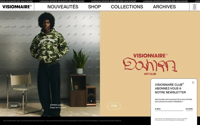
Preview image. Unlock full-res
Raw monochrome canvas.
Color palette
Supporting palette color for small decorative accents when the core palette needs contrast. Do not promote it to the primary CTA color
Supporting palette color for small decorative accents when the core palette needs contrast. Do not promote it to the primary CTA color
Supporting palette color for small decorative accents when the core palette needs contrast. Do not promote it to the primary CTA color
Primary text, icon fill, borders, active element accents, and footer background. It provides stark contrast and defines the outlines of the UI
Page backgrounds, card surfaces, and navigation elements. It offers a clean, expansive canvas
Muted text, subtle borders for ghost buttons, and secondary icon fills. It introduces a softer level of contrast
Key content section backgrounds, providing a warm, subtle shift for promotional or featured areas without introducing saturation
Typography
- Weights
- 500, 700
- Sizes
- 8px, 10px, 11px, 12px, 14px, 15px, 18px, 21px, 24px, 30px, 33px, 45px
- Line height
- 1.15, 1.2, 1.3, 1.5, 2, 2.78
- Letter spacing
- 0.016, 0.021, 0.023, 0.029, 0.03, 0.033, 0.039, 0.047, 0.05, 0.058, 0.064, 0.07, 0.088, 0.091, 0.1
- Fallback
- Inter
The sole typeface for all content, from headings to body text and navigation. Its condensed, modern, sans-serif character supports a compact and precise textual presentation, especially at the lighter weights for larger text and tighter tracking for small, all-caps elements.
Spacing & shape
Components
Transparent background, Midnight Ink (#000000) text and 1px border. No border-radius. Padding of 20px on all sides. Text is PP Neue Montreal, typically uppercase.
Transparent background, Ghost Gray (#888888) text and 1px border. No border-radius. No padding is explicitly defined; adapts to content. Used for minimal interactive elements like 'Valider' in forms.
Transparent background, no border, no shadow, no border-radius defined at the card wrapper level but content within might have 15px radius images. Padding is non-existent, implying images fill the card up to the edge. Product information is tightly integrated below the image.
Paper White (#ffffff) background, with a 15px top-left/top-right border radius and 0px for bottom corners. No shadow. Input fields are transparent with a Midnight Ink (#000000) bottom border.
Transparent background with Midnight Ink (#000000) 1px bottom border. No border-radius. Padding of 0px top/right/left, 5px bottom.
Guidelines
- Use Midnight Ink (#000000) for all primary text, borders, and icons to maintain high contrast with Paper White (#ffffff) backgrounds.
- Prioritize ghost button styles for interactive elements, employing Midnight Ink (#000000) or Ghost Gray (#888888) for borders and text, with 0px border-radius.
- Apply PP Neue Montreal as the exclusive font family across all typographic elements, leveraging its different weights for hierarchy rather than different fonts.
- Employ the Sand Dune (#f7f5e8) color for distinct content sections to subtly break the monochromatic flow without introducing strong chromatic elements.
- Maintain a compact information density with small element gaps (4px) and relatively small section gaps (30px).
- Use 15px border-radius sparingly for cards or images, and 50px for certain link elements, otherwise default to 0px for sharp edges.
- Avoid visible shadows for elevation; rely on color changes or borders to differentiate elements.
- Do not introduce highly saturated colors for general UI elements; these are reserved for decorative accents or specific product imagery.
- Refrain from using varied font families or decorative typefaces; maintain a consistent, singular font for brand identity.
- Do not use large, expansive whitespace between content elements; keep layouts dense and to the point.
- Avoid generous padding on cards or primary content blocks; content should appear close to edges.
- Do not use rounded corners universally; apply 0px radius unless specifically designated for cards or certain links.
About this system
ShowHide
The VISIONNAIRE design system embraces a raw, minimalist aesthetic with a street-wear edge. It features stark black-and-white UI elements on a primarily white canvas, punctuated by a unique, muted sandy-beige for specific content sections and occasional product photography. Typography is compact and precise, often used in all-caps, defining a tight information architecture. Interactive elements are primarily ghost buttons or unstyled links, maintaining a flat, unornamented surface treatment.
The page uses a maximum content width for key sections but allows for full-bleed elements, such as headers or specific section backgrounds. The hero section often features a split layout with imagery on one side and a brand statement on a colored background (Sand Dune) on the other. Product listings are presented in responsive grid formations, often 2-5 columns, with consistent vertical spacing between items. Navigation is a fixed top bar on larger screens, compacting on smaller views. Sections are primarily divided by changes in background color (Paper White, Sand Dune) or implied by distinct content blocks. Overall density is compact, with element and section gaps creating a rhythmic flow rather than vast whitespace.
This site features product-focused imagery, primarily fashion photography showing models wearing the apparel. Photos are generally high-key with strong contrast, often against studio white or minimalist settings. There are occasional lifestyle shots and abstract branding elements, such as the 'VISIONNAIRE Dahran ART CLUB' graphic. Imagery is typically contained within cards (sometimes with 15px corner radii) or presented full-bleed in hero sections, not overlapping. Icons are minimalist, outlined, and monochromatic (Midnight Ink). Visuals serve primarily to showcase products and establish brand atmosphere.
Reminiscent of Aesthetic, Palace Skateboards, Kith, Bodega.
# VISIONNAIRE — Style Reference
> Raw monochrome canvas.

**Theme:** light

**Site:** https://vision-naire.com

The VISIONNAIRE design system embraces a raw, minimalist aesthetic with a street-wear edge. It features stark black-and-white UI elements on a primarily white canvas, punctuated by a unique, muted sandy-beige for specific content sections and occasional product photography. Typography is compact and precise, often used in all-caps, defining a tight information architecture. Interactive elements are primarily ghost buttons or unstyled links, maintaining a flat, unornamented surface treatment.

## Tokens — Colors

| Name | Value | Token | Role |
|------|------|------|------|
| Sky Blue | `#DAEDFF` | `--color-sky-blue` | Supporting palette color for small decorative accents when the core palette needs contrast. Do not promote it to the primary CTA color |
| Bubblegum Pink | `#FF92C4` | `--color-bubblegum-pink` | Supporting palette color for small decorative accents when the core palette needs contrast. Do not promote it to the primary CTA color |
| Goldenrod | `#FFE36C` | `--color-goldenrod` | Supporting palette color for small decorative accents when the core palette needs contrast. Do not promote it to the primary CTA color |
| Midnight Ink | `#000000` | `--color-midnight-ink` | Primary text, icon fill, borders, active element accents, and footer background. It provides stark contrast and defines the outlines of the UI |
| Paper White | `#ffffff` | `--color-paper-white` | Page backgrounds, card surfaces, and navigation elements. It offers a clean, expansive canvas |
| Ghost Gray | `#888888` | `--color-ghost-gray` | Muted text, subtle borders for ghost buttons, and secondary icon fills. It introduces a softer level of contrast |
| Sand Dune | `#f7f5e8` | `--color-sand-dune` | Key content section backgrounds, providing a warm, subtle shift for promotional or featured areas without introducing saturation |

## Tokens — Typography

### PP Neue Montreal
- **Substitute:** Inter
- **Weights:** 500, 700
- **Sizes:** 8px, 10px, 11px, 12px, 14px, 15px, 18px, 21px, 24px, 30px, 33px, 45px
- **Line height:** 1.15, 1.2, 1.3, 1.5, 2, 2.78
- **Letter spacing:** 0.016, 0.021, 0.023, 0.029, 0.03, 0.033, 0.039, 0.047, 0.05, 0.058, 0.064, 0.07, 0.088, 0.091, 0.1
- **Role:** The sole typeface for all content, from headings to body text and navigation. Its condensed, modern, sans-serif character supports a compact and precise textual presentation, especially at the lighter weights for larger text and tighter tracking for small, all-caps elements.

## Tokens — Type Scale

Perfect Fourth (1.333) from 18px base.

| Role | Size | Line height | Letter spacing |
|------|------|------|------|
| heading-sm | 18px | 1.2 | 0.033em |
| heading | 24px | 1.2 | 0.029em |
| heading-lg | 33px | 1.15 | 0.021em |
| display | 45px | 1.15 | 0.016em |

## Tokens — Spacing

- **Section gap:** 30px
- **Card padding:** 20px
- **Element gap:** 4px

## Tokens — Radius

- **Buttons:** 0px
- **Cards:** 15px
- **Images:** 15px
- **links:** 50px

## Layout

The page uses a maximum content width for key sections but allows for full-bleed elements, such as headers or specific section backgrounds. The hero section often features a split layout with imagery on one side and a brand statement on a colored background (Sand Dune) on the other. Product listings are presented in responsive grid formations, often 2-5 columns, with consistent vertical spacing between items. Navigation is a fixed top bar on larger screens, compacting on smaller views. Sections are primarily divided by changes in background color (Paper White, Sand Dune) or implied by distinct content blocks. Overall density is compact, with element and section gaps creating a rhythmic flow rather than vast whitespace.

## Imagery

This site features product-focused imagery, primarily fashion photography showing models wearing the apparel. Photos are generally high-key with strong contrast, often against studio white or minimalist settings. There are occasional lifestyle shots and abstract branding elements, such as the 'VISIONNAIRE Dahran ART CLUB' graphic. Imagery is typically contained within cards (sometimes with 15px corner radii) or presented full-bleed in hero sections, not overlapping. Icons are minimalist, outlined, and monochromatic (Midnight Ink). Visuals serve primarily to showcase products and establish brand atmosphere.

## Components

### Ghost Primary Button
*Navigational and call-to-action elements.*

Transparent background, Midnight Ink (#000000) text and 1px border. No border-radius. Padding of 20px on all sides. Text is PP Neue Montreal, typically uppercase.

### Muted Ghost Button
*Secondary and less prominent actions.*

Transparent background, Ghost Gray (#888888) text and 1px border. No border-radius. No padding is explicitly defined; adapts to content. Used for minimal interactive elements like 'Valider' in forms.

### Product Card
*Display individual product listings in grid layouts.*

Transparent background, no border, no shadow, no border-radius defined at the card wrapper level but content within might have 15px radius images. Padding is non-existent, implying images fill the card up to the edge. Product information is tightly integrated below the image.

### Newsletter Signup Overlay
*Capturing user emails with a distinct pop-up.*

Paper White (#ffffff) background, with a 15px top-left/top-right border radius and 0px for bottom corners. No shadow. Input fields are transparent with a Midnight Ink (#000000) bottom border.

### Text Input Minimal
*User input fields.*

Transparent background with Midnight Ink (#000000) 1px bottom border. No border-radius. Padding of 0px top/right/left, 5px bottom.

## Guidelines

### Do

- Use Midnight Ink (#000000) for all primary text, borders, and icons to maintain high contrast with Paper White (#ffffff) backgrounds.
- Prioritize ghost button styles for interactive elements, employing Midnight Ink (#000000) or Ghost Gray (#888888) for borders and text, with 0px border-radius.
- Apply PP Neue Montreal as the exclusive font family across all typographic elements, leveraging its different weights for hierarchy rather than different fonts.
- Employ the Sand Dune (#f7f5e8) color for distinct content sections to subtly break the monochromatic flow without introducing strong chromatic elements.
- Maintain a compact information density with small element gaps (4px) and relatively small section gaps (30px).
- Use 15px border-radius sparingly for cards or images, and 50px for certain link elements, otherwise default to 0px for sharp edges.

### Don't

- Avoid visible shadows for elevation; rely on color changes or borders to differentiate elements.
- Do not introduce highly saturated colors for general UI elements; these are reserved for decorative accents or specific product imagery.
- Refrain from using varied font families or decorative typefaces; maintain a consistent, singular font for brand identity.
- Do not use large, expansive whitespace between content elements; keep layouts dense and to the point.
- Avoid generous padding on cards or primary content blocks; content should appear close to edges.
- Do not use rounded corners universally; apply 0px radius unless specifically designated for cards or certain links.

## Agent Prompt Guide

Quick Color Reference:
text: #000000
background: #ffffff
border: #000000
accent: #DAEDFF
primary action: no distinct CTA color

Example Component Prompts:
1. Create a header: Paper White background. Navigation links in PP Neue Montreal size 14px weight 500, Midnight Ink (#000000), letter-spacing 0.047em, all-caps. Shopping cart icon in Midnight Ink (#000000).
2. Create a product card: Transparent background. Image at 15px border-radius. Product name (PP Neue Montreal size 14px weight 500, Midnight Ink #000000, letter-spacing 0.047em) and price (PP Neue Montreal size 12px weight 500, Midnight Ink #000000, letter-spacing 0.05em) stacked directly below the image, with 4px elementGap between text lines.
3. Create a ghost button: Transparent background, Midnight Ink (#000000) 1px border. Text in PP Neue Montreal size 12px weight 500, Midnight Ink (#000000), letter-spacing 0.05em, all-caps. Padding 20px horizontally and vertically. No border-radius.
4. Create a newsletter signup form: Sand Dune (#f7f5e8) background. Headline 'VISIONNAIRE CLUB' in PP Neue Montreal size 18px weight 700, Midnight Ink (#000000), letter-spacing 0.033em. Input field is transparent with a 1px bottom border in Midnight Ink (#000000), padding 5px solely from the bottom. 'Valider' button is a Muted Ghost Button.
More like this









Keep what you find
A free account saves references to boards and can send you a weekly email of picks based on what you save.
To see every result, go Pro.