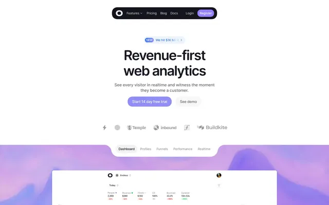
Preview image. Unlock full-res
Analytical canvas vibrant spectrum
Color palette
Subtle highlights, decorative borders, background accents
Primary action backgrounds, interactive indicators, brand highlight color for icons and accent borders
Accent buttons, interactive elements (darker shade of brand purple)
Violet accent for outlined action borders, linked labels, and lightweight interactive emphasis; Decorative background gradients, hero element backgrounds
Green outline accent for tags, dividers, and focused UI edges. Use as a supporting accent, not as a status color
Yellow decorative accent for icons, marks, and small graphic details. Use as a supporting accent, not as a status color
Decorative icons, secondary brand accents
Decorative SVG fills, minor accents (used in product screenshots)
Page backgrounds, card surfaces, ghost button backgrounds
Primary text, prominent headings, strong borders
Body text, secondary headings, default icon color
Muted text, helper text, inactive navigation items, dividers
Subtle borders, table dividers, ghost button borders
Soft section background, alternate surface, and quiet card fill
Typography
- Weights
- 400, 500, 600, 700
- Sizes
- 12px, 13px, 14px, 16px, 18px, 20px, 24px, 36px, 48px, 60px
- Line height
- 1, 1.11, 1.13, 1.17, 1.22, 1.33, 1.4, 1.43, 1.5, 1.56
- Letter spacing
- -0.0500em, -0.0270em, -0.0250em, -0.0230em, -0.0200em, -0.0180em, -0.0170em, -0.0160em, -0.0130em, -0.0090em, -0.0070em
- Fallback
- system-ui, sans-serif
Primary typeface for all UI elements, headings, and body text. Its compact metrics and varied letter spacing across sizes reinforce the analytical yet modern feel of the interface.
Spacing & shape
Elevation
Components
Typography: OpenRunde weight 400 at 16px, color: #181925. No background, no border, no padding. Hover state indicated by color change or underline.
Background: transparent (rgba(0,0,0,0)). Text color: #181925. No border. Padding: 0px vertical, 12px horizontal. Radius: 0px. Text is OpenRunde 16px weight 400.
Background: transparent (rgba(0,0,0,0)). Text color: #666666. Border: none. Padding: 0px. Radius: 1.67772e+07px (effectively full pill). Text is OpenRunde 14px weight 400.
Background: #918df6. Text color: #ffffff. Radius: 8px to 1.67772e+07px. Padding varies (e.g., 6px vertical, 10-12px horizontal). Text is OpenRunde 16px weight 500. Box shadow: rgba(0, 0, 0, 0.08) 0px 1px 1px 1px, rgba(0, 0, 0, 0.06) 0px 0px 0px 0.5px. Example: 'Start 14 day free trial'.
Background: #9580ff. Text color: #ffffff. Radius: 1.67772e+07px. Padding: 0px vertical, 6px horizontal. Text is OpenRunde 16px weight 400. Example: 'Register' in nav.
Background: #ffffff. Text color: #181925. Radius: 1.67772e+07px. Padding: 0px vertical, 6-10px horizontal. Text is OpenRunde 12px weight 400. Example: 'new We hit $1K MRR'.
Background: rgba(0,0,0,0.03) or #fafafa. Radius: 16px. No box shadow. Padding: 0px initially, but inner content typically uses 20-24px. Features a soft, nearly invisible background.
Background: #ffffff or #fafafa. Radius: 24px. Box shadow: none for content isolation. Padding: 64px vertical, 32px horizontal. This card uses more internal space.
Guidelines
- Use Radiant Violet (#918df6) exclusively for primary action backgrounds and brand-aligned interactive elements; avoid using it for decorative purposes.
- Apply OpenRunde with specific letter-spacing values: -0.013em for 48px headlines, scaling down to -0.05em for 12px caption text.
- Maintain comfortable visual distance between elements using a base unit of 4px; common `elementGap` is 16px, and `cardPadding` is 16px.
- Utilize 1.67772e+07px (effectively 9999px) border-radius for all pill-shaped buttons and tags to create a consistent soft, rounded edge.
- Implement the soft box shadow `rgba(0, 0, 0, 0.08) 0px 1px 1px 1px, rgba(0, 0, 0, 0.06) 0px 0px 0px 0.5px` sparingly for interactive buttons.
- Use Slate Ink (#181925) for all high-contrast, structural text, including main headings and primary body content, ensuring readability on light backgrounds.
- Separate sections with a substantial 64px vertical `sectionGap` unless content dictates a continuous flow.
- Do not use saturated colors for large background areas or extensive text; reserve them for accents and actionable components.
- Avoid sharp corners; ensure all interactive elements and content containers have a minimum border-radius of 8px.
- Do not introduce new typefaces; OpenRunde is the sole family for all textual content.
- Do not use heavy, opaque shadows; leverage the prescribed subtle shadows for depth or rely on background color changes for hierarchy.
- Do not clutter layouts; prioritize negative space and clear visual hierarchy on a bright, minimalist canvas.
- Do not apply `letter-spacing: normal` to display or large heading sizes; always use the specified negative tracking for OpenRunde.
- Do not use multiple instances of distinct purple hues for primary actions; Radiant Violet (#918df6) is the definitive choice for filled buttons.
About this system
ShowHide
The Visitors design system employs a crisp, analytical aesthetic with a playful edge. It balances substantial negative space and achromatic surfaces with a vibrant, gradient-infused purple as its primary brand color, punctuated by a suite of vivid secondary accents. Typography is compact and precise, maintaining readability while maximizing information density. Interactive elements often manifest as ghost buttons or subtle, rounded containers, giving a lightweight feel until the accent color 'switches on' for primary actions. The pervasive use of rounded corners softens the otherwise direct, functional presentation.
The page primarily employs a max-width contained layout, approximately 1200px, horizontally centered. The hero section features a centered headline and description over a full-bleed gradient background that extends across the viewport. Below the hero, content typically alternates between full-width banner-like sections and narrower, contained blocks. Feature sections often use a multi-column grid (e.g., 3-column) for concise information. Vertical rhythm is established by consistent section gaps of 64px, with components and cards featuring internal padding. Navigation is a sticky top bar with a left-aligned brand logo, right-aligned navigation links, and accent-colored 'Login'/'Register' buttons, indicating a clear, un-cluttered approach to utility.
The imagery style is a mix of product screenshots, abstract gradient backgrounds, and line art icons. Product screenshots are clean and direct, showcasing UI elements without heavy stylization. Abstract graphics are characterized by smooth, organic gradients, primarily in blues and purples, providing decorative atmosphere. Icons are minimalist, outlined, and often monochromatic or subtly tinted with accent colors like #33c758 (green), #ffa600 (yellow), or #d6409f (pink), serving as explanatory content or functional indicators. They possess a moderate stroke weight. The visual density is balanced, with imagery serving to break up text-heavy sections or highlight key data, rather than being overwhelming.
Reminiscent of Plausible Analytics, Fathom Analytics, Supabase, Linear.
# Visitors — Style Reference
> Analytical canvas vibrant spectrum

**Theme:** light

**Site:** https://visitors.now

The Visitors design system employs a crisp, analytical aesthetic with a playful edge. It balances substantial negative space and achromatic surfaces with a vibrant, gradient-infused purple as its primary brand color, punctuated by a suite of vivid secondary accents. Typography is compact and precise, maintaining readability while maximizing information density. Interactive elements often manifest as ghost buttons or subtle, rounded containers, giving a lightweight feel until the accent color 'switches on' for primary actions. The pervasive use of rounded corners softens the otherwise direct, functional presentation.

## Tokens — Colors

| Name | Value | Token | Role |
|------|------|------|------|
| Whisper Purple | `#dad9fc` | `--color-whisper-purple` | Subtle highlights, decorative borders, background accents |
| Radiant Violet | `#918df6` | `--color-radiant-violet` | Primary action backgrounds, interactive indicators, brand highlight color for icons and accent borders |
| Deep Purple | `#9580ff` | `--color-deep-purple` | Accent buttons, interactive elements (darker shade of brand purple) |
| Electric Blue | `#2c78fc` | `--color-electric-blue` | Violet accent for outlined action borders, linked labels, and lightweight interactive emphasis; Decorative background gradients, hero element backgrounds |
| Success Green | `#33c758` | `--color-success-green` | Green outline accent for tags, dividers, and focused UI edges. Use as a supporting accent, not as a status color |
| Warning Yellow | `#ffa600` | `--color-warning-yellow` | Yellow decorative accent for icons, marks, and small graphic details. Use as a supporting accent, not as a status color |
| Accent Pink | `#d6409f` | `--color-accent-pink` | Decorative icons, secondary brand accents |
| Vivid Orange | `#ff3e00` | `--color-vivid-orange` | Decorative SVG fills, minor accents (used in product screenshots) |
| Canvas White | `#ffffff` | `--color-canvas-white` | Page backgrounds, card surfaces, ghost button backgrounds |
| Slate Ink | `#181925` | `--color-slate-ink` | Primary text, prominent headings, strong borders |
| Medium Gray | `#666666` | `--color-medium-gray` | Body text, secondary headings, default icon color |
| Muted Gray | `#999999` | `--color-muted-gray` | Muted text, helper text, inactive navigation items, dividers |
| Light Gray | `#e8e8e8` | `--color-light-gray` | Subtle borders, table dividers, ghost button borders |
| Pale Mint | `#def6e4` | `--color-pale-mint` | Soft section background, alternate surface, and quiet card fill |

## Tokens — Typography

### OpenRunde
- **Substitute:** system-ui, sans-serif
- **Weights:** 400, 500, 600, 700
- **Sizes:** 12px, 13px, 14px, 16px, 18px, 20px, 24px, 36px, 48px, 60px
- **Line height:** 1, 1.11, 1.13, 1.17, 1.22, 1.33, 1.4, 1.43, 1.5, 1.56
- **Letter spacing:** -0.0500em, -0.0270em, -0.0250em, -0.0230em, -0.0200em, -0.0180em, -0.0170em, -0.0160em, -0.0130em, -0.0090em, -0.0070em
- **Role:** Primary typeface for all UI elements, headings, and body text. Its compact metrics and varied letter spacing across sizes reinforce the analytical yet modern feel of the interface.

## Tokens — Type Scale

Perfect Fourth (1.333) from 14px base.

| Role | Size | Line height | Letter spacing |
|------|------|------|------|
| caption | 12px | 1.56 | -0.05em |
| body | 14px | 1.43 | -0.025em |
| heading-sm | 18px | 1.33 | -0.02em |
| heading | 20px | 1.22 | -0.018em |
| heading-lg | 24px | 1.17 | -0.017em |
| display | 48px | 1.13 | -0.013em |

## Tokens — Spacing

- **Section gap:** 64px
- **Card padding:** 16px
- **Element gap:** 16px

## Tokens — Radius

- **Default:** 8px
- **Buttons:** 1.67772e+07px
- **Cards:** 16px
- **large:** 24px
- **pill:** 9999px

## Tokens — Elevation

- **Interactive Button:** `rgba(0, 0, 0, 0.08) 0px 1px 1px 1px, rgba(0, 0, 0, 0.06) 0px 0px 0px 0.5px`

## Layout

The page primarily employs a max-width contained layout, approximately 1200px, horizontally centered. The hero section features a centered headline and description over a full-bleed gradient background that extends across the viewport. Below the hero, content typically alternates between full-width banner-like sections and narrower, contained blocks. Feature sections often use a multi-column grid (e.g., 3-column) for concise information. Vertical rhythm is established by consistent section gaps of 64px, with components and cards featuring internal padding. Navigation is a sticky top bar with a left-aligned brand logo, right-aligned navigation links, and accent-colored 'Login'/'Register' buttons, indicating a clear, un-cluttered approach to utility.

## Imagery

The imagery style is a mix of product screenshots, abstract gradient backgrounds, and line art icons. Product screenshots are clean and direct, showcasing UI elements without heavy stylization. Abstract graphics are characterized by smooth, organic gradients, primarily in blues and purples, providing decorative atmosphere. Icons are minimalist, outlined, and often monochromatic or subtly tinted with accent colors like #33c758 (green), #ffa600 (yellow), or #d6409f (pink), serving as explanatory content or functional indicators. They possess a moderate stroke weight. The visual density is balanced, with imagery serving to break up text-heavy sections or highlight key data, rather than being overwhelming.

## Components

### Navigation Link
*Menu items, simple textual links*

Typography: OpenRunde weight 400 at 16px, color: #181925. No background, no border, no padding. Hover state indicated by color change or underline.

### Ghost Button
*Secondary actions, tertiary navigation items*

Background: transparent (rgba(0,0,0,0)). Text color: #181925. No border. Padding: 0px vertical, 12px horizontal. Radius: 0px. Text is OpenRunde 16px weight 400.

### Pill Ghost Button
*Subtle filtering, small secondary actions*

Background: transparent (rgba(0,0,0,0)). Text color: #666666. Border: none. Padding: 0px. Radius: 1.67772e+07px (effectively full pill). Text is OpenRunde 14px weight 400.

### Primary Action Button
*Main calls to action, clear user intent*

Background: #918df6. Text color: #ffffff. Radius: 8px to 1.67772e+07px. Padding varies (e.g., 6px vertical, 10-12px horizontal). Text is OpenRunde 16px weight 500. Box shadow: rgba(0, 0, 0, 0.08) 0px 1px 1px 1px, rgba(0, 0, 0, 0.06) 0px 0px 0px 0.5px. Example: 'Start 14 day free trial'.

### Accent Pill Button
*Prominent but compact actions like 'Register'*

Background: #9580ff. Text color: #ffffff. Radius: 1.67772e+07px. Padding: 0px vertical, 6px horizontal. Text is OpenRunde 16px weight 400. Example: 'Register' in nav.

### Subtle Text Button
*Small, informative labels, often with an icon*

Background: #ffffff. Text color: #181925. Radius: 1.67772e+07px. Padding: 0px vertical, 6-10px horizontal. Text is OpenRunde 12px weight 400. Example: 'new We hit $1K MRR'.

### Feature Card
*Displaying key features or content blocks*

Background: rgba(0,0,0,0.03) or #fafafa. Radius: 16px. No box shadow. Padding: 0px initially, but inner content typically uses 20-24px. Features a soft, nearly invisible background.

### Elevated Content Card
*Prominent information display, often with more substantial content*

Background: #ffffff or #fafafa. Radius: 24px. Box shadow: none for content isolation. Padding: 64px vertical, 32px horizontal. This card uses more internal space.

## Guidelines

### Do

- Use Radiant Violet (#918df6) exclusively for primary action backgrounds and brand-aligned interactive elements; avoid using it for decorative purposes.
- Apply OpenRunde with specific letter-spacing values: -0.013em for 48px headlines, scaling down to -0.05em for 12px caption text.
- Maintain comfortable visual distance between elements using a base unit of 4px; common `elementGap` is 16px, and `cardPadding` is 16px.
- Utilize 1.67772e+07px (effectively 9999px) border-radius for all pill-shaped buttons and tags to create a consistent soft, rounded edge.
- Implement the soft box shadow `rgba(0, 0, 0, 0.08) 0px 1px 1px 1px, rgba(0, 0, 0, 0.06) 0px 0px 0px 0.5px` sparingly for interactive buttons.
- Use Slate Ink (#181925) for all high-contrast, structural text, including main headings and primary body content, ensuring readability on light backgrounds.
- Separate sections with a substantial 64px vertical `sectionGap` unless content dictates a continuous flow.

### Don't

- Do not use saturated colors for large background areas or extensive text; reserve them for accents and actionable components.
- Avoid sharp corners; ensure all interactive elements and content containers have a minimum border-radius of 8px.
- Do not introduce new typefaces; OpenRunde is the sole family for all textual content.
- Do not use heavy, opaque shadows; leverage the prescribed subtle shadows for depth or rely on background color changes for hierarchy.
- Do not clutter layouts; prioritize negative space and clear visual hierarchy on a bright, minimalist canvas.
- Do not apply `letter-spacing: normal` to display or large heading sizes; always use the specified negative tracking for OpenRunde.
- Do not use multiple instances of distinct purple hues for primary actions; Radiant Violet (#918df6) is the definitive choice for filled buttons.

## Agent Prompt Guide

Quick Color Reference:
text: #181925
background: #ffffff
border: #e8e8e8
accent: #918df6
primary action: #918df6 (filled action)

Example Component Prompts:
1. Create a Primary Action Button: #918df6 background, #181925 text, 9999px radius, compact pill padding. Use this filled treatment for the main CTA.
2. Create a Feature Card: background rgba(0,0,0,0.03), 16px radius, content padding 20px. Inside, place a heading 'Lightweight script.' using OpenRunde 24px weight 600, #181925, letter-spacing -0.017em. Below, body text 'Under 1KB. Won't hurt your page speed or Core Web Vitals.' using OpenRunde 16px weight 400, #666666, letter-spacing -0.023em.
3. Create a Navigation Bar: background #ffffff. Left-aligned logo. Right-aligned ghost buttons for 'Features', 'Pricing', 'Blog', 'Docs' using OpenRunde 16px weight 400, #181925, padding 0px vertical, 12px horizontal. Followed by a 'Login' Ghost Button (same style) and a 'Register' Accent Pill Button with background #9580ff, text #ffffff, 9999px radius, OpenRunde 16px weight 400.
4. Create a Dashboard Tab Bar: background transparent. Tabs for 'Dashboard', 'Profiles', 'Funnels', 'Performance', 'Realtime'. Active tab has a bottom border 2px solid #918df6, inactive tabs have #e8e8e8 bottom border. Text for tabs is OpenRunde 16px weight 500, active #181925, inactive #666666.
More like this









Keep what you find
A free account saves references to boards and can send you a weekly email of picks based on what you save.
To see every result, go Pro.