Preview image. Unlock full-res
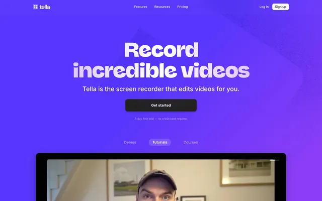
Violet broadcast signal — the design feels like a TV network's on-air package: full-bleed chromatic fields, bold compressed display type, hard cuts between saturated and white.
Color palette
Primary brand color — hero backgrounds, CTAs, interactive states, logo mark. The electric quality (vivid, high-chroma) makes every surface it touches feel charged.
Hero section footer tone and gradient terminus. Paired with Signal Violet for the dark-to-darker hero gradient that creates depth within the purple field.
Button shadow underlay and hover states on the hero. Creates tactile depth on dark surfaces via box-shadow layering.
Secondary headline text on dark violet backgrounds — brand color carried into typography so the hero never loses chromatic identity.
Full-bleed hero background — Signal Violet to Deep Nebula vertical gradient with radial glow at top center.
Pill button accent variant — appears as a pastel contrast button against the violet hero. Black text on this color delivers AAA contrast with brand warmth.
Feature card illustration tints and ghost typography in the white sections — keeps brand hue present without saturating light backgrounds.
Icon fills and glow halos (box-shadow on interactive elements). The lighter violet relative of Signal Violet — used for SVG fills and hover glow effects.
Decorative accent surface — appears sparingly as a cool counterpoint to the warm violet system.
Primary heading text on white sections.
Body text on white sections, secondary navigation labels.
Tertiary body copy, fine print, disabled states.
Icon strokes, placeholder text, muted UI elements.
Card borders, section dividers, input borders on light surfaces.
Page background for feature sections.
Card surfaces, nav background, text on dark hero.
CTA button fill on the hero (the dark pill that contrasts with the violet field), high-contrast body text.
Body copy within violet/dark sections where pure white would be too harsh.
Typography
- Weights
- 700
- Sizes
- 56px, 64px, 84px
- Line height
- 1.1
- Letter spacing
- -0.054em at 56px, -0.047em at 64px, -0.036em at 84px
- Fallback
- Cabinet Grotesk ExtraBold or Clash Display Bold
Hero and section display headlines exclusively. The custom font's chunky stroke contrast and tight tracking at display sizes creates broadcast-title energy — unmistakable at a glance, nothing Inter could replicate. The aggressive negative tracking (-0.054em at 56px) squeezes letters into a dense typographic block that reads as a single graphic unit.
- Weights
- 500, 600, 700
- Sizes
- 12px, 14px, 16px, 18px, 20px, 24px, 28px, 30px
- Line height
- 1
- Letter spacing
- normal
- Fallback
- Inter (freely available via Google Fonts)
All UI text: navigation, body copy, subheadings, card titles, buttons, captions. Weight 700 at 24-30px for section subheadings; weight 600 at 18-20px for card headers; weight 500 at 14-16px for body and UI labels. The utilitarian pairing with NaN Jaune Midi is intentional — Inter stays invisible so the display font commands full attention.
- Weights
- 400
- Sizes
- 12px
- Line height
- 1.5
- Letter spacing
- normal
- Fallback
- System sans-serif
System fallback at 12px for fine-print labels and browser-rendered micro text.
Spacing & shape
Elevation
Components
40px border-radius pill, #111111 background, #ffffff text, Inter 600 16px. Sits inside a fully saturated violet hero — the deliberate darkness makes it recede into urgency rather than compete with the background. Padding approximately 16px 32px. No border.
40px border-radius pill, #d5a8f5 background, #000000 text, #000000 border. Inter 600 14-16px. Used as a visual counterpoint — warm pastel against violet — creates a softer entry point alongside the hard dark CTA.
No background, no border. Inter 500 16px, #475569 text color on white nav, #ffffff on dark sections. Hover state likely adds #5e51f8 color. Letter-spacing normal.
40px border-radius pill, transparent background, #000000 border 1px solid, #000000 text on light nav. Inter 600 14px. Padding 8px 20px. On dark hero sections, border becomes #ffffff.
32px border-radius, #ffffff background, #e5e7eb border 1px solid, shadow rgba(0,0,0,0.15) 0px 8px 32px 4px. Padding 24px. Interior contains an icon (16px, #5e51f8 or #867dfa fill), Inter 700 18px heading in #0f172a, Inter 400 16px body in #475569. Feature illustration in the lower half uses #d7d3fd and #cfcbfd tints on white — brand-colored at low saturation.
Active state: 40px radius pill, #ffffff background, Inter 600 14px #0f172a text, shadow rgba(0,0,0,0.16) 0px 2px 4px, rgba(0,0,0,0.16) 0px 4px 8px, rgba(255,255,255,0.25) 0px 1px 1px inset. Inactive: no background, #ffffff text at reduced opacity. Container: semi-transparent violet surface.
24px border-radius card, #ffffff background, shadow rgba(0,0,0,0.15) 0px 8px 32px 0px. Contains thumbnail image at 16px radius left side, Inter 700 20px headline #0f172a, Inter 500 16px link text in #5e51f8 ('Watch the demo'). Positioned floating over the violet-to-white transition band.
16px border-radius on the inner screen content, dark bezel (#111111) at ~8-12px around the screen. Shadow: rgba(238,217,253,0.25) 0px 16px 64px 4px + rgba(0,0,0,0.1) 0px 8px 32px 0px. The lavender-tinted outer glow is the signature — elevation feels brand-colored, not neutral.
Horizontally scrolling row of circular avatars (40px diameter, 9999px radius). Overlapping arrangement with 16px negative margin between each. Centered below the hero. Caption text Inter 500 14px #475569 centered above.
24px border-radius, #ffffff background, border #e5e7eb 1px. Internal layout: image left (product photo at 16px radius), text right with Inter 700 16px title #0f172a, body Inter 400 14px #475569. CTA pill button '#5e51f8 background, #ffffff text, 40px radius' inside the card.
Inter 400 12px, #cfcbfd color on dark violet, centered. No background. Used for '7-day Free trial — no credit card required' messaging.
Guidelines
- Use NaN Jaune Midi Bold with letter-spacing -0.047em to -0.054em for all display headlines above 48px — never set this font at tracking above -0.036em or it loses its broadcast-title compression.
- Apply the full-bleed violet hero (#5e51f8 → #251544 gradient) as a hard-cut section, not a fade — the abrupt transition to #f8fafc white is a signature move, not a design error.
- Use 40px border-radius for all interactive pill elements: CTA buttons, nav sign-up button, tab selectors, and tag labels — this is the single rounded form that appears system-wide.
- Tint feature card illustrations and ghost text with #d7d3fd or #cfcbfd on white surfaces — this keeps brand violet present in content sections without saturating the white ground.
- Apply the lavender glow shadow (rgba(238,217,253,0.25) 0px 16px 64px 4px) to product screenshots and elevated frames — generic black shadows on violet-adjacent content would break the brand-colored elevation system.
- Maintain the dark CTA (#111111 pill) as the primary action on violet hero sections — the unexpected darkness against saturated violet reads as decisive contrast, not absence of brand.
- Use Inter 700 at 24-30px for section subheadings on white sections — NaN Jaune Midi is reserved for display sizes only; Inter carries section-level hierarchy below 48px.
- Never use NaN Jaune Midi Bold below 48px — the custom face loses its display impact at text sizes and competes poorly with Inter's legibility.
- Never add gradient transitions between the violet hero and white sections — the hard cut is a deliberate design choice, not a transition oversight.
- Never use semantic red/green for status colors without verifying they appear in the design system — no semantic colors were detected in the extracted data; default to violet (#5e51f8) for interactive states.
- Never apply card border-radius below 24px — even small UI elements use 12-20px; the system has no sharp-cornered cards.
- Never place the lavender pill button (#d5a8f5) as the sole primary CTA — it reads as decorative or secondary alongside the dark pill; always pair it with or subordinate it to #111111 primary action.
- Never use box-shadows with warm-toned or yellow-shifted colors — all elevation uses either neutral black rgba(0,0,0,x) or brand-tinted lavender rgba(238,217,253,x). No warm brown or golden shadow tones.
- Never center-align body copy in card grids at more than 2 lines — the feature cards use left-aligned body text below card headers; centered multi-line body copy breaks the card's reading rhythm.
About this system
ShowHide
Tella pulses with electric violet energy — a hero that washes the entire viewport in saturated purple (#5e51f8 to #251544), then cuts hard to white for feature sections. The contrast is deliberate and jarring in the best way: you go from immersive chromatic field to clinical white card grid without transition. The headline font NaN Jaune Midi Bold does the heavy lifting — a chunky, tightly-tracked display face at -0.054em letter-spacing that feels like broadcast TV titles squeezed into browser chrome. Lavender-tinted secondary text (#cfcbfd on dark, #d7d3fd on features) carries brand color even into body copy, preventing the white sections from losing brand identity. The pill-shaped dark CTA floating in a violet sea is the signature contradiction: the most important action is the darkest, most contained element on the page.
Max-width approximately 1200px, centered. Hero is full-bleed violet spanning the full viewport width and approximately 100vh, with centered headline stack and a single dark pill CTA. Below the CTA, a tab row switches between content modes, and a large product screenshot frame extends below the fold — the frame bottom intentionally crops, pulling the eye down. The hero-to-white section transition is a hard cut with no gradient bridge. Feature sections use a horizontal scroll card grid (4 visible cards, partial 5th visible, approximately 280px wide each) — not a static grid, implying overflow scroll on desktop. The video demo card floats in the transition zone between violet and white, using a card-on-gradient effect. Social proof is a single centered row at near-full width. Navigation is a fixed top bar with logo left, three links centered, auth actions right — standard SaaS nav but the sign-up button uses a pill outline matching the brand's rounded language. Footer is multi-column with approximately 3 content columns on a dark violet/near-black background.
Tella's visual language mixes real user webcam footage (candid, casual, head-and-shoulders crops inside rounded device frames) with flat-style brand illustrations. The webcam footage is raw and unretouched — intentionally amateur-feeling, matching the 'anyone can make videos' positioning. Product screenshots are contained within simulated laptop/monitor bezels at 16px internal radius. Feature card illustrations use ultra-light lavender (#d7d3fd, #cfcbfd) line drawings on white — outline-style, no fill, geometric human figures carrying trash (delete silences), large typographic elements ('um', 'ahh', 'ehhh' in fading lavender) for the filler-words card. Icons are outlined, approximately 1.5px stroke weight, monochromatic using #5e51f8 or #94a3b8. The rainbow linear/conic gradient (yellow→cyan→magenta) appears as an animated decorative ring — a neon halo effect, likely around the logo or a status indicator. Imagery is sparse: the white sections are text-and-illustration dominant, the hero is type-dominant with one large contained product demo below the fold.
Reminiscent of Loom, Framer, Pitch, Descript, Supercut.
# Tella — Style Reference
> Violet broadcast signal — the design feels like a TV network's on-air package: full-bleed chromatic fields, bold compressed display type, hard cuts between saturated and white.

**Theme:** mixed

**Site:** https://tella.tv

Tella pulses with electric violet energy — a hero that washes the entire viewport in saturated purple (#5e51f8 to #251544), then cuts hard to white for feature sections. The contrast is deliberate and jarring in the best way: you go from immersive chromatic field to clinical white card grid without transition. The headline font NaN Jaune Midi Bold does the heavy lifting — a chunky, tightly-tracked display face at -0.054em letter-spacing that feels like broadcast TV titles squeezed into browser chrome. Lavender-tinted secondary text (#cfcbfd on dark, #d7d3fd on features) carries brand color even into body copy, preventing the white sections from losing brand identity. The pill-shaped dark CTA floating in a violet sea is the signature contradiction: the most important action is the darkest, most contained element on the page.

## Tokens — Colors

| Name | Value | Token | Role |
|------|------|------|------|
| Signal Violet | `#5e51f8` | `--color-signal-violet` | Primary brand color — hero backgrounds, CTAs, interactive states, logo mark. The electric quality (vivid, high-chroma) makes every surface it touches feel charged. |
| Deep Nebula | `#251544` | `--color-deep-nebula` | Hero section footer tone and gradient terminus. Paired with Signal Violet for the dark-to-darker hero gradient that creates depth within the purple field. |
| Iris Mid | `#4b41c6` | `--color-iris-mid` | Button shadow underlay and hover states on the hero. Creates tactile depth on dark surfaces via box-shadow layering. |
| Soft Amethyst | `#cfcbfd` | `--color-soft-amethyst` | Secondary headline text on dark violet backgrounds — brand color carried into typography so the hero never loses chromatic identity. |
| Hero Gradient | `#5e51f8` | `--color-hero-gradient` | Full-bleed hero background — Signal Violet to Deep Nebula vertical gradient with radial glow at top center. |
| Lavender Mist | `#d5a8f5` | `--color-lavender-mist` | Pill button accent variant — appears as a pastel contrast button against the violet hero. Black text on this color delivers AAA contrast with brand warmth. |
| Powder Violet | `#d7d3fd` | `--color-powder-violet` | Feature card illustration tints and ghost typography in the white sections — keeps brand hue present without saturating light backgrounds. |
| Periwinkle Glow | `#867dfa` | `--color-periwinkle-glow` | Icon fills and glow halos (box-shadow on interactive elements). The lighter violet relative of Signal Violet — used for SVG fills and hover glow effects. |
| Celestial Cyan | `#99eeff` | `--color-celestial-cyan` | Decorative accent surface — appears sparingly as a cool counterpoint to the warm violet system. |
| Ink | `#0f172a` | `--color-ink` | Primary heading text on white sections. |
| Slate | `#475569` | `--color-slate` | Body text on white sections, secondary navigation labels. |
| Steel | `#808a99` | `--color-steel` | Tertiary body copy, fine print, disabled states. |
| Fog | `#94a3b8` | `--color-fog` | Icon strokes, placeholder text, muted UI elements. |
| Ash Border | `#e5e7eb` | `--color-ash-border` | Card borders, section dividers, input borders on light surfaces. |
| Chalk | `#f8fafc` | `--color-chalk` | Page background for feature sections. |
| Pure White | `#ffffff` | `--color-pure-white` | Card surfaces, nav background, text on dark hero. |
| Carbon | `#111111` | `--color-carbon` | CTA button fill on the hero (the dark pill that contrasts with the violet field), high-contrast body text. |
| Deep Violet Text | `#312e58` | `--color-deep-violet-text` | Body copy within violet/dark sections where pure white would be too harsh. |

## Tokens — Typography

### NaN Jaune Midi Bold
- **Substitute:** Cabinet Grotesk ExtraBold or Clash Display Bold
- **Weights:** 700
- **Sizes:** 56px, 64px, 84px
- **Line height:** 1.1
- **Letter spacing:** -0.054em at 56px, -0.047em at 64px, -0.036em at 84px
- **Role:** Hero and section display headlines exclusively. The custom font's chunky stroke contrast and tight tracking at display sizes creates broadcast-title energy — unmistakable at a glance, nothing Inter could replicate. The aggressive negative tracking (-0.054em at 56px) squeezes letters into a dense typographic block that reads as a single graphic unit.

### Inter
- **Substitute:** Inter (freely available via Google Fonts)
- **Weights:** 500, 600, 700
- **Sizes:** 12px, 14px, 16px, 18px, 20px, 24px, 28px, 30px
- **Line height:** 1
- **Letter spacing:** normal
- **Role:** All UI text: navigation, body copy, subheadings, card titles, buttons, captions. Weight 700 at 24-30px for section subheadings; weight 600 at 18-20px for card headers; weight 500 at 14-16px for body and UI labels. The utilitarian pairing with NaN Jaune Midi is intentional — Inter stays invisible so the display font commands full attention.

### sans-serif
- **Substitute:** System sans-serif
- **Weights:** 400
- **Sizes:** 12px
- **Line height:** 1.5
- **Letter spacing:** normal
- **Role:** System fallback at 12px for fine-print labels and browser-rendered micro text.

## Tokens — Type Scale

Perfect Fourth (1.333) from 16px base.

| Role | Size | Line height | Letter spacing |
|------|------|------|------|
| caption | 12px | 18px | — |
| body-sm | 14px | 22px | — |
| body | 16px | 25px | — |
| subheading | 18px | 27px | — |
| heading-sm | 24px | 29px | — |
| heading | 30px | 36px | — |
| heading-lg | 56px | 62px | -3.02px |
| display | 84px | 93px | -4.54px |

## Tokens — Spacing

- **Max width:** 1200px
- **Section gap:** 96px
- **Card padding:** 24px
- **Element gap:** 16px

## Tokens — Radius

- **Buttons:** 40px
- **Inputs:** 8px
- **Cards:** 24px
- **Images:** 16px
- **featureCards:** 32px
- **tags:** 12px

## Tokens — Elevation

- **Feature Card (white section):** `rgba(0, 0, 0, 0.15) 0px 8px 32px 4px`
- **Product Screenshot Frame:** `rgba(238, 217, 253, 0.25) 0px 16px 64px 4px, rgba(0, 0, 0, 0.1) 0px 8px 32px 0px`
- **Navigation Pill / Active Tab:** `rgba(0, 0, 0, 0.16) 0px 2px 4px 0px, rgba(0, 0, 0, 0.16) 0px 4px 8px 0px, rgba(255, 255, 255, 0.25) 0px 1px 1px 0px inset`
- **Bottom Card Edge:** `rgba(0, 0, 0, 0.05) 0px -4px 6px 0px, rgba(0, 0, 0, 0.1) 0px -10px 15px 0px`

## Layout

Max-width approximately 1200px, centered. Hero is full-bleed violet spanning the full viewport width and approximately 100vh, with centered headline stack and a single dark pill CTA. Below the CTA, a tab row switches between content modes, and a large product screenshot frame extends below the fold — the frame bottom intentionally crops, pulling the eye down. The hero-to-white section transition is a hard cut with no gradient bridge. Feature sections use a horizontal scroll card grid (4 visible cards, partial 5th visible, approximately 280px wide each) — not a static grid, implying overflow scroll on desktop. The video demo card floats in the transition zone between violet and white, using a card-on-gradient effect. Social proof is a single centered row at near-full width. Navigation is a fixed top bar with logo left, three links centered, auth actions right — standard SaaS nav but the sign-up button uses a pill outline matching the brand's rounded language. Footer is multi-column with approximately 3 content columns on a dark violet/near-black background.

## Imagery

Tella's visual language mixes real user webcam footage (candid, casual, head-and-shoulders crops inside rounded device frames) with flat-style brand illustrations. The webcam footage is raw and unretouched — intentionally amateur-feeling, matching the 'anyone can make videos' positioning. Product screenshots are contained within simulated laptop/monitor bezels at 16px internal radius. Feature card illustrations use ultra-light lavender (#d7d3fd, #cfcbfd) line drawings on white — outline-style, no fill, geometric human figures carrying trash (delete silences), large typographic elements ('um', 'ahh', 'ehhh' in fading lavender) for the filler-words card. Icons are outlined, approximately 1.5px stroke weight, monochromatic using #5e51f8 or #94a3b8. The rainbow linear/conic gradient (yellow→cyan→magenta) appears as an animated decorative ring — a neon halo effect, likely around the logo or a status indicator. Imagery is sparse: the white sections are text-and-illustration dominant, the hero is type-dominant with one large contained product demo below the fold.

## Components

### Hero CTA Section

### Feature Cards Grid

### Tab Selector + Video Demo Card

### Hero Primary CTA Button
*Main conversion action on the violet hero*

40px border-radius pill, #111111 background, #ffffff text, Inter 600 16px. Sits inside a fully saturated violet hero — the deliberate darkness makes it recede into urgency rather than compete with the background. Padding approximately 16px 32px. No border.

### Lavender Accent Pill Button
*Secondary or decorative CTA variant*

40px border-radius pill, #d5a8f5 background, #000000 text, #000000 border. Inter 600 14-16px. Used as a visual counterpoint — warm pastel against violet — creates a softer entry point alongside the hard dark CTA.

### Ghost Navigation Link
*Top nav links (Features, Resources, Pricing)*

No background, no border. Inter 500 16px, #475569 text color on white nav, #ffffff on dark sections. Hover state likely adds #5e51f8 color. Letter-spacing normal.

### Outlined Sign Up Button
*Nav bar secondary action*

40px border-radius pill, transparent background, #000000 border 1px solid, #000000 text on light nav. Inter 600 14px. Padding 8px 20px. On dark hero sections, border becomes #ffffff.

### Feature Card
*Individual feature showcase in the horizontal scrolling card grid*

32px border-radius, #ffffff background, #e5e7eb border 1px solid, shadow rgba(0,0,0,0.15) 0px 8px 32px 4px. Padding 24px. Interior contains an icon (16px, #5e51f8 or #867dfa fill), Inter 700 18px heading in #0f172a, Inter 400 16px body in #475569. Feature illustration in the lower half uses #d7d3fd and #cfcbfd tints on white — brand-colored at low saturation.

### Tab Selector (Demo/Tutorials/Courses)
*Content filter tabs beneath the hero product screenshot*

Active state: 40px radius pill, #ffffff background, Inter 600 14px #0f172a text, shadow rgba(0,0,0,0.16) 0px 2px 4px, rgba(0,0,0,0.16) 0px 4px 8px, rgba(255,255,255,0.25) 0px 1px 1px inset. Inactive: no background, #ffffff text at reduced opacity. Container: semi-transparent violet surface.

### Video Demo Card
*Inline video teaser with play button*

24px border-radius card, #ffffff background, shadow rgba(0,0,0,0.15) 0px 8px 32px 0px. Contains thumbnail image at 16px radius left side, Inter 700 20px headline #0f172a, Inter 500 16px link text in #5e51f8 ('Watch the demo'). Positioned floating over the violet-to-white transition band.

### Product Screenshot Frame
*Showcasing the Tella app UI within the hero*

16px border-radius on the inner screen content, dark bezel (#111111) at ~8-12px around the screen. Shadow: rgba(238,217,253,0.25) 0px 16px 64px 4px + rgba(0,0,0,0.1) 0px 8px 32px 0px. The lavender-tinted outer glow is the signature — elevation feels brand-colored, not neutral.

### Social Proof Avatar Row
*Trust signal showing user community*

Horizontally scrolling row of circular avatars (40px diameter, 9999px radius). Overlapping arrangement with 16px negative margin between each. Centered below the hero. Caption text Inter 500 14px #475569 centered above.

### Gear List / Content Card
*Embedded product content card (within app screenshot)*

24px border-radius, #ffffff background, border #e5e7eb 1px. Internal layout: image left (product photo at 16px radius), text right with Inter 700 16px title #0f172a, body Inter 400 14px #475569. CTA pill button '#5e51f8 background, #ffffff text, 40px radius' inside the card.

### Footnote / Trial Copy
*De-emphasised trust copy beneath primary CTA*

Inter 400 12px, #cfcbfd color on dark violet, centered. No background. Used for '7-day Free trial — no credit card required' messaging.

## Guidelines

### Do

- Use NaN Jaune Midi Bold with letter-spacing -0.047em to -0.054em for all display headlines above 48px — never set this font at tracking above -0.036em or it loses its broadcast-title compression.
- Apply the full-bleed violet hero (#5e51f8 → #251544 gradient) as a hard-cut section, not a fade — the abrupt transition to #f8fafc white is a signature move, not a design error.
- Use 40px border-radius for all interactive pill elements: CTA buttons, nav sign-up button, tab selectors, and tag labels — this is the single rounded form that appears system-wide.
- Tint feature card illustrations and ghost text with #d7d3fd or #cfcbfd on white surfaces — this keeps brand violet present in content sections without saturating the white ground.
- Apply the lavender glow shadow (rgba(238,217,253,0.25) 0px 16px 64px 4px) to product screenshots and elevated frames — generic black shadows on violet-adjacent content would break the brand-colored elevation system.
- Maintain the dark CTA (#111111 pill) as the primary action on violet hero sections — the unexpected darkness against saturated violet reads as decisive contrast, not absence of brand.
- Use Inter 700 at 24-30px for section subheadings on white sections — NaN Jaune Midi is reserved for display sizes only; Inter carries section-level hierarchy below 48px.

### Don't

- Never use NaN Jaune Midi Bold below 48px — the custom face loses its display impact at text sizes and competes poorly with Inter's legibility.
- Never add gradient transitions between the violet hero and white sections — the hard cut is a deliberate design choice, not a transition oversight.
- Never use semantic red/green for status colors without verifying they appear in the design system — no semantic colors were detected in the extracted data; default to violet (#5e51f8) for interactive states.
- Never apply card border-radius below 24px — even small UI elements use 12-20px; the system has no sharp-cornered cards.
- Never place the lavender pill button (#d5a8f5) as the sole primary CTA — it reads as decorative or secondary alongside the dark pill; always pair it with or subordinate it to #111111 primary action.
- Never use box-shadows with warm-toned or yellow-shifted colors — all elevation uses either neutral black rgba(0,0,0,x) or brand-tinted lavender rgba(238,217,253,x). No warm brown or golden shadow tones.
- Never center-align body copy in card grids at more than 2 lines — the feature cards use left-aligned body text below card headers; centered multi-line body copy breaks the card's reading rhythm.

## Agent Prompt Guide

**Quick Color Reference**
- Text (dark sections): #ffffff primary, #cfcbfd secondary
- Text (light sections): #0f172a primary, #475569 body, #808a99 tertiary
- Page background: #f8fafc
- Hero background: #5e51f8 → #251544 gradient
- Primary CTA: #111111 background, #ffffff text
- Brand accent / links: #5e51f8
- Card border: #e5e7eb
- Card surface: #ffffff

**Example Component Prompts**

1. **Hero Section**: Full-bleed violet background using radial-gradient(50% 200% at 50% -100%, #776bff 0%, #5e51f8 100%) over linear-gradient(#27154c, #181127). Centered content. Headline 'Record incredible videos' at 84px NaN Jaune Midi Bold weight 700, letter-spacing -0.054em, line-height 1.10 — first line #ffffff, second line #cfcbfd. Subheadline Inter 500 20px #ffffff at 80% opacity. Dark pill CTA (#111111 background, #ffffff text, 40px radius, 16px 32px padding, Inter 600 16px). Fine-print caption 12px #cfcbfd below button.

2. **Feature Card (White Section)**: White card (#ffffff), 32px border-radius, 1px #e5e7eb border, shadow rgba(0,0,0,0.15) 0px 8px 32px 4px, 24px padding. Top: small icon (20px, #5e51f8 stroke). Title Inter 700 18px #0f172a. Body Inter 400 16px #475569 line-height 1.6. Lower half: decorative illustration using #d7d3fd line-art on white. Card width ~280px.

3. **Tab Selector Row**: Semi-transparent violet container, 40px radius. Active tab: white pill (#ffffff bg, 40px radius, Inter 600 14px #0f172a, shadow rgba(0,0,0,0.16) 0px 2px 4px + rgba(0,0,0,0.16) 0px 4px 8px + rgba(255,255,255,0.25) 0px 1px 1px inset, 8px 20px padding). Inactive tabs: no background, Inter 500 14px #ffffff 70% opacity.

4. **Video Demo Card**: 24px border-radius, #ffffff background, shadow rgba(0,0,0,0.15) 0px 8px 32px 0px. Left: video thumbnail (16px radius, ~80px wide). Right: title Inter 700 18px #0f172a, 'Watch the demo' link Inter 500 16px #5e51f8. Floating between violet and white sections.

5. **Nav Bar**: White background, full-width, ~64px height. Left: logo mark + 'tella' wordmark Inter 700 16px #0f172a. Center: 'Features', 'Resources', 'Pricing' — Inter 500 16px #475569. Right: 'Log in' Inter 500 16px #475569, 'Sign up' pill button 40px radius 1px #000000 border #000000 text Inter 600 14px 8px 20px padding.

## Gradient System

Tella uses four gradient types with specific roles:

1. **Hero Background Gradient**: radial-gradient(50% 200% at 50% -100%, #776bff 0%, #5e51f8 100%) layered over linear-gradient(#27154c, #181127 100%) — creates a glowing violet orb at the top of the hero that fades to near-black at the bottom.

2. **Brand CTA Gradient**: linear-gradient(135deg, #5e51f8 4.6%, #5e51f8 32.6%, #955ceb 63.4%) — used on brand-colored interactive elements, creates a subtle violet-to-purple shift.

3. **Lavender Shimmer**: linear-gradient(270deg, #dec8ff 0%, #ffffff 50%, #dec8ff 100%) — appears on card backgrounds or section separators in the white feature areas, a barely-there tint suggesting brand presence without commitment.

4. **Rainbow Neon Ring**: linear-gradient(270deg, #ffff00 0%, #00ffff 33%, #ff00ff 65%, #ffff00 100%) — likely animated, appears as a decorative halo element (logo ring or status indicator). Use sparingly — it's a punctuation mark, not a background.
More like this






Keep what you find
A free account saves references to boards and can send you a weekly email of picks based on what you save.
To see every result, go Pro.