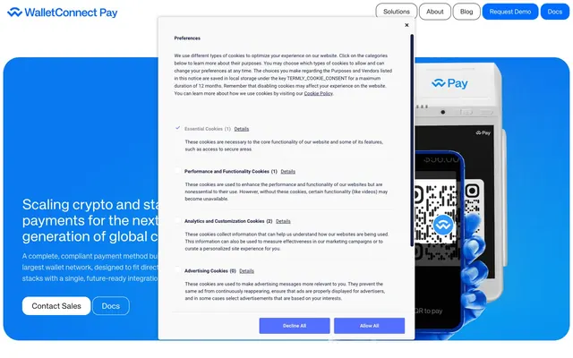
Preview image. Unlock full-res
Digital ledger on white marble.
Color palette
Subtle highlights, secondary background accents, light border tints
Primary links, active navigation indicators, decorative borders — creates a vibrant pull against neutral tones
Primary action button backgrounds, active states, focus rings — a bright, commanding blue for interactivity
Outlined button borders, secondary interactive accents
Hero section backgrounds, prominent accent fills for marketing elements
Page backgrounds, elevated card surfaces, body text on dark backgrounds
Default card backgrounds, subtle background distinction from canvas
Muted background for sections or tertiary cards, slight elevation distinction
Primary text, prominent headings, dark button backgrounds, focused borders
Secondary text, subtle borders, high-contrast text on light backgrounds
Medium-dark text for supporting information, input borders
Placeholder text, inactive element borders, subtle dividers
Tertiary card backgrounds, subtle borders contrasting with dark
Subtle box shadow for focus or elevation
Typography
- Weights
- 400
- Sizes
- 13px, 14px, 16px, 18px, 20px, 24px, 30px, 36px
- Line height
- 1, 1.11, 1.2, 1.33, 1.4, 1.43, 1.46, 1.5, 1.56, 1.71
- Letter spacing
- normal
- Fallback
- Inter
Primary typeface for all UI elements, headings, body text, and links. Its clean, geometric form supports readability across all sizes, driving clarity.
- Weights
- 400, 500, 700
- Sizes
- 12px, 16px, 17px
- Line height
- 1.41, 1.5, 2
- Letter spacing
- normal
- Fallback
- Roboto
Used for specific auxiliary text, such as some button labels, maintaining legibility for smaller informational notes.
- Weights
- 400
- Sizes
- 12px, 14px
- Line height
- 1.33, 1.43
- Letter spacing
- normal
- Fallback
- Fira Code
Monospaced font used for code snippets or technical details, offering clear character distinction, typically in cards.
Spacing & shape
Elevation
Components
Transparent background, 'Midnight Ink' text, no border. Used for discrete, text-based actions.
Canvas White background, 'Graphite' text, 16px border-radius, 11px vertical padding, 23px horizontal padding. A soft, approachable interactive element.
'Action Blue' background, 'Paper White' text, 3px border-radius, 10px vertical padding. This button is used sparingly to draw prominent attention to key user actions.
Canvas White background, 'Graphite' text, 'Graphite' border, 16px border-radius, 12px vertical padding, 18px horizontal padding. Offers a clear action without the strong visual weight of a filled button.
Transparent background, 0px border-radius, 0px padding-top/bottom, 8px padding-left/right. Used for structural grouping without adding visual weight.
Light Steel background, 40px top-left and top-right border-radius, 0px for bottom corners. Used for creating unique section boundaries.
Ash Gray background, 0px top-left and top-right border-radius, 40px bottom-left and bottom-right border-radius, 32px padding. Provides a visual closure to content blocks.
Transparent background, 40px border-radius, no shadow, no padding. Used for imagery or graphical elements that need a soft container.
Transparent background, 'Canvas White' text, 'Silver Mist' border, 16px border-radius, 12.5px vertical padding, 13px horizontal padding. Provides a clear, modern input area.
Paper White background, 16px padding-left/right, 40px border-radius, with a subtle 'Focus Shadow' (rgba(0, 0, 0, 0.3) 0px 0px 8px 0px). Provides a temporary overlay context.
Transparent background, 'Graphite' text, 0px border-radius, 15px padding. Used for unobtrusive categorization or status indicators.
Guidelines
- Prioritize 'Canvas White' (#ffffff) and 'Paper White' (#f9f9f9) for primary backgrounds to maintain a bright, open aesthetic.
- Use 'Action Blue' (#4672ff) exclusively for primary call-to-action button backgrounds and active states to ensure high impact and clarity.
- Employ 'KHTeka' font for all primary text elements, adjusting weight and size to establish hierarchy as defined in the type scale.
- Apply a 16px border-radius for all interactive elements like buttons and input fields to maintain visual consistency.
- Maintain a comfortable information density using an 8px 'elementGap' for most horizontal and vertical spacing between UI elements.
- Use 'Midnight Ink' (#1b2045) for secondary text and subtle borders to create distinction without over-saturating the interface with dark tones.
- Utilize a page max-width of 1600px, centering content within this constraint to provide ample breathing room and consistent layout.
- Do not introduce new saturated colors outside the defined blue palette in primary UI elements; reserve them for specific content or imagery.
- Avoid using heavy drop shadows for elevation; instead, rely on subtle background color shifts and the single 'Focus Shadow' for distinction.
- Do not deviate from the specified border-radii; the 3px default, 16px for interactive elements, and 40px for large rounded elements are critical to the brand's shape language.
- Refrain from using `Roboto` or `KHTekaMono` for headings or extensive body copy; their roles are specific and should not be expanded.
- Do not use generic gray tones for borders or accents where a 'Sky Blue' (#cce2ff) or 'Azure Blue' (#006cff) could reinforce brand identity.
- Avoid tight, constrained layouts; aim for a comfortable density with ample whitespace, especially around content blocks and sections.
- Do not use text decoration (underline) on standard body links; reserve it for specific interactive states or functional UI elements.
About this system
ShowHide
WalletConnect's design system evokes a digital ledger on a crisp white backdrop, emphasizing clarity and efficient data display. A vibrant spectrum of blues serves as the brand accent, signaling interactive elements and critical information without visual clutter. Typography is precise and utilitarian, supporting the feeling of a clean, functional interface where content takes precedence. Components are lightweight with subtle radii, avoiding heavy shadows or ornate flourishes to maintain an uncluttered visual plane.
The page employs a max-width 1600px centered layout for content, but the hero section often uses full-bleed backgrounds often featuring gradients to establish a rich initial visual. Sections typically alternate between white '#ffffff' and light gray '#e9e9e9' or '#bbbbbb' backgrounds, creating a clear visual rhythm. Content is arranged in alternating text-left/image-right or image-left/text-right patterns, alongside centered stacks for calls to action and descriptive paragraphs. A notable feature is the use of rounded edge cards for distinct top and bottom section boundaries. The navigation is a sticky top bar with ghost buttons and a prominent 'Request Demo' button. Overall density is comfortable, with generous vertical spacing between sections.
The imagery style is product-focused, featuring tightly cropped product shots of abstract devices displaying QR codes and digital interfaces, often set against brand-blue backgrounds. Photography uses high-key lighting for clarity, positioning the object as the hero without lifestyle context. Illustrations are minimal, with a clean, vector-based style. Icons are primarily outlined or subtle fills, contributing to the lightweight UI aesthetic. The visual density heavily favors UI elements and text, with imagery serving as clear, direct product showcasing rather than decorative atmosphere.
Reminiscent of Stripe, Ramp, Mercury, Checkout.com.
# WalletConnect — Style Reference
> Digital ledger on white marble.

**Theme:** light

**Site:** https://walletconnect.com

WalletConnect's design system evokes a digital ledger on a crisp white backdrop, emphasizing clarity and efficient data display. A vibrant spectrum of blues serves as the brand accent, signaling interactive elements and critical information without visual clutter. Typography is precise and utilitarian, supporting the feeling of a clean, functional interface where content takes precedence. Components are lightweight with subtle radii, avoiding heavy shadows or ornate flourishes to maintain an uncluttered visual plane.

## Tokens — Colors

| Name | Value | Token | Role |
|------|------|------|------|
| Sky Blue | `#cce2ff` | `--color-sky-blue` | Subtle highlights, secondary background accents, light border tints |
| Azure Blue | `#006cff` | `--color-azure-blue` | Primary links, active navigation indicators, decorative borders — creates a vibrant pull against neutral tones |
| Action Blue | `#4672ff` | `--color-action-blue` | Primary action button backgrounds, active states, focus rings — a bright, commanding blue for interactivity |
| Bright Blue | `#66a7ff` | `--color-bright-blue` | Outlined button borders, secondary interactive accents |
| Sky Burst Radial | `#099ff0` | `--color-sky-burst-radial` | Hero section backgrounds, prominent accent fills for marketing elements |
| Canvas White | `#ffffff` | `--color-canvas-white` | Page backgrounds, elevated card surfaces, body text on dark backgrounds |
| Paper White | `#f9f9f9` | `--color-paper-white` | Default card backgrounds, subtle background distinction from canvas |
| Ash Gray | `#e9e9e9` | `--color-ash-gray` | Muted background for sections or tertiary cards, slight elevation distinction |
| Graphite | `#202020` | `--color-graphite` | Primary text, prominent headings, dark button backgrounds, focused borders |
| Midnight Ink | `#1b2045` | `--color-midnight-ink` | Secondary text, subtle borders, high-contrast text on light backgrounds |
| Slate Gray | `#4f4f4f` | `--color-slate-gray` | Medium-dark text for supporting information, input borders |
| Silver Mist | `#787878` | `--color-silver-mist` | Placeholder text, inactive element borders, subtle dividers |
| Light Steel | `#bbbbbb` | `--color-light-steel` | Tertiary card backgrounds, subtle borders contrasting with dark |
| Focus Shadow | `#b3b3b3` | `--color-focus-shadow` | Subtle box shadow for focus or elevation |

## Tokens — Typography

### KHTeka
- **Substitute:** Inter
- **Weights:** 400
- **Sizes:** 13px, 14px, 16px, 18px, 20px, 24px, 30px, 36px
- **Line height:** 1, 1.11, 1.2, 1.33, 1.4, 1.43, 1.46, 1.5, 1.56, 1.71
- **Letter spacing:** normal
- **Role:** Primary typeface for all UI elements, headings, body text, and links. Its clean, geometric form supports readability across all sizes, driving clarity.

### Roboto
- **Substitute:** Roboto
- **Weights:** 400, 500, 700
- **Sizes:** 12px, 16px, 17px
- **Line height:** 1.41, 1.5, 2
- **Letter spacing:** normal
- **Role:** Used for specific auxiliary text, such as some button labels, maintaining legibility for smaller informational notes.

### KHTekaMono
- **Substitute:** Fira Code
- **Weights:** 400
- **Sizes:** 12px, 14px
- **Line height:** 1.33, 1.43
- **Letter spacing:** normal
- **Role:** Monospaced font used for code snippets or technical details, offering clear character distinction, typically in cards.

## Tokens — Type Scale

Perfect Fourth (1.333) from 14px base.

| Role | Size | Line height | Letter spacing |
|------|------|------|------|
| caption | 12px | 1.33 | — |
| body | 14px | 1.71 | — |
| heading | 18px | 1.4 | — |
| heading-lg | 20px | 1.33 | — |
| display | 36px | 1 | — |

## Tokens — Spacing

- **Max width:** 1600px
- **Section gap:** 32px
- **Card padding:** 12px
- **Element gap:** 8px

## Tokens — Radius

- **Default:** 3px
- **heroElement:** 40px
- **interactive:** 16px

## Tokens — Elevation

- **Card (Dialog/Toast):** `rgba(0, 0, 0, 0.3) 0px 0px 8px 0px`

## Layout

The page employs a max-width 1600px centered layout for content, but the hero section often uses full-bleed backgrounds often featuring gradients to establish a rich initial visual. Sections typically alternate between white '#ffffff' and light gray '#e9e9e9' or '#bbbbbb' backgrounds, creating a clear visual rhythm. Content is arranged in alternating text-left/image-right or image-left/text-right patterns, alongside centered stacks for calls to action and descriptive paragraphs. A notable feature is the use of rounded edge cards for distinct top and bottom section boundaries. The navigation is a sticky top bar with ghost buttons and a prominent 'Request Demo' button. Overall density is comfortable, with generous vertical spacing between sections.

## Imagery

The imagery style is product-focused, featuring tightly cropped product shots of abstract devices displaying QR codes and digital interfaces, often set against brand-blue backgrounds. Photography uses high-key lighting for clarity, positioning the object as the hero without lifestyle context. Illustrations are minimal, with a clean, vector-based style. Icons are primarily outlined or subtle fills, contributing to the lightweight UI aesthetic. The visual density heavily favors UI elements and text, with imagery serving as clear, direct product showcasing rather than decorative atmosphere.

## Components

### Ghost Navigation Button
*Top navigation links, secondary calls to action.*

Transparent background, 'Midnight Ink' text, no border. Used for discrete, text-based actions.

### Default Small Button
*General purpose action button.*

Canvas White background, 'Graphite' text, 16px border-radius, 11px vertical padding, 23px horizontal padding. A soft, approachable interactive element.

### Primary Action Button (Filled)
*Main call to action.*

'Action Blue' background, 'Paper White' text, 3px border-radius, 10px vertical padding. This button is used sparingly to draw prominent attention to key user actions.

### Outline CTA Button
*Secondary call to action.*

Canvas White background, 'Graphite' text, 'Graphite' border, 16px border-radius, 12px vertical padding, 18px horizontal padding. Offers a clear action without the strong visual weight of a filled button.

### Subtle Padding Card
*Generic card for content regions.*

Transparent background, 0px border-radius, 0px padding-top/bottom, 8px padding-left/right. Used for structural grouping without adding visual weight.

### Rounded Edge Card (Top)
*Visually distinct card for section headers or feature blocks.*

Light Steel background, 40px top-left and top-right border-radius, 0px for bottom corners. Used for creating unique section boundaries.

### Rounded Edge Card (Bottom)
*Visually distinct card for section footers or related content.*

Ash Gray background, 0px top-left and top-right border-radius, 40px bottom-left and bottom-right border-radius, 32px padding. Provides a visual closure to content blocks.

### Rounded Corner Card
*General content card.*

Transparent background, 40px border-radius, no shadow, no padding. Used for imagery or graphical elements that need a soft container.

### Input Field
*User input for forms.*

Transparent background, 'Canvas White' text, 'Silver Mist' border, 16px border-radius, 12.5px vertical padding, 13px horizontal padding. Provides a clear, modern input area.

### Toast/Dialog Card
*Temporary information display, such as cookie preferences.*

Paper White background, 16px padding-left/right, 40px border-radius, with a subtle 'Focus Shadow' (rgba(0, 0, 0, 0.3) 0px 0px 8px 0px). Provides a temporary overlay context.

### Badge (Text Only)
*Informational labels.*

Transparent background, 'Graphite' text, 0px border-radius, 15px padding. Used for unobtrusive categorization or status indicators.

## Guidelines

### Do

- Prioritize 'Canvas White' (#ffffff) and 'Paper White' (#f9f9f9) for primary backgrounds to maintain a bright, open aesthetic.
- Use 'Action Blue' (#4672ff) exclusively for primary call-to-action button backgrounds and active states to ensure high impact and clarity.
- Employ 'KHTeka' font for all primary text elements, adjusting weight and size to establish hierarchy as defined in the type scale.
- Apply a 16px border-radius for all interactive elements like buttons and input fields to maintain visual consistency.
- Maintain a comfortable information density using an 8px 'elementGap' for most horizontal and vertical spacing between UI elements.
- Use 'Midnight Ink' (#1b2045) for secondary text and subtle borders to create distinction without over-saturating the interface with dark tones.
- Utilize a page max-width of 1600px, centering content within this constraint to provide ample breathing room and consistent layout.

### Don't

- Do not introduce new saturated colors outside the defined blue palette in primary UI elements; reserve them for specific content or imagery.
- Avoid using heavy drop shadows for elevation; instead, rely on subtle background color shifts and the single 'Focus Shadow' for distinction.
- Do not deviate from the specified border-radii; the 3px default, 16px for interactive elements, and 40px for large rounded elements are critical to the brand's shape language.
- Refrain from using `Roboto` or `KHTekaMono` for headings or extensive body copy; their roles are specific and should not be expanded.
- Do not use generic gray tones for borders or accents where a 'Sky Blue' (#cce2ff) or 'Azure Blue' (#006cff) could reinforce brand identity.
- Avoid tight, constrained layouts; aim for a comfortable density with ample whitespace, especially around content blocks and sections.
- Do not use text decoration (underline) on standard body links; reserve it for specific interactive states or functional UI elements.

## Agent Prompt Guide

Quick Color Reference:
text: #202020
background: #ffffff
border: #1b2045
accent: #006cff
primary action: #4672ff (filled action)

Example Component Prompts:
Create a Primary Action Button: #4672ff background, #ffffff text, 9999px radius, compact pill padding. Use this filled treatment for the main CTA.
Create a standard content card: 'Paper White' (#f9f9f9) background, 12px padding, 0px border-radius. Headline is 'KHTeka' 20px, #202020. Body text 'KHTeka' 14px, #1b2045.
Create an input field: transparent background, 'Silver Mist' (#787878) border, 16px border-radius, 12.5px vertical padding, 13px horizontal padding. Placeholder text is 'Silver Mist' 'KHTeca' 14px, weight 400.
Create a ghost navigation item: 'Midnight Ink' (#1b2045) text, no background, no border. Text is 'KHTeka' 16px, weight 400. On hover, text color changes to 'Azure Blue' (#006cff).
More like this









Keep what you find
A free account saves references to boards and can send you a weekly email of picks based on what you save.
To see every result, go Pro.