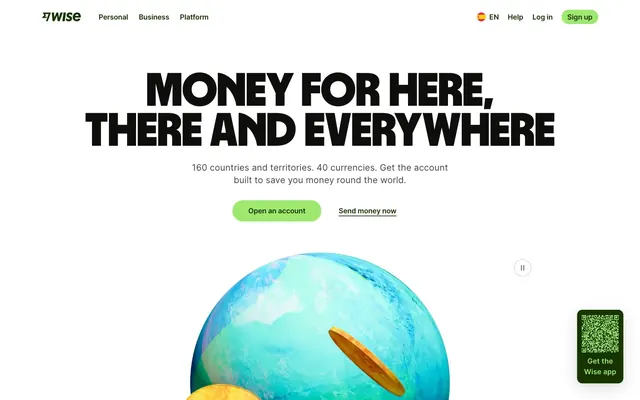
Preview image. Unlock full-res
Vibrant Fintech Authority; a financial system in bold green and crisp black on a pristine white canvas.
Color palette
Primary brand color for text links, navigation items, selected states, and dark green elements within the UI.
Vivid red filling for specific illustrations or icons.
Specific illustration details, rare accent.
Specific illustration details, rare accent.
Darker green accents within cards or icons.
Coin illustrations, specific accents.
Call-to-action buttons, interactive accents, success indicators. Its vivid hue provides clear visual affordance.
Page and section backgrounds, primary surfaces for content.
Primary heading text, interactive element text, high-contrast UI details.
Body text, secondary headings, default icon color.
Subtle background for UI blocks, secondary card surfaces, borders.
Disabled states, subtle borders around inputs and buttons, placeholder text.
Tertiary text, less prominent UI elements.
Soft accent background, often for celebratory or informational sections. Suggests a cool, clean environment.
Informational badges, secondary links, and icons where a cooler blue tone is preferred over green for thematic variation.
Error messages, warnings, critical state indicators. A vivid, immediate call for attention.
Typography
- Weights
- 400, 500, 600, 700
- Sizes
- 12px, 14px, 16px, 18px, 20px, 22px, 25px, 36px, 45px, 61px, 300px
- Line height
- 0.72, 1, 1.1, 1.25, 1.3, 1.4, 1.43, 1.44, 1.5, 1.55, 1.63, 1.71, 1.86, 2.17
- Letter spacing
- 0.005, 0.005, -0.003, -0.005, -0.006, -0.007, -0.008, -0.009, -0.011, -0.015, -0.03
- Fallback
- system-ui, sans-serif
General body text, navigation, buttons, and smaller headings. Its high legibility and wide range of weights support all secondary content.
- Weights
- 400, 900
- Sizes
- 40px, 52px, 59px, 89px, 105px, 300px
- Line height
- 0.85, 1.5
- Letter spacing
- -0.002, -0.002
Display and prominent headings. The custom font provides a distinctive brand voice with its strong, expanded letterforms, making headlines assertive without being aggressive.
- Weights
- 400
- Sizes
- 300px
monospace — detected in extracted data but not described by AI
- Weights
- 400
- Sizes
- 300px
sans-serif — detected in extracted data but not described by AI
Spacing & shape
Elevation
Components
Background: Lime Accent (#9fe870), Text: Forest Green (#163300), Border: 1px transparent, Radius: 9999px, Padding: 11px vertical, 24px horizontal. Delivers immediate visual action.
Background: transparent, Text: Forest Green (#163300), Border: 1px transparent, Radius: 9999px, Padding: 11px vertical, 24px horizontal. Used for less prominent actions, integrating seamlessly with text content.
Background: transparent, Text: Forest Green (#163300), Border: 1px solid Forest Green (#163300), Radius: 9999px, Padding: 8px vertical, 9.38462px horizontal. Provides a subtle interactive element with a clear boundary.
Background: Canvas White (#ffffff), Text: Slate Text (#454745), Border: 1px solid rgba(14, 15, 12, 0.12), Radius: 50%, Padding: 0px. Used for standalone icons or small interactive elements like pagination controls.
Background: transparent, Border: none, Shadow: none, Radius: 0px, Padding: 0px. Used for displaying collections of items, often with internal spacing creating structure.
Background: Canvas White (#ffffff), Border: none, Shadow: none, Radius: 28.1539px, Padding: 37.5385px vertical, 28.1539px horizontal. Used for drawing attention to specific content blocks with a softer visual appeal.
Background: Forest Green (#163300), Border: none, Shadow: none, Radius: 37.5385px, Padding: 75.0769px vertical, 56.3076px horizontal. Acts as a high-contrast container for key messages or calls to value.
Background: transparent, Text: Ink Black (#0e0f0c), Border: 1px solid transparent, Radius: 10px, Padding: 12px vertical, 16px horizontal. Focus state likely indicated by a border.
Background: Lime Accent (#9fe870), Text: Forest Green (#163300), Radius: 16px, Padding: 0px vertical, 16px horizontal. Used for active states or small feature flags.
Background: transparent, Text: Forest Green (#163300), Radius: 16px, Padding: 0px vertical, 16px horizontal. For subtler categorization or descriptors.
Guidelines
- Use Wise Sans at weight 900 for all large page headings to preserve the brand's bold, condensed voice.
- Apply Lime Accent (#9fe870) exclusively to primary call-to-action buttons and interactive elements to maintain its distinction.
- Set text links to Forest Green (#163300) to ensure interactive elements are clearly marked, matching the brand's primary color.
- Employ a 9999px border-radius for all primary buttons and interactive tags to provide a consistent modern and approachable feel.
- Use Canvas White (#ffffff) as the dominant background color for all primary content sections to ensure high contrast and readability.
- Implement an 8px element gap for standard spacing between UI elements like buttons and icons for a comfortable density.
- Do not use Forest Green (#163300) as a background for non-interactive elements, as it's reserved for brand highlights and interactive text.
- Avoid using sharp corners on interactive buttons; all primary action buttons should use the 9999px pill radius.
- Do not deviate from the Inter font for body text and secondary content, as it is crucial for legibility and information hierarchy.
- Avoid applying excessive shadows; visual depth is primarily achieved through surface color variations and clear layout, with subtle shadow only for occasional emphasis.
- Do not use less than 11px padding for primary buttons; maintain the established 11px vertical and 24px horizontal padding for consistent actionability.
- Do not introduce additional vivid accent colors; the Lime Accent (#9fe870) and Deep Teal (#0b4c72) serve distinct purposes and should not be diluted.
About this system
ShowHide
The Wise design system feels like an assured and straightforward financial platform, built on stark contrasts and an unwavering accent color. The primary palette of deep forest green, near-black, and bright white creates a dynamic and trustworthy visual identity. Heavy, condensed sans-serif headings anchor information with a no-nonsense tone, while clear, readable body text maintains legibility. Deliberately rounded corners on interactive elements provide a touch of modern approachability against otherwise sharp UI elements, emphasizing ease of use within a rigorous financial context.
The page model is primarily max-width contained, with a few full-bleed sections. The hero section features a large, centered headline over a background that integrates a striking 3D graphic. Section rhythm alternates between full-width content blocks and contained content, maintaining consistent vertical spacing. Content is generally arranged in centered stacks for headings and subtext, transitioning to multi-column grids (like a 3-column country flag grid) for features and lists. The navigation is a sticky top bar, providing persistent access to core links and CTAs. The overall density is comfortable, ensuring sufficient breathing room around content.
The visual language focuses on a mix of abstract 3D elements and functional iconography. Large, stylized 3D coin and globe illustrations are used in hero sections, providing a unique, playful yet sophisticated brand identity related to finance. Product screenshots are used sparingly to show app interfaces. Iconography is clean, outlined, and monochromatic, primarily using Ink Black or Forest Green, serving an explanatory and navigational role. Images generally exist in isolation or within content blocks, avoiding full-bleed photography. The density is image-heavy in hero sections, transitioning to text-dominant with supporting icons in content areas.
Reminiscent of Revolut, Monzo, N26, Stripe.
# Wise — Style Reference
> Vibrant Fintech Authority; a financial system in bold green and crisp black on a pristine white canvas.

**Theme:** light

**Site:** https://wise.com

The Wise design system feels like an assured and straightforward financial platform, built on stark contrasts and an unwavering accent color. The primary palette of deep forest green, near-black, and bright white creates a dynamic and trustworthy visual identity. Heavy, condensed sans-serif headings anchor information with a no-nonsense tone, while clear, readable body text maintains legibility. Deliberately rounded corners on interactive elements provide a touch of modern approachability against otherwise sharp UI elements, emphasizing ease of use within a rigorous financial context.

## Tokens — Colors

| Name | Value | Token | Role |
|------|------|------|------|
| Forest Green | `#163300` | `--color-forest-green` | Primary brand color for text links, navigation items, selected states, and dark green elements within the UI. |
| Rich Red | `#ef253b` | `--color-rich-red` | Vivid red filling for specific illustrations or icons. |
| Violet Tint | `#221d9a` | `--color-violet-tint` | Specific illustration details, rare accent. |
| Warm Orange | `#ff7700` | `--color-warm-orange` | Specific illustration details, rare accent. |
| Deep Emerald | `#054d28` | `--color-deep-emerald` | Darker green accents within cards or icons. |
| Gold Yellow | `#ffd300` | `--color-gold-yellow` | Coin illustrations, specific accents. |
| Lime Accent | `#9fe870` | `--color-lime-accent` | Call-to-action buttons, interactive accents, success indicators. Its vivid hue provides clear visual affordance. |
| Canvas White | `#ffffff` | `--color-canvas-white` | Page and section backgrounds, primary surfaces for content. |
| Ink Black | `#0e0f0c` | `--color-ink-black` | Primary heading text, interactive element text, high-contrast UI details. |
| Slate Text | `#454745` | `--color-slate-text` | Body text, secondary headings, default icon color. |
| Ash Gray | `#e8ebe6` | `--color-ash-gray` | Subtle background for UI blocks, secondary card surfaces, borders. |
| Muted Grey | `#868685` | `--color-muted-grey` | Disabled states, subtle borders around inputs and buttons, placeholder text. |
| Ghost Gray | `#6a6c6a` | `--color-ghost-gray` | Tertiary text, less prominent UI elements. |
| Ambient Cyan | `#ecf9f9` | `--color-ambient-cyan` | Soft accent background, often for celebratory or informational sections. Suggests a cool, clean environment. |
| Deep Teal | `#0b4c72` | `--color-deep-teal` | Informational badges, secondary links, and icons where a cooler blue tone is preferred over green for thematic variation. |
| Alert Red | `#cb272f` | `--color-alert-red` | Error messages, warnings, critical state indicators. A vivid, immediate call for attention. |

## Tokens — Typography

### Inter
- **Substitute:** system-ui, sans-serif
- **Weights:** 400, 500, 600, 700
- **Sizes:** 12px, 14px, 16px, 18px, 20px, 22px, 25px, 36px, 45px, 61px, 300px
- **Line height:** 0.72, 1, 1.1, 1.25, 1.3, 1.4, 1.43, 1.44, 1.5, 1.55, 1.63, 1.71, 1.86, 2.17
- **Letter spacing:** 0.005, 0.005, -0.003, -0.005, -0.006, -0.007, -0.008, -0.009, -0.011, -0.015, -0.03
- **Role:** General body text, navigation, buttons, and smaller headings. Its high legibility and wide range of weights support all secondary content.

### Wise Sans
- **Weights:** 400, 900
- **Sizes:** 40px, 52px, 59px, 89px, 105px, 300px
- **Line height:** 0.85, 1.5
- **Letter spacing:** -0.002, -0.002
- **Role:** Display and prominent headings. The custom font provides a distinctive brand voice with its strong, expanded letterforms, making headlines assertive without being aggressive.

### monospace
- **Weights:** 400
- **Sizes:** 300px
- **Role:** monospace — detected in extracted data but not described by AI

### sans-serif
- **Weights:** 400
- **Sizes:** 300px
- **Role:** sans-serif — detected in extracted data but not described by AI

## Tokens — Type Scale

Major Third (1.25) from 16px base.

| Role | Size | Line height | Letter spacing |
|------|------|------|------|
| caption | 12px | 1.44 | 0.005em |
| body-sm | 14px | 1.43 | 0.005em |
| body | 16px | 1.5 | -0.003em |
| subheading | 18px | 1.55 | -0.005em |
| heading-sm | 20px | 1.4 | -0.006em |
| heading-lg | 25px | 1.25 | -0.008em |
| display-sm | 36px | 1.1 | -0.009em |
| display | 45px | 1.1 | -0.011em |
| display-lg | 61px | 1 | -0.015em |
| display-xl | 89px | 0.85 | -0.002em |

## Tokens — Spacing

- **Section gap:** 32px
- **Card padding:** 28px
- **Element gap:** 8px

## Tokens — Radius

- **Default:** 10px
- **card-lg:** 28.1539px
- **card-md:** 18.7693px
- **card-xl:** 37.5385px
- **full:** 1000px
- **none:** 0px
- **pill:** 9999px
- **sm:** 2px

## Tokens — Elevation

- **Input/Button focus:** `rgb(134, 134, 133) 0px 0px 0px 1px inset`
- **Card Overlay:** `rgba(0, 0, 0, 0.15) 0px 10px 32px 0px, rgba(0, 0, 0, 0.04) 0px 40px 40px 0px`
- **Small Card Shadow:** `rgba(0, 0, 0, 0.08) 0px 6px 20px 0px`
- **Navigation:** `rgba(14, 15, 12, 0.12) 0px 0px 0px 1px`

## Layout

The page model is primarily max-width contained, with a few full-bleed sections. The hero section features a large, centered headline over a background that integrates a striking 3D graphic. Section rhythm alternates between full-width content blocks and contained content, maintaining consistent vertical spacing. Content is generally arranged in centered stacks for headings and subtext, transitioning to multi-column grids (like a 3-column country flag grid) for features and lists. The navigation is a sticky top bar, providing persistent access to core links and CTAs. The overall density is comfortable, ensuring sufficient breathing room around content.

## Imagery

The visual language focuses on a mix of abstract 3D elements and functional iconography. Large, stylized 3D coin and globe illustrations are used in hero sections, providing a unique, playful yet sophisticated brand identity related to finance. Product screenshots are used sparingly to show app interfaces. Iconography is clean, outlined, and monochromatic, primarily using Ink Black or Forest Green, serving an explanatory and navigational role. Images generally exist in isolation or within content blocks, avoiding full-bleed photography. The density is image-heavy in hero sections, transitioning to text-dominant with supporting icons in content areas.

## Components

### Primary Filled Button
*Call to action*

Background: Lime Accent (#9fe870), Text: Forest Green (#163300), Border: 1px transparent, Radius: 9999px, Padding: 11px vertical, 24px horizontal. Delivers immediate visual action.

### Secondary Ghost Button
*Secondary action (text only)*

Background: transparent, Text: Forest Green (#163300), Border: 1px transparent, Radius: 9999px, Padding: 11px vertical, 24px horizontal. Used for less prominent actions, integrating seamlessly with text content.

### Outlined Pill Button
*Tertiary action*

Background: transparent, Text: Forest Green (#163300), Border: 1px solid Forest Green (#163300), Radius: 9999px, Padding: 8px vertical, 9.38462px horizontal. Provides a subtle interactive element with a clear boundary.

### Circular Icon Button
*Decorative/Functional*

Background: Canvas White (#ffffff), Text: Slate Text (#454745), Border: 1px solid rgba(14, 15, 12, 0.12), Radius: 50%, Padding: 0px. Used for standalone icons or small interactive elements like pagination controls.

### Base Card
*Informational grouping*

Background: transparent, Border: none, Shadow: none, Radius: 0px, Padding: 0px. Used for displaying collections of items, often with internal spacing creating structure.

### Rounded Informational Card
*Featured content*

Background: Canvas White (#ffffff), Border: none, Shadow: none, Radius: 28.1539px, Padding: 37.5385px vertical, 28.1539px horizontal. Used for drawing attention to specific content blocks with a softer visual appeal.

### Dark Featured Card
*Prominent promotional content*

Background: Forest Green (#163300), Border: none, Shadow: none, Radius: 37.5385px, Padding: 75.0769px vertical, 56.3076px horizontal. Acts as a high-contrast container for key messages or calls to value.

### Text Input
*User data entry*

Background: transparent, Text: Ink Black (#0e0f0c), Border: 1px solid transparent, Radius: 10px, Padding: 12px vertical, 16px horizontal. Focus state likely indicated by a border.

### Accent Badge
*Highlight/Tag*

Background: Lime Accent (#9fe870), Text: Forest Green (#163300), Radius: 16px, Padding: 0px vertical, 16px horizontal. Used for active states or small feature flags.

### Ghost Badge
*Informational tag*

Background: transparent, Text: Forest Green (#163300), Radius: 16px, Padding: 0px vertical, 16px horizontal. For subtler categorization or descriptors.

## Guidelines

### Do

- Use Wise Sans at weight 900 for all large page headings to preserve the brand's bold, condensed voice.
- Apply Lime Accent (#9fe870) exclusively to primary call-to-action buttons and interactive elements to maintain its distinction.
- Set text links to Forest Green (#163300) to ensure interactive elements are clearly marked, matching the brand's primary color.
- Employ a 9999px border-radius for all primary buttons and interactive tags to provide a consistent modern and approachable feel.
- Use Canvas White (#ffffff) as the dominant background color for all primary content sections to ensure high contrast and readability.
- Implement an 8px element gap for standard spacing between UI elements like buttons and icons for a comfortable density.

### Don't

- Do not use Forest Green (#163300) as a background for non-interactive elements, as it's reserved for brand highlights and interactive text.
- Avoid using sharp corners on interactive buttons; all primary action buttons should use the 9999px pill radius.
- Do not deviate from the Inter font for body text and secondary content, as it is crucial for legibility and information hierarchy.
- Avoid applying excessive shadows; visual depth is primarily achieved through surface color variations and clear layout, with subtle shadow only for occasional emphasis.
- Do not use less than 11px padding for primary buttons; maintain the established 11px vertical and 24px horizontal padding for consistent actionability.
- Do not introduce additional vivid accent colors; the Lime Accent (#9fe870) and Deep Teal (#0b4c72) serve distinct purposes and should not be diluted.

## Agent Prompt Guide

Quick Color Reference:
- Text: Ink Black (#0e0f0c)
- Background: Canvas White (#ffffff)
- CTA: Lime Accent (#9fe870)
- Primary Border: Muted Grey (#868685)
- Accent (Text Links): Forest Green (#163300)

Example Component Prompts:
1. Create a hero section: Canvas White (#ffffff) background. Headline 'MONEY FOR HERE, THERE AND EVERYWHERE' using Wise Sans weight 900, size 89px, line-height 0.85, letter-spacing -0.002em, color Ink Black (#0e0f0c). Subtext '160 countries...' using Inter weight 400, size 18px, line-height 1.55, letter-spacing -0.005em, color Slate Text (#454745). Primary button 'Open an account' (Primary Filled Button) and secondary link 'Send money now' (Secondary Ghost Button).
2. Create a feature card: Background Canvas White (#ffffff), Radius 28.1539px, Padding 37.5385px vertical, 28.1539px horizontal. Headline 'Trusted by millions' using Inter weight 700, size 25px, line-height 1.25, letter-spacing -0.008em, color Ink Black (#0e0f0c). Body text 'We move €14 billion...' using Inter weight 400, size 16px, line-height 1.5, letter-spacing -0.003em, color Slate Text (#454745).
3. Create a navigation bar: Background Canvas White (#ffffff), padding 12px vertical. 'Wise' logo (icon) color Forest Green (#163300). Navigation text 'Personal', 'Business', 'Platform' use Inter weight 500, size 16px, line-height 1.5, color Ink Black (#0e0f0c). Primary CTA button 'Sign up' (Primary Filled Button).
More like this








Keep what you find
A free account saves references to boards and can send you a weekly email of picks based on what you save.
To see every result, go Pro.