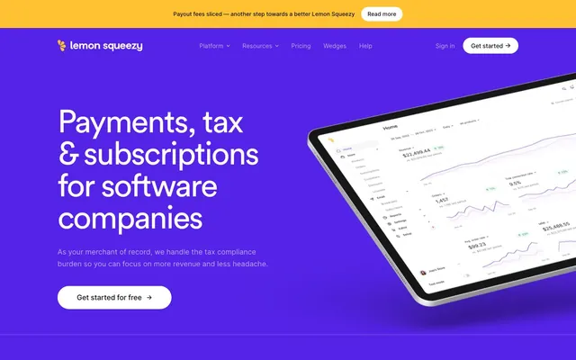
Preview image. Unlock full-res
Grape Soda & Lemon Zest. A bold purple lake with bright yellow accents floating atop.
Color palette
Primary background for hero sections and key marketing areas. Establishes a bold, energetic brand presence.
Announcement bars, secondary CTA highlights, and interactive elements. Provides a warm, high-contrast accent.
Used for distinctive highlights, potentially playful marketing elements; stands out against the core brand purple.
Base text color for all content, headings, and primary interactive elements. Offers high contrast on light backgrounds.
Page backgrounds, card surfaces, and primary text color on dark backgrounds. Ensures clarity and spaciousness.
Secondary text, descriptive elements, and subtle borders. Provides softer contrast than Midnight Ink.
Subtle background for UI elements like unselected tabs or slight surface differentiation. Near-white gray.
Subtle borders and dividers, providing visual structure without harshness.
Lightest background tint for specific UI sections, softening the pure white.
Success states and positive affirmations, particularly in buttons and cards. Conveys growth and completion.
Informational badges, interactive links, and specific button variants, offering an alternative accent to Forest Canopy.
Typography
- Weights
- 400
- Sizes
- 18px, 26px, 36px, 38px, 48px, 56px, 80px
- Line height
- 1, 1.13, 1.14, 1.2, 1.22, 1.25
- Letter spacing
- -0.04em, -0.03em, -0.02em
- Fallback
- Montserrat, Gotham
Display and headlines. The 'ss04' feature settings subtly alter character forms, giving it a distinct, confident yet approachable feel. It's used at massive sizes, with negative letter-spacing for impact, commanding attention.
- Weights
- 400, 500
- Sizes
- 14px, 15px, 16px, 18px
- Line height
- 1.29, 1.4, 1.6, 1.7, 1.8
- Letter spacing
- -0.01em, 0.143em
- Fallback
- Inter
Body copy, navigation, buttons, and detailed UI text. Its high legibility and variable letter spacing at smaller sizes make it ideal for information-dense areas.
- Weights
- 400, 500
- Sizes
- 14px, 15px, 16px, 18px
- Line height
- 1.29, 1.4, 1.6, 1.7, 1.8
- Letter spacing
- -0.01em, 0.143em
- Fallback
- Inter
Emphasized text, subheadings, and interactive elements within body copy. Provides subtle hierarchy in a cohesive family.
Spacing & shape
Components
Text: Ghost White. Background: Grape Soda (#5423e7). Border Radius: 8px. Padding: 9px top/bottom, 30px left/right. Font: Inter 400, 16px.
Text: Midnight Ink (#121217). Background: transparent. Border: 1px solid Midnight Ink (#121217). Border Radius: 8px. Padding: 9px top/bottom, 30px left/right. Font: Inter 400, 16px.
Text: Ocean Deep (#0075ad). Background: transparent. Border: 1px solid Ocean Deep (#0075ad). Border Radius: 8px. Padding: 40px all. Font: Inter 400, 16px.
Text: Forest Canopy (#1e874c). Background: transparent. Border: 1px solid Forest Canopy (#1e874c). Border Radius: 8px. Padding: 40px all. Font: Inter 400, 16px.
Text: Ghost White (#ffffff). Font: Circularpro Book 400, 80px, line-height 1.0, letter-spacing -0.04em. Background: Grape Soda (#5423e7).
Text: Midnight Ink (#121217). Font: Inter 400, 16px. No underline. Hover state not provided, but implies a slight color change or underline.
Guidelines
- Use Grape Soda (#5423e7) for strong background statements or primary branding blocks.
- Apply Lemon Zest (#ffc233) for high-impact alerts or secondary interactive elements.
- Employ Circularpro Book 400 with negative letter spacing for all headings and display text to achieve a distinctive visual voice.
- Maintain high contrast text with Midnight Ink (#121217) on light backgrounds and Ghost White (#ffffff) on dark backgrounds.
- Use Inter font for all body copy and UI elements to ensure readability across sizes, varying weights for hierarchy.
- Apply 8px border-radius consistently for all interactive buttons and smaller UI elements.
- Utilize 48px border-radius for larger, distinct elements such as feature cards or graphical containers to soften their appearance.
- Avoid using primary brand colors (Grape Soda, Lemon Zest) for extensive body copy; refer to Midnight Ink or Driftwood for readability.
- Do not use box shadows for elevation; rely on color changes and Ghost White (#ffffff) backgrounds to differentiate content blocks.
- Do not introduce additional font families; adhere strictly to Inter and Circularpro Book.
- Avoid arbitrary color choices; all chromatic colors should derive from the established brand, accent, or semantic palettes.
- Do not use generic button styles; always apply 8px radius and text/background/border combinations from the defined button variants.
- Do not add additional visual ornamentation or gradients; the design relies on bold color blocks and typographic expressiveness.
- Avoid deviating from the established spacing scale (multiples of 8px) for consistent visual rhythm.
About this system
ShowHide
This system feels like a playful, high-energy tech brand that dares to be vibrant without sacrificing clarity. The deep, rich 'Grape Soda' purple is the signature and dominant hue, creating a striking backdrop for crisp white text and clean, information-dense UIs. Bright 'Lemon Zest' yellow appears strategically as an accent, especially in the announcement bar, introducing a pop of warmth. Type is clean and authoritative with a touch of character, using generous letter spacing within headlines to balance the bold color choices.
The page primarily uses a max-width contained layout (1233px) with content centered. The hero section, however, breaks this pattern with a full-bleed Grape Soda (#5423e7) background, featuring a large, centered headline and a prominent product mockup. Section rhythm alternates between large, full-bleed color blocks (Grape Soda) and clean, white or slightly tinted (#feecfb) backgrounds for content sections. Content arrangement typically follows a clear vertical stacking or alternating two-column layout (text on left, visual/icon on right, or vice-versa). Vertical spacing between sections is generous, creating a spacious and breathable feel. Navigation is a sticky top bar with primary links and a 'Get Started' CTA, positioned on the right.
The visual language is characterized by realistic product mockups (e.g., tablet showing the dashboard UI) floating in space on vibrant brand-colored backgrounds. These are contained, sharp-edged, and serve to directly showcase product functionality rather than create an abstract mood. Icons, where visible, are simple, monochromatic, and outlined, appearing frequently in navigation or feature lists. Photography is notably absent, reinforcing the focus on the digital product itself. The overall density is text-dominant in feature sections, with hero areas relying on bold typography and a single product visual.
Reminiscent of Stripe, Framer, Notion, Linear.
# Payments — Style Reference
> Grape Soda & Lemon Zest. A bold purple lake with bright yellow accents floating atop.

**Theme:** light

**Site:** https://lemonsqueezy.com

This system feels like a playful, high-energy tech brand that dares to be vibrant without sacrificing clarity. The deep, rich 'Grape Soda' purple is the signature and dominant hue, creating a striking backdrop for crisp white text and clean, information-dense UIs. Bright 'Lemon Zest' yellow appears strategically as an accent, especially in the announcement bar, introducing a pop of warmth. Type is clean and authoritative with a touch of character, using generous letter spacing within headlines to balance the bold color choices.

## Tokens — Colors

| Name | Value | Token | Role |
|------|------|------|------|
| Grape Soda | `#5423e7` | `--color-grape-soda` | Primary background for hero sections and key marketing areas. Establishes a bold, energetic brand presence. |
| Lemon Zest | `#ffc233` | `--color-lemon-zest` | Announcement bars, secondary CTA highlights, and interactive elements. Provides a warm, high-contrast accent. |
| Bubblegum Pink | `#cf75ff` | `--color-bubblegum-pink` | Used for distinctive highlights, potentially playful marketing elements; stands out against the core brand purple. |
| Midnight Ink | `#121217` | `--color-midnight-ink` | Base text color for all content, headings, and primary interactive elements. Offers high contrast on light backgrounds. |
| Ghost White | `#ffffff` | `--color-ghost-white` | Page backgrounds, card surfaces, and primary text color on dark backgrounds. Ensures clarity and spaciousness. |
| Driftwood | `#6c6c89` | `--color-driftwood` | Secondary text, descriptive elements, and subtle borders. Provides softer contrast than Midnight Ink. |
| Parchment | `#f7f7f8` | `--color-parchment` | Subtle background for UI elements like unselected tabs or slight surface differentiation. Near-white gray. |
| Cloud Grey | `#d1d1db` | `--color-cloud-grey` | Subtle borders and dividers, providing visual structure without harshness. |
| Pink Sugar | `#feecfb` | `--color-pink-sugar` | Lightest background tint for specific UI sections, softening the pure white. |
| Forest Canopy | `#1e874c` | `--color-forest-canopy` | Success states and positive affirmations, particularly in buttons and cards. Conveys growth and completion. |
| Ocean Deep | `#0075ad` | `--color-ocean-deep` | Informational badges, interactive links, and specific button variants, offering an alternative accent to Forest Canopy. |

## Tokens — Typography

### Circularpro Book
- **Substitute:** Montserrat, Gotham
- **Weights:** 400
- **Sizes:** 18px, 26px, 36px, 38px, 48px, 56px, 80px
- **Line height:** 1, 1.13, 1.14, 1.2, 1.22, 1.25
- **Letter spacing:** -0.04em, -0.03em, -0.02em
- **Role:** Display and headlines. The 'ss04' feature settings subtly alter character forms, giving it a distinct, confident yet approachable feel. It's used at massive sizes, with negative letter-spacing for impact, commanding attention.

### Inter
- **Substitute:** Inter
- **Weights:** 400, 500
- **Sizes:** 14px, 15px, 16px, 18px
- **Line height:** 1.29, 1.4, 1.6, 1.7, 1.8
- **Letter spacing:** -0.01em, 0.143em
- **Role:** Body copy, navigation, buttons, and detailed UI text. Its high legibility and variable letter spacing at smaller sizes make it ideal for information-dense areas.

### Inter
- **Substitute:** Inter
- **Weights:** 400, 500
- **Sizes:** 14px, 15px, 16px, 18px
- **Line height:** 1.29, 1.4, 1.6, 1.7, 1.8
- **Letter spacing:** -0.01em, 0.143em
- **Role:** Emphasized text, subheadings, and interactive elements within body copy. Provides subtle hierarchy in a cohesive family.

## Tokens — Type Scale

Perfect Fourth (1.333) from 16px base.

| Role | Size | Line height | Letter spacing |
|------|------|------|------|
| caption | 14px | 1.7 | 0.143px |
| body | 16px | 1.6 | — |
| subheading | 18px | 1.8 | — |
| heading-sm | 26px | 1.25 | — |
| heading | 36px | 1.22 | -0.48px |
| heading-lg | 48px | 1.13 | -0.96px |
| display | 80px | 1 | -3.2px |

## Tokens — Spacing

- **Max width:** 1233px
- **Section gap:** 80px
- **Card padding:** 0px
- **Element gap:** 8-16px

## Tokens — Radius

- **Buttons:** 8px
- **Cards:** 48px
- **navigation:** 40px
- **other:** 20px

## Layout

The page primarily uses a max-width contained layout (1233px) with content centered. The hero section, however, breaks this pattern with a full-bleed Grape Soda (#5423e7) background, featuring a large, centered headline and a prominent product mockup. Section rhythm alternates between large, full-bleed color blocks (Grape Soda) and clean, white or slightly tinted (#feecfb) backgrounds for content sections. Content arrangement typically follows a clear vertical stacking or alternating two-column layout (text on left, visual/icon on right, or vice-versa). Vertical spacing between sections is generous, creating a spacious and breathable feel. Navigation is a sticky top bar with primary links and a 'Get Started' CTA, positioned on the right.

## Imagery

The visual language is characterized by realistic product mockups (e.g., tablet showing the dashboard UI) floating in space on vibrant brand-colored backgrounds. These are contained, sharp-edged, and serve to directly showcase product functionality rather than create an abstract mood. Icons, where visible, are simple, monochromatic, and outlined, appearing frequently in navigation or feature lists. Photography is notably absent, reinforcing the focus on the digital product itself. The overall density is text-dominant in feature sections, with hero areas relying on bold typography and a single product visual.

## Components

### Announcement Banner

### Button Group

### Feature List Section

### Primary Call to Action Button
*Primary interactive element.*

Text: Ghost White. Background: Grape Soda (#5423e7). Border Radius: 8px. Padding: 9px top/bottom, 30px left/right. Font: Inter 400, 16px.

### Outline Button - Default
*Secondary and tertiary actions.*

Text: Midnight Ink (#121217). Background: transparent. Border: 1px solid Midnight Ink (#121217). Border Radius: 8px. Padding: 9px top/bottom, 30px left/right. Font: Inter 400, 16px.

### Outline Button - Ocean Deep
*Informational or complementary actions.*

Text: Ocean Deep (#0075ad). Background: transparent. Border: 1px solid Ocean Deep (#0075ad). Border Radius: 8px. Padding: 40px all. Font: Inter 400, 16px.

### Outline Button - Forest Canopy
*Positive or confirmation actions.*

Text: Forest Canopy (#1e874c). Background: transparent. Border: 1px solid Forest Canopy (#1e874c). Border Radius: 8px. Padding: 40px all. Font: Inter 400, 16px.

### Hero Section Headline
*Main page title or key marketing message.*

Text: Ghost White (#ffffff). Font: Circularpro Book 400, 80px, line-height 1.0, letter-spacing -0.04em. Background: Grape Soda (#5423e7).

### Navigation Link
*Primary navigation items.*

Text: Midnight Ink (#121217). Font: Inter 400, 16px. No underline. Hover state not provided, but implies a slight color change or underline.

## Guidelines

### Do

- Use Grape Soda (#5423e7) for strong background statements or primary branding blocks.
- Apply Lemon Zest (#ffc233) for high-impact alerts or secondary interactive elements.
- Employ Circularpro Book 400 with negative letter spacing for all headings and display text to achieve a distinctive visual voice.
- Maintain high contrast text with Midnight Ink (#121217) on light backgrounds and Ghost White (#ffffff) on dark backgrounds.
- Use Inter font for all body copy and UI elements to ensure readability across sizes, varying weights for hierarchy.
- Apply 8px border-radius consistently for all interactive buttons and smaller UI elements.
- Utilize 48px border-radius for larger, distinct elements such as feature cards or graphical containers to soften their appearance.

### Don't

- Avoid using primary brand colors (Grape Soda, Lemon Zest) for extensive body copy; refer to Midnight Ink or Driftwood for readability.
- Do not use box shadows for elevation; rely on color changes and Ghost White (#ffffff) backgrounds to differentiate content blocks.
- Do not introduce additional font families; adhere strictly to Inter and Circularpro Book.
- Avoid arbitrary color choices; all chromatic colors should derive from the established brand, accent, or semantic palettes.
- Do not use generic button styles; always apply 8px radius and text/background/border combinations from the defined button variants.
- Do not add additional visual ornamentation or gradients; the design relies on bold color blocks and typographic expressiveness.
- Avoid deviating from the established spacing scale (multiples of 8px) for consistent visual rhythm.

## Agent Prompt Guide

### Quick Color Reference
- **Text Primary:** #121217 (Midnight Ink)
- **Background Primary:** #ffffff (Ghost White)
- **CTA Background:** #5423e7 (Grape Soda)
- **CTA Text:** #ffffff (Ghost White)
- **Accent:** #ffc233 (Lemon Zest)
- **Border:** #121217 (Midnight Ink) for outlined buttons

### Example Component Prompts
1. **Create a Hero Section:** Full-bleed Grape Soda (#5423e7) background. Centered headline 'Payments, tax & subscriptions for software companies' using Circularpro Book 400, 80px, line-height 1.0, letter-spacing -3.2px, in Ghost White (#ffffff). Sub-text 'As your merchant of record...' using Inter 400, 18px, line-height 1.8, in Ghost White (#ffffff). Primary Call to Action button ('Get started for free') with Grape Soda background, Ghost White text, 8px radius, 9px top/bottom, 30px left/right padding.
2. **Generate an Announcement Bar:** Background Lemon Zest (#ffc233). Text 'Payout fees sliced — another step towards a better Lemon Squeezy Read more' using Inter 400, 14px, #121217. Height for content is 40px with 16px left/right padding.
3. **Design a Feature Card:** Ghost White (#ffffff) background, with 48px border-radius. Headline 'Global tax compliance' using Circularpro Book 400, 26px, line-height 1.25, #121217. Body text 'We’re your merchant of record...' using Inter 400, 16px, line-height 1.6, #6c6c89. No box-shadow.
4. **Create a Secondary Outline Button:** 'Explore the API' using Inter 400, 16px, #0075ad. Transparent background. 1px solid #0075ad border. 8px border-radius. 9px top/bottom, 30px left/right padding.
More like this








Keep what you find
A free account saves references to boards and can send you a weekly email of picks based on what you save.
To see every result, go Pro.