Preview image. Unlock full-res
Childhood doodle sketchbook
Color palette
Primary action background, active state accent, secondary surface treatments — the key optimistic brand color. Its vibrancy makes interactive elements feel distinct
Decorative background fills for visual sections or product showcases — a rich, cool tone that complements the playful primary yellow
Decorative background fills for visual sections or product showcases — a grounding, earthy hue
Decorative background fills for visual sections or product showcases — a strong, warm accent
Page backgrounds, muted borders, subtle surface accents — a near-white canvas allowing product illustrations to be the focal point
Primary text, headings, prominent borders, filled button backgrounds. The core dark for high contrast
Button borders for ghost buttons, subtle dividers. A softer boundary than direct black
Secondary body text, price listings, less prominent textual elements — a gentle contrast against the canvas
Typography
- Weights
- 500
- Sizes
- 15px
- Line height
- 1
- Letter spacing
- -0.02
ts-unused — detected in extracted data but not described by AI
- Weights
- 400, 500
- Sizes
- 15px, 24px, 25px, 95px
- Line height
- 1, 1.2, 1.35
- Letter spacing
- -0.6, -0.3, 1
- Fallback
- Inter
Primary brand typeface for headings, body text, and interactive elements. Its custom nature provides a unique friendly yet authoritative feel. Weight 400 is common for body text (15px), while larger headings use 500 (25px, 95px) with tighter letter spacing for impact. The generous letter spacing for 24px text softens the content.
- Weights
- 400
- Sizes
- 16px
- Line height
- 1
- Letter spacing
- -0.3
- Fallback
- Inter
Used for specific body text elements, likely a display-focused variation. Its tight letter spacing (-0.019em) creates a compact, refined appearance, contrasting with the slightly more open Macan.
- Weights
- 400
- Sizes
- 15px
- Line height
- 1.5
- Letter spacing
- -0.02
GTStandard-M — detected in extracted data but not described by AI
Spacing & shape
Components
Transparent background (rgba(0, 0, 0, 0)), Ink Black text (#000000). Features a subtle Muted Ash (#bbbab7) border of 1px, with 30px border-radius. Padding is 11px vertical, 14px horizontal.
Filled with Crayon Yellow (#ecca53) background and Ink Black (#000000) text. Has a 30px border-radius. Padding is 11px vertical, 14px horizontal.
Transparent background (rgba(0, 0, 0, 0)), Ink Black (#000000) text. Features a 1px Ink Black (#000000) border with a 30px border-radius. Padding is 11px vertical, 14px horizontal.
Solid Ink Black (#000000) background with white text. Features a sharp 0px border-radius. Generous horizontal padding of 48px.
Background is Canvas (#e5e7eb) with no explicit border or shadow (relying on implied spacing from Canvas background). Product titles use Macan Medium (weight 500) at 15px, and prices use Graphite (#8d8c8a) at 15px. Internal element spacing between title and price is roughly 15px.
Guidelines
- Use Canvas (#e5e7eb) as the primary background for all page sections and underlying surfaces.
- Apply a 30px border-radius to all buttons and input fields to maintain a soft, approachable feel, unless explicitly overridden for a specific component variation.
- Utilize Ink Black (#000000) for all primary text, headings, and significant interactive text, ensuring high contrast against light backgrounds.
- Employ Crayon Yellow (#ecca53) exclusively for primary calls-to-action or active states, making these elements distinct and energetic.
- Maintain a clear elementGap of 22px between logically grouped UI elements, and a sectionGap of 60px between major content blocks.
- Prioritize Macan for all textual content, using weight 400 for body text and weight 500 for larger headlines.
- Ensure all interactive fields and ghost buttons feature a 1px border using Muted Ash (#bbbab7) or Ink Black (#000000).
- Do not use Crayon Yellow (#ecca53) for decorative purposes or text that is not a primary action or active state indication.
- Avoid harsh, angular corners; always prefer the defined 30px border-radius for interactive elements unless a specific component variant dictates otherwise (e.g., the Full-Width Primary Button).
- Do not introduce new border colors or weights; stick to 1px Ink Black (#000000) or Muted Ash (#bbbab7) for borders.
- Do not introduce drop shadows for elevation; rely on spacing, background color changes, and borders for visual hierarchy.
- Avoid using highly saturated, non-brand colors outside of the specified decorative background fills (Deep Violet, Forest Green, Artisan Red).
- Do not use the A1 Gothic M font for general body text or headlines; reserve it for its specific defined content role.
- Do not reduce the elementGap below 22px or sectionGap below 60px, as it will disrupt the comfortable density.
About this system
ShowHide
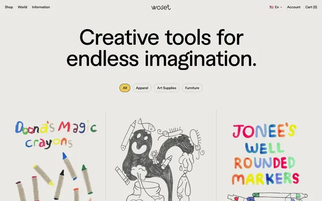
Woset employs a playful yet considered aesthetic, reminiscent of a child's art cart organized with care. The system uses a clean, light canvas, punctuated by a vibrant primary yellow that brings a pop of creative energy. Typography is grounded, with a custom sans-serif family that balances friendliness with legibility. Components often feature generous border-radii, giving them a soft, approachable feel, while the overall density remains comfortable to allow product illustrations to breathe.
The page uses a contained, centered layout, allowing full-bleed background colors for distinct sections. The hero feature is a prominent, large-text headline centered over the page canvas. Content often arranges in a single column or a 3-column grid for product cards. Sections are delineated by vertical spacing (sectionGap 60px) and occasionally by alternating background colors (e.g., Canvas vs. Deep Violet, Forest Green, Artisan Red). Navigation is a compact top bar with left-aligned brand elements and right-aligned utility links, which scrolls with the page.
The site heavily features whimsical, hand-drawn product illustrations, reminiscent of children's drawings. These are the primary visual content, occupying significant space and appearing as product imagery on card components. Photography is absent. Icons, where present (e.g., cart, account), are simple, outlined, and monochromatic (Ink Black); their stroke weight is minimal. The imagery serves primarily to showcase products and create a playful, imaginative atmosphere, dominating visually over text.
Reminiscent of Paper & Stitch, Beci Orpin's shop, Good Kids, Of Unusual Kind.
# Woset — Style Reference
> Childhood doodle sketchbook

**Theme:** light

**Site:** https://www.woset.world

Woset employs a playful yet considered aesthetic, reminiscent of a child's art cart organized with care. The system uses a clean, light canvas, punctuated by a vibrant primary yellow that brings a pop of creative energy. Typography is grounded, with a custom sans-serif family that balances friendliness with legibility. Components often feature generous border-radii, giving them a soft, approachable feel, while the overall density remains comfortable to allow product illustrations to breathe.

## Tokens — Colors

| Name | Value | Token | Role |
|------|------|------|------|
| Crayon Yellow | `#ecca53` | `--color-crayon-yellow` | Primary action background, active state accent, secondary surface treatments — the key optimistic brand color. Its vibrancy makes interactive elements feel distinct |
| Deep Violet | `#2d5193` | `--color-deep-violet` | Decorative background fills for visual sections or product showcases — a rich, cool tone that complements the playful primary yellow |
| Forest Green | `#054331` | `--color-forest-green` | Decorative background fills for visual sections or product showcases — a grounding, earthy hue |
| Artisan Red | `#a5001b` | `--color-artisan-red` | Decorative background fills for visual sections or product showcases — a strong, warm accent |
| Canvas | `#e5e7eb` | `--color-canvas` | Page backgrounds, muted borders, subtle surface accents — a near-white canvas allowing product illustrations to be the focal point |
| Ink Black | `#000000` | `--color-ink-black` | Primary text, headings, prominent borders, filled button backgrounds. The core dark for high contrast |
| Muted Ash | `#bbbab7` | `--color-muted-ash` | Button borders for ghost buttons, subtle dividers. A softer boundary than direct black |
| Graphite | `#8d8c8a` | `--color-graphite` | Secondary body text, price listings, less prominent textual elements — a gentle contrast against the canvas |

## Tokens — Typography

### ts-unused
- **Weights:** 500
- **Sizes:** 15px
- **Line height:** 1
- **Letter spacing:** -0.02
- **Role:** ts-unused — detected in extracted data but not described by AI

### Macan
- **Substitute:** Inter
- **Weights:** 400, 500
- **Sizes:** 15px, 24px, 25px, 95px
- **Line height:** 1, 1.2, 1.35
- **Letter spacing:** -0.6, -0.3, 1
- **Role:** Primary brand typeface for headings, body text, and interactive elements. Its custom nature provides a unique friendly yet authoritative feel. Weight 400 is common for body text (15px), while larger headings use 500 (25px, 95px) with tighter letter spacing for impact. The generous letter spacing for 24px text softens the content.

### A1 Gothic M
- **Substitute:** Inter
- **Weights:** 400
- **Sizes:** 16px
- **Line height:** 1
- **Letter spacing:** -0.3
- **Role:** Used for specific body text elements, likely a display-focused variation. Its tight letter spacing (-0.019em) creates a compact, refined appearance, contrasting with the slightly more open Macan.

### GTStandard-M
- **Weights:** 400
- **Sizes:** 15px
- **Line height:** 1.5
- **Letter spacing:** -0.02
- **Role:** GTStandard-M — detected in extracted data but not described by AI

## Tokens — Type Scale

| Role | Size | Line height | Letter spacing |
|------|------|------|------|
| body-lg | 16px | 1 | -0.3px |
| subheading | 24px | 1.2 | 1px |
| display | 95px | 1 | -0.6px |

## Tokens — Spacing

- **Section gap:** 60px
- **Card padding:** 14px
- **Element gap:** 22px

## Tokens — Radius

- **Buttons:** 30px
- **Inputs:** 30px

## Layout

The page uses a contained, centered layout, allowing full-bleed background colors for distinct sections. The hero feature is a prominent, large-text headline centered over the page canvas. Content often arranges in a single column or a 3-column grid for product cards. Sections are delineated by vertical spacing (sectionGap 60px) and occasionally by alternating background colors (e.g., Canvas vs. Deep Violet, Forest Green, Artisan Red). Navigation is a compact top bar with left-aligned brand elements and right-aligned utility links, which scrolls with the page.

## Imagery

The site heavily features whimsical, hand-drawn product illustrations, reminiscent of children's drawings. These are the primary visual content, occupying significant space and appearing as product imagery on card components. Photography is absent. Icons, where present (e.g., cart, account), are simple, outlined, and monochromatic (Ink Black); their stroke weight is minimal. The imagery serves primarily to showcase products and create a playful, imaginative atmosphere, dominating visually over text.

## Components

### Ghost Button
*Secondary actions, navigation links, filtering options.*

Transparent background (rgba(0, 0, 0, 0)), Ink Black text (#000000). Features a subtle Muted Ash (#bbbab7) border of 1px, with 30px border-radius. Padding is 11px vertical, 14px horizontal.

### Primary Action Button
*Main call-to-actions, prominent interactive elements.*

Filled with Crayon Yellow (#ecca53) background and Ink Black (#000000) text. Has a 30px border-radius. Padding is 11px vertical, 14px horizontal.

### Text Input
*Form fields for user data entry.*

Transparent background (rgba(0, 0, 0, 0)), Ink Black (#000000) text. Features a 1px Ink Black (#000000) border with a 30px border-radius. Padding is 11px vertical, 14px horizontal.

### Full-Width Primary Button
*Key navigational or submission actions, often at the bottom of forms or sections requiring higher emphasis.*

Solid Ink Black (#000000) background with white text. Features a sharp 0px border-radius. Generous horizontal padding of 48px.

### Product Card
*Displaying individual products with imagery and pricing.*

Background is Canvas (#e5e7eb) with no explicit border or shadow (relying on implied spacing from Canvas background). Product titles use Macan Medium (weight 500) at 15px, and prices use Graphite (#8d8c8a) at 15px. Internal element spacing between title and price is roughly 15px.

## Guidelines

### Do

- Use Canvas (#e5e7eb) as the primary background for all page sections and underlying surfaces.
- Apply a 30px border-radius to all buttons and input fields to maintain a soft, approachable feel, unless explicitly overridden for a specific component variation.
- Utilize Ink Black (#000000) for all primary text, headings, and significant interactive text, ensuring high contrast against light backgrounds.
- Employ Crayon Yellow (#ecca53) exclusively for primary calls-to-action or active states, making these elements distinct and energetic.
- Maintain a clear elementGap of 22px between logically grouped UI elements, and a sectionGap of 60px between major content blocks.
- Prioritize Macan for all textual content, using weight 400 for body text and weight 500 for larger headlines.
- Ensure all interactive fields and ghost buttons feature a 1px border using Muted Ash (#bbbab7) or Ink Black (#000000).

### Don't

- Do not use Crayon Yellow (#ecca53) for decorative purposes or text that is not a primary action or active state indication.
- Avoid harsh, angular corners; always prefer the defined 30px border-radius for interactive elements unless a specific component variant dictates otherwise (e.g., the Full-Width Primary Button).
- Do not introduce new border colors or weights; stick to 1px Ink Black (#000000) or Muted Ash (#bbbab7) for borders.
- Do not introduce drop shadows for elevation; rely on spacing, background color changes, and borders for visual hierarchy.
- Avoid using highly saturated, non-brand colors outside of the specified decorative background fills (Deep Violet, Forest Green, Artisan Red).
- Do not use the A1 Gothic M font for general body text or headlines; reserve it for its specific defined content role.
- Do not reduce the elementGap below 22px or sectionGap below 60px, as it will disrupt the comfortable density.

## Agent Prompt Guide

Quick Color Reference:
text: #000000
background: #e5e7eb
border: #bbbab7
accent: #ecca53
primary action: #ecca53 (filled action)

Example Component Prompts:
Create a hero section: Canvas #e5e7eb background. Centered headline 'Creative tools for endless imagination.' using Macan weight 500, size 95px, letter-spacing -0.6px, Ink Black #000000. Below it, a subtle text 'Where ideas bloom.' using Macan weight 400, size 24px, letter-spacing 1.0px, Graphite #8d8c8a.

Create a ghost button: Text 'View Details' using Macan weight 400, size 15px, Ink Black #000000. Background transparent, border 1px solid Muted Ash #bbbab7 with 30px radius. Padding 11px vertical, 14px horizontal.

Create a product card: Canvas #e5e7eb background. Product image (placeholder: 200x200px solid light gray). Product name 'Doona's Magic Crayons' in Macan weight 500, size 15px, Ink Black #000000. Price '€31,95' in Macan weight 400, size 15px, Graphite #8d8c8a. Card padding 14px, with 15px elementGap between image and text block.
More like this









Keep what you find
A free account saves references to boards and can send you a weekly email of picks based on what you save.
To see every result, go Pro.