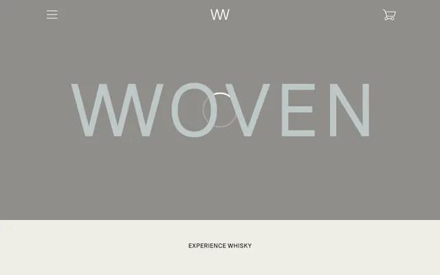
Preview image. Unlock full-res
Artisanal parchment and charcoal calligraphy
Color palette
Primary text, dark backgrounds for inverted sections, hairline borders, default button fills, and iconic elements. Its deep, near-black tone establishes gravitas
Dominant page background, providing a warm, tactile canvas that contributes to the artisanal feel
Card backgrounds, clean product display areas, and occasional link backgrounds, offering visual lift against the Parchment background
Secondary text, subtle borders, and placeholder text, offering a softer alternative to Carbon for less critical information
Typography
- Weights
- 400, 700
- Sizes
- 12px, 14px, 15px, 16px, 18px, 20px
- Line height
- 1.2, 1.5, 1.63, 1.71, 2.4
- Letter spacing
- -0.063em at 12px, 0.094em at 14px, 0.121em at 15px, 0.167em at 16px
- Fallback
- IBM Plex Mono
Primary UI text for links, navigation, body copy, and headings, often set in uppercase. Its semi-monospace nature and generous letter-spacing create a distinct, structured voice.
- Weights
- 400
- Sizes
- 16px, 20px, 24px, 32px
- Line height
- 1, 1.13, 1.2, 1.23, 1.5, 1.63, 1.71, 2.4
- Letter spacing
- normal
- Fallback
- Inter
Used for prominent display headings and key brand messaging. Its proportional spacing provides a more traditional, impactful presence compared to the semi-mono variant.
- Weights
- 400, 700
- Sizes
- 12px, 14px
- Line height
- 1.63, 1.71
- Letter spacing
- normal
- Fallback
- Figtree
Secondary text for buttons, navigation, and detailed list items. Its readability at small sizes complements the broader typographic choices, providing supporting information.
Spacing & shape
Components
Transparent background, Carbon text color. Used for subtle interactions like menu buttons and secondary actions. No padding beyond content.
Carbon background, Porcelain text color. No border radius. Padding: 15px top, 40px right, 17px bottom, 40px left. Used for primary actions like 'Checkout'.
Porcelain background, 0px border-radius, no box-shadow. Padding 26px on all sides. Used for displaying items like whisky bottles.
Porcelain background, 50% border-radius (circle), no box-shadow. No padding. Used for purely aesthetic container needs.
Transparent background, Carbon text color, bottom border of Carbon. No border-radius. Padding: 10px top/bottom, 0px left/right. Serves as a direct input for forms.
Guidelines
- Use Parchment (#eeede5) as the default background for most page sections.
- Employ Carbon (#232323) for primary headings and body text, maintaining high contrast against light backgrounds.
- Apply all body text and secondary headings using 'Spezia Semi-Mono', emphasizing generous letter-spacing to enhance readability and establish a structured aesthetic.
- Utilize 0px border-radius for all primary interactive elements and most container edges to maintain a sharp, deliberate aesthetic.
- Ensure generous vertical spacing between sections, adhering to the `sectionGap` of 150px to create a spacious, breathable layout.
- Design interactive elements, especially navigation, as ghost buttons with transparent backgrounds and Carbon text, for an understated interface.
- Use 'Spezia' with normal letter spacing for large, impactful headlines to create visual differentiation from the monospaced UI text.
- Avoid strong, saturated colors; limit the palette to the established neutrals to preserve the brand's understated elegance.
- Do not use box-shadows or heavy elevation for cards or main UI elements; surfaces should appear flat or with subtle border delineations.
- Do not use generic system fonts; always prioritize 'Spezia Semi-Mono', 'Spezia', and 'Figtree' to maintain consistent brand typography.
- Do not introduce rounded corners for primary UI elements; maintain sharp, crisp edges unless a circular card variation is explicitly required for decorative purposes.
- Avoid dense, information-heavy blocks of text; break content into manageable sections with ample negative space.
- Do not add unnecessary padding to ghost buttons; they should remain lightweight and borderless without internal spacing.
About this system
ShowHide
Woven's design system evokes a refined, artisanal mood with a predominantly monochrome palette punctuated by subtle, natural off-whites. Typography is compact and precise, often uppercase with generous tracking, conveying a sense of heritage and meticulous craftsmanship. Components are lightweight and border-focused, with minimal use of shadows, emphasizing content over heavy UI chrome. The overall effect is understated luxury, where visual tension is created through careful spacing and material contrast rather than bold color or complex graphics.
The page primarily uses a full-bleed layout for background elements, with content contained centrally within an implicit maximum width, visible particularly in the product grids. The hero section often features a centered headline over a background that shifts between the dominant neutrals. Section rhythm is created through alternating Parchment and Porcelain backgrounds, but also through consistent vertical spacing (150px section gap) rather than explicit dividers. Content is arranged in alternating two-column layouts (text left, image right) or centered stacks for headlines and subtext. Product listings appear in responsive card grids. Navigation is a minimalistic top bar with a hamburger menu icon, suggesting a focus on content exploration rather than complex hierarchical navigation.
This design system uses product photography as its primary visual language. Imagery consists mainly of tightly cropped, minimalist product shots (whisky bottles) on pure white or light grey backgrounds. These are contained within defined boundaries without overlapping, often serving as the central focus of a section or within a grid. There are no lifestyle shots, abstract graphics, or 3D renders. Icons are minimal, outlined, and monochromatic (Carbon), serving purely functional roles like navigation or shopping cart indicators. Imagery dense, with products occupying significant visual space in relation to accompanying text, acting as explanatory content and product showcase.
Reminiscent of Aēsop, Allbirds, Great Jones, Everlane.
# Woven — Style Reference
> Artisanal parchment and charcoal calligraphy

**Theme:** light

**Site:** https://wovenwhisky.com

Woven's design system evokes a refined, artisanal mood with a predominantly monochrome palette punctuated by subtle, natural off-whites. Typography is compact and precise, often uppercase with generous tracking, conveying a sense of heritage and meticulous craftsmanship. Components are lightweight and border-focused, with minimal use of shadows, emphasizing content over heavy UI chrome. The overall effect is understated luxury, where visual tension is created through careful spacing and material contrast rather than bold color or complex graphics.

## Tokens — Colors

| Name | Value | Token | Role |
|------|------|------|------|
| Carbon | `#232323` | `--color-carbon` | Primary text, dark backgrounds for inverted sections, hairline borders, default button fills, and iconic elements. Its deep, near-black tone establishes gravitas |
| Parchment | `#eeede5` | `--color-parchment` | Dominant page background, providing a warm, tactile canvas that contributes to the artisanal feel |
| Porcelain | `#ffffff` | `--color-porcelain` | Card backgrounds, clean product display areas, and occasional link backgrounds, offering visual lift against the Parchment background |
| Slate | `#4a4a4a` | `--color-slate` | Secondary text, subtle borders, and placeholder text, offering a softer alternative to Carbon for less critical information |

## Tokens — Typography

### Spezia Semi-Mono
- **Substitute:** IBM Plex Mono
- **Weights:** 400, 700
- **Sizes:** 12px, 14px, 15px, 16px, 18px, 20px
- **Line height:** 1.2, 1.5, 1.63, 1.71, 2.4
- **Letter spacing:** -0.063em at 12px, 0.094em at 14px, 0.121em at 15px, 0.167em at 16px
- **Role:** Primary UI text for links, navigation, body copy, and headings, often set in uppercase. Its semi-monospace nature and generous letter-spacing create a distinct, structured voice.

### Spezia
- **Substitute:** Inter
- **Weights:** 400
- **Sizes:** 16px, 20px, 24px, 32px
- **Line height:** 1, 1.13, 1.2, 1.23, 1.5, 1.63, 1.71, 2.4
- **Letter spacing:** normal
- **Role:** Used for prominent display headings and key brand messaging. Its proportional spacing provides a more traditional, impactful presence compared to the semi-mono variant.

### Figtree
- **Substitute:** Figtree
- **Weights:** 400, 700
- **Sizes:** 12px, 14px
- **Line height:** 1.63, 1.71
- **Letter spacing:** normal
- **Role:** Secondary text for buttons, navigation, and detailed list items. Its readability at small sizes complements the broader typographic choices, providing supporting information.

## Tokens — Type Scale

Major Third (1.25) from 12px base.

| Role | Size | Line height | Letter spacing |
|------|------|------|------|
| caption | 12px | 1.63 | 0.063em |
| body-sm | 14px | 1.63 | 0.094em |
| heading-sm | 20px | 1.2 | — |
| heading | 24px | 1.23 | — |
| display | 32px | 1.2 | — |

## Tokens — Spacing

- **Section gap:** 150px
- **Card padding:** 26px
- **Element gap:** 20px

## Tokens — Radius

- **circle:** 50%
- **none:** 0px

## Layout

The page primarily uses a full-bleed layout for background elements, with content contained centrally within an implicit maximum width, visible particularly in the product grids. The hero section often features a centered headline over a background that shifts between the dominant neutrals. Section rhythm is created through alternating Parchment and Porcelain backgrounds, but also through consistent vertical spacing (150px section gap) rather than explicit dividers. Content is arranged in alternating two-column layouts (text left, image right) or centered stacks for headlines and subtext. Product listings appear in responsive card grids. Navigation is a minimalistic top bar with a hamburger menu icon, suggesting a focus on content exploration rather than complex hierarchical navigation.

## Imagery

This design system uses product photography as its primary visual language. Imagery consists mainly of tightly cropped, minimalist product shots (whisky bottles) on pure white or light grey backgrounds. These are contained within defined boundaries without overlapping, often serving as the central focus of a section or within a grid. There are no lifestyle shots, abstract graphics, or 3D renders. Icons are minimal, outlined, and monochromatic (Carbon), serving purely functional roles like navigation or shopping cart indicators. Imagery dense, with products occupying significant visual space in relation to accompanying text, acting as explanatory content and product showcase.

## Components

### Ghost Button
*Interactive element (e.g. navigation, menu toggles)*

Transparent background, Carbon text color. Used for subtle interactions like menu buttons and secondary actions. No padding beyond content.

### Primary Filled Button
*Call to action*

Carbon background, Porcelain text color. No border radius. Padding: 15px top, 40px right, 17px bottom, 40px left. Used for primary actions like 'Checkout'.

### Product Card
*Displaying product listings*

Porcelain background, 0px border-radius, no box-shadow. Padding 26px on all sides. Used for displaying items like whisky bottles.

### Circular Card
*Decorative or iconic element container*

Porcelain background, 50% border-radius (circle), no box-shadow. No padding. Used for purely aesthetic container needs.

### Underlined Input Field
*Text input areas*

Transparent background, Carbon text color, bottom border of Carbon. No border-radius. Padding: 10px top/bottom, 0px left/right. Serves as a direct input for forms.

## Guidelines

### Do

- Use Parchment (#eeede5) as the default background for most page sections.
- Employ Carbon (#232323) for primary headings and body text, maintaining high contrast against light backgrounds.
- Apply all body text and secondary headings using 'Spezia Semi-Mono', emphasizing generous letter-spacing to enhance readability and establish a structured aesthetic.
- Utilize 0px border-radius for all primary interactive elements and most container edges to maintain a sharp, deliberate aesthetic.
- Ensure generous vertical spacing between sections, adhering to the `sectionGap` of 150px to create a spacious, breathable layout.
- Design interactive elements, especially navigation, as ghost buttons with transparent backgrounds and Carbon text, for an understated interface.
- Use 'Spezia' with normal letter spacing for large, impactful headlines to create visual differentiation from the monospaced UI text.

### Don't

- Avoid strong, saturated colors; limit the palette to the established neutrals to preserve the brand's understated elegance.
- Do not use box-shadows or heavy elevation for cards or main UI elements; surfaces should appear flat or with subtle border delineations.
- Do not use generic system fonts; always prioritize 'Spezia Semi-Mono', 'Spezia', and 'Figtree' to maintain consistent brand typography.
- Do not introduce rounded corners for primary UI elements; maintain sharp, crisp edges unless a circular card variation is explicitly required for decorative purposes.
- Avoid dense, information-heavy blocks of text; break content into manageable sections with ample negative space.
- Do not add unnecessary padding to ghost buttons; they should remain lightweight and borderless without internal spacing.

## Agent Prompt Guide

Quick Color Reference:
text: #232323
background: #eeede5
border: #232323
accent: no distinct accent color
primary action: no distinct CTA color

Example Component Prompts:
No distinct primary action color was observed; use the extracted neutral button treatments instead of inventing a filled CTA color.

Create a product listing card: Porcelain background (#ffffff), 0px radius, 26px padding. Product image at the top (assume centered). Product name 'HOMEMADE' centered below image, Spezia Semi-Mono, size 16px, weight 400, letter-spacing 0.167em, Carbon text (#232323). Price '£45' centered below name, Spezia Semi-Mono, size 15px, weight 400, letter-spacing 0.121em, Carbon text (#232323).

Create a navigation menu toggle: Ghost button. Carbon (#232323) icon (e.g. hamburger). No background, no padding. Element gap 8px from other nav items.
More like this









Keep what you find
A free account saves references to boards and can send you a weekly email of picks based on what you save.
To see every result, go Pro.