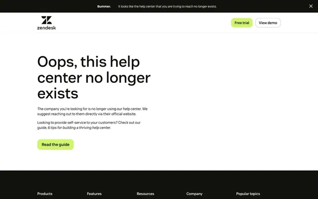
Preview image. Unlock full-res
Crisp digital canvas
Color palette
Primary call-to-action buttons, interactive links, highlight accents, decorative branding element in footer
Page backgrounds, elevated surfaces, default icon fills, default link text in dark sections
Primary text, deep shadow effects where present
Footer background, secondary text on light backgrounds, dark surface elements
Muted text, subtle borders, background for secondary headings
Typography
- Weights
- 400, 500, 600, 700
- Sizes
- 14px, 16px, 18px, 32px, 42px, 68px
- Line height
- 1, 1.05, 1.15, 1.2, 1.39, 1.4, 1.44, 1.45, 1.5, 1.56, 1.68
- Letter spacing
- normal
- Fallback
- Inter, sans-serif
The primary typeface for all text content, from headings to body text and navigation. Its clean, modern lines reinforce the system's clarity and directness.
Spacing & shape
Components
Filled button with Zendesk Green (#d1f470) background and Charcoal (#11110d) text. Features 16px border-radius and 10px vertical, 20px horizontal padding. Prominently used for primary actions.
Transparent background with Canvas White (#ffffff) text (when on dark background like footer). No distinct padding, relies on surrounding layout for spacing. Used for navigation links or secondary actions that need less emphasis.
Dark Charcoal (#11110d) background with Canvas White (#ffffff) text. Used for system-wide notices at the top of the page. Minimal padding, directly integrated into the header structure.
Canvas White (#ffffff) text on Charcoal (#11110d) background. Default state is simple text, interactive states or special links may use Zendesk Green (#d1f470) text. Small 4px border-radius for interactive elements.
Text in Fog Gray (#f5f5f2) color, often used in information-dense sections like the footer. Sizes range based on hierarchy, e.g. 18px / 1.5.
Guidelines
- Use Canvas White (#ffffff) for primary page backgrounds, ensuring maximum legibility for content.
- Apply Zendesk Green (#d1f470) exclusively for primary calls-to-action, interactive elements, and focused brand highlights.
- Employ Charcoal (#11110d) as the background for footer sections and high-contrast informational banners.
- Use Vanilla Sans (or Inter as substitute) for all typographic elements, prioritizing legibility and a consistent brand voice.
- Ensure all buttons and navigation items utilize a 16px border-radius for a consistent, soft visual feel.
- Maintain high contrast (AAA level) for all text against its background, e.g., Ink Black (#000000) on Canvas White (#ffffff).
- Utilize an 8px base unit for all spacing, with common element gaps at 16px and section gaps at 88px for clarity.
- Do not introduce new vibrant colors outside of Zendesk Green (#d1f470), as it diminishes the impact of the primary accent.
- Avoid heavy shadows or gradients on interactive elements; rely on color and typography changes for states.
- Do not deviate from the established type scale; maintain consistent sizing and line heights for hierarchy.
- Do not use generic system fonts; always specify Vanilla Sans or its substitute Inter.
- Avoid applying tight letter-spacing to body text; it should remain at 'normal' for readability.
- Do not use border-radius values other than 4px or 16px for UI elements, except for the large 40px radius on a specific body surface.
- Do not use more subtle forms of interaction for primary CTAs; they must be filled with Zendesk Green.
About this system
ShowHide
Zendesk employs a crisp, bright aesthetic with high contrast typography and a single vibrant accent color. The visual system prioritizes legibility and direct communication on a clean white canvas, grounded by dark, information-dense footers. Components are lightweight and functional, using subtle rounding and a clear hierarchy driven by size and color. Interaction points are sharply defined by the key accent green, making actions feel clear and responsive.
The page follows a contained layout model, centered within a max-width constraint, though the 'max-width' itself is not explicitly defined in the data, the content is clearly not full-bleed. The hero section features a large, centered headline followed by body text and an engaging call to action. Sections are delineated by clear vertical rhythm with generous spacing. The footer shifts to a dark background, employing a multi-column grid for navigation links and a visually distinct 'Contact us.' section with a brand accent. Page-level navigation is a simple top bar with a logo and two ghost action buttons.
This site predominantly uses icons and UI elements rather than complex imagery. White background with a simple black logo. When present, imagery is typically functional, like a small decorative green gradient in the footer or simple line icons in navigation. The design is text-dominant, with visual elements serving to break up sections or highlight interaction. Icons are minimal, likely filled or solid, with no apparent stroke. No elaborate photography or custom illustrations are present beyond the brand's immediate UI needs.
Reminiscent of monday.com, Asana, Notion.
# Zendesk — Style Reference
> Crisp digital canvas

**Theme:** light

**Site:** https://thankyoumachine.zendesk.com

Zendesk employs a crisp, bright aesthetic with high contrast typography and a single vibrant accent color. The visual system prioritizes legibility and direct communication on a clean white canvas, grounded by dark, information-dense footers. Components are lightweight and functional, using subtle rounding and a clear hierarchy driven by size and color. Interaction points are sharply defined by the key accent green, making actions feel clear and responsive.

## Tokens — Colors

| Name | Value | Token | Role |
|------|------|------|------|
| Zendesk Green | `#d1f470` | `--color-zendesk-green` | Primary call-to-action buttons, interactive links, highlight accents, decorative branding element in footer |
| Canvas White | `#ffffff` | `--color-canvas-white` | Page backgrounds, elevated surfaces, default icon fills, default link text in dark sections |
| Ink Black | `#000000` | `--color-ink-black` | Primary text, deep shadow effects where present |
| Charcoal | `#11110d` | `--color-charcoal` | Footer background, secondary text on light backgrounds, dark surface elements |
| Fog Gray | `#f5f5f2` | `--color-fog-gray` | Muted text, subtle borders, background for secondary headings |

## Tokens — Typography

### Vanilla Sans
- **Substitute:** Inter, sans-serif
- **Weights:** 400, 500, 600, 700
- **Sizes:** 14px, 16px, 18px, 32px, 42px, 68px
- **Line height:** 1, 1.05, 1.15, 1.2, 1.39, 1.4, 1.44, 1.45, 1.5, 1.56, 1.68
- **Letter spacing:** normal
- **Role:** The primary typeface for all text content, from headings to body text and navigation. Its clean, modern lines reinforce the system's clarity and directness.

## Tokens — Type Scale

| Role | Size | Line height | Letter spacing |
|------|------|------|------|
| caption | 14px | 1.4 | — |
| body-sm | 16px | 1.5 | — |
| body | 18px | 1.5 | — |
| heading-sm | 32px | 1.2 | — |
| heading | 42px | 1.05 | — |
| display | 68px | 1 | — |

## Tokens — Spacing

- **Section gap:** 88px
- **Card padding:** 16px
- **Element gap:** 16px

## Tokens — Radius

- **Buttons:** 16px
- **bodySurface:** 40px
- **links:** 4px
- **navigationItems:** 16px

## Layout

The page follows a contained layout model, centered within a max-width constraint, though the 'max-width' itself is not explicitly defined in the data, the content is clearly not full-bleed. The hero section features a large, centered headline followed by body text and an engaging call to action. Sections are delineated by clear vertical rhythm with generous spacing. The footer shifts to a dark background, employing a multi-column grid for navigation links and a visually distinct 'Contact us.' section with a brand accent. Page-level navigation is a simple top bar with a logo and two ghost action buttons.

## Imagery

This site predominantly uses icons and UI elements rather than complex imagery. White background with a simple black logo. When present, imagery is typically functional, like a small decorative green gradient in the footer or simple line icons in navigation. The design is text-dominant, with visual elements serving to break up sections or highlight interaction. Icons are minimal, likely filled or solid, with no apparent stroke. No elaborate photography or custom illustrations are present beyond the brand's immediate UI needs.

## Components

### Primary Action Button
*Call to action*

Filled button with Zendesk Green (#d1f470) background and Charcoal (#11110d) text. Features 16px border-radius and 10px vertical, 20px horizontal padding. Prominently used for primary actions.

### Ghost Navigation Button
*Secondary navigation or action*

Transparent background with Canvas White (#ffffff) text (when on dark background like footer). No distinct padding, relies on surrounding layout for spacing. Used for navigation links or secondary actions that need less emphasis.

### Info Banner
*Top-level informational message*

Dark Charcoal (#11110d) background with Canvas White (#ffffff) text. Used for system-wide notices at the top of the page. Minimal padding, directly integrated into the header structure.

### Footer Link
*Navigation links within the footer*

Canvas White (#ffffff) text on Charcoal (#11110d) background. Default state is simple text, interactive states or special links may use Zendesk Green (#d1f470) text. Small 4px border-radius for interactive elements.

### Muted Heading
*Secondary section headings*

Text in Fog Gray (#f5f5f2) color, often used in information-dense sections like the footer. Sizes range based on hierarchy, e.g. 18px / 1.5.

## Guidelines

### Do

- Use Canvas White (#ffffff) for primary page backgrounds, ensuring maximum legibility for content.
- Apply Zendesk Green (#d1f470) exclusively for primary calls-to-action, interactive elements, and focused brand highlights.
- Employ Charcoal (#11110d) as the background for footer sections and high-contrast informational banners.
- Use Vanilla Sans (or Inter as substitute) for all typographic elements, prioritizing legibility and a consistent brand voice.
- Ensure all buttons and navigation items utilize a 16px border-radius for a consistent, soft visual feel.
- Maintain high contrast (AAA level) for all text against its background, e.g., Ink Black (#000000) on Canvas White (#ffffff).
- Utilize an 8px base unit for all spacing, with common element gaps at 16px and section gaps at 88px for clarity.

### Don't

- Do not introduce new vibrant colors outside of Zendesk Green (#d1f470), as it diminishes the impact of the primary accent.
- Avoid heavy shadows or gradients on interactive elements; rely on color and typography changes for states.
- Do not deviate from the established type scale; maintain consistent sizing and line heights for hierarchy.
- Do not use generic system fonts; always specify Vanilla Sans or its substitute Inter.
- Avoid applying tight letter-spacing to body text; it should remain at 'normal' for readability.
- Do not use border-radius values other than 4px or 16px for UI elements, except for the large 40px radius on a specific body surface.
- Do not use more subtle forms of interaction for primary CTAs; they must be filled with Zendesk Green.

## Agent Prompt Guide

Quick Color Reference:
text: #000000
background: #ffffff
border: #d1f470 (for active states/highlights)
accent: #d1f470
primary action: #d1f470 (filled action)

Example Component Prompts:
1. Create a Primary Action Button: #d1f470 background, #000000 text, 9999px radius, compact pill padding. Use this filled treatment for the main CTA.
2. Create a main headline: text #11110d, font Vanilla Sans weight 700, size 68px, lineHeight 1.0.
4. Create a hero body text block: text #11110d, font Vanilla Sans weight 400, size 18px, lineHeight 1.5.
More like this









Keep what you find
A free account saves references to boards and can send you a weekly email of picks based on what you save.
To see every result, go Pro.